How To Navigate Guest Settings (Detailed)
This guide is essential for anyone looking to create a customized guest intake form using PodUp's Guest Settings. It offers detailed instructions on how to navigate the platform, edit profile components, and tailor questions to fit specific needs. By following the steps provided, users can easily design an intuitive and engaging form that ensures a smooth experience for their guests. Overall, this guide simplifies the process of setting up guest profiles and enhances user interaction.
1. Navigate to https://app.podup.com/home

2. Click "Guests"

3. Click "Guest Settings"

4. Click "Profile" shows you the basic profile information that is asked of your guest
A list of basic questions will appear, but you can edit it to fit your needs

5. To reorder a component, select the 6 dots in the top middle of the component and drag it to the desired destination
- You will know you have successfully grabbed the component when it has a gray outline
- A blue line will appear showing you where the component is currently resting

6. On the right-hand side, you can add more components to the form by 1 of 2 ways. 1) To add the component, you can click on the component you want to add, and it will add to the bottom, where you can then drag it to the desired location. 2) Drag the component name to the desired location
- Checkbox Group: A group of checkboxes that lets users select multiple options at once.
- Use it for: Things like “Select all topics you’re interested in” or “I agree to the terms.”
- See step 10 for editing details
- Date Finder: A calendar-style field that lets users pick a specific date.
- Use it for: Booking appointments, choosing a birthdate, or selecting an event date.
- See step 11 for editing details
- Header: A title or section label that helps organize the form and guide users through it.
- Use it for: Separating sections like “Contact Info” or “Payment Details.”
- See step 12 for editing details
- Number: A field that only accepts numerical input.
- Use it for: Phone numbers, quantities, age, or budget fields.
- See step 13 for editing details
- Paragraph: A block of text used for instructions or descriptions within the form.
- Use it for: Giving users additional context like explaining what your podcast is about
- See step 14 for editing details
- Radio Group: A group of options where users can select only one choice.
- Use it for: Yes/No questions or selecting a single preference like “Choose your size.”
- See step 15 for editing details
- Select: A dropdown menu that lets users choose one option from a list.
- Use it for: Country selection, preferred time slots, or department choices.
- See step 16 for editing details
- Text Field: A single-line field for short text entries.
- Use it for: Name, email address, or job title.
- See step 17 for editing details
- Text: A static line of text that provides instructions or details but doesn’t accept input.
- Use it for: Simple notes like “All fields are required” or “Step 1: Fill out your info.”
- See step 18 for editing details

7. Click "Delete" - the trash can icon - to delete the component

8. Click "Edit" to edit the component
- Note: Each component has. A different menu that can be edited, which will be explained in steps 10 - 18

9. Click "Copy" to duplicate the component

10. For "Checkbox Group", you have the following options
Required: Determines whether the user must select at least one option before submitting the form.
- This will appear as a red star by the Label
Label: The title or question displayed above the group of checkboxes (e.g., “What are your favorite colors?”).
Help Text: Extra guidance shown as a question mark to the right of the Label to help users understand what to enter
Toggle: Allows users to check/uncheck all options at once, usually by clicking a single button or switch.
Inline: Displays checkboxes side-by-side horizontally instead of stacking them vertically.
Access: Controls who can see or interact with the checkbox group (e.g., everyone, logged-in users, admins only).
- If you select this option, a second option will appear allowing you to select the users who can access this question
Enable "Other": Adds an option labeled “Other” with a text field, allowing users to write in a custom answer.
Options: The list of choices presented as checkboxes (e.g., Red, Blue, Green). These are the actual selectable values.
- If you want to add another option, select "Add Option +" in the bottom right-hand corner
Close the edit menu by clicking "Close" in the bottom middle

11. For "Date Field", you have the following options
- Required: Makes the date field mandatory—users can’t submit the form without selecting a date.
- This will appear as a red star by the Label
- Label: The name or question shown above or beside the date field (e.g., “Select your appointment date”).
- Help Text: Extra guidance shown as a question mark to the right of the Label to help users understand what to enter (e.g., “Use the format MM/DD/YYYY”).
- Placeholder: Text that appears inside the date box before a user enters anything, usually showing the format like "MM/DD/YYYY" or saying "Select a date" to guide them.
- Access: Controls who can view or fill out the field (e.g., all users, certain roles, or logged-in users only).
- If you select this option, a second option will appear allowing you to select the users who can access this question
- Min: Sets the earliest date a user can select (e.g., can’t choose a date before today).
- You have to use the format YYYY-MM-DD
- Max: Sets the latest date a user can choose (e.g., limit bookings to within 1 year).
- You have to use the format YYYY-MM-DD
Close the edit menu by clicking "Close" in the bottom middle

12. For "Header", you have the following options
- Label: The name or question shown above or beside the date field (e.g., “Select your appointment date”).
- Access: Controls who can view or fill out the field (e.g., all users, certain roles, or logged-in users only).
- If you select this option, a second option will appear allowing you to select the users who can access this question
Close the edit menu by clicking "Close" in the bottom middle

13. For "Number", you have the following options
- Required: Makes the date field mandatory—users can’t submit the form without selecting a date.
- This will appear as a red star by the Label
- Label: The name or question shown above or beside the date field (e.g., “Select your appointment date”).
- Help Text: Extra guidance shown as a question mark to the right of the Label to help users understand what to enter (e.g., “Use the format MM/DD/YYYY”).
- Placeholder: Text that appears inside the date box before a user enters anything, usually showing the format like "MM/DD/YYYY" or saying "Select a date" to guide them.
- Access: Controls who can view or fill out the field (e.g., all users, certain roles, or logged-in users only).
- If you select this option, a second option will appear allowing you to select the users who can access this question
- Min: Sets the earliest date a user can select (e.g., can’t choose a date before today).
- You have to use the format YYYY-MM-DD
- Max: Sets the latest date a user can choose (e.g., limit bookings to within 1 year).
- You have to use the format YYYY-MM-DD
Close the edit menu by clicking "Close" in the bottom middle

14. For "Paragraph", you have the following options
- Content: Write the text that you wish to have displayed in this section.
- Since the "Paragraph" box is used for text that you have already written like a description you can add that information to this box
- Access: Controls who can view or fill out the field (e.g., all users, certain roles, or logged-in users only).
- If you select this option, a second option will appear allowing you to select the users who can access this question
Close the edit menu by clicking "Close" in the bottom middle

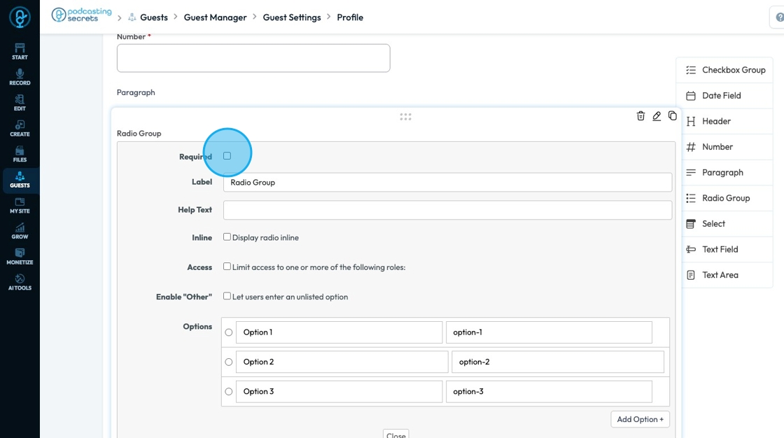
15. For the "Radio Group", you have the following options
- Required: Determines whether the user must select at least one option before submitting the form.
- This will appear as a red star by the Label
- Label: The title or question displayed above the group of checkboxes (e.g., “What are your favorite colors?”).
- Help Text: Extra guidance shown as a question mark to the right of the Label to help users understand what to select
- Inline: Displays checkboxes side-by-side horizontally instead of stacking them vertically.
- Access: Controls who can see or interact with the checkbox group (e.g., everyone, logged-in users, admins only).
- If you select this option, a second option will appear allowing you to select the users who can access this question
- Enable "Other": Adds an option labeled “Other” with a text field, allowing users to write in a custom answer.
- Options: The list of choices presented (e.g., Red, Blue, Green). These are the actual selectable values.
- If you want to add another option, select "Add Option +" in the bottom right-hand corner
Close the edit menu by clicking "Close" in the bottom middle
16. For "Select", you have the following options
- Required: Determines whether the user must select at least one option before submitting the form.
- This will appear as a red star by the Label
- Label: The title or question displayed above the group of checkboxes (e.g., “What are your favorite colors?”).
- Help Text: Extra guidance shown as a question mark to the right of the Label to help users understand what to enter (e.g., “Use the format MM/DD/YYYY”).
- Placeholder: It gives users a clear starting point by showing example text like "Please choose an option" before they make a selection, helping them understand that a choice is required and preventing them from skipping the field.
- Access: Controls who can view or fill out the field (e.g., all users, certain roles, or logged-in users only).
- If you select this option, a second option will appear allowing you to select the users who can access this question
- Allow Multiple Selections: Permits the user to select multiple different options
- Options: The list of choices presented (e.g., Red, Blue, Green). These are the actual selectable values.
- If you want to add another option, select "Add Option +" in the bottom right-hand corner
Close the edit menu by clicking "Close" in the bottom middle

17. For the "Text Field", you have the following options
- Required: Determines whether the user must select at least one option before submitting the form.
- This will appear as a red star by the Label
- Label: The title or question displayed above the group of checkboxes (e.g., “What are your favorite colors?”).
- Help Text: Extra guidance shown as a question mark to the right of the Label to help users understand what to enter (e.g., “Use the format MM/DD/YYYY”).
- Placeholder: Shows example text inside the box to guide users on what to enter, like "Type your full name" or "Enter your email," making the form easier to understand and fill out correctly.
- Access: Controls who can view or fill out the field (e.g., all users, certain roles, or logged-in users only).
- If you select this option, a second option will appear allowing you to select the users who can access this question
- Max Length: Controls how many characters are allowed in the text field
- Character: A single letter, number, space, punctuation mark, or symbol used in writing or typing. For example: A, 7, !, and space are all characters.
Close the edit menu by clicking "Close" in the bottom middle

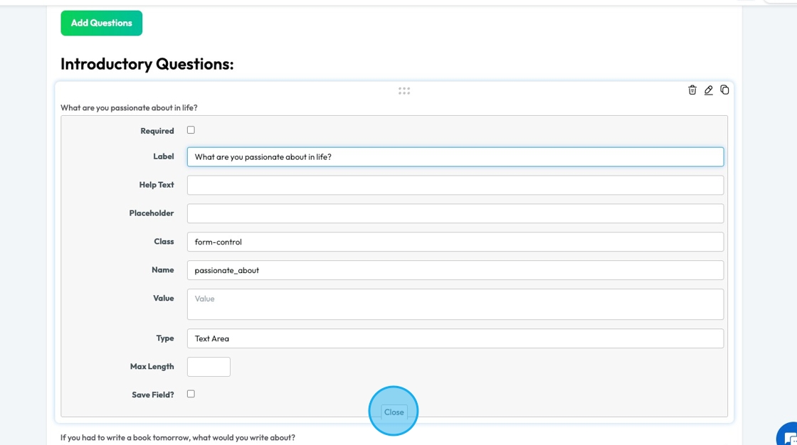
18. For the "Text Area", you have the following options
- Required: Determines whether the user must select at least one option before submitting the form.
- This will appear as a red star by the Label
- Label: The title or question displayed above the group of checkboxes (e.g., “What are your favorite colors?”).
- Help Text: Extra guidance shown as a question mark to the right of the Label to help users understand what to enter (e.g., “Use the format MM/DD/YYYY”).
- Placeholder: Provides the users a hint about what kind of longer response is expected, like "Tell us about your project" or "Write your message here," helping them know what to write and how much detail to include.
- Access: Controls who can view or fill out the field (e.g., all users, certain roles, or logged-in users only).
- If you select this option, a second option will appear allowing you to select the users who can access this question
- Max Length: Controls how many characters are allowed in the text field
- Character: A single letter, number, space, punctuation mark, or symbol used in writing or typing. For example: A, 7, !, and space are all characters.
- Rows: Sets the height of the text box by defining how many lines of text are visible at once, helping control the size of the field to match the expected length of the user's response.
Close the edit menu by clicking "Close" in the bottom middle

19. Click "Update" to save the changes you have made to the Profile form

20. A message box will appear informing you that the form was updated successfully. Click "OK" to dismiss

21. Click "Next" to move to the next page

22. "Your Links" shows the platforms where you can request a link to your guest’s profile.
- For example, if Facebook is active your guest has the option to share the link for their Facebook account

23. Click "Active" to change the status of the platform. A pop-up will appear asking for confirmation that you want to change the status. When agreed, it will automatically change the status from the current status to the other option
- "Active" means that the client can select to submit a link to their profile on that platform
- "Inactive" mean that the platform is not included as an option for guest to add their profile link

Tip: Tip! If a platform is active, that does not mean that the guest has to submit their profile. The guest just had the option to submit their profile
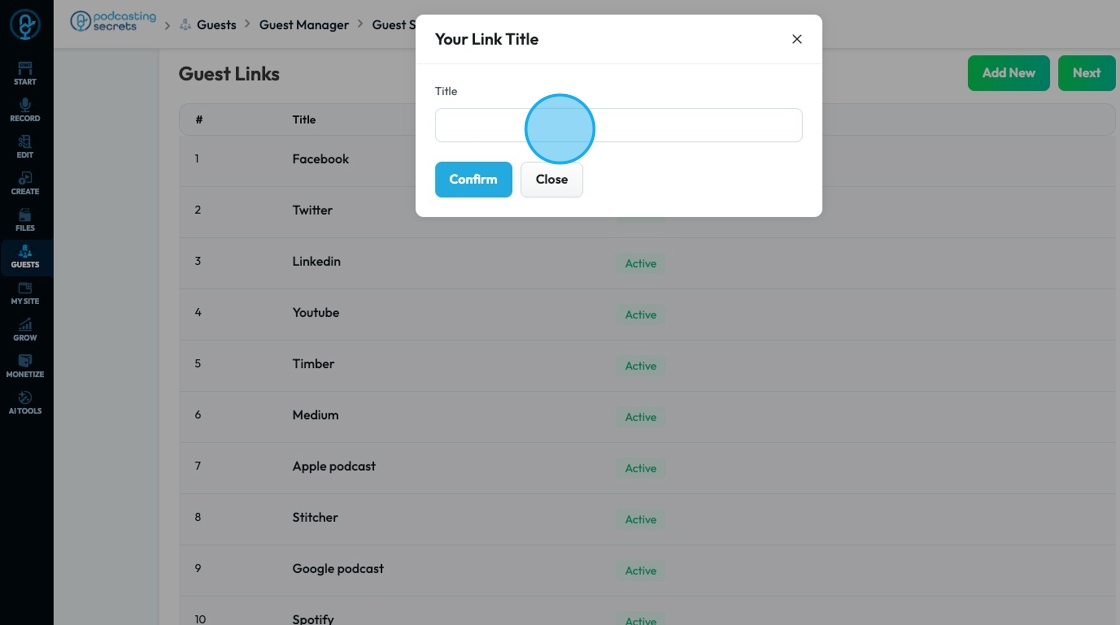
24. Click "Add New" to add a platform to the list of offered platforms

25. A popup will appear allowing you to add the title of the platform
Click "Confirm" to add the platform or "Close" to delete
26. A message will appear to inform you that it was created successfully
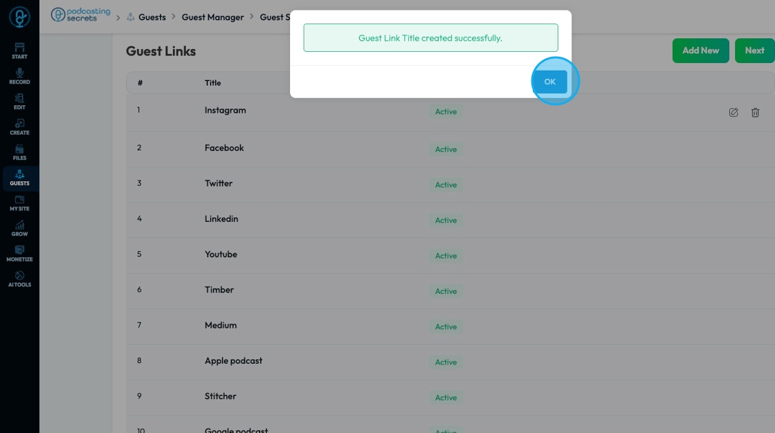
27. The newly created platform will appear first on the list

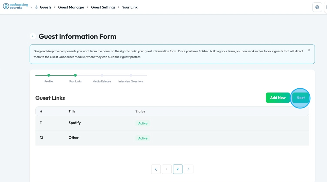
28. The Guest links will only show 10 options at a time to view more click the navigational arrows at the bottom

29. Click "Next" to navigate to the next step
30. Media Release contains your media release that is store in "Legal Docs" on PodUp
Click "Click here" in the bottom right-hand corner to edit the media release

31. Click "Next" to navigate to the next page

32. Click the 6 dots icon to move the questions

33. Click the trashcan icon to delete the question

34. Click "Edit" to change the settings of the question. The features include
- Required: Determines whether the user must select at least one option before submitting the form.
- This will appear as a red star by the Label
- Label: The title or question displayed above the group of checkboxes (e.g., “What are your favorite colors?”).
- Help Text: Extra guidance shown as a question mark to the right of the Label to help users understand what to enter (e.g., “Use the format MM/DD/YYYY”).
- Placeholder: Shows example text inside the box to guide users on what to enter, like "Type your full name" or "Enter your email," making the form easier to understand and fill out correctly.
- Access: Controls who can view or fill out the field (e.g., all users, certain roles, or logged-in users only).
- If you select this option, a second option will appear allowing you to select the users who can access this question
- Max Length: Controls how many characters are allowed in the text field
- Character: A single letter, number, space, punctuation mark, or symbol used in writing or typing. For example: A, 7, !, and space are all characters.

35. Click "Close" in the bottom middle to close the menu
36. Click "Copy" to duplicate the component

37. Click "Add Questions" to add a new question to the "Interview Questions"

38. The component options will appear the same as they did when editing the profile
See steps 10-18

39. Below the components are a list of commonly used questions

40. Click "Update" to update the interview questions

41. To navigate to a previous section or move forward, select the name of the section that you want to jump to on the navigation bar below the title "Guest Information Form"

42. Click the back arrow to leave the guest settings

43. Leaving the "Guest Information Form" will send you to the "Guest Inviter" where you can send the form to your guests

Related Articles
How to Navigate Guest Manager (Detailed)
This guide provides a straightforward process for adding guests to the PodUp application, ensuring you can efficiently manage guest information and invitations. By following the steps outlined, users can easily input necessary details and customize ...How To Navigate Recorder (Detailed)
This guide gives you clear steps to record and manage a podcast studio. It covers setup, adding guests, recording, and editing. With this easy-to-follow resource, you can improve your podcast quality and work more efficiently. Tip: Words to know ...How To Update Your Podcast Guest Profile
This guide is essential for podcasters looking to streamline the process of updating their guest profiles. It offers a step-by-step walkthrough on how to customize guest information, manage links to their social profiles, format a media release, and ...How to change account settings?
This guide shows you how to update your PodUp account settings so your profile stays current and reflects your personal information. 1. Navigate to https://app.podup.com/home 2. Click your "Profile" icon in the top-right corner 3. Select "Edit My ...How To Navigate Categories (Detailed)
This guide offers a straightforward approach to adding and updating categories on your Podup website, making it essential for users looking to enhance their site’s organization and appearance. It provides step-by-step instructions that are easy to ...