How Create a Newsletter in PodUp
This guide shows you how to create a professional newsletter in PodUp using 40+ templates and easy design tools. You'll learn how to customize layout, text, and components for a clean look on any device. It’s a simple way to create and share engaging content.
1. Click "Create"

2. Click "Newsletter"

3. Click "Themes"
Click and choose from 40+ templates of Newsletter

4. Click "Create Newsletter Template" to create your own Newsletter

5. A pop-up window appears
- Name: This is the internal name you give to your email template. It's how you will identify and distinguish this specific template from others within your newsletter
- Subject: This is the actual subject line of the Newsletter
- Template Type: This field allows you to categorize the type of email template you are creating

6. Click "Create Template" to continue

7. A new window appears (Newsletter Builder)

8. Click the display icons to change the display of the page. This helps you edit the website according to different screen sizes
Computer icon: Switches the view to desktop mode. Lets you see and edit how your website looks on a full-sized screen.
Tablet icon: Switches the view to tablet mode. Lets you adjust layout and styling for mid-sized screens like iPads or other tablets.
Phone icon: Switches the view to mobile mode. Helps you fine-tune how your website looks and functions on smartphones.

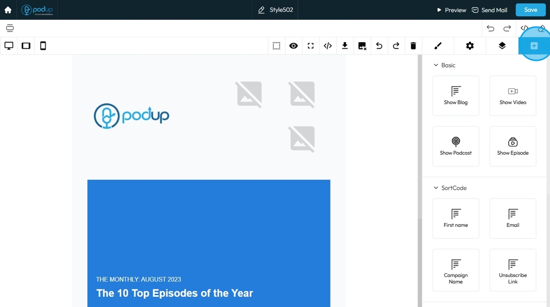
9. Click "Components" icon
Over 40+ templates are available for your usage

10. Click and select a template from the list of template

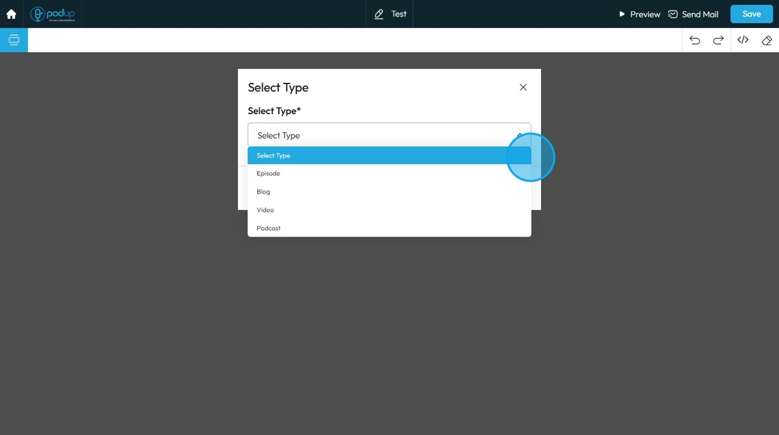
11. Click "Select Type". Select 1 of 4 types
- Episode
- Blog
- Video
- Podcast
12. The template opens up
Click "Blocks" to add different elements to your page
Blocks can be easily drag and dropped in the newsletter.
Elements are self-contained units of content and design. Each element represents a specific piece of functionality or content that you can add to your page. When you drag an "Image" element onto your page, for instance, you're not just adding a space for an image; you're adding a complete, pre-configured structure that's ready for you to upload an image and apply specific styling
13. Click "Open Layer Manager"
Open Layer Manager is a important tool that helps you manage the different elements and content on your web page. Think of it like a stack of transparent sheets (layers) in a graphic design program (like Photoshop or Figma), where each sheet holds a different part of your design

14. Click "Component settings" which is context-sensitive; meaning, the options displayed within it change depending on which component you have selected on your page/email canvas

15. Components setting:
ID: This field displays and allows you to edit the unique identifier (ID) of the selected component
Title: This field allows you to provide a descriptive title or name for the selected component

16. Click "Open Style Manager"

17. Click "Dimension" to adjust the dimensions as per your needs
Dimensions: Refer to the physical size of an element (its width and height) and its spacing relative to other elements (margins and padding). Understanding these concepts is key to creating well-structured and visually appealing layouts
- Width: Set the horizontal size of an element
- Height: Set the vertical size of an element
- Max. width: Set an upper limit for an element's width. The element will never be wider than this value, but it can be narrower
- Min height: Set a lower limit for an element's height. The element will never be shorter than this value, but it can be taller

18. Click "Margin" to adjust margins as per your needs
Margin: Controls the space outside the component's border, separating it from other elements around it. Think of it as pushing other elements away
- Margin top: Controls the space above an element. It pushes the element down from whatever is directly above it (e.g., another element, the browser window edge, or its parent container's top edge)
- Margin right: Controls the space to the right of an element. It pushes the element to the left from whatever is directly to its right
- Margin bottom: Controls the space below an element. It pushes the element up from whatever is directly below it
- Margin left: Controls the space to the left of an element. It pushes the element to the right from whatever is directly to its left

19. Click "Padding" to set the padding for the section
Padding: Padding creates inner space within an element. It pushes the element's content away from its own borders (and therefore away from its own edges)
- Padding top: Controls the inner space above an element's content. It pushes the content down from the element's top border
- Padding bottom: Controls the inner space below an element's content. It pushes the content up from the element's bottom border
- Padding right: Controls the inner space to the right of an element's content. It pushes the content to the left from the element's right border
- Padding left: Controls the inner space to the left of an element's content. It pushes the content to the right from the element's left border

20. Click "Typography" to change the font, size, color, alignment etc. of the text
- Font: Select the typeface (the specific design of the letters) to be used for the text
- Font Size: Controls the height of the characters in your text
- Weight: Controls the boldness or thickness of the text characters
- Letter Spacing: Controls the horizontal space between individual characters (letters) within a word. Also known as "tracking" in traditional typography
- Font Color: Sets the color of the text characters themselves
- Line Height: Controls the vertical space between lines of text within a paragraph or text block. Also known as "leading" in traditional typography

21. Text align: Controls the horizontal alignment of text and inline content within its containing element (e.g., a paragraph, heading, button, or column). It dictates where the text begins and ends horizontally within the available space of its parent
- Left: Align the text to the left edge of its container. The right edge of the text will appear "ragged" or uneven
- Center: Centers the text horizontally within its container. Both the left and right edges of the text will appear ragged
- Right: Aligns the text to the right edge of its container. The left edge of the text will appear ragged
- Justify: When you apply "justify" to a block of text, the browser will stretch the text lines so that both the left and right edges are flush (aligned) with the container's boundaries. This creates a very neat, block-like appearance for the paragraph, similar to how text is often formatted in newspapers, books, and magazines

22. -
- Text decoration: Refer to visual enhancements that affect the appearance of the text
- None: No decoration is applied to the text.
- Underline: A line appears directly below the text.
- Strike out: A line appears through the middle of the text, often used to show that something is no longer valid or has been removed.
- Font style: The way text looks or is formatted. It affects the appearance of the letters and can be used to add emphasis or create a specific tone.
- A: Regular or normal font style with no special formatting.
- I: Italic font style, where the text is slanted to the right, often used for emphasis or titles.
- Vertical Align: This setting determines how text content is aligned vertically within its containing element or line
- Top: Aligns the top of the text to the top of the line box or its container.
- Middle: Vertically centers the text within the line box or its container.
- Bottom: Aligns the bottom of the text to the bottom of the line box or its container

23. Click "Decorations"
Decorations: Refer to the visual styling elements that affect the box of the component itself, rather than just the text
- Background: This setting controls the background color of the selected component
- Border collapse: This setting likely applies specifically to how borders of adjacent cells or elements within a table-like structure behave, or how the borders of a nested element interact with its parent's border
- No: (Currently selected) Borders remain separate or individual.
- Yes: Borders might merge or collapse into a single border line.

24. - Border Radius: his controls the roundness of the corners of the component's box. It allows you to create rounded corners of the elements
- Top Left: Controls the roundness of the top-left corner
- Top Right: Controls the roundness of the top-right corner
- Bottom Right: Controls the roundness of the bottom-right corner
- Bottom Left: Controls the roundness of the bottom-left corner
- Border: This section controls the properties of the lines that form the outer edge of the component's box
- Width: Sets the thickness of the border line
- Style: Determines the visual pattern of the border line
- Color: Sets the color of the border line

25. Click "Background"
Background: This section allows you to define the background of the selected component's box. You can choose to have a solid color or an image as the background
- Image: This is where you click to select or upload an image to use as the background
- Repeat: Determines how the background image behaves if it's smaller than the component's area
- Position: Determines where the background image is placed within the component's area
- Attachment: Determines whether the background image scrolls with the content or stays fixed in place when the user scrolls the page
- Size: Controls how the background image is scaled relative to the component's area

26. Click the "Delete" icon to clear the page

27. Click "Redo" which brings back a change you just undid, in case you want it again.

28. Click "Undo" which reverses your last change, like deleting text or moving something by mistake

29. Click the icon to remove all the images from the newsletter

30. Click "Download" to download the newsletter

31. Click "View Code" to copy and use the code wherever you want

32. Click "Fullscreen" to enter the fullscreen mode

33. Click "Preview" to view the file

34. Click "View Components"
View Components: Helps you to view the components individually as presented in the newsletter

35. Click "Preview" a new window will open with the newsletter

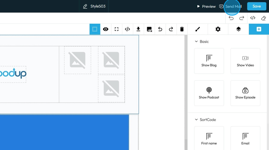
36. Click "Send Mail" to share the newsletter
37. Click "To Email" and enter the email address of the person you want to send the newsletter
Click "Save"

38. Click "Save" to save the newsletter

Related Articles
Create a Custom Newsletter Template in Podup
By following this guide, you can easily create a custom newsletter template in PodUp that reflects your brand and enhances audience engagement. 1. Navigate to https://app.podup.com/home 2. Click "Grow" 3. Select "Email Marketing" 4. Click "Create ...How to Create a Newsletter List and Segment in PodUp
This guide shows you how to create and manage a newsletter list in PodUp. Learn how to customize lists, segment subscribers, and track results to improve targeting and boost engagement. 1. Navigate to https://app.podup.com/home 2. Click "Grow" 3. ...How do I customize my newsletter for every newsletter?
Follow this guide to customize your newsletter with your own content and images easily. 1. Navigate to https://app.podup.com/home 2. Click "Grow" 3. Select "Email Marketing" 4. The “Newsletter” section will load 5. Click “Create Newsletter Template” ...How To Navigate Newsletter Generator (Detailed)
This guide provides a comprehensive walkthrough on generating AI newsletters specifically tailored for podcast monetization. It simplifies the newsletter creation process, allowing users to effectively incorporate keywords, blogs, videos, and ...How to Create and Send a Campaign in PodUp
This guide shows you how to create and send email campaigns in PodUp. It covers each step—from setup to testing and tracking—so you can send effective, well-timed newsletters with ease. Great for both beginners and experienced marketers. Tip: An ...