How To Navigate Site Themes (Detailed)
This guide offers a comprehensive step-by-step approach to customizing your website's theme and logo using PodUp, providing valuable insights on design elements such as templates, colors, fonts, and logos. It empowers users to create a visually appealing and brand-consistent site by detailing how to select and edit themes, adjust typography, and implement branding elements effectively. Whether you're a novice or experienced user, this guide ensures you can craft a unique online presence tailored to your vision.
1. Navigate to https://app.podup.com/home

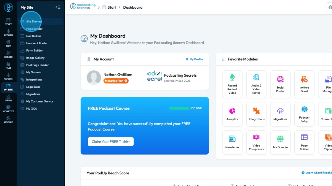
2. Click "My Site"
3. Click "Site Themes"
4. Site themes will appear with 16 website templates. All of these templates are editable but it gives a start to what the website could look like
- To preview a template, select the preview "eye" icon in the top right-hand corner
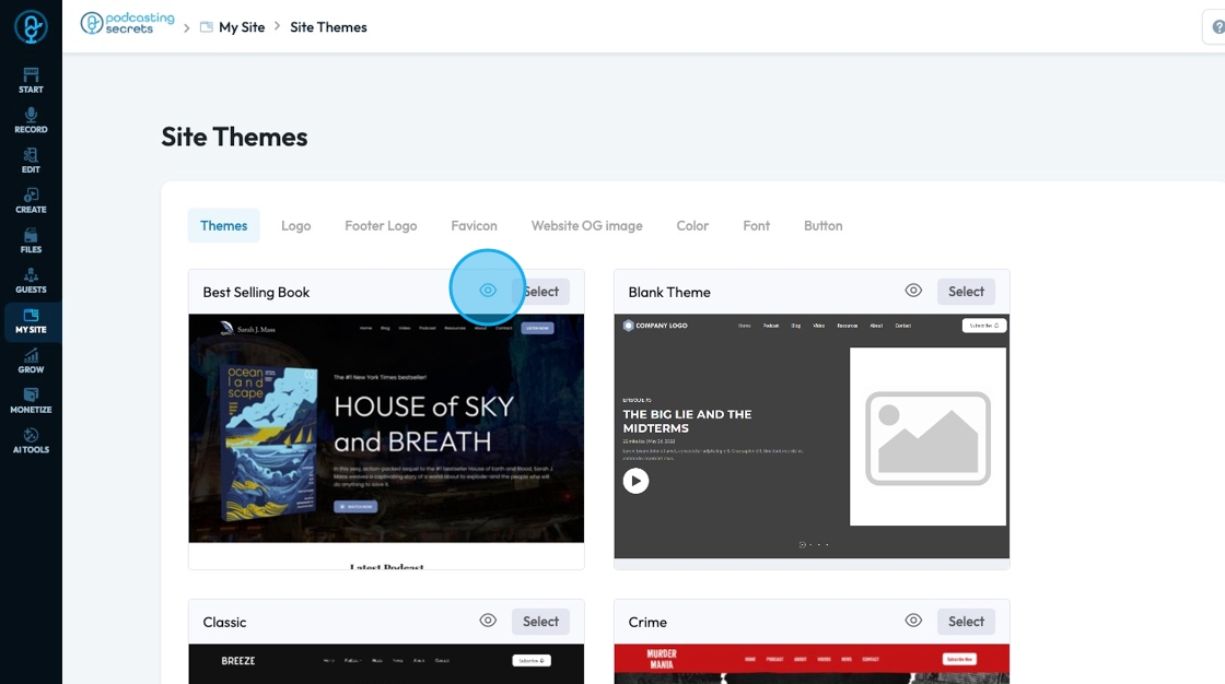
5. The preview will appear as a pop-up that you can scroll though

6. Click "Select" on the site that you want to use
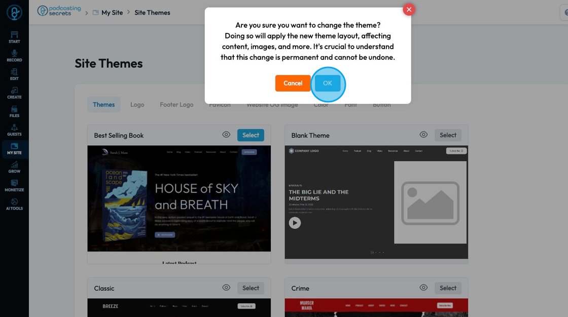
- Note: Select a template that you love because once you have started editing your website changing the theme will lose all of your edits
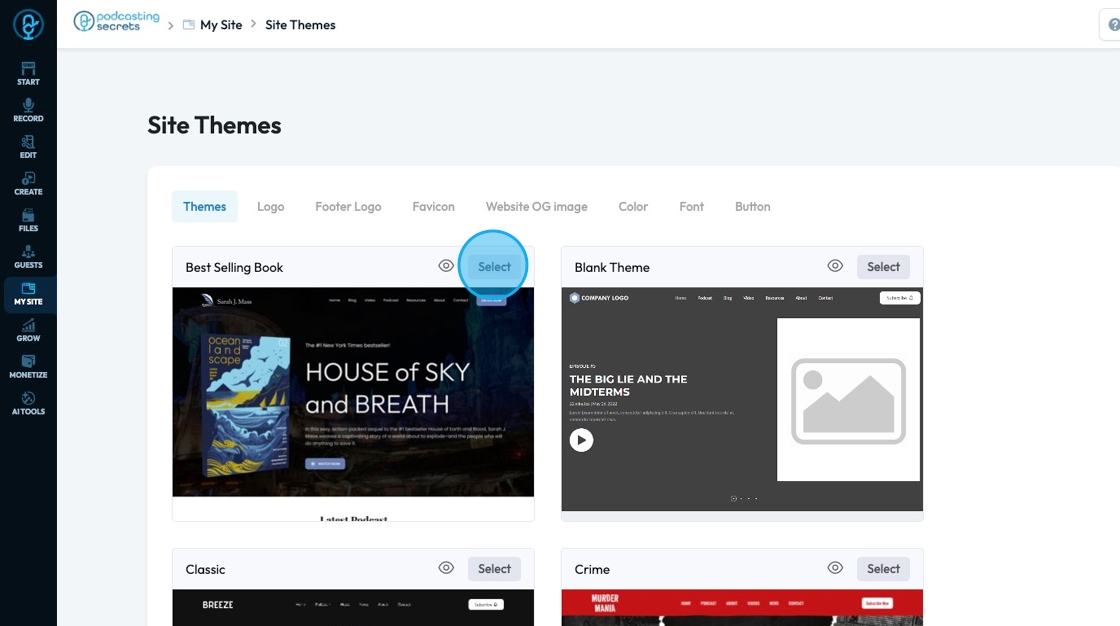
7. A pop-up will appear confirming that you want to change the theme and it stresses the significance of changing a site theme
- If you want to change the theme click "Ok"
- If you don't want to change theme click "Cancel"
8. "Logo" allows you to attach a logo to your website by clicking "Attach file"
- A pop-up of the PodUp file Manager will appear where you can select a file that is already in PodUp or upload a file from your computer
Click "Save" to save the changes you made
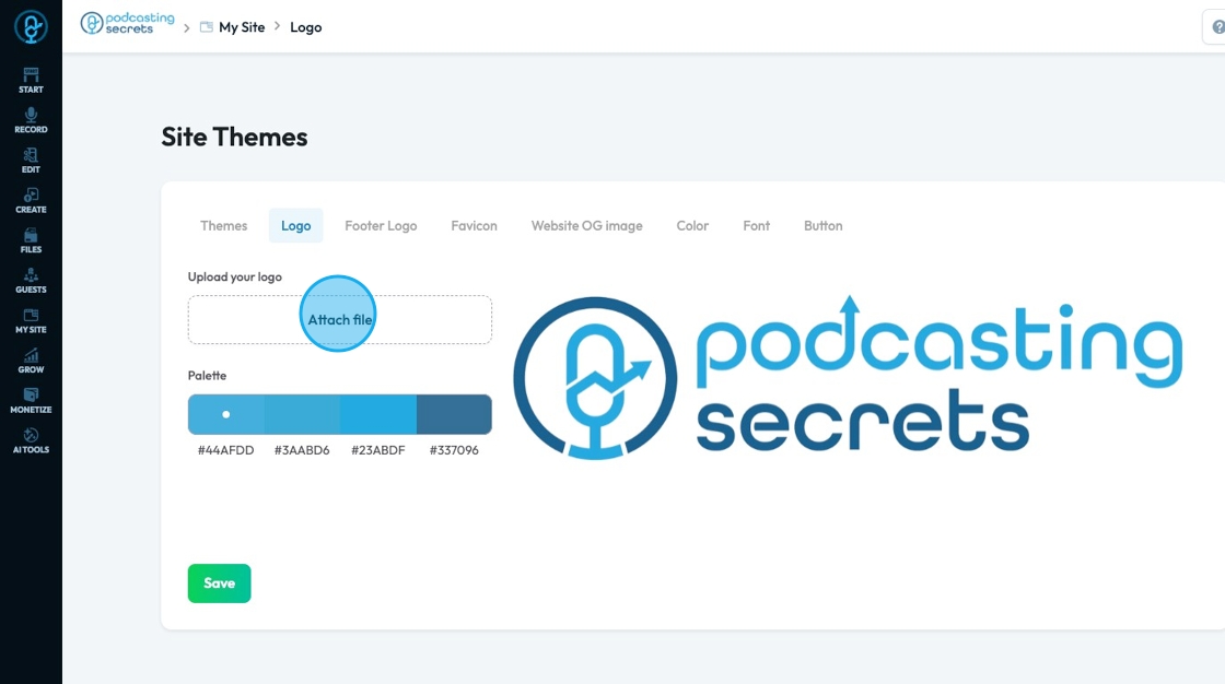
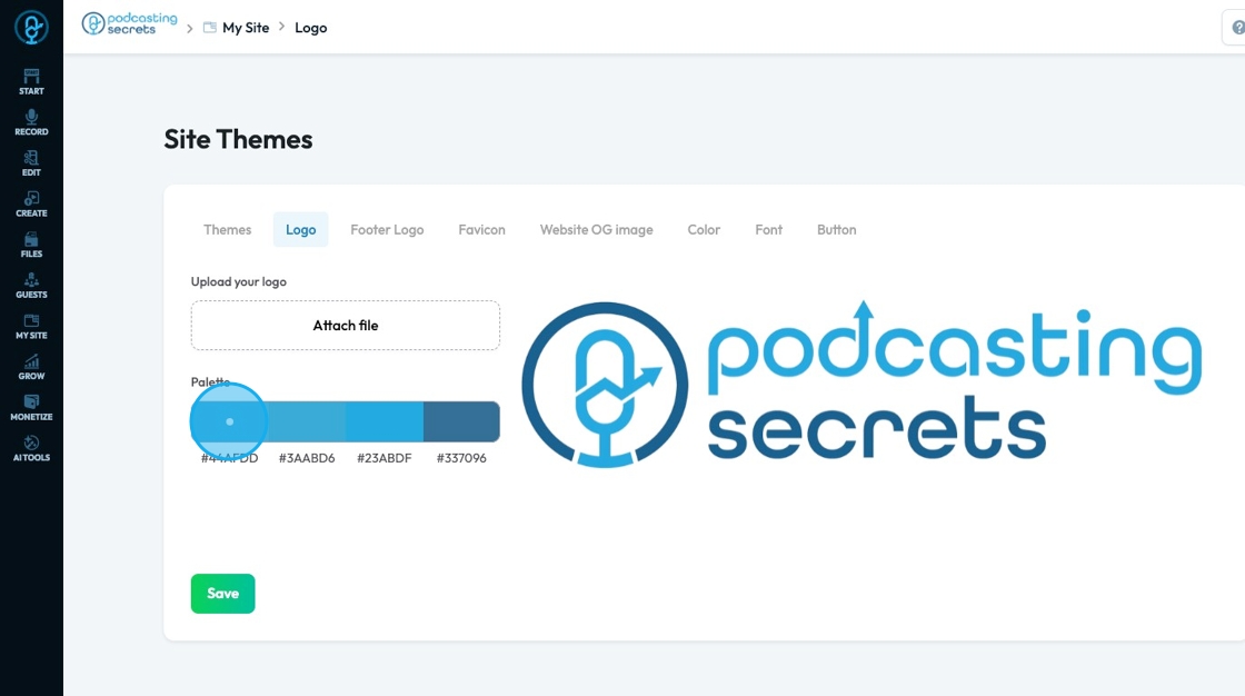
9. Once the logo has been uploaded a custom palette will be created with the colors contained in your logo.
- These colors are being selected by point on your logo that can be moved around to select which 4 colors in your logo you want to use as a palette
- The 6 digit code under the color is called a "Hex Code" that tells you the exact code for that color so you can be able to use it in all your designs
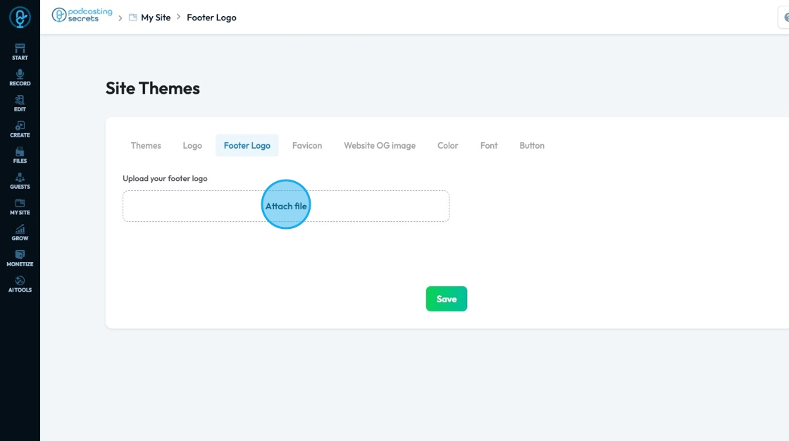
10. "Footer Logo" allows you to attach a logo to your footer by clicking "Attach file"
- Footer logo: The image or symbol of a brand that appears at the bottom (footer) of a website. It usually matches the main logo but is often smaller or in a simplified color (like white or grayscale) to fit the footer's design. It helps reinforce branding and gives a professional, consistent look across the site.
- A pop-up of the PodUp file Manager will appear where you can select a file that is already in PodUp or upload a file from your computer
Click "Save" to save the changes you made
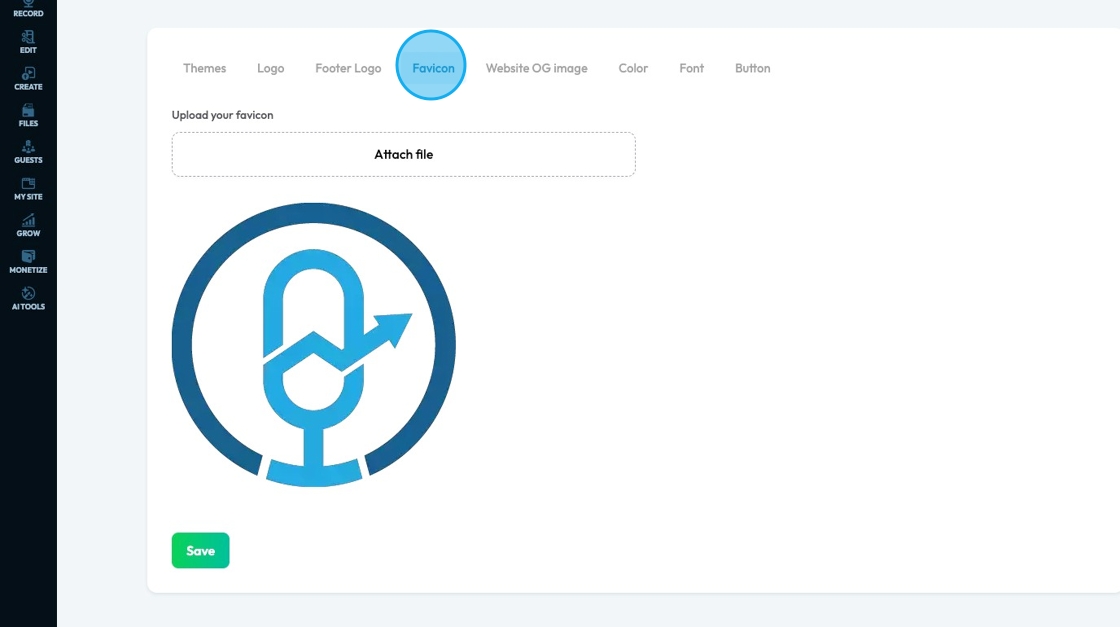
11. "Favicon" allows you to attach a logo to your footer by clicking "Attach file"
Favicon: The small icon that appears in a browser tab next to the page title. It's also used in bookmarks and browser history. Favicons are usually a simplified version of a website’s logo or symbol, helping users quickly recognize the site. They are typically square and very small—often 16x16 or 32x32 pixels.
A pop-up of the PodUp file Manager will appear where you can select a file that is already in PodUp or upload a file from your computer
Click "Save" to save the changes you made
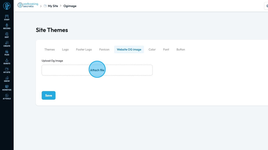
12. "Website OG Image" allows you to attach a logo to your footer by clicking "Attach file"
Website OG image (Open Graph image): The preview image that appears when a link to your website is shared on social media platforms like Facebook, LinkedIn, or X (Twitter). It represents your page visually and is set using Open Graph meta tags in your site’s code. A good OG image helps attract clicks by making the shared link more engaging and on-brand.
A pop-up of the PodUp file Manager will appear where you can select a file that is already in PodUp or upload a file from your computer
Click "Save" to save the changes you made
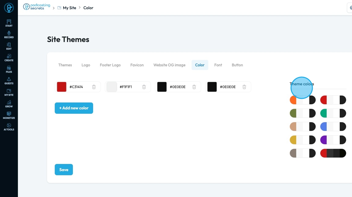
13. "Color" displays the colors currently in use on your website and possible theme colors
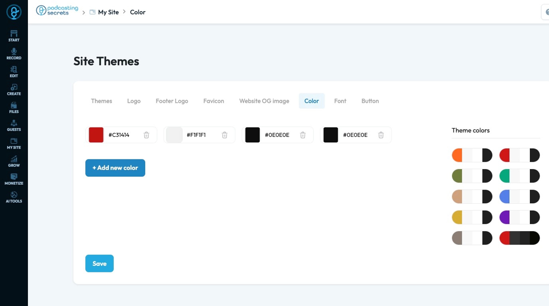
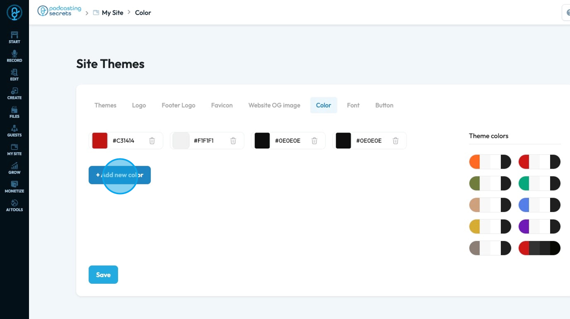
14. Click "+ Add new color" to select a new color to add to your site theme
15. Click the colored block in the color field to change the color
A color spectrum will open, allowing you to select the color on the color spectrum or search for a specific color using hex, rgb, or hsl
hex: A 6-digit code that starts with
#(like#FF5733). It defines color using combinations of red, green, and blue in hexadecimal format. Common in web design.rgb: Stands for Red, Green, Blue. It defines color using three numbers (like
rgb(255, 87, 51)), where each number ranges from 0 to 255 to mix the right shade.hsl: Stands for Hue, Saturation, Lightness. It defines color based on:
Hue (0–360 degrees on a color wheel),
Saturation (intensity of the color), and
Lightness (brightness from black to white).
Example:hsl(12, 100%, 60%).

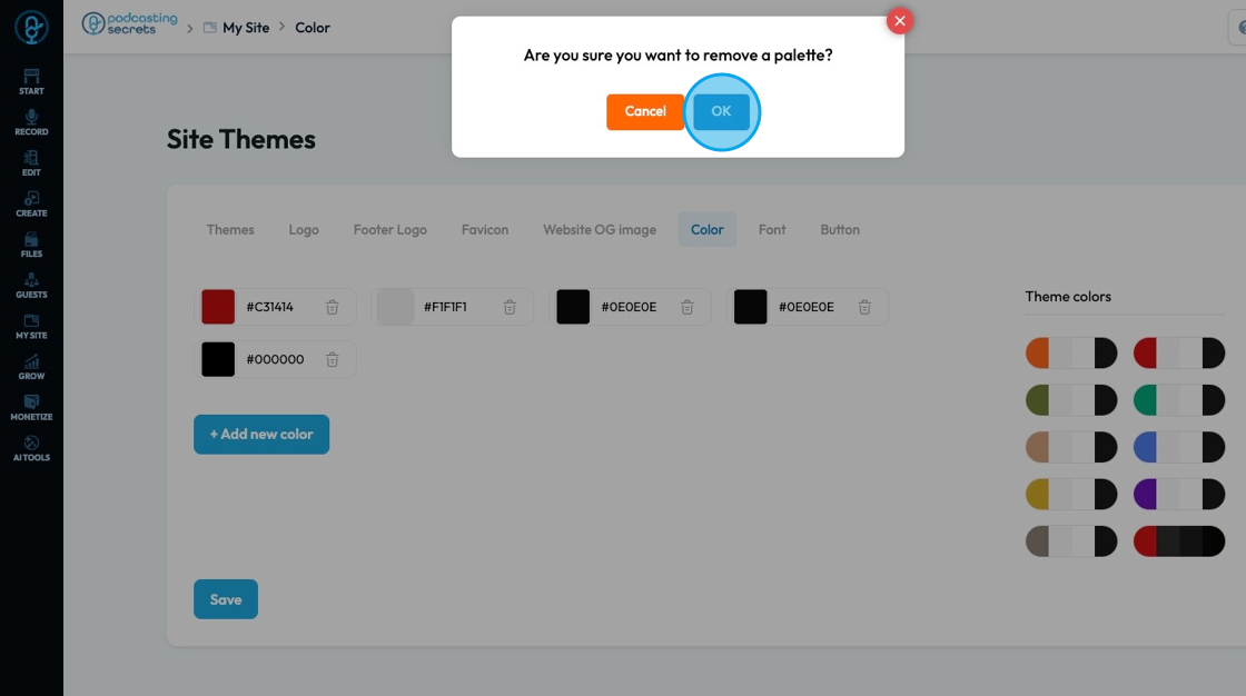
16. Click "Delete" - the trashcan icon - to delete the color

17. A popup will appear asking for confirmation to delete the color, click "OK" to remove the color
18. "Theme colors" offers a set of colors that can be selected to be the key colorrs fo your theme
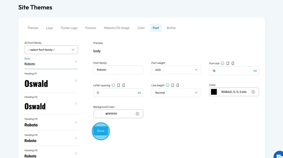
19. Click "select font family" to pick a font to apply to the whole website and to all the heading levels
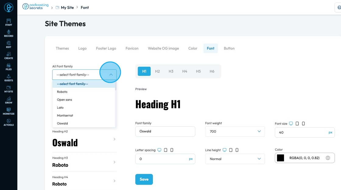
20. The left hand side shows the heading level which refers to the rank or importance of a heading on a webpage, usually labeled from H1 to H6.
- Body: Controls the main font style, size, and spacing used for most regular text on the site.
- Heading H1: Sets the font for the largest and most important page title, usually bold and attention-grabbing.
- Heading H2: Defines the font for second-level headings like section titles, slightly smaller than H1.
- Heading H3: Used for subheadings under H2, with a smaller size and lighter styling.
- Heading H4: Applies to smaller section titles, often medium weight and less prominent than H3.
- Heading H5: Styles minor headings or labels, typically similar in size to body text but styled to stand out.
- Heading H6: The smallest heading style, often subtle and close in size to paragraph text.
- Paragraph: Sets the font styling for longer blocks of text, focusing on readability and consistency.
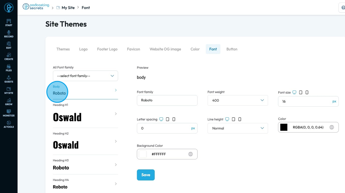
21. To edit a specific heading level click on the heading you want to edit

22. A preview will appear at the top to show you what the text looks like on the page
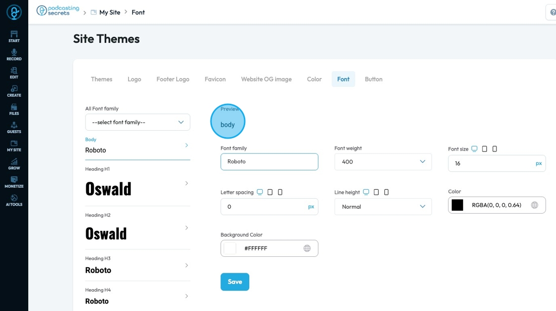
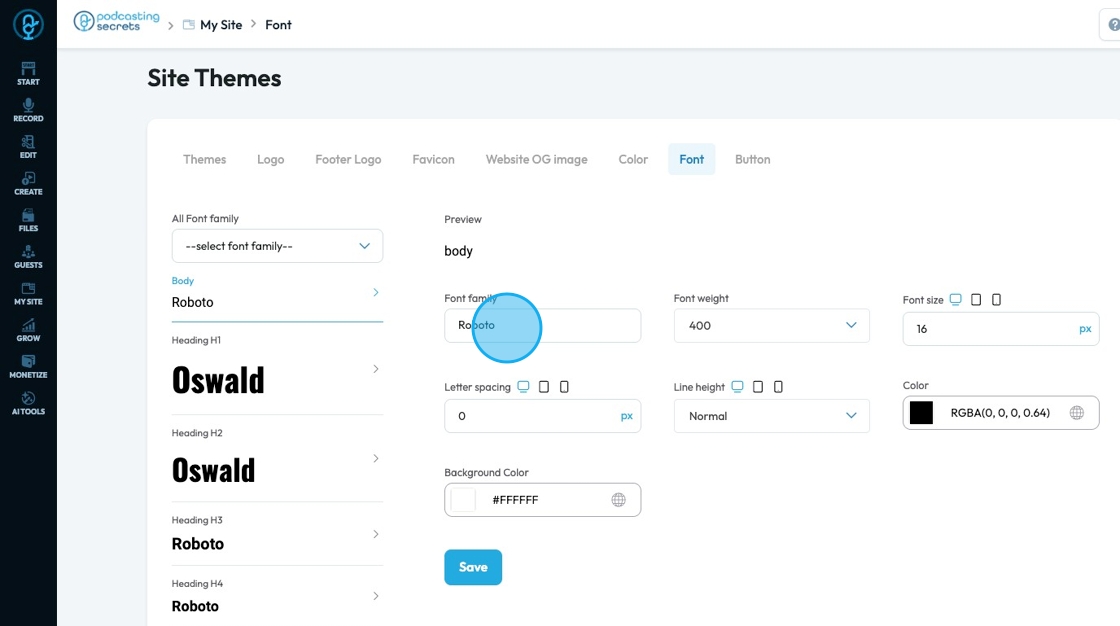
23. Click this dropdown to select a font family
- Font family: The typeface (the specific design of the letters) to be used for the text
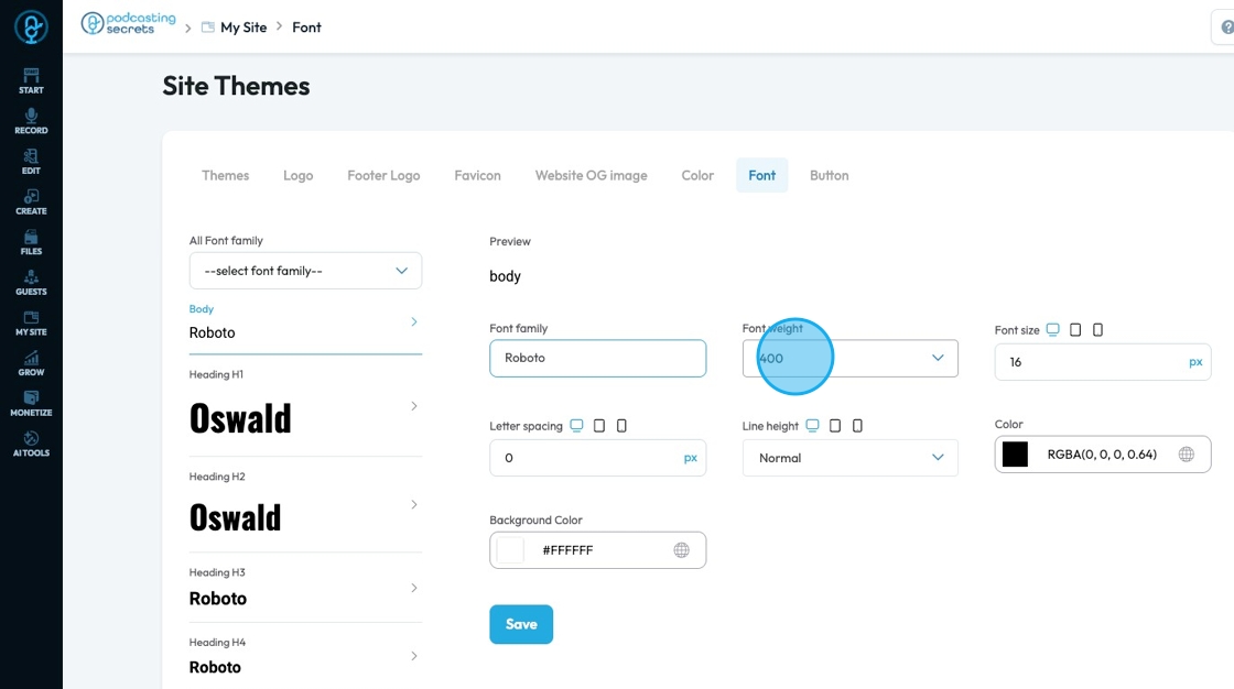
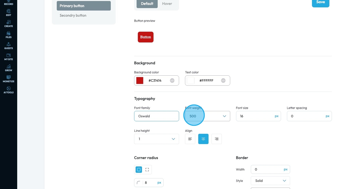
24. Font Weight: Controls the boldness or thickness of the text characters
- The bigger the number the thicker the font
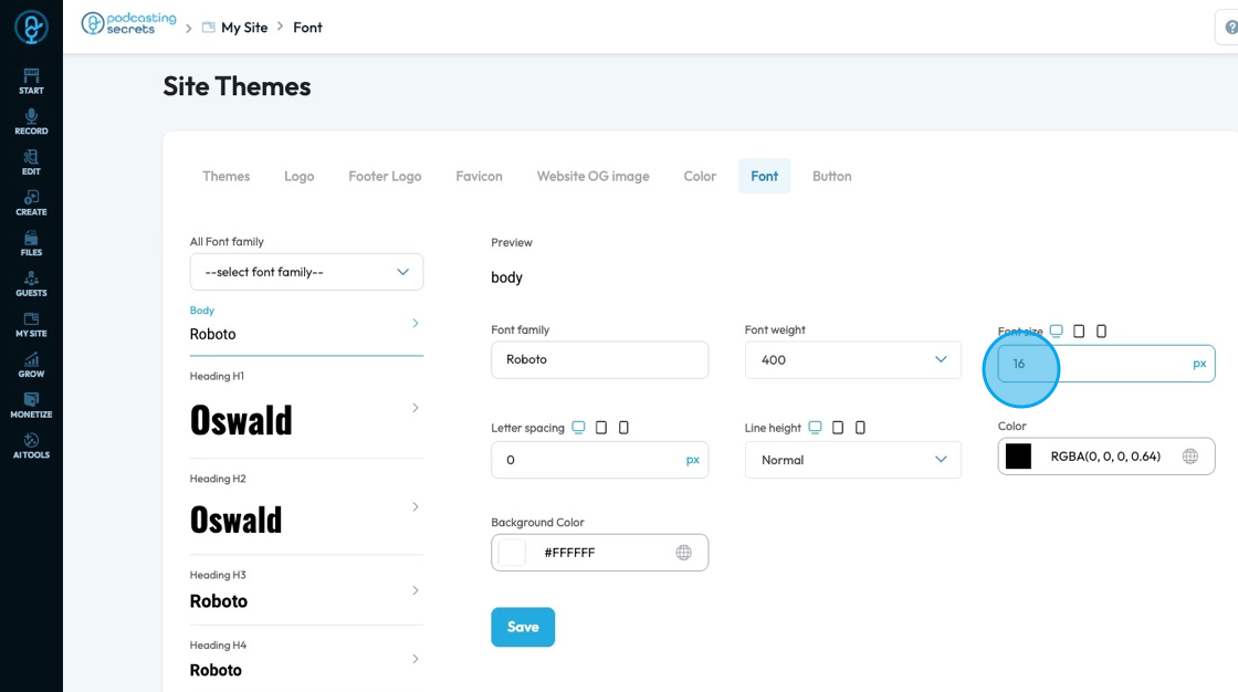
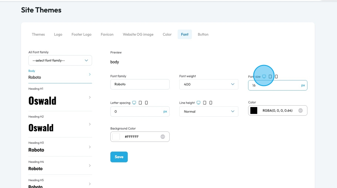
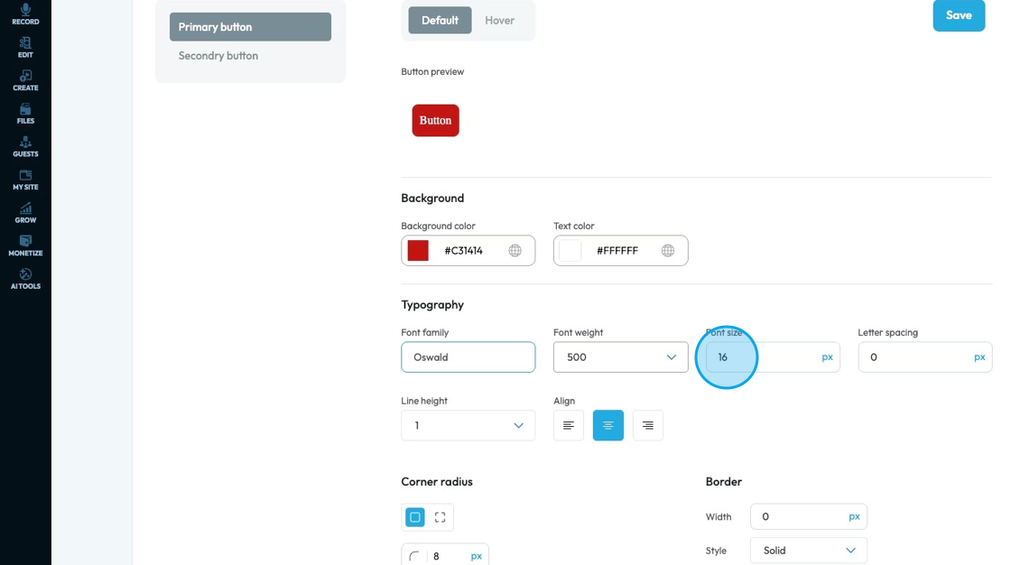
25. Font Size: Controls the height of the characters in your text
- The bigger the number the bigger the character
- The unit can be changed to adjust to the specific project you are working in. Generally px is easiest
- px (pixels): Like little dots on the screen.
200pxmeans 200 dots wide or tall. - % (percent): A part of something else.
50%means half the size of the box it’s in. - em: Grows with the text around it.
2emis 2 times bigger than the normal text. - rem: Like em, but always starts from the main page size.
1remis usually normal-size text. - vh (viewport height): How tall the screen is.
100vhmeans the whole height of the screen. - vw (viewport width): How wide the screen is.
100vwmeans the whole width of the screen.
- px (pixels): Like little dots on the screen.
26. You can adjust the font size for different screens by clicking the display icons to change the feature for that display
Computer icon: Lets you adjust font sizes for desktop screens so text looks good on large monitors.
Tablet icon: Allows you to set font sizes specifically for tablets, so text stays readable on medium-sized screens.
Phone icon: Enables you to customize font sizes for mobile phones, ensuring the text fits well and is easy to read on small screens.
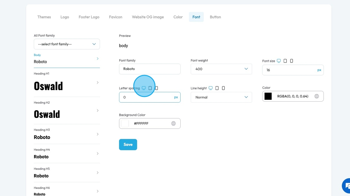
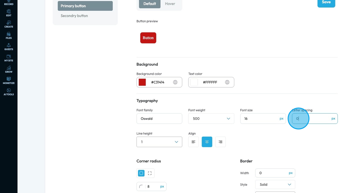
27. Click "Letter Spacing" to adjust the space between individual letters in a word. It lets you adjust how tight or wide the text appears. Increasing letter spacing can make text feel more open and airy, while decreasing it can make the text look tighter or more compact. It’s often used to improve readability or for stylistic effect.
- The unit can be changed to adjust to the specific project you are working in. Generally px is easiest
- px (pixels): Like little dots on the screen.
200pxmeans 200 dots wide or tall. - % (percent): A part of something else.
50%means half the size of the box it’s in. - em: Grows with the text around it.
2emis 2 times bigger than the normal text. - rem: Like em, but always starts from the main page size.
1remis usually normal-size text. - vh (viewport height): How tall the screen is.
100vhmeans the whole height of the screen. - vw (viewport width): How wide the screen is.
100vwmeans the whole width of the screen.
- px (pixels): Like little dots on the screen.
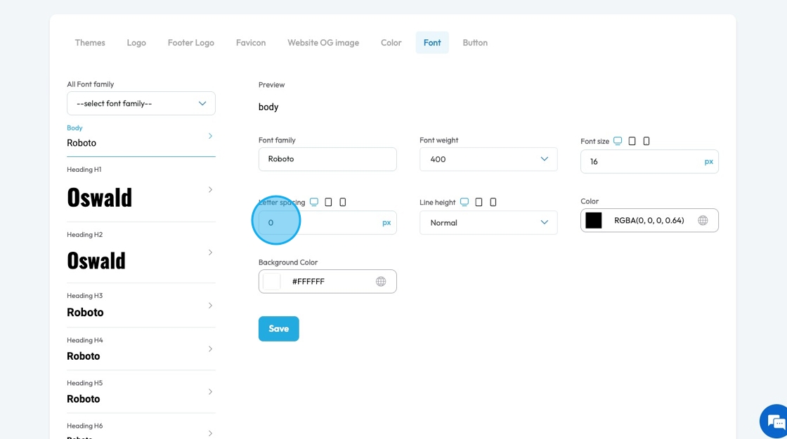
28. You can adjust the letter spacing for different screens by clicking the display icons to change the feature for that display
- Computer icon: Lets you adjust letter spacing specifically for desktop screens, so text looks clean and readable on larger displays.
- Tablet icon: Allows you to fine-tune letter spacing for tablets, helping keep text legible without feeling too cramped or too spaced out on mid-sized screens.
- Phone icon: Enables you to set letter spacing for mobile devices, where tighter layouts may need more careful spacing to maintain clarity on small screens.
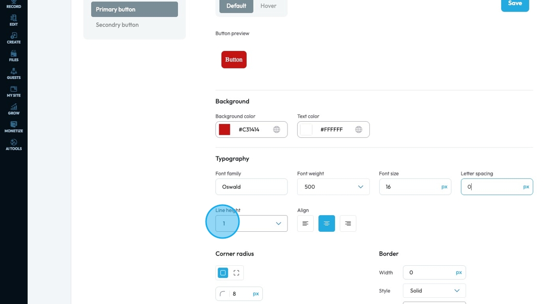
29. Click "Line Height" to change the space between lines of text to improve readability and layout.
- You can choose from 4 different spacing options
- Normal: Uses the browser or theme’s default spacing—usually slightly more than 1 for good readability.
- 1: Sets tight line spacing with no extra space between lines; can feel cramped and harder to read.
- 1.5: Adds moderate space between lines, making text more open and easier to read, especially in paragraphs.
- 2: Doubles the line spacing, creating lots of space between lines—good for very large text or designs that need extra breathing room.
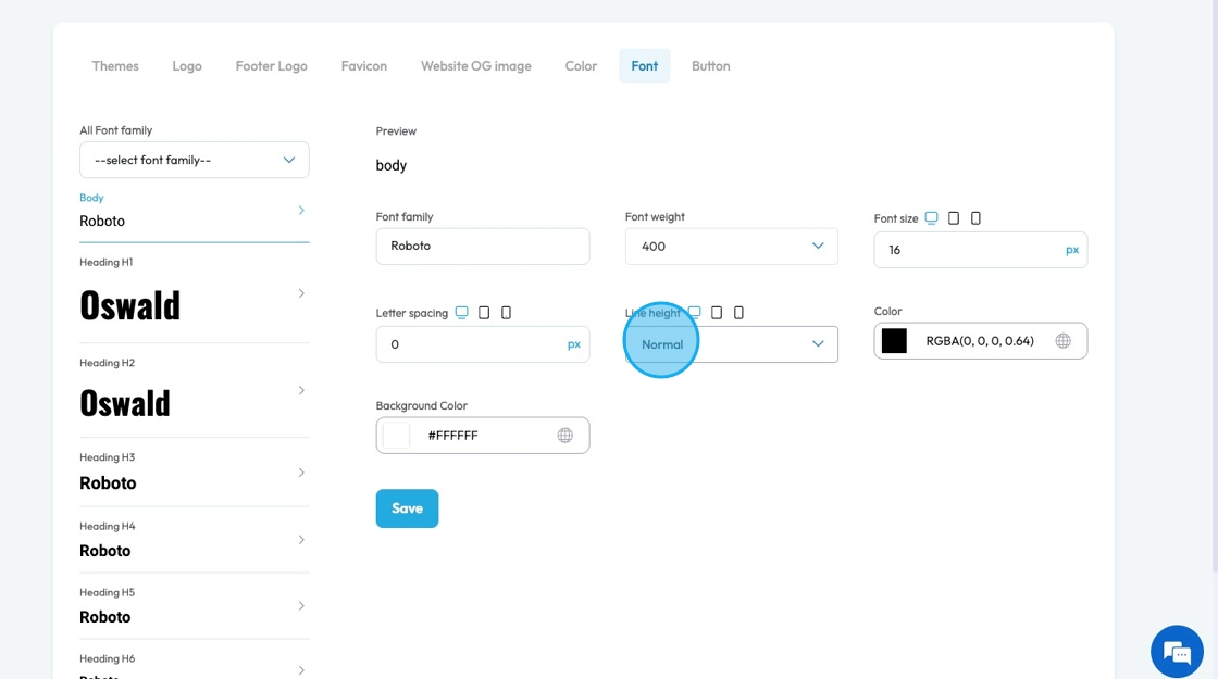
30. You can adjust the line height for different screens by clicking the display icons to change the feature for that display.

31. Click the colored block to change the color of the text
Click the colored box to pick the color from the color spectrum or to insert your hex code, rgb or hsl
Hex Code: A six-digit code used in web design to represent a specific color. It starts with a # symbol followed by numbers and letters (like #FF5733). This can help you stay consistent with your colors
RGB: Stands for Red, Green, Blue. It defines color using three numbers (like
rgb(255, 87, 51)), where each number ranges from 0 to 255 to mix the right shade.HSL: Stands for Hue, Saturation, Lightness. It defines color based on:
Hue (0–360 degrees on a color wheel),
Saturation (intensity of the color), and
Lightness (brightness from black to white).
Example:hsl(12, 100%, 60%).
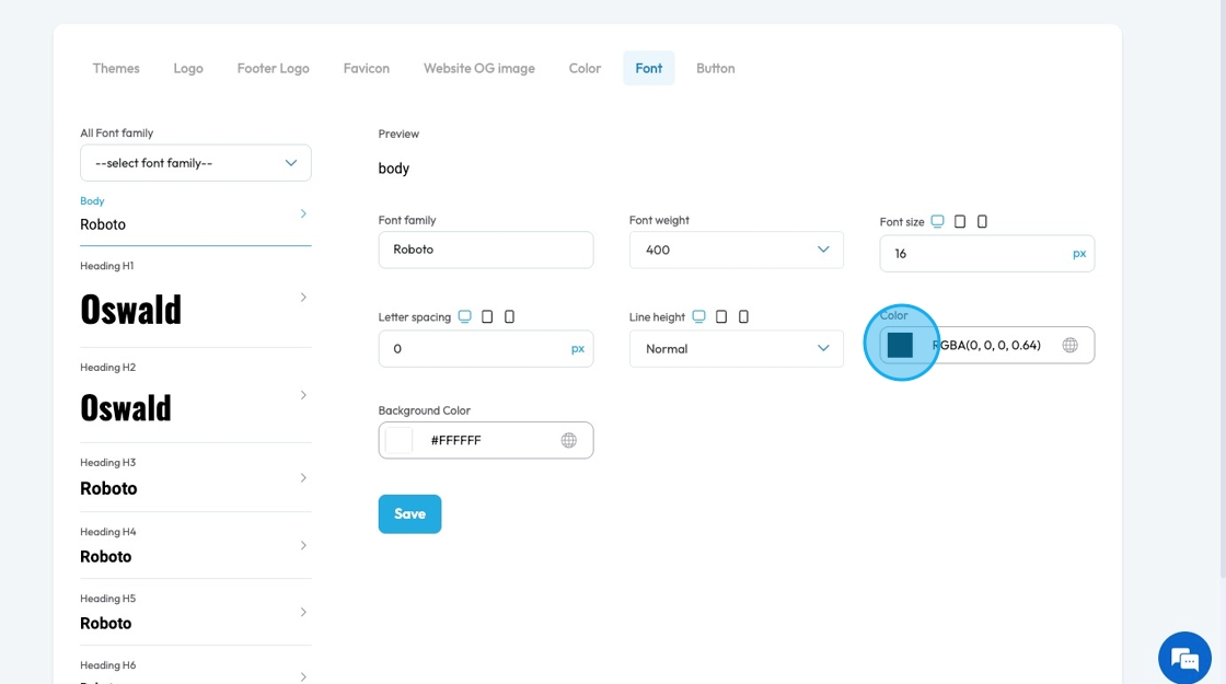
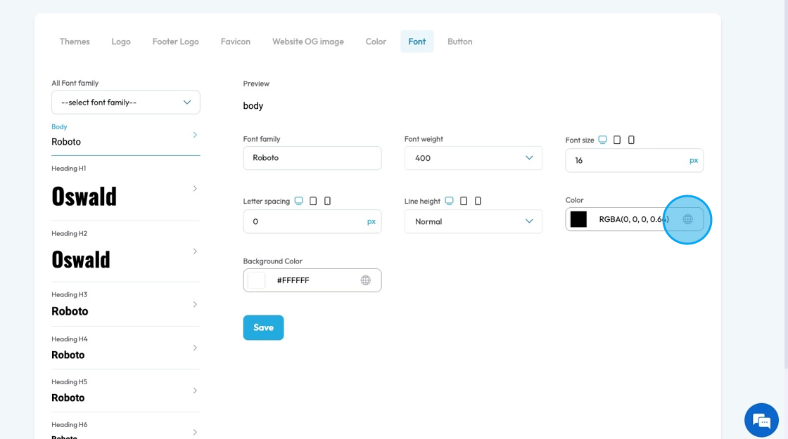
32. Click the globe icon - which indicates a global color—to update that color everywhere it’s used on your site for consistent design
33. Click the colored block to change the color of the background color for the text
Click the colored box to pick the color from the color spectrum or to insert your hex code, rgb or hsl
Hex Code: A six-digit code used in web design to represent a specific color. It starts with a # symbol followed by numbers and letters (like #FF5733). This can help you stay consistent with your colors
RGB: Stands for Red, Green, Blue. It defines color using three numbers (like
rgb(255, 87, 51)), where each number ranges from 0 to 255 to mix the right shade.HSL: Stands for Hue, Saturation, Lightness. It defines color based on:
Hue (0–360 degrees on a color wheel),
Saturation (intensity of the color), and
Lightness (brightness from black to white).
Example:hsl(12, 100%, 60%).
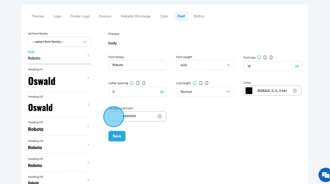
34. Click the globe icon - which indicates a global color—to update that color everywhere it’s used on your site for consistent design

35. Click "Save" to save any changes that you made
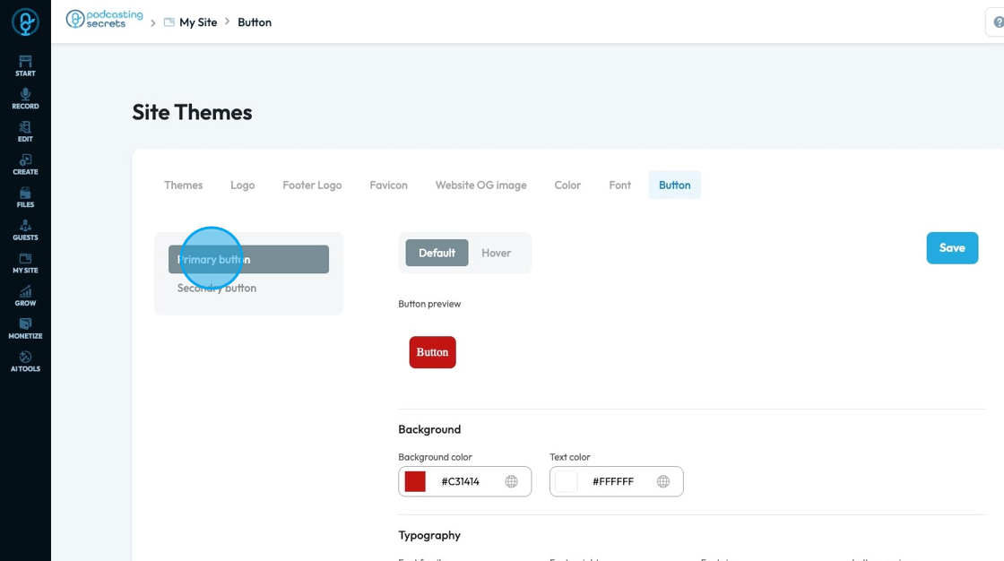
36. Buttons: Help users take action on a website, like submitting a form, navigating to another page, or starting a purchase—making the site easier to use and more interactive.
- Primary: Used for the main action on a page, like "Submit" or "Save." It usually has a bold or standout color to draw attention.
- Secondary: Used for less important actions, like "Cancel" or "Learn More." It typically has a lighter color or an outlined style to appear less prominent.
37. Default shows how the button looks sitting on the website
Hover shows how the button looks when the cursor is over the button
- This can look the same as the default, or it can be different to add an interactive element to your site
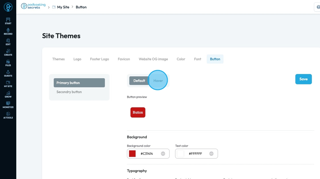
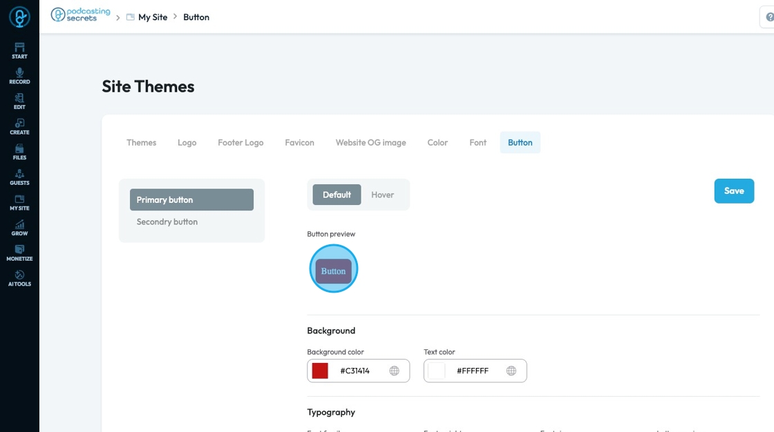
38. A preview of the button will appear to demonstrate how the button will appear on the main page
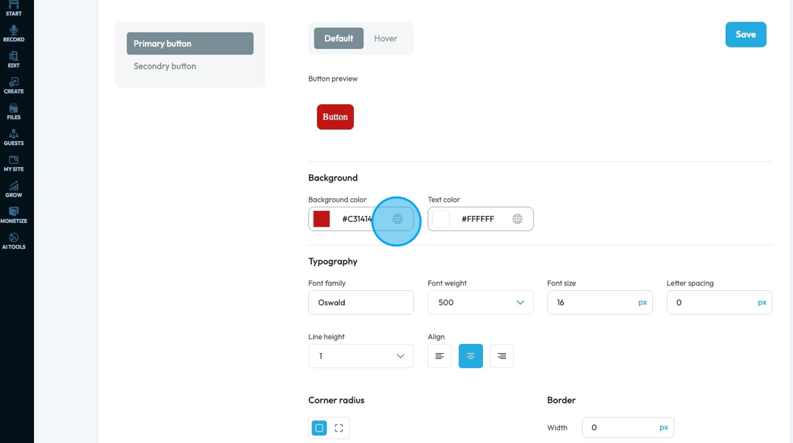
39. Click the colored block to change the color of the background color for the button
Click the colored box to pick the color from the color spectrum or to insert your hex code, rgb or hsl
Hex Code: A six-digit code used in web design to represent a specific color. It starts with a # symbol followed by numbers and letters (like #FF5733). This can help you stay consistent with your colors
RGB: Stands for Red, Green, Blue. It defines color using three numbers (like
rgb(255, 87, 51)), where each number ranges from 0 to 255 to mix the right shade.HSL: Stands for Hue, Saturation, Lightness. It defines color based on:
Hue (0–360 degrees on a color wheel),
Saturation (intensity of the color), and
Lightness (brightness from black to white).
Example:hsl(12, 100%, 60%).
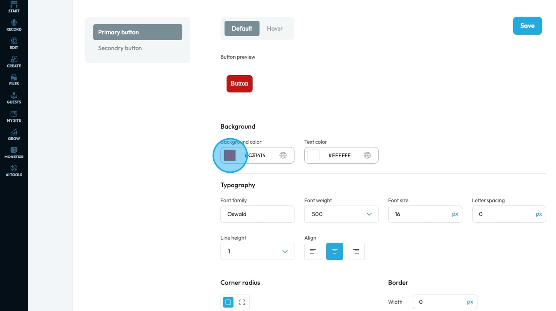
40. Click the globe icon - which indicates a global color—to update that color everywhere it’s used on your site for consistent design
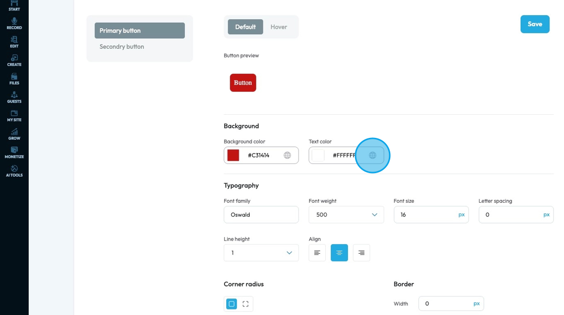
41. Click the colored block to change the color of the text color for the button
Click the colored box to pick the color from the color spectrum or to insert your hex code, rgb or hsl
Hex Code: A six-digit code used in web design to represent a specific color. It starts with a # symbol followed by numbers and letters (like #FF5733). This can help you stay consistent with your colors
RGB: Stands for Red, Green, Blue. It defines color using three numbers (like
rgb(255, 87, 51)), where each number ranges from 0 to 255 to mix the right shade.HSL: Stands for Hue, Saturation, Lightness. It defines color based on:
Hue (0–360 degrees on a color wheel),
Saturation (intensity of the color), and
Lightness (brightness from black to white).
Example:hsl(12, 100%, 60%).
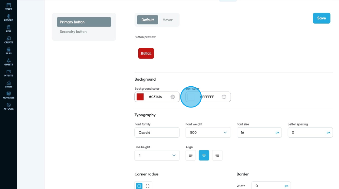
42. Click the globe icon - which indicates a global color—to update that color everywhere it’s used on your site for consistent design
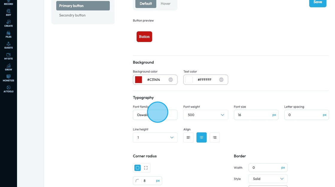
43. Font family: Select the typeface (the specific design of the letters) to be used for the text
44. Font Weight: Controls the boldness or thickness of the text characters
- The bigger the number the thicker the text
45. Font Size: Controls the height of the characters in your text
- The bigger the number the bigger the character
- The unit can be changed to adjust to the specific project you are working in. Generally px is easiest
- px (pixels): Like little dots on the screen.
200pxmeans 200 dots wide or tall. - % (percent): A part of something else.
50%means half the size of the box it’s in. - em: Grows with the text around it.
2emis 2 times bigger than the normal text. - rem: Like em, but always starts from the main page size.
1remis usually normal-size text. - vh (viewport height): How tall the screen is.
100vhmeans the whole height of the screen. - vw (viewport width): How wide the screen is.
100vwmeans the whole width of the screen.
- px (pixels): Like little dots on the screen.
46. Letter Spacing: Controls the horizontal space between individual characters (letters) within a word. Also known as "tracking" in traditional typography
- The bigger the number the more space between the characters
- Change the unit by clicking the blue dash next to the number
- px (pixels): Like little dots on the screen.
200pxmeans 200 dots wide or tall. - % (percent): A part of something else.
50%means half the size of the box it’s in. - em: Grows with the text around it.
2emis 2 times bigger than the normal text. - rem: Like em, but always starts from the main page size.
1remis usually normal-size text. - vh (viewport height): How tall the screen is.
100vhmeans the whole height of the screen. - vw (viewport width): How wide the screen is.
100vwmeans the whole width of the screen.
- px (pixels): Like little dots on the screen.
47. Line Height: Controls the vertical space between lines of text within a paragraph or text block. Also known as "leading" in traditional typography
- 1 is the standard spacing size
- Change the units by selecting the dash next to the number
- px (pixels): Like little dots on the screen.
200pxmeans 200 dots wide or tall. - % (percent): A part of something else.
50%means half the size of the box it’s in. - em: Grows with the text around it.
2emis 2 times bigger than the normal text. - rem: Like em, but always starts from the main page size.
1remis usually normal-size text. - vh (viewport height): How tall the screen is.
100vhmeans the whole height of the screen. - vw (viewport width): How wide the screen is.
100vwmeans the whole width of the screen.
- px (pixels): Like little dots on the screen.
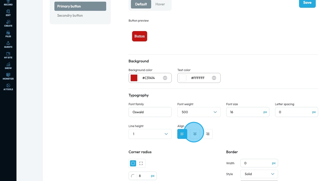
48. Text align: Controls the horizontal alignment of text and inline content within its containing element (e.g., a paragraph, heading, button, or column). It dictates where the text begins and ends horizontally within the available space of its parent
- Left: Align the text to the left edge of the button. The right edge of the text will appear "ragged" or uneven
- Center: Centers the text horizontally within the button. Both the left and right edges of the text will appear ragged
- Right: Aligns the text to the right edge of the button. The left edge of the text will appear ragged
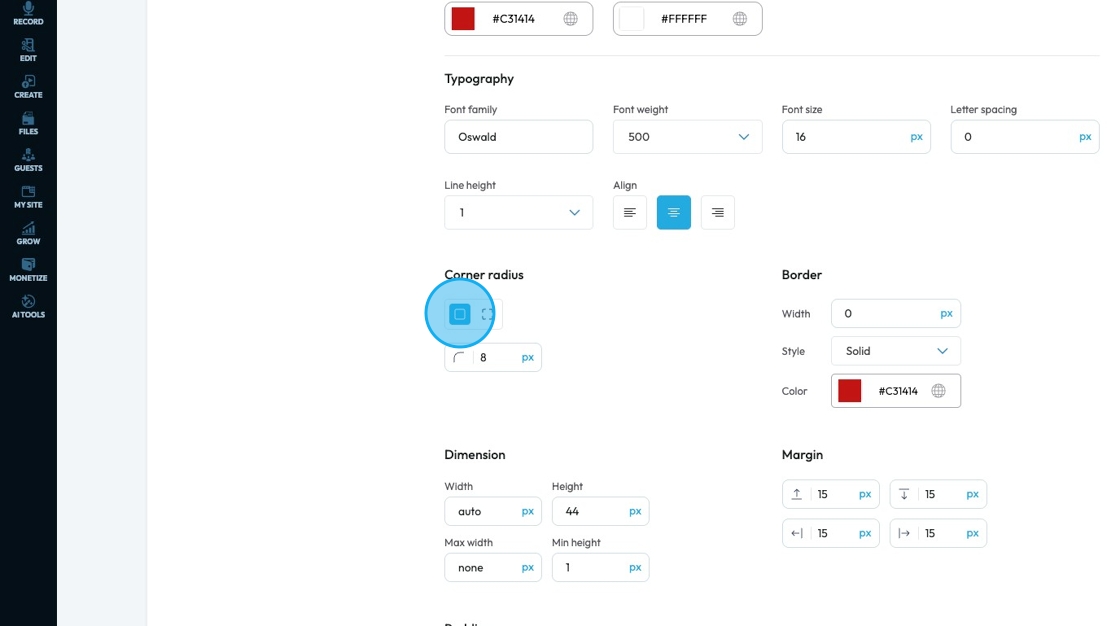
49. Corner radius: Controls how rounded the corners of a button look—higher values make the button more curved, while lower values keep it square or sharp.
- Linked corners: All four corners are set to the same radius (in this case, 8px).
- Unlinked corners: Lets you set each corner independently (top-left, top-right, etc.) with different values.
Set the sharpness of the corner by changing the number in the box
- The lower the number the sharper the value
- The higher the number the more curved the corner
- Change the units by selecting the dash next to the number
- px (pixels): Like little dots on the screen.
200pxmeans 200 dots wide or tall. - % (percent): A part of something else.
50%means half the size of the box it’s in. - em: Grows with the text around it.
2emis 2 times bigger than the normal text. - rem: Like em, but always starts from the main page size.
1remis usually normal-size text. - vh (viewport height): How tall the screen is.
100vhmeans the whole height of the screen. - vw (viewport width): How wide the screen is.
100vwmeans the whole width of the screen.
- px (pixels): Like little dots on the screen.
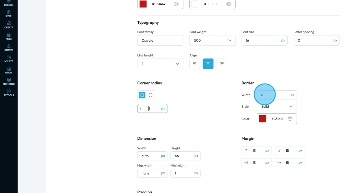
50. Border Width: Controls the thickness of the border line. Change the size (number) and unit by adding a number and clicking 1 of the 5 following units
- px (pixels): Like little dots on the screen.
200pxmeans 200 dots wide or tall. - em: Grows with the text around it.
2emis 2 times bigger than the normal text. - rem: Like em, but always starts from the main page size.
1remis usually normal-size text. - vh (viewport height): How tall the screen is.
100vhmeans the whole height of the screen. - vw (viewport width): How wide the screen is.
100vwmeans the whole width of the screen.
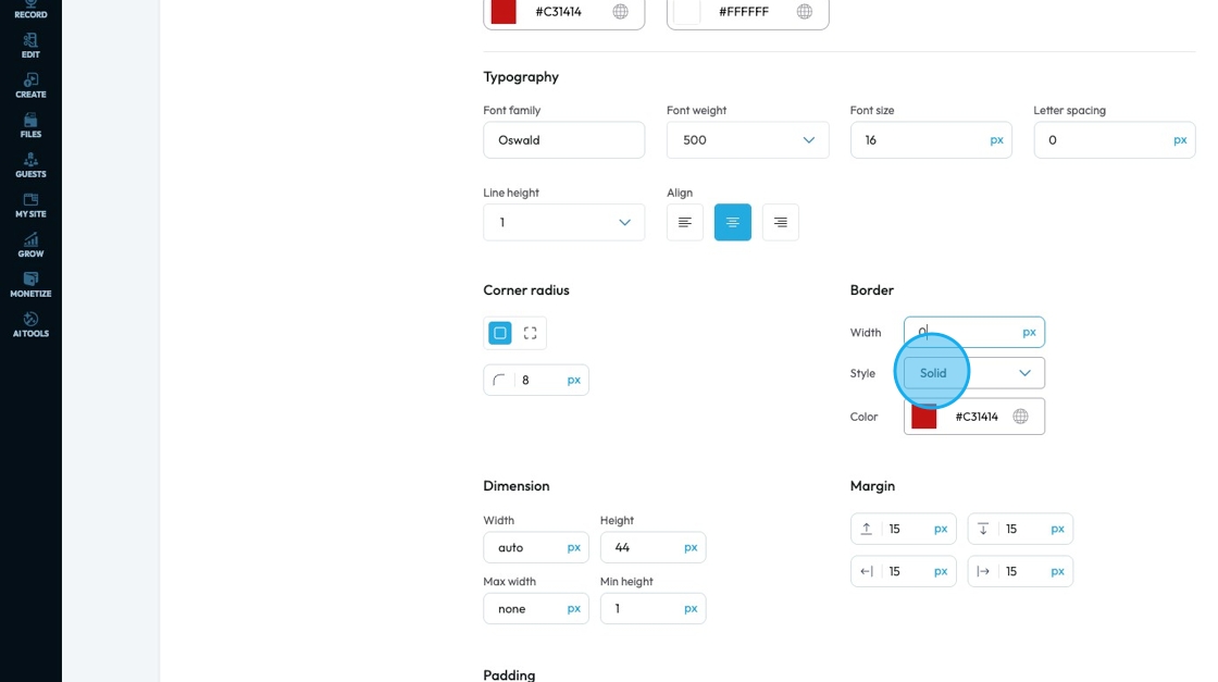
51. Border Style: Determines the visual pattern or type of the border line. This is crucial for how the border actually looks. Select one of 3 options from the drop down menu
- Solid: a single, unbroken line as the border
- Dotted: a border made of evenly spaced round dots
- Dashed: a border made of short, straight dashes
52. Click the colored block to change the color of the text color for the button
Click the colored box to pick the color from the color spectrum or to insert your hex code, rgb or hsl
Hex Code: A six-digit code used in web design to represent a specific color. It starts with a # symbol followed by numbers and letters (like #FF5733). This can help you stay consistent with your colors
RGB: Stands for Red, Green, Blue. It defines color using three numbers (like
rgb(255, 87, 51)), where each number ranges from 0 to 255 to mix the right shade.HSL: Stands for Hue, Saturation, Lightness. It defines color based on:
Hue (0–360 degrees on a color wheel),
Saturation (intensity of the color), and
Lightness (brightness from black to white).
Example:hsl(12, 100%, 60%).
Click the globe icon - which indicates a global color—to update that color everywhere it’s used on your site for consistent design
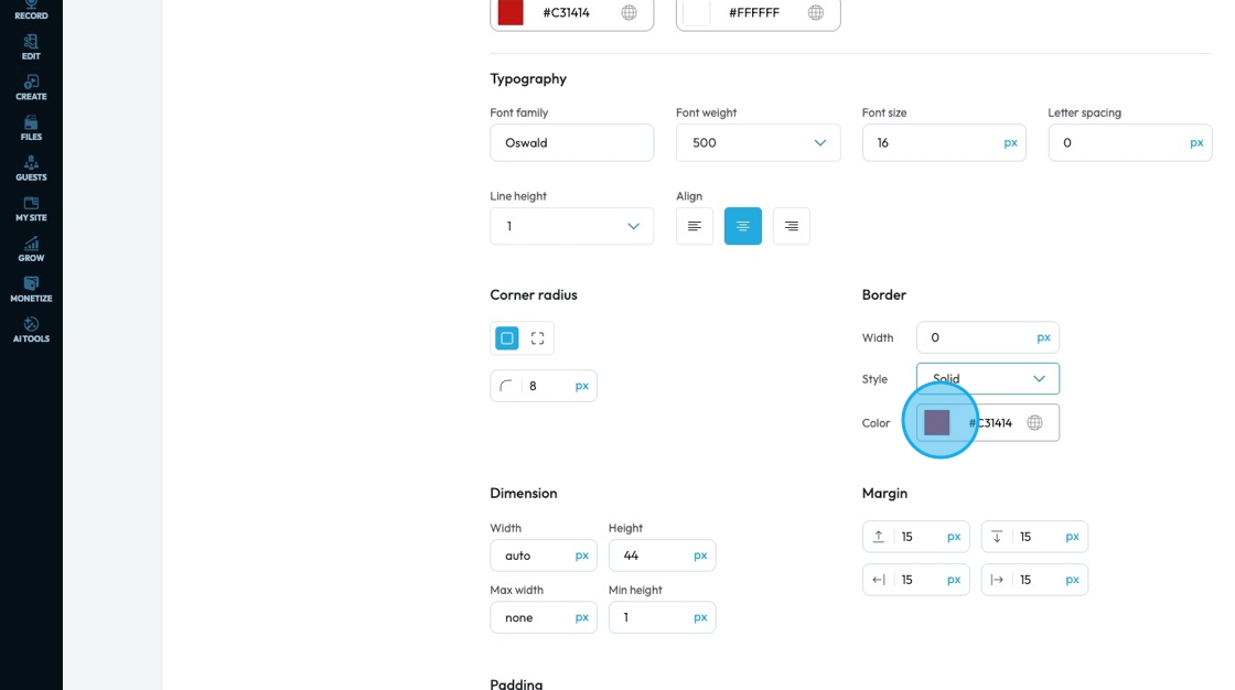
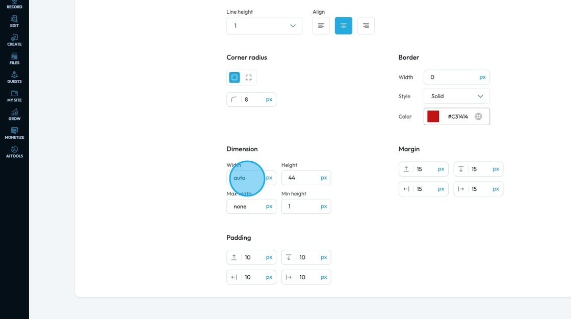
53. Click "Dimension" to adjust the dimensions as per your needs
- Width: Set the horizontal size of an element on a web page
- Height: Set the vertical size of an element on a web page
- Max. width: Set an upper limit for an element's width. The element will never be wider than this value, but it can be narrower
- Min height: Set a lower limit for an element's height. The element will never be shorter than this value, but it can be taller
Next to each of these elements, you can change the number and the unit of the feature. See below for an explanation of the units
- px (pixels): Like little dots on the screen.
200pxmeans 200 dots wide or tall. - % (percent): A part of something else.
50%means half the size of the box it’s in. - em: Grows with the text around it.
2emis 2 times bigger than the normal text. - rem: Like em, but always starts from the main page size.
1remis usually normal-size text. - vh (viewport height): How tall the screen is.
100vhmeans the whole height of the screen. - vw (viewport width): How wide the screen is.
100vwmeans the whole width of the screen.
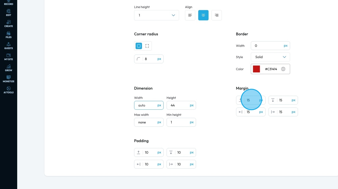
54. Margin is the space outside an element (like a box, image, or text block) on a webpage.
- Margin All: This is a shorthand property that allows you to set the margin for all four sides (top, right, bottom, and left) of an element simultaneously
- Margin top: Controls the space above an element. It pushes the element down from whatever is directly above it (e.g., another element, the browser window edge, or its parent container's top edge)
- Margin right: Controls the space to the right of an element. It pushes the element to the left from whatever is directly to its right
- Margin bottom: Controls the space below an element. It pushes the element up from whatever is directly below it
- Margin left: Controls the space to the left of an element. It pushes the element to the right from whatever is directly to its left
You can change the value (number) and the unit of the feature. See below for an explanation of the units
- px (pixels): Like little dots on the screen.
200pxmeans 200 dots wide or tall. - % (percent): A part of something else.
50%means half the size of the box it’s in. - em: Grows with the text around it.
2emis 2 times bigger than the normal text. - rem: Like em, but always starts from the main page size.
1remis usually normal-size text. - vh (viewport height): How tall the screen is.
100vhmeans the whole height of the screen. - vw (viewport width): How wide the screen is.
100vwmeans the whole width of the screen.
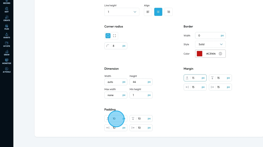
55. Padding: Padding creates inner space within an element. It pushes the element's content away from its own borders (and therefore away from its own edges)
- Padding all: This is a shorthand property that allows you to set the padding for all four sides (top, right, bottom, and left) of an element simultaneously.
- Padding top: Controls the inner space above an element's content. It pushes the content down from the element's top border
- Padding bottom: Controls the inner space below an element's content. It pushes the content up from the element's bottom border
- Padding right: Controls the inner space to the right of an element's content. It pushes the content to the left from the element's right border
- Padding left: Controls the inner space to the left of an element's content. It pushes the content to the right from the element's left border
You can change the value (number) and the unit of the feature. See below for an explanation of the units
- px (pixels): Like little dots on the screen.
200pxmeans 200 dots wide or tall. - % (percent): A part of something else.
50%means half the size of the box it’s in. - em: Grows with the text around it.
2emis 2 times bigger than the normal text. - rem: Like em, but always starts from the main page size.
1remis usually normal-size text. - vh (viewport height): How tall the screen is.
100vhmeans the whole height of the screen. - vw (viewport width): How wide the screen is.
100vwmeans the whole width of the screen.
Related Articles
How To Use Integrations (Detailed)
This guide shows you how to connect your podcast and social media to PodUp to boost your reach. It walks through each step—from adding your podcast info to linking social accounts and analytics—so you can easily manage and promote your show across ...How To Use Integrations (Detailed)
This guide shows you how to connect your podcast and social media to PodUp to boost your reach. It walks through each step—from adding your podcast info to linking social accounts and analytics—so you can easily manage and promote your show across ...How to Navigate Analytics (Detailed)
This guide offers a comprehensive overview of accessing and understanding podcast analytics through PodUp Analytics, making it essential for podcasters aiming to optimize their content reach. By breaking down key metrics and providing step-by-step ...How to Change Your Site Theme on PodUp
By following this guide, you can easily change your PodUp site theme to match your brand and enhance user experience. 1. Navigate to https://app.podup.com/home 2. Click "My Site" 3. Select "Site Themes" 4. The ‘Site Themes’ page will load 5. The ...My Site Themes Demo Video