How to Navigate Header & Footer - Header (Detailed)
This guide is an essential resource for anyone looking to enhance their PodUp website by effectively creating and customizing headers and footers. It provides step-by-step instructions on how to utilize key features like global design settings, typography, and color palettes to ensure a cohesive and professional appearance. By following this guide, users can easily establish their brand identity online while ensuring a user-friendly experience across different devices.

1. Click "My Site"
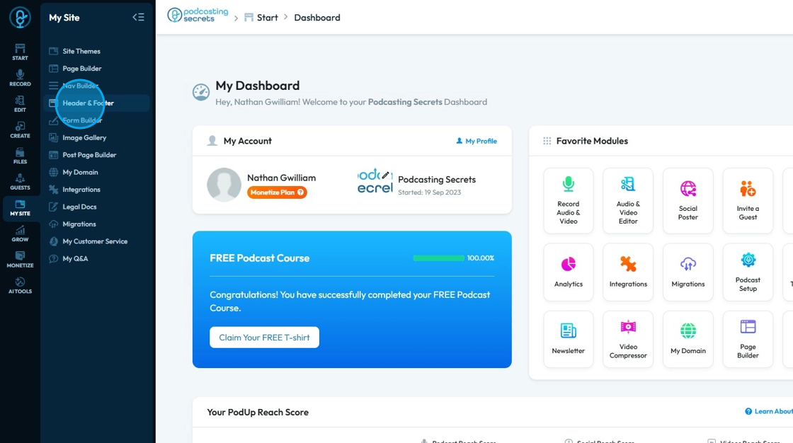
2. Click "Header & Footer"
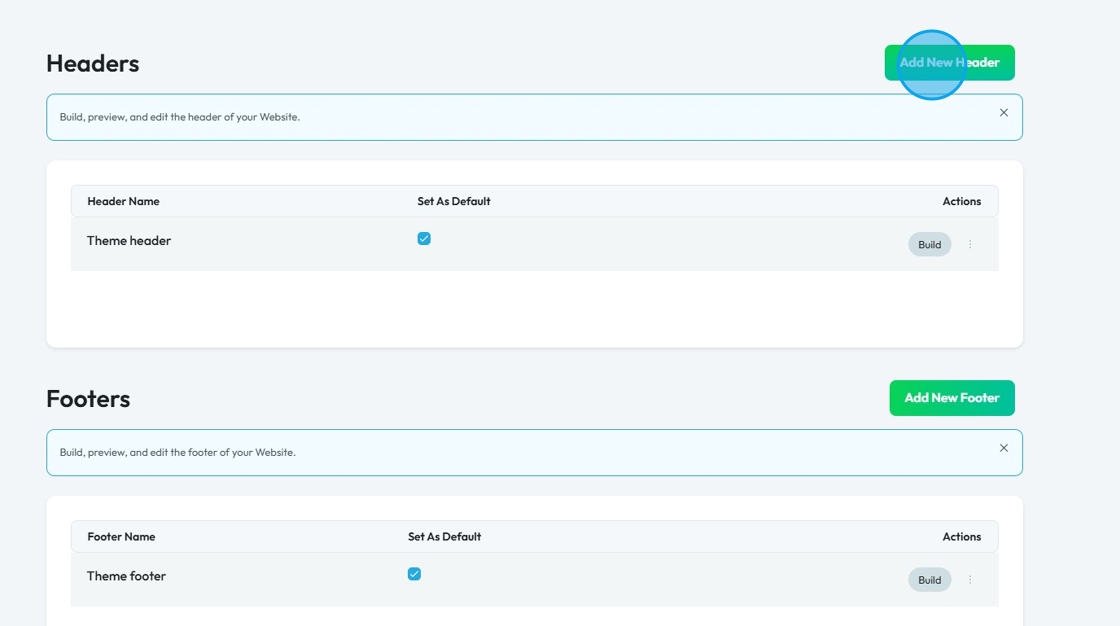
3. Click "Add New Header"
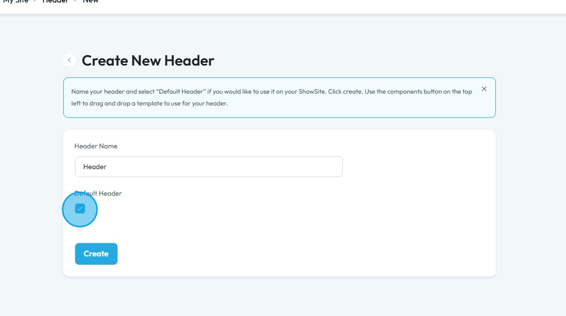
4. Click "Header Name" and enter the header name
If you want this header to be your default header, meaning that it will be what appears on every page of your website unless you customize if for that page, make sure to check the "Default Header" checkbox
Click "Create"
5. A new window opens up "Global Design"
Global Design refers to the ability to define and apply a consistent design and layout to these critical sections across your entire website from a single place
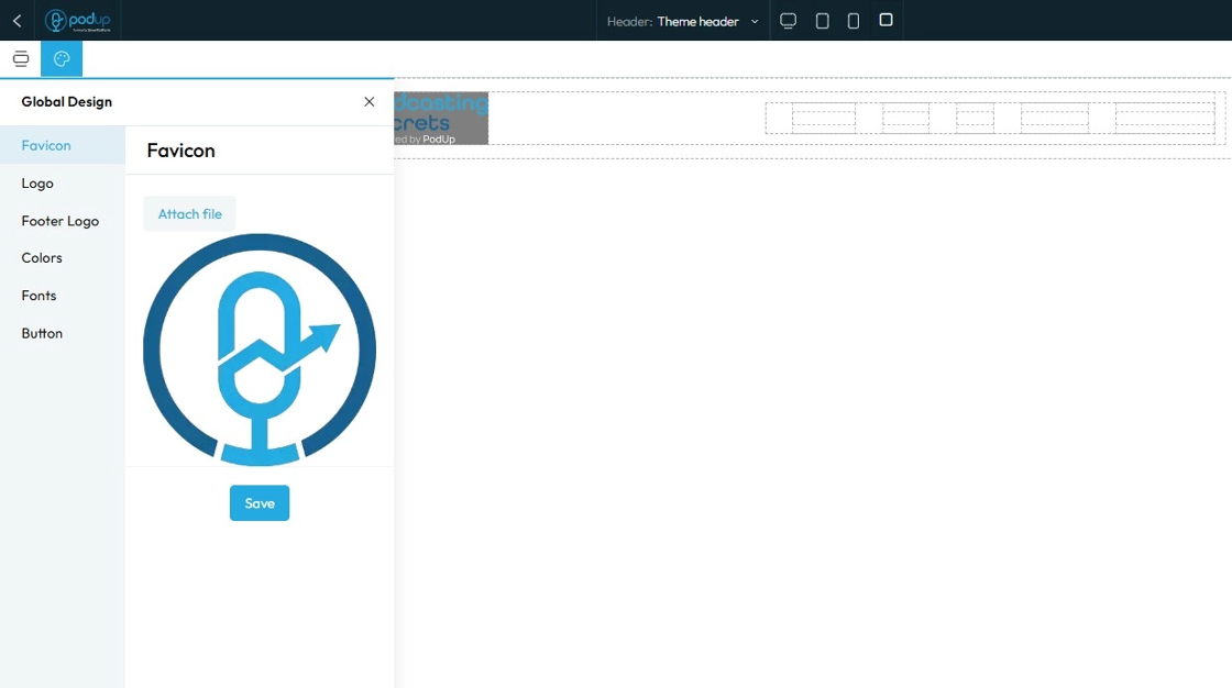
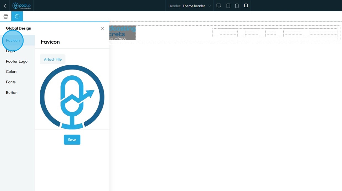
6. Click "Favicon" to add your favourate icon
A Favicon (short for "favorite icon") is a small, square, iconic image that represents your website
Click "Attach file" to add the image then click "Save" once you have chosen your favicon
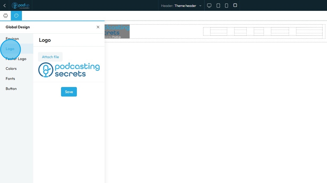
7. Click "Logo" to add logo
"Logo" refers to the graphical mark or emblem that represents your brand, company, or personal identity on your website
Click "Attach file" to add the logo then click "Save" to apply the changes
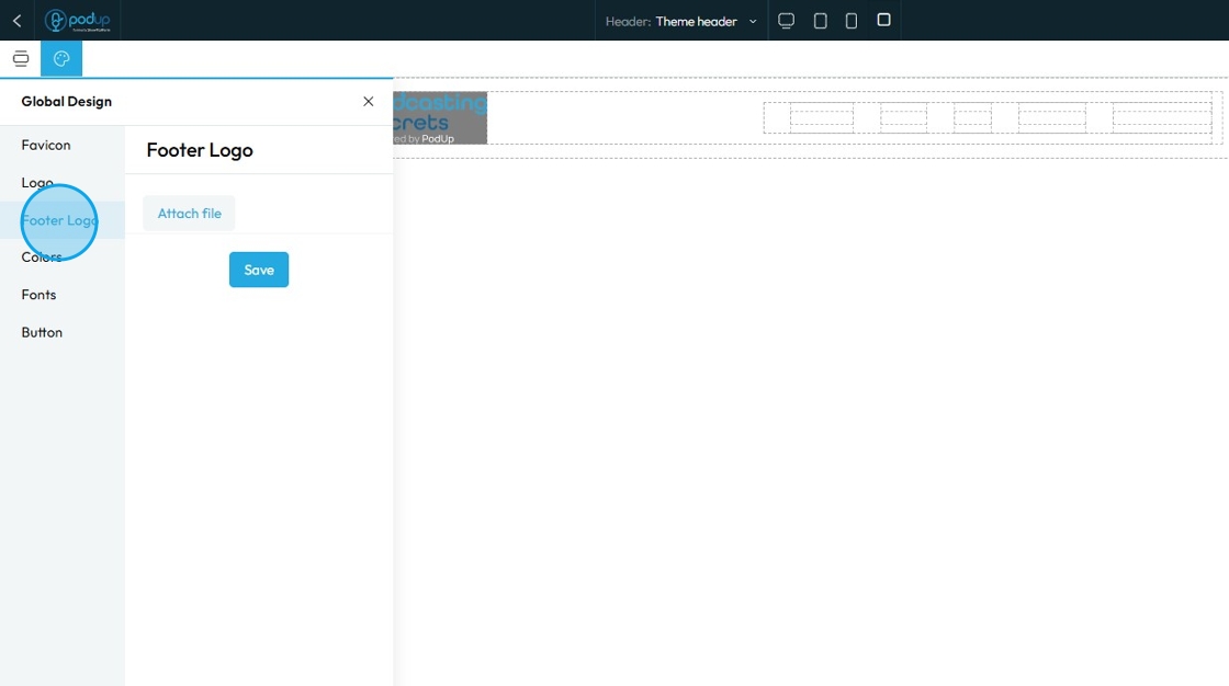
8. Click "Footer Logo" to add a logo at the footer section of your website
The Footer Logo is an instance of your brand's logo that is specifically placed within the footer section of your website. The footer is the bottommost section that appears consistently across all or most pages of your site, typically containing copyright information, navigation links, contact details, and sometimes social media links
Click "Attach file" to add the footer logo then click "Save" to apply the changes
9. Click "Color"
When you manage "Color" in the Global Design section, you're not just setting the color for one specific piece of text or one background. Instead, you're defining the entire color palette and scheme for all header in your entire website
Pick theme colors or add your own colors by clicking "+ Add new color"
To change the color
Click the colored box where you can select the color from the color spectrum or insert a specific number using Hex, rgb, or hsl
Hex: A 6-digit code that starts with
#(like#FF5733). It defines color using combinations of red, green, and blue in hexadecimal format. Common in web design.rgb: Stands for Red, Green, Blue. It defines color using three numbers (like
rgb(255, 87, 51)), where each number ranges from 0 to 255 to mix the right shade.hsl: Stands for Hue, Saturation, Lightness. It defines color based on:
Hue (0–360 degrees on a color wheel),
Saturation (intensity of the color), and
Lightness (brightness from black to white). Example:
hsl(12, 100%, 60%).
Each method produces the same result—a specific color—just in different formats.
Click "Save"

10. Click "Fonts"
"Fonts" in your Global Design settings means you are defining the default typefaces, sizes, and styles for all text elements in your header section
Click "Save"

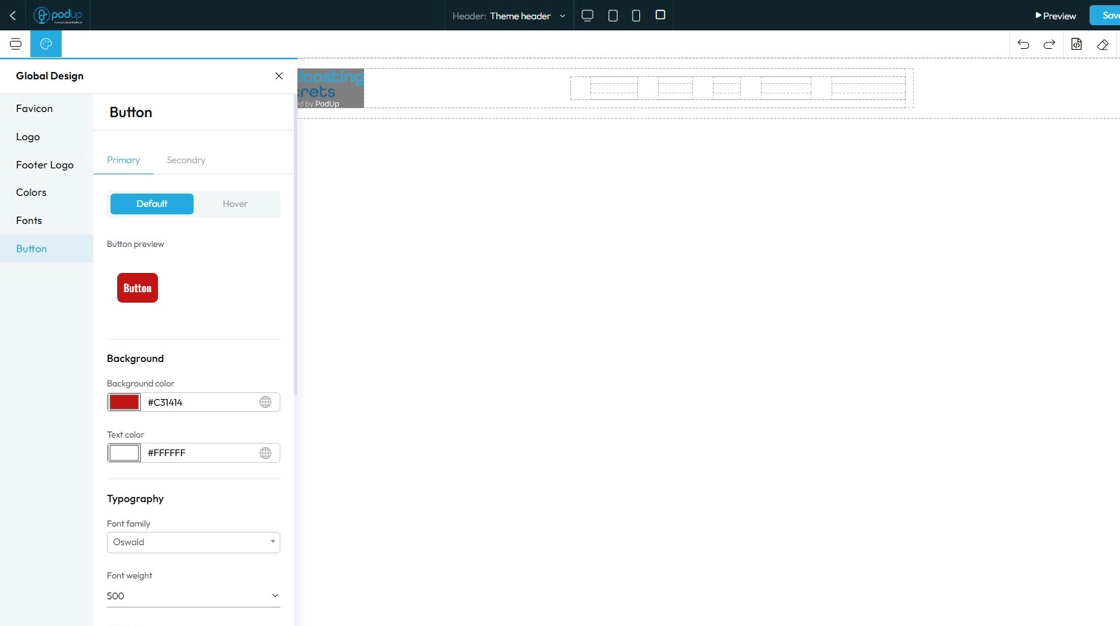
11. Click "Button" under Global Design settings
"Button" settings in the Global Design section, you are defining the default visual appearance for all (or specific types of) buttons across your header section of your website. This ensures that every time you add a new button, it automatically adopts a consistent, on-brand look and feel without you having to manually style it each time
- Primary: Used for the main action on a page, like "Submit" or "Save." It usually has a bold or standout color to draw attention.
- Default shows how the button looks sitting on the website
- Hover shows how the button looks when the cursor is over the button
- This can look the same as the default, or it can be different to add an interactive element to your site
- A preview of the button will appear to demonstrate how the button will appear on the main page
- Secondary: Used for less important actions, like "Cancel" or "Learn More." It typically has a lighter color or an outlined style to appear less prominent.
- Default shows how the button looks sitting on the website
- Hover shows how the button looks when the cursor is over the button
- This can look the same as the default, or it can be different to add an interactive element to your site
- A preview of the button will appear to demonstrate how the button will appear on the main page
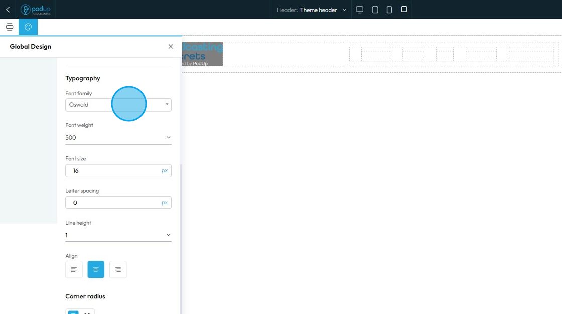
12. "Typography" lets you to change the font, size, color, alignment etc. of the text
- Font family: Select the typeface (the specific design of the letters) to be used for the text
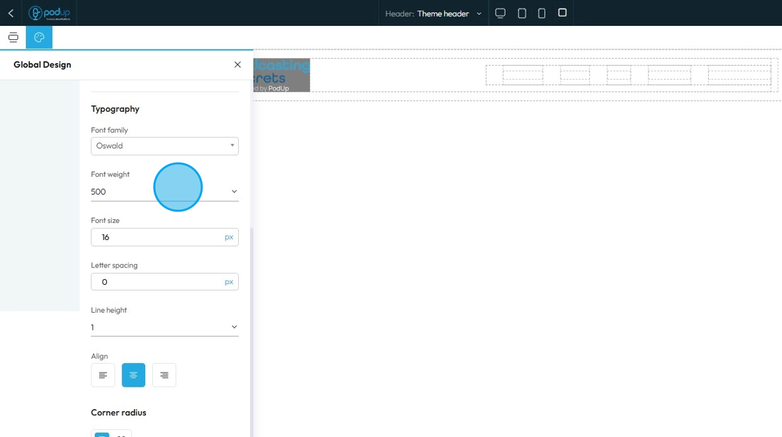
13. Font Weight: Controls the boldness or thickness of the text characters
- The bigger the number the thicker the text
14. Font Size: Controls the height of the characters in your text
- The bigger the number the bigger the character
- The unit can be changed to adjust to the specific project you are working in. Generally px is easiest
- px (pixels): Like little dots on the screen.
200pxmeans 200 dots wide or tall. - % (percent): A part of something else.
50%means half the size of the box it’s in. - em: Grows with the text around it.
2emis 2 times bigger than the normal text. - rem: Like em, but always starts from the main page size.
1remis usually normal-size text. - vh (viewport height): How tall the screen is.
100vhmeans the whole height of the screen. - vw (viewport width): How wide the screen is.
100vwmeans the whole width of the screen
- px (pixels): Like little dots on the screen.

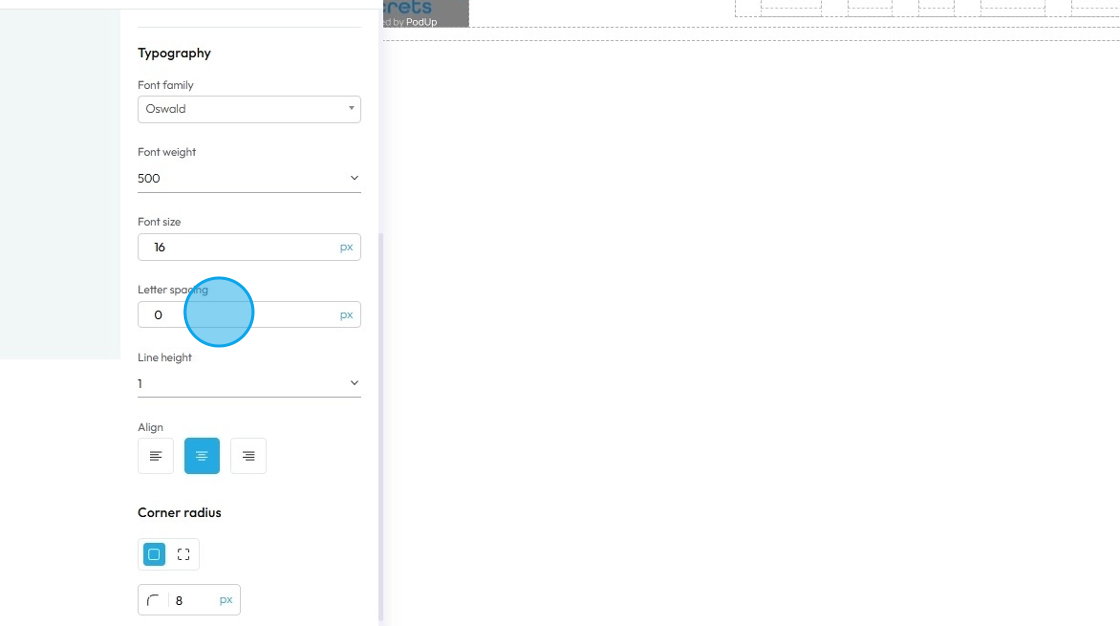
15. - Letter Spacing: Controls the horizontal space between individual characters (letters) within a word. Also known as "tracking" in traditional typography
- The bigger the number the more space between the characters
- Change the unit by clicking the blue dash next to the number
- px (pixels): Like little dots on the screen.
200pxmeans 200 dots wide or tall. - % (percent): A part of something else.
50%means half the size of the box it’s in. - em: Grows with the text around it.
2emis 2 times bigger than the normal text. - rem: Like em, but always starts from the main page size.
1remis usually normal-size text. - vh (viewport height): How tall the screen is.
100vhmeans the whole height of the screen. - vw (viewport width): How wide the screen is.
100vwmeans the whole width of the screen
- px (pixels): Like little dots on the screen.
16. Line Height: Controls the vertical space between lines of text within a paragraph or text block. Also known as "leading" in traditional typography
- 1 is the standard spacing size
- Change the units by selecting the dash next to the number
- px (pixels): Like little dots on the screen.
200pxmeans 200 dots wide or tall. - % (percent): A part of something else.
50%means half the size of the box it’s in. - em: Grows with the text around it.
2emis 2 times bigger than the normal text. - rem: Like em, but always starts from the main page size.
1remis usually normal-size text. - vh (viewport height): How tall the screen is.
100vhmeans the whole height of the screen. - vw (viewport width): How wide the screen is.
100vwmeans the whole width of the screen
- px (pixels): Like little dots on the screen.
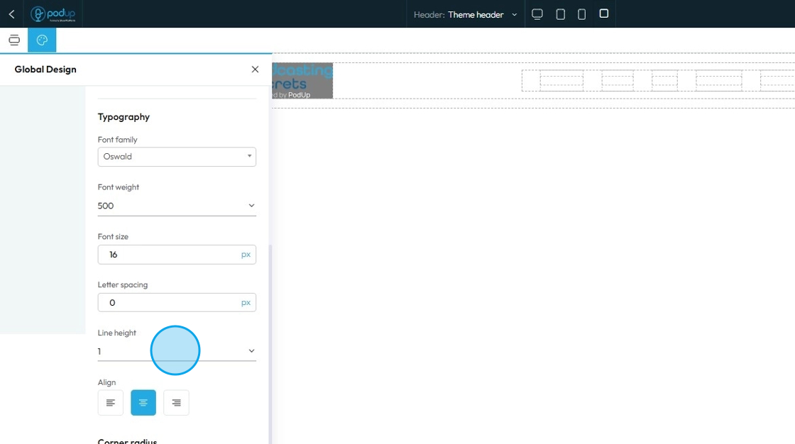
17. Text align: Controls the horizontal alignment of text and inline content within its containing element (e.g., a paragraph, heading, button, or column). It dictates where the text begins and ends horizontally within the available space of its parent
- Left: Align the text to the left edge of its container. The right edge of the text will appear "ragged" or uneven
- Center: Centers the text horizontally within its container. Both the left and right edges of the text will appear ragged
- Right: Aligns the text to the right edge of its container. The left edge of the text will appear ragged
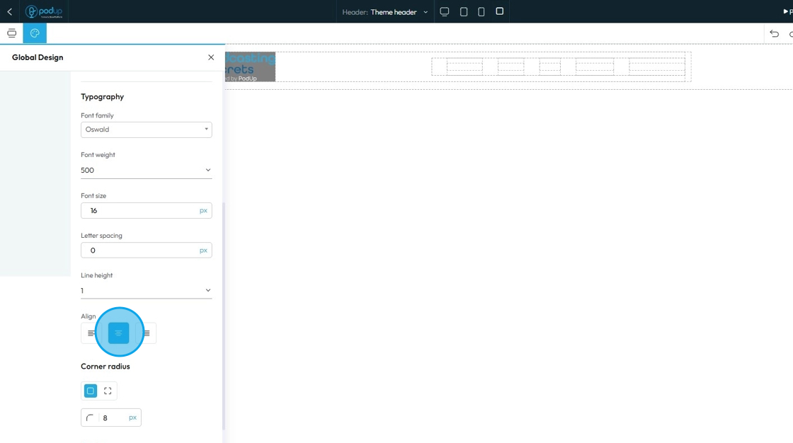
18. Corner radius: Controls how rounded the corners of a button look—higher values make the button more curved, while lower values keep it square or sharp.
- Linked corners: All four corners are set to the same radius (in this case, 8px).
- Unlinked corners: Lets you set each corner independently (top-left, top-right, etc.) with different values.
Set the sharpness of the corner by changing the number in the box
- The lower the number the sharper the value
- The higher the number the more curved the corner
- Change the units by selecting the dash next to the number
- px (pixels): Like little dots on the screen.
200pxmeans 200 dots wide or tall. - % (percent): A part of something else.
50%means half the size of the box it’s in. - em: Grows with the text around it.
2emis 2 times bigger than the normal text. - rem: Like em, but always starts from the main page size.
1remis usually normal-size text. - vh (viewport height): How tall the screen is.
100vhmeans the whole height of the screen. - vw (viewport width): How wide the screen is.
100vwmeans the whole width of the screen.
- px (pixels): Like little dots on the screen.

19. - Border Width: Controls the thickness of the border line. Change the size (number) and unit by adding a number and clicking 1 of the 5 following units
px (pixels): Like little dots on the screen.
200pxmeans 200 dots wide or tall.em: Grows with the text around it.
2emis 2 times bigger than the normal text.rem: Like em, but always starts from the main page size.
1remis usually normal-size text.vh (viewport height): How tall the screen is.
100vhmeans the whole height of the screen.vw (viewport width): How wide the screen is.
100vwmeans the whole width of the screen.Border Style: Determines the visual pattern or type of the border line. This is crucial for how the border looks
- Solid: A single, unbroken line as the border
- Dotted: A border made of evenly spaced round dots
- Dashed: A border made of short, straight dashes
Border Color: Defines the color of the border line
Click the colored box to pick the color from the color spectrum or to insert your hex code, rgb or hsl
Hex Code: A six-digit code used in web design to represent a specific color. It starts with a # symbol followed by numbers and letters (like #FF5733). This can help you stay consistent with your colors
RGB: Stands for Red, Green, Blue. It defines color using three numbers (like
rgb(255, 87, 51)), where each number ranges from 0 to 255 to mix the right shade.HSL: Stands for Hue, Saturation, Lightness. It defines color based on:
Hue (0–360 degrees on a color wheel),
Saturation (intensity of the color), and
Lightness (brightness from black to white).
Example:hsl(12, 100%, 60%).
Click the globe icon - which indicates a global color—to update that color everywhere it’s used on your site for consistent design
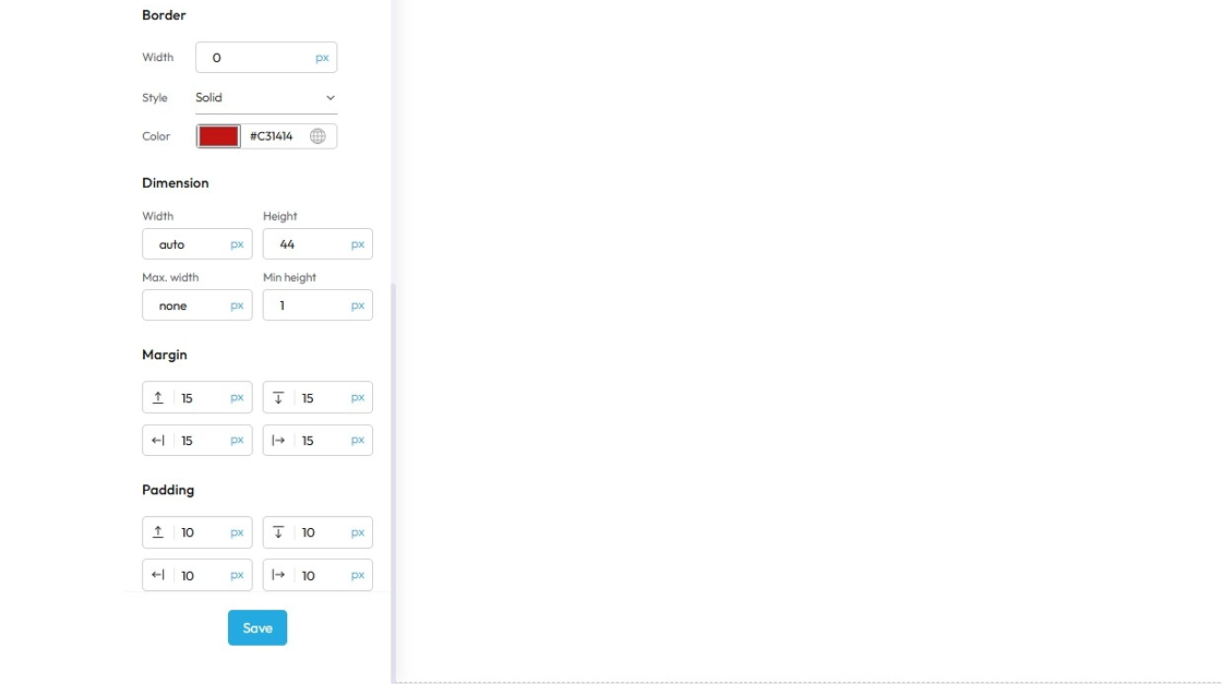
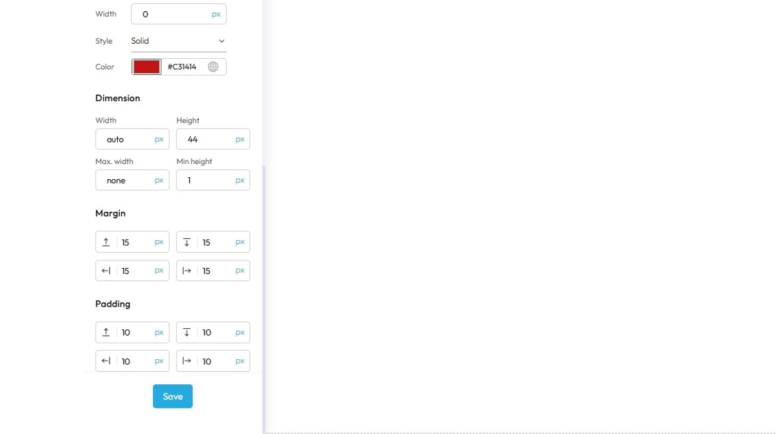
20. "Dimension" lets you to adjust the dimensions of the button as per your needs
- Width: Set the horizontal size of an element on a web page
- Height: Set the vertical size of an element on a web page
- Max. width: Set an upper limit for an element's width. The element will never be wider than this value, but it can be narrower
- Min height: Set a lower limit for an element's height. The element will never be shorter than this value, but it can be taller
Next to each of these elements, you can change the number and the unit of the feature. See below for an explanation of the units
- px (pixels): Like little dots on the screen.
200pxmeans 200 dots wide or tall. - % (percent): A part of something else.
50%means half the size of the box it’s in. - em: Grows with the text around it.
2emis 2 times bigger than the normal text. - rem: Like em, but always starts from the main page size.
1remis usually normal-size text. - vh (viewport height): How tall the screen is.
100vhmeans the whole height of the screen. - vw (viewport width): How wide the screen is.
100vwmeans the whole width of the screen.
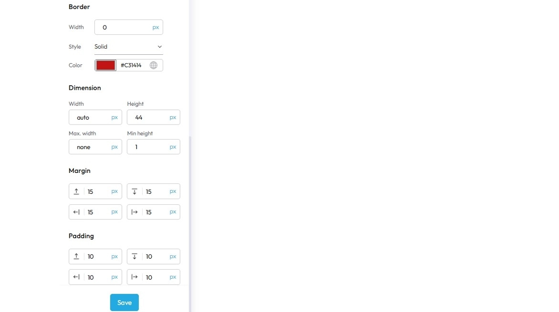
21. Margin is the space outside an element (like a box, image, or text block) on a webpage.
- Margin top: Controls the space above an element. It pushes the element down from whatever is directly above it (e.g., another element, the browser window edge, or its parent container's top edge)
- Margin bottom: Controls the space below an element. It pushes the element up from whatever is directly below it
- Margin left: Controls the space to the left of an element. It pushes the element to the right from whatever is directly to its left
- Margin right: Controls the space to the right of an element. It pushes the element to the left from whatever is directly to its right
Next to each of these elements, you can change the number and the unit of the feature. See below for an explanation of the units
- px (pixels): Like little dots on the screen.
200pxmeans 200 dots wide or tall. - % (percent): A part of something else.
50%means half the size of the box it’s in. - em: Grows with the text around it.
2emis 2 times bigger than the normal text. - rem: Like em, but always starts from the main page size.
1remis usually normal-size text. - vh (viewport height): How tall the screen is.
100vhmeans the whole height of the screen. - vw (viewport width): How wide the screen is.
100vwmeans the whole width of the screen.

22. Padding: Padding creates inner space within an element. It pushes the element's content away from its own borders (and therefore away from its own edges)
- Padding top: Controls the inner space above an element's content. It pushes the content down from the element's top border
- Padding bottom: Controls the inner space below an element's content. It pushes the content up from the element's bottom border
- Padding left: Controls the inner space to the left of an element's content. It pushes the content to the right from the element's left border
- Padding right: Controls the inner space to the right of an element's content. It pushes the content to the left from the element's right border
Next to each of these elements, you can change the number and the unit of the feature. See below for an explanation of the units
- px (pixels): Like little dots on the screen.
200pxmeans 200 dots wide or tall. - % (percent): A part of something else.
50%means half the size of the box it’s in. - em: Grows with the text around it.
2emis 2 times bigger than the normal text. - rem: Like em, but always starts from the main page size.
1remis usually normal-size text. - vh (viewport height): How tall the screen is.
100vhmeans the whole height of the screen. - vw (viewport width): How wide the screen is.
100vwmeans the whole width of the screen.
Click "Save"
23. Click "Components" to add, move, delete, or rearrange components
Components (sometimes also called "blocks," "widgets," "modules," or "elements") are essentially pre-built, reusable building blocks that you drag and drop onto your webpage to construct its layout and add content. They are the fundamental units that make up your website, allowing you to create a complex site without needing to write code from scratch
Think of components like LEGO bricks. Each brick has a specific shape and function, and you combine them in various ways to build a complete structure
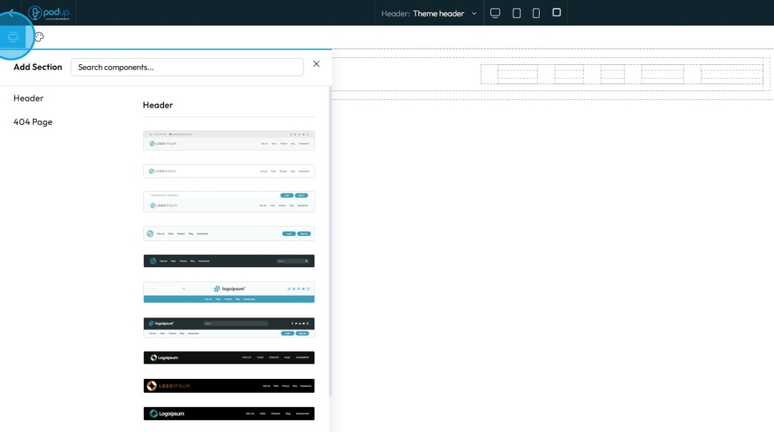
24. Choose over 20+ header templates click to add it or drag it to the page
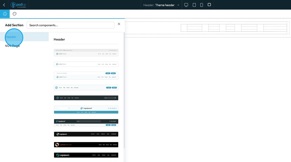
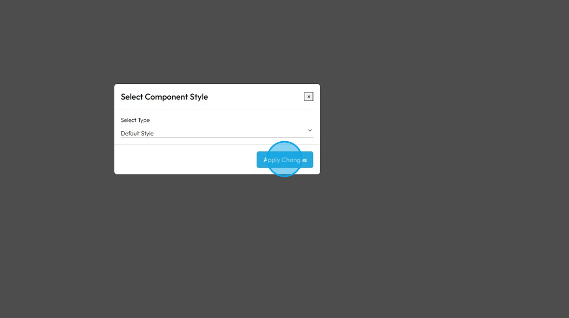
25. Click on the desired template and add it to your Header & Footer section
- Global style: A site-wide design setting you can apply to multiple elements—changing it updates all elements using that style.
- Default style: The starting design automatically applied to an element unless you customize or override it.
Click "Apply Changes"
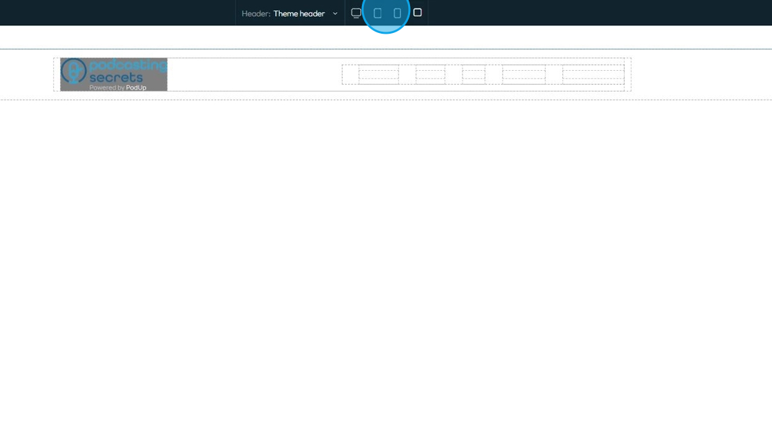
26. Click the display icons to change the display of the page. This helps you edit the website according to different screen sizes
Computer icon: Switches the view to desktop mode. Lets you see and edit how your website looks on a full-sized screen.
Tablet icon: Switches the view to tablet mode. Lets you adjust layout and styling for mid-sized screens like iPads or other tablets.
Phone icon: Switches the view to mobile mode. Helps you fine-tune how your website looks and functions on smartphones.
Square icon: Often represents a full-width or default view. It may reset the display or show the original layout without device-specific styling. (Exact function can vary depending on the builder.)
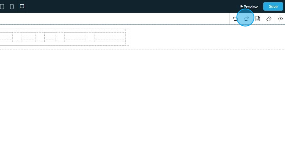
27. Click "Undo" which reverses your last change, like deleting text or moving something by mistake

28. Click "Redo" which brings back a change you just undid, in case you want it again
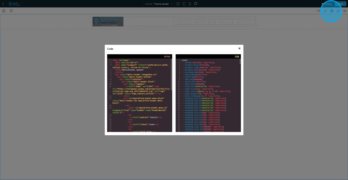
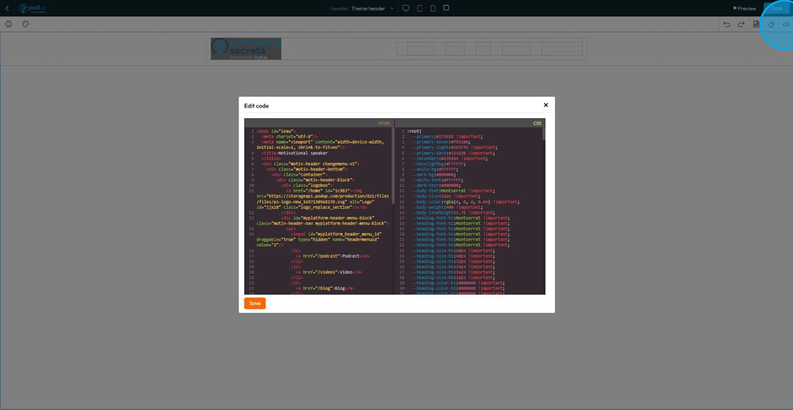
29. Click "Open Code" to open the code and view the HTML and CSS codes
- Note - You cannot edit the code here
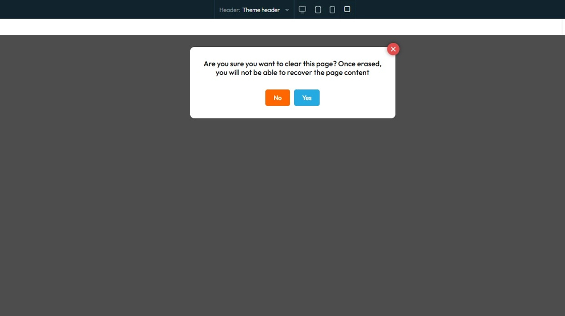
30. Click "Erase" to clear the page
31. A confirmation popup will appear asking for confirmation that you want to delete the page
- Click "Yes" to continue erasing the page
- Click "No" to keep the page content
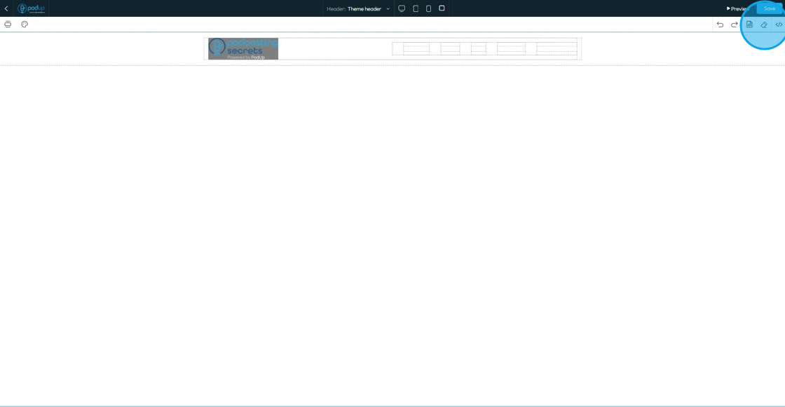
32. Click "Edit Code" to edit the HTML or CSS code
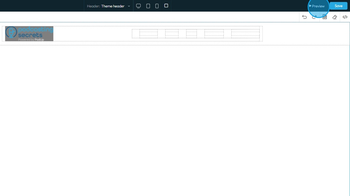
33. Click "Preview" to view the website as would appear on the browser
- The web preview will open in a different tab
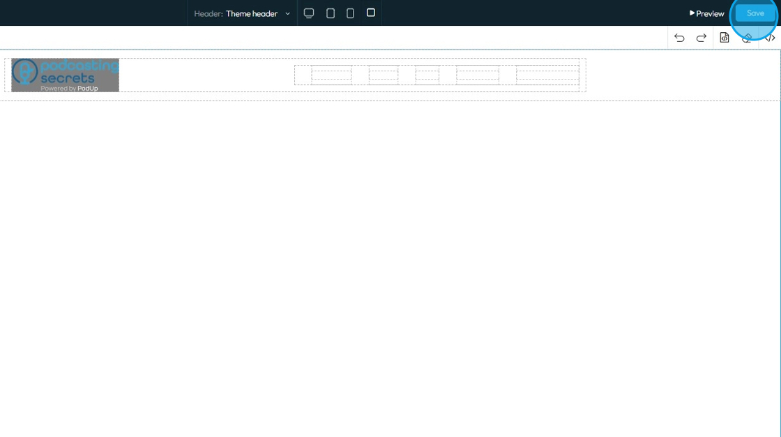
34. Click "Save" to keep all the progress that you've made on the Header and Footer
Related Articles
How to Navigate Header and Footer - Footer (Detailed)
This guide offers a comprehensive step-by-step process for creating and customizing footers in PodUp, empowering users to enhance their website's design with unique branding elements like logos and favicons. It covers essential design aspects such as ...How to Navigate Page Builder (Detailed)
This guide provides a straightforward method for creating and customizing website pages using PodUp's Page Builder, making it ideal for users of all skill levels. It outlines each step in the process, from accessing the page builder to editing ...How to Build a footer for my website
By following this guide, you can quickly create a custom footer in PodUp to enhance your website’s design and functionality. 1. Navigate to https://app.podup.com/home 2. Click "My Site" 3. Select "Header & Footer" 4. Click "Add New Footer" 5. Enter ...How do I customize Web builder Quick Add (Detailed) - Card
By following this guide, you can easily customize the Quick Add Card feature in PodUp Web Builder to enhance your website’s design and visual appeal. 1. Navigate to https://app.podup.com/home 2. Click "Page Builder". 3. Click the "Build" button for ...How To Navigate Guest Settings (Detailed)
This guide is essential for anyone looking to create a customized guest intake form using PodUp's Guest Settings. It offers detailed instructions on how to navigate the platform, edit profile components, and tailor questions to fit specific needs. By ...