How to Navigate Page Builder (Detailed)
This guide provides a straightforward method for creating and customizing website pages using PodUp's Page Builder, making it ideal for users of all skill levels. It outlines each step in the process, from accessing the page builder to editing details like SEO and design elements. By following these instructions, users can effectively tailor their website's appearance and functionality to meet their specific needs, enhancing the overall user experience.
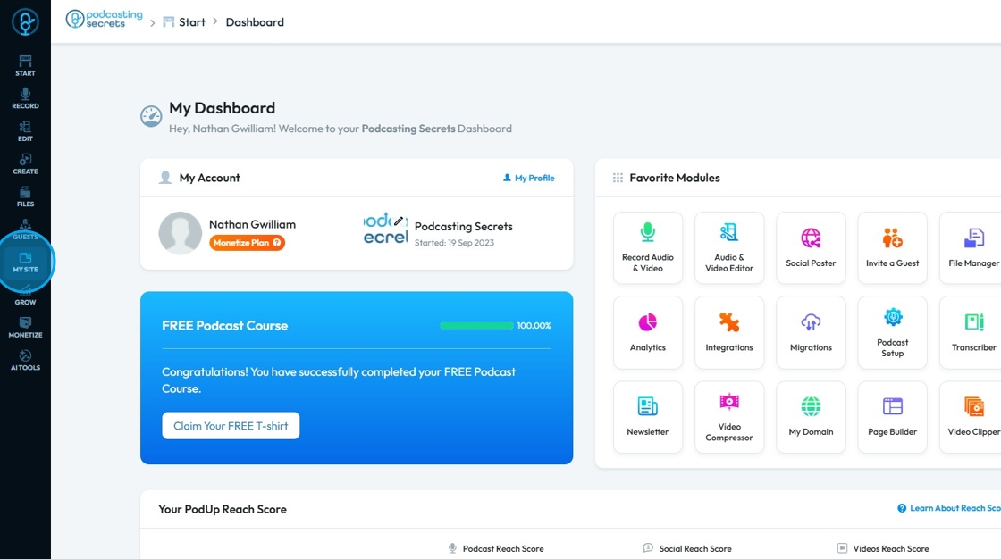
1. Click "My Site"
2. Click "Page Builder"
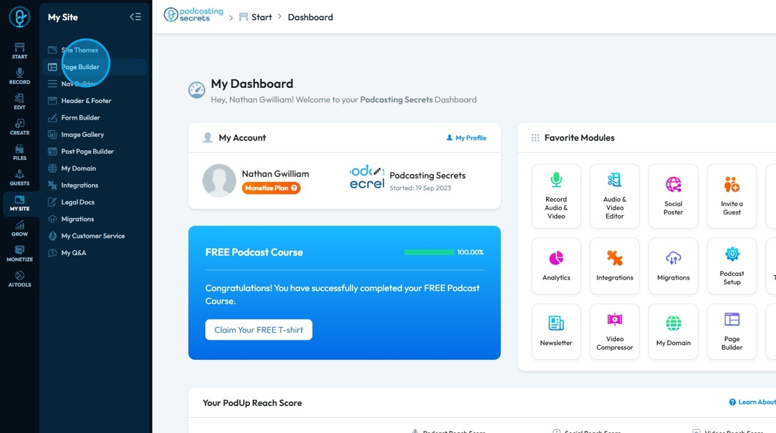
3. You will enter the "Page Builder"
All the pages of your website are listed here
These pages are created according to the website theme you choose
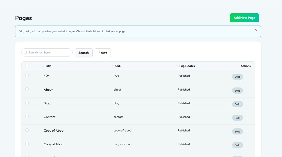
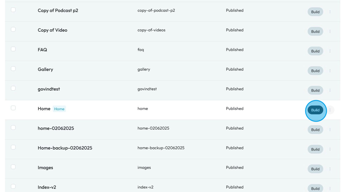
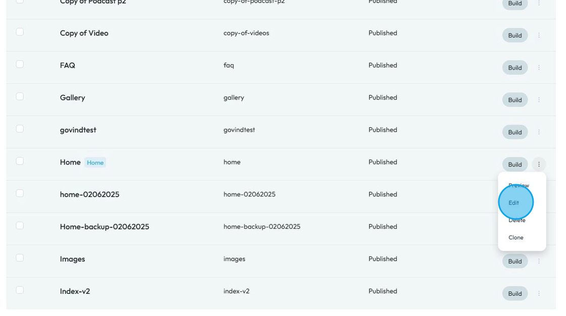
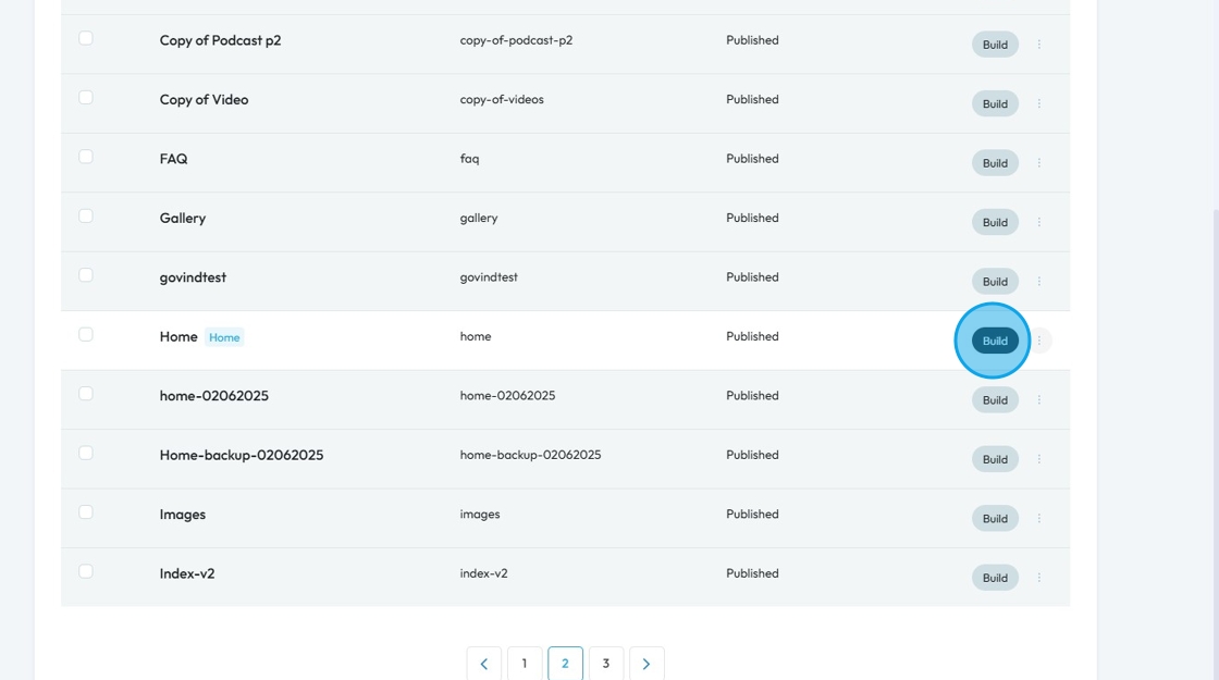
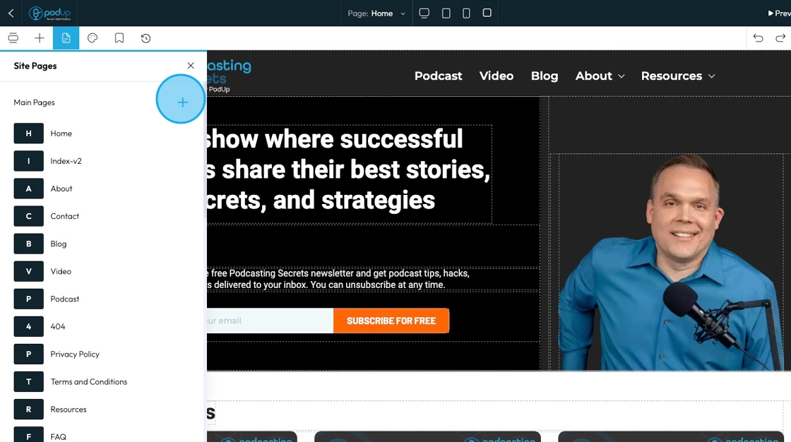
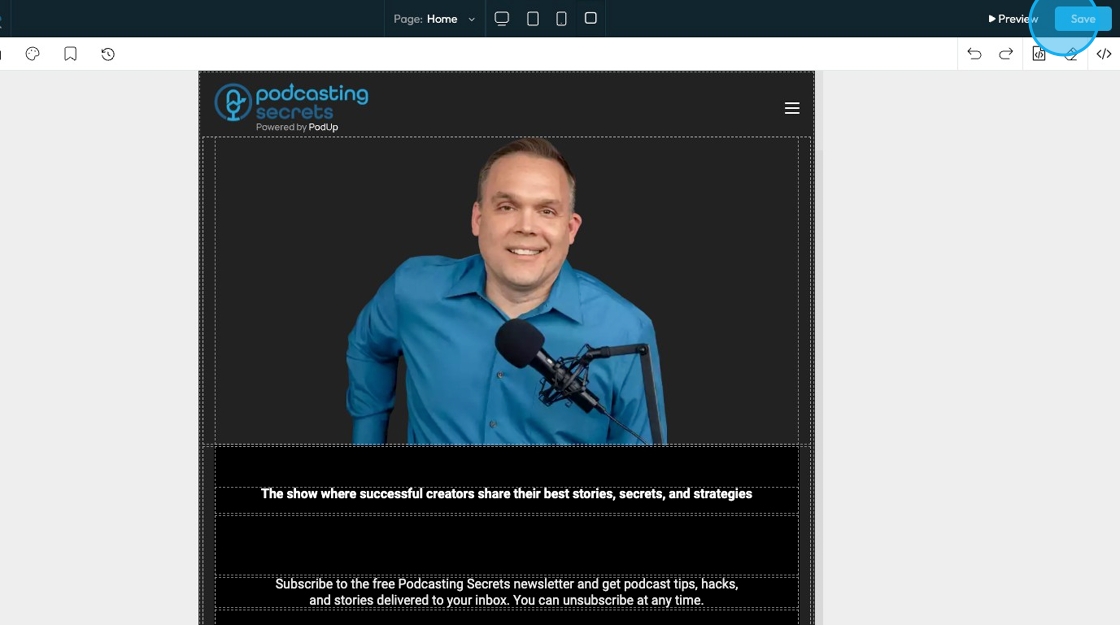
4. Find the page you want to customize, for example: Let's start with the Home page
Click the button with three dots next to "Build"
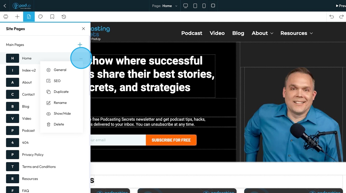
5. You will get a dropdown list of options:
- Preview: See what the page will look like before publishing it
- Edit: Make changes to the name and SEO of the page
- Delete: Remove the page completely
- Clone: Make a copy of the page to reuse or edit separately
Click "Edit"
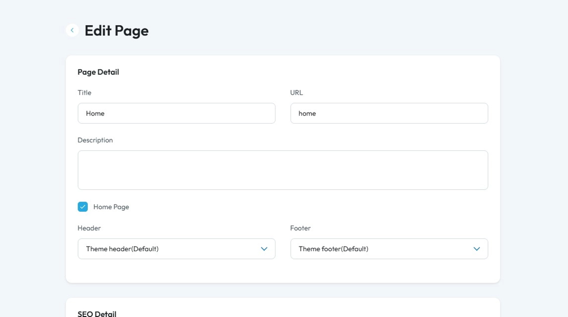
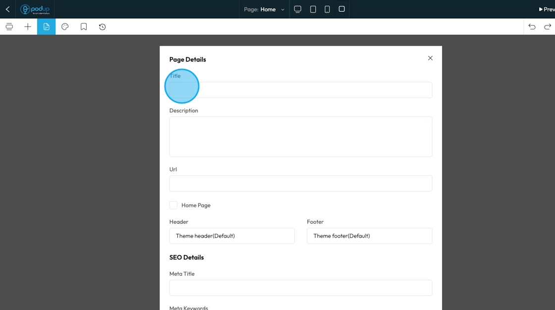
6. Once you click "Edit" you will enter the Edit Page
You can change the page detail:
- Title: Under this section, you can enter the name of your page as it will appear on the website
- URL: This field will generate the URL of the page so it will be "home.domain.com"
- Description: A small summary of the page you are building
- Home Page: Check this box to indicate that this page will be the home page, meaning that this will be the first page of your website
- Header: This is the top-most section of your page
- Footer: This is the bottom-most section of your page
Tip: Tip!
Meta Titles and Descriptions:
These are written specifically for search engines. They appear in search results to help people decide if they want to click your link. They don’t always show on your actual web page.
Normal Titles and Descriptions:
These appear directly on your web page. They are what visitors see when they view the content and help structure your page.
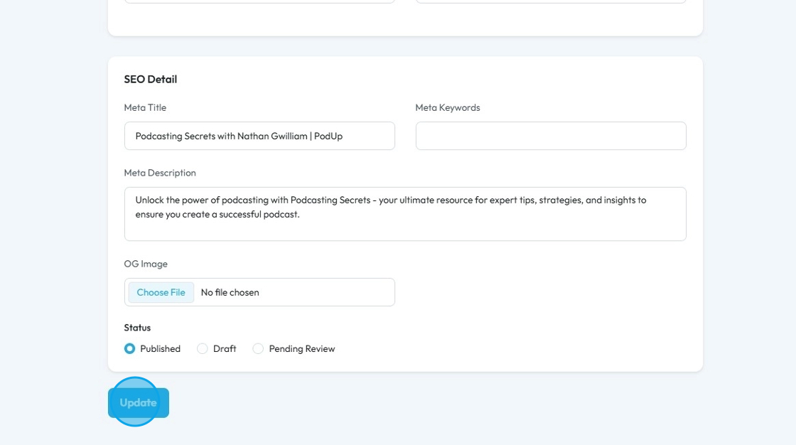
7. SEO details:
- Meta Title: Displays as the main headline in search results and on browser tabs
- Meta Keyword: Refers to a list of relevant keywords for the page's content.
- Keyword: A word or phrase that people type into a search engine when looking for information.
- Meta Description: Provides a brief, engaging summary of the page's content to encourage clicks.
- OG Image (Open Graphic Image): This is the image that will appear with the link if someone shares the link of your page
- Status: This represents the status of the webpage
- Published: The page is live and visible to the public.
Draft: The page is saved but not yet visible to the public — still being worked on.
Pending: The page is waiting for approval before it can be published.
- Published: The page is live and visible to the public.
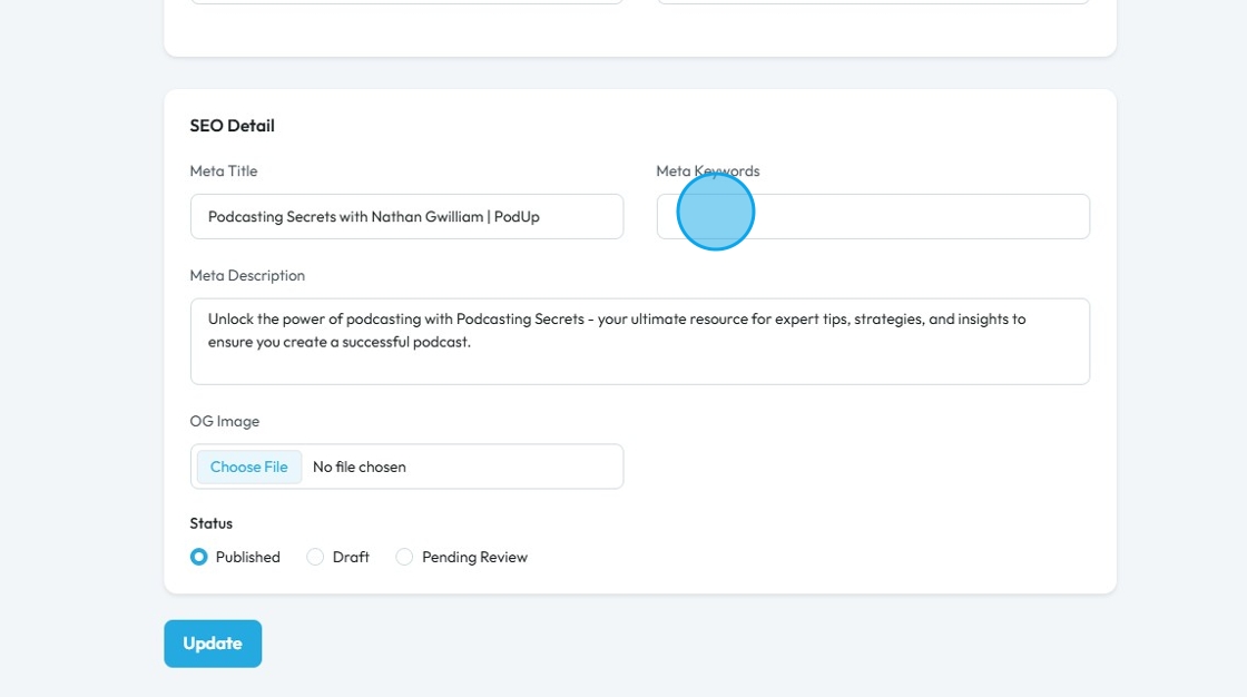
8. Click "Update" to save the details
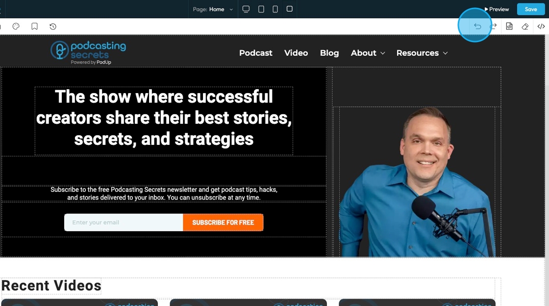
9. Click "Build" to enter the page builder
10. The "Page Builder" opens in a new tab with your template
You can change the sections/elements of the page from here
11. Each section of the page can be customized individually
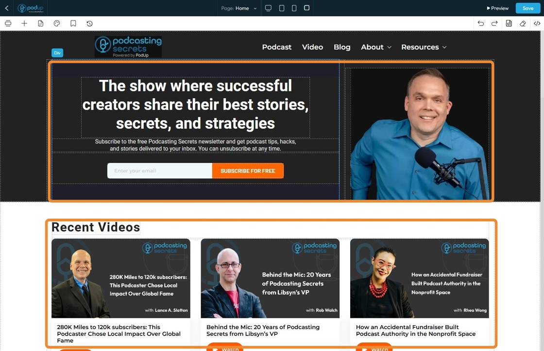
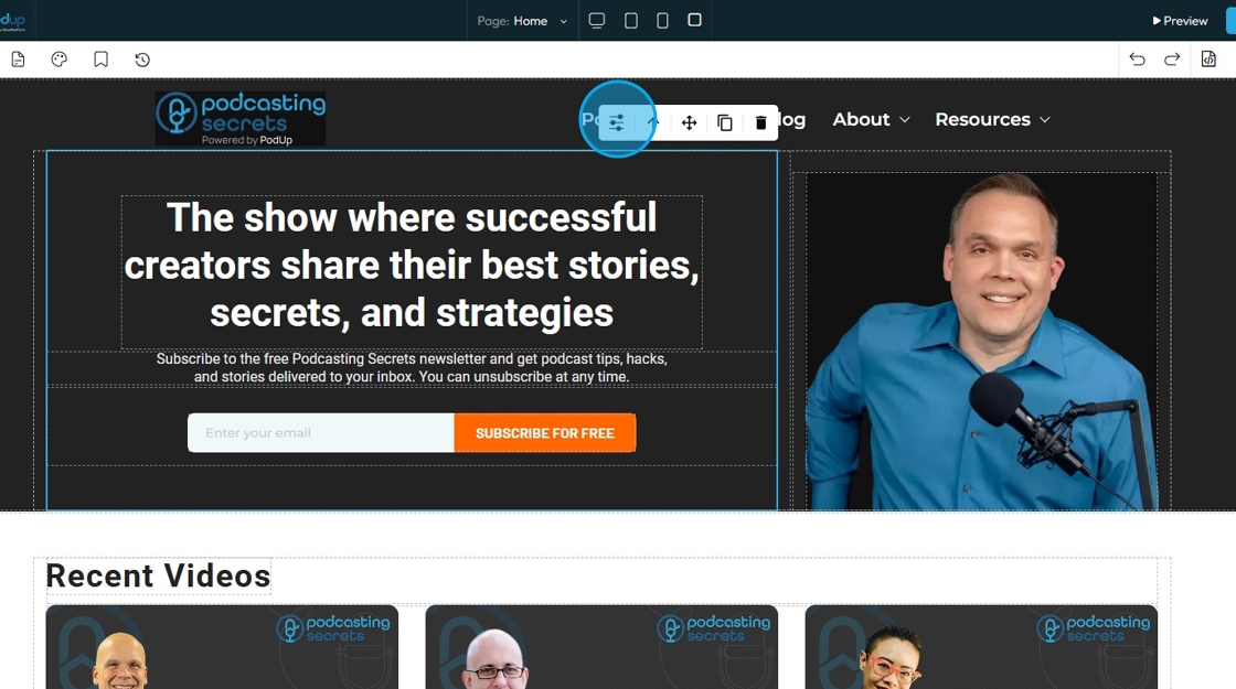
12. Click on the section of the page you want to customize and a menu will appear allowing for customization
- Add your custom style: Provides you with many customizable options (Explained in slides 13-21)
- Parent Container: Click this icon to tell the element to “move to the next bigger container,” which shifts it from a smaller box (like a text block or section) into the larger layout it's part of—helping you place it more accurately on the page
- Move: Reposition the section to where you want. Click and hold this icon while you drag it to the desired location. A green line will indicate where it is being placed
- Copy: Create a copy of the section
- Delete: Remove the section entirely. If you have a duplicate, it will only delete one of the two
13. If you select "Add Custom Style" a white menu will appear giving you the features to edit the website
- This menu can be moved by dragging it to the desired location
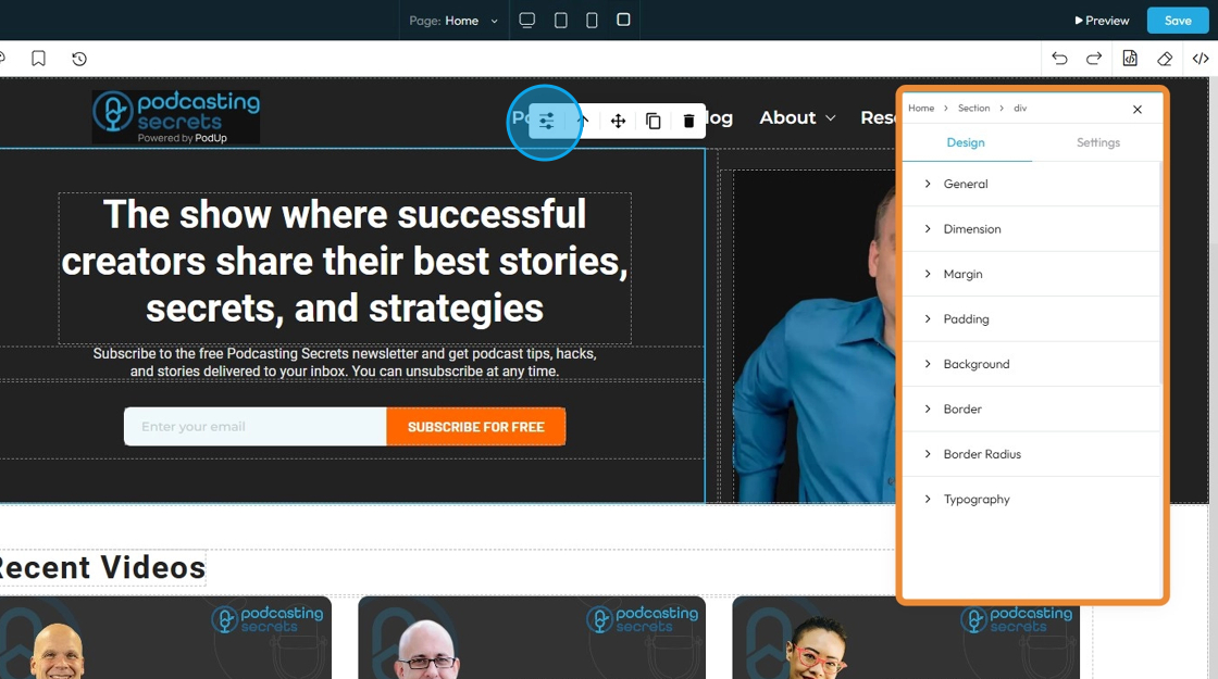
14. If you click "Design" you will get eight customizable options
- General: Basic settings like name, visibility, or position of the element on the page.
- Dimensions: The width and height of the element.
- Margin: The space outside the element, creating distance from other elements.
- Padding: The space inside the element, between the content and the border.
- Background: The color, image, or gradient behind the content of the element.
- Border: The line around the element’s edge — can be styled, colored, or sized.
- Border Radius: The roundness of the element’s corners.
- Typography: The style of the text, including font, size, color, line spacing, and alignment.

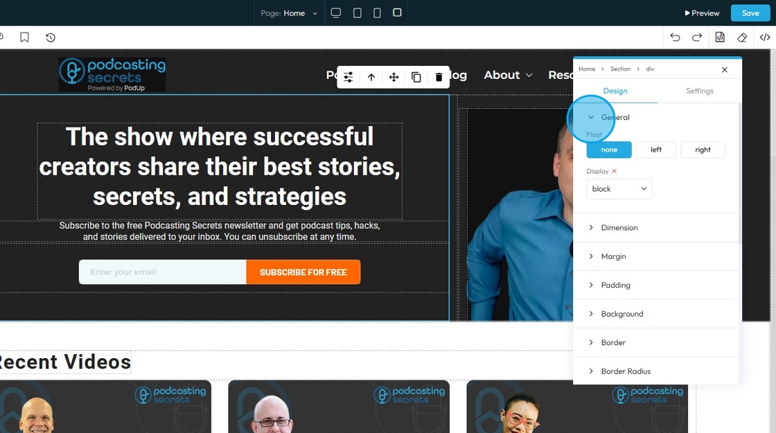
15. If you click "General" you can customize the Float and Display
- Float: Controls how an element lines up next to other elements
- None: The selected element will stay as it was originally placed
- Left: The selected element will be placed on the left with the surrounding material on the right
- Right: The selected element will be placed on the right with the surrounding material on the left
- Display: Controls how an element behaves on the page — whether it appears as a block, inline, flex, grid, or is hidden. It affects layout and spacing.
- Block: Takes full width and starts on a new line, good for sections and containers.
- Inline: Takes only the space needed and stays in line with other elements, good for text and small items.
- Inline-Block: Like inline but can have width and height set, useful for small boxes inside text.
- Flex: Arranges elements in a row or column with easy alignment, great for menus and buttons.
- None: Completely hides the element and removes it from the layout, so it doesn’t take up any space—useful to temporarily or permanently hide content.
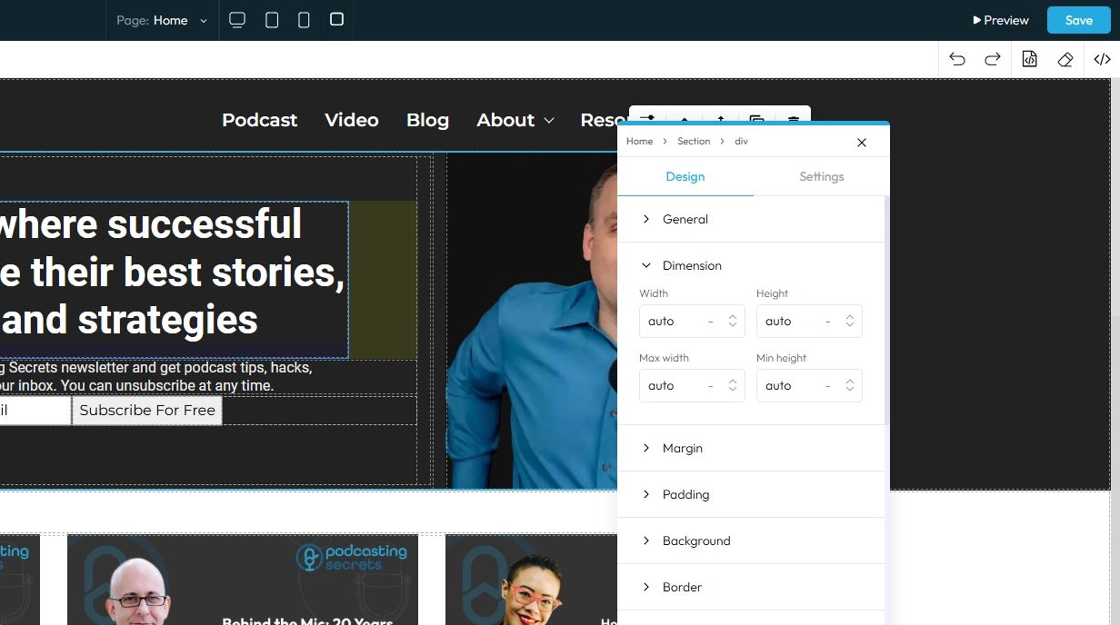
16. Click "Dimension" to adjust the dimensions as per your needs
- Width: Set the horizontal size of an element on a web page
- Height: Set the vertical size of an element on a web page
- Max. width: Set an upper limit for an element's width. The element will never be wider than this value, but it can be narrower
- Min height: Set a lower limit for an element's height. The element will never be shorter than this value, but it can be taller
Next to each of these elements, you can change the number and the unit of the feature. See below for an explanation of the units
- px (pixels): Like little dots on the screen.
200pxmeans 200 dots wide or tall. - % (percent): A part of something else.
50%means half the size of the box it’s in. - em: Grows with the text around it.
2emis 2 times bigger than the normal text. - rem: Like em, but always starts from the main page size.
1remis usually normal-size text. - vh (viewport height): How tall the screen is.
100vhmeans the whole height of the screen. - vw (viewport width): How wide the screen is.
100vwmeans the whole width of the screen.
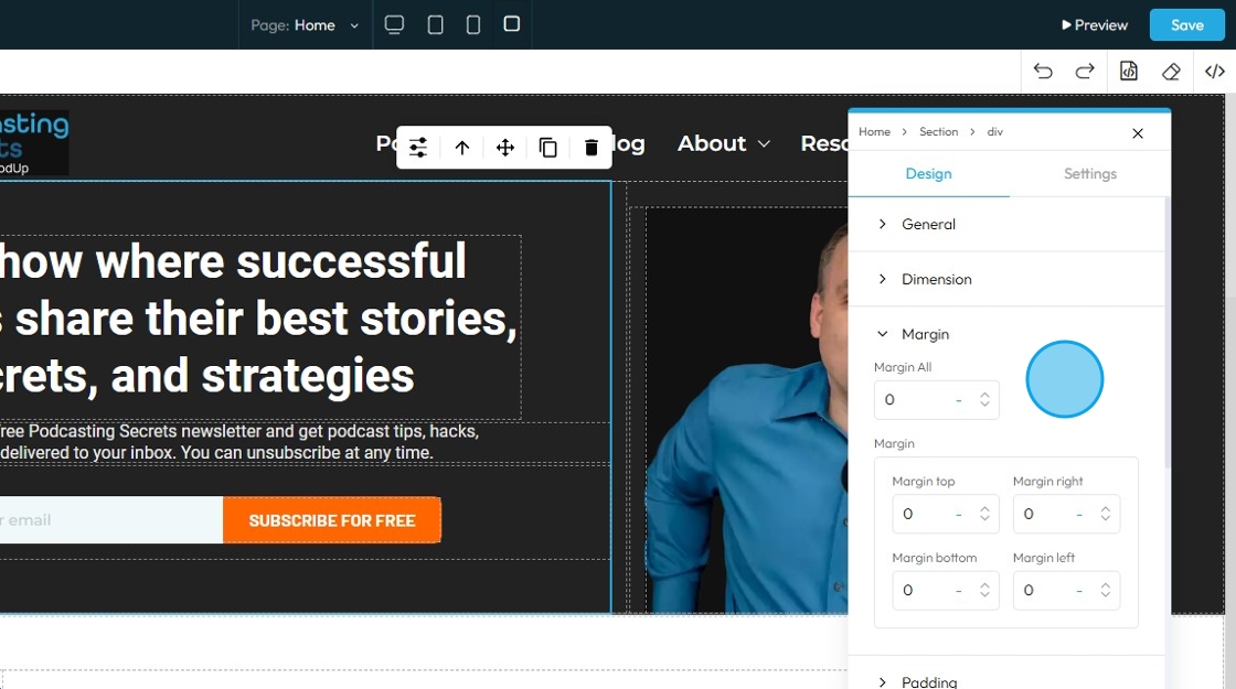
17. Click "Margin" to set the margin of the section
Margin is the space outside an element (like a box, image, or text block) on a webpage.
- Margin All: This is a shorthand property that allows you to set the margin for all four sides (top, right, bottom, and left) of an element simultaneously
- Margin top: Controls the space above an element. It pushes the element down from whatever is directly above it (e.g., another element, the browser window edge, or its parent container's top edge)
- Margin right: Controls the space to the right of an element. It pushes the element to the left from whatever is directly to its right
- Margin bottom: Controls the space below an element. It pushes the element up from whatever is directly below it
- Margin left: Controls the space to the left of an element. It pushes the element to the right from whatever is directly to its left
You can change the value (number) and the unit of the feature. See below for an explanation of the units
- px (pixels): Like little dots on the screen.
200pxmeans 200 dots wide or tall. - % (percent): A part of something else.
50%means half the size of the box it’s in. - em: Grows with the text around it.
2emis 2 times bigger than the normal text. - rem: Like em, but always starts from the main page size.
1remis usually normal-size text. - vh (viewport height): How tall the screen is.
100vhmeans the whole height of the screen. - vw (viewport width): How wide the screen is.
100vwmeans the whole width of the screen.
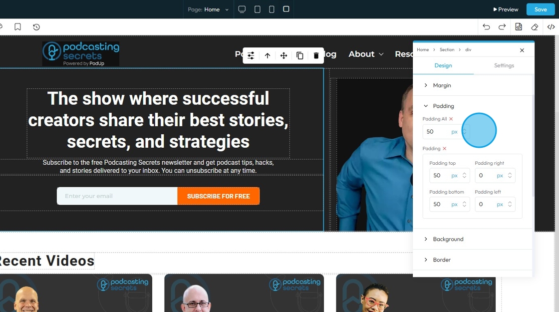
18. Click "Padding" to set the padding for the section
Padding: Padding creates inner space within an element. It pushes the element's content away from its own borders (and therefore away from its own edges)
- Padding all: This is a shorthand property that allows you to set the padding for all four sides (top, right, bottom, and left) of an element simultaneously.
- Padding top: Controls the inner space above an element's content. It pushes the content down from the element's top border
- Padding bottom: Controls the inner space below an element's content. It pushes the content up from the element's bottom border
- Padding right: Controls the inner space to the right of an element's content. It pushes the content to the left from the element's right border
- Padding left: Controls the inner space to the left of an element's content. It pushes the content to the right from the element's left border
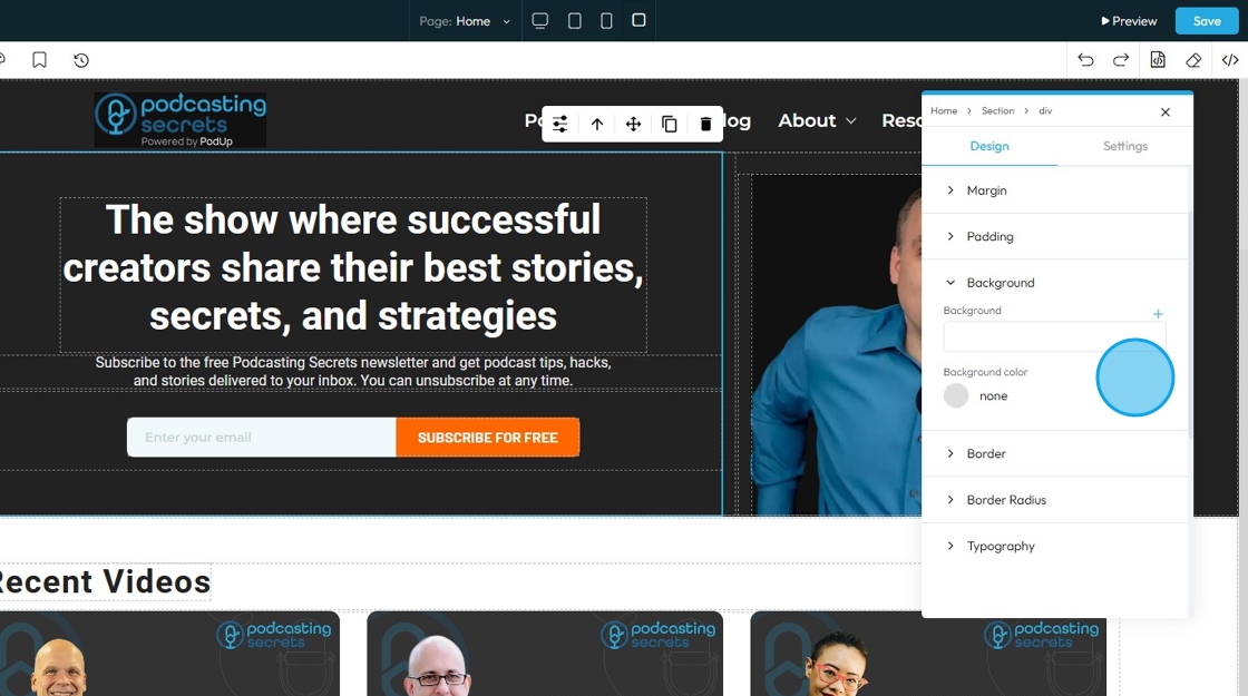
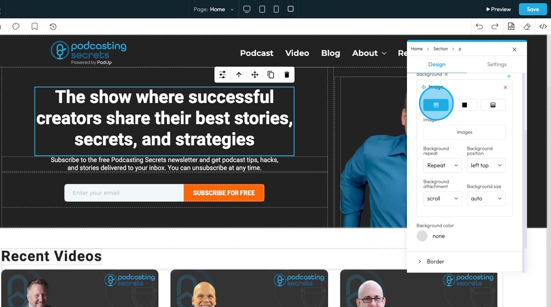
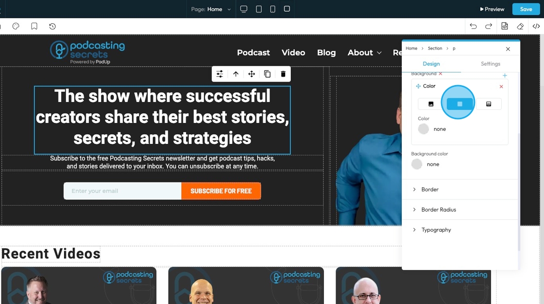
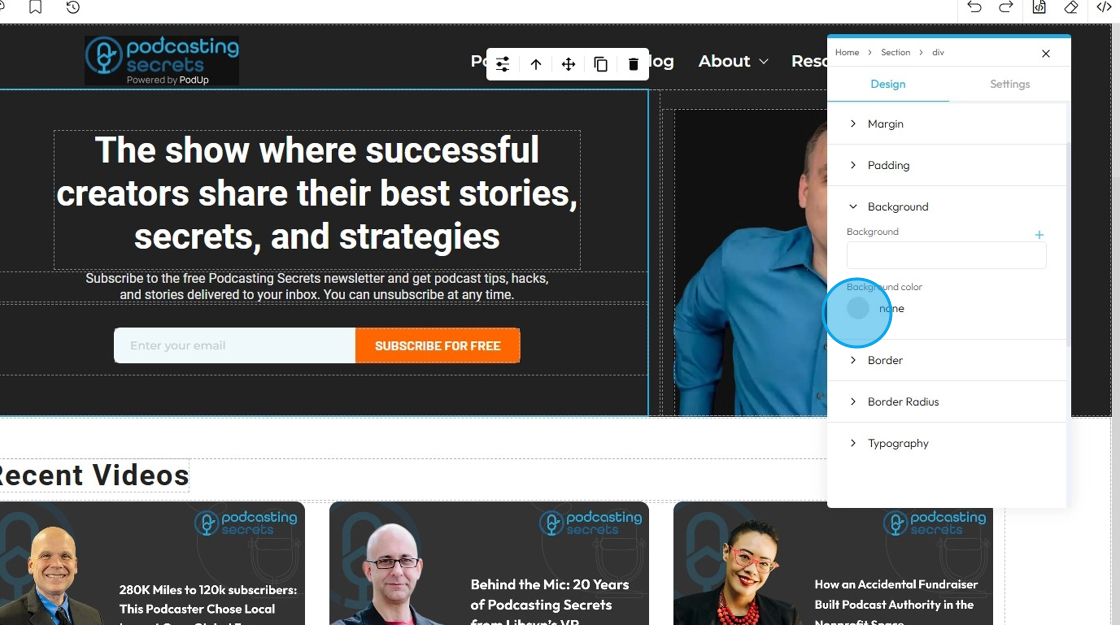
19. Click "Background color" to change the background color
- Background image: Allows you to place an image behind the content and padding of an element. This is powerful for creating visual interest, setting a mood, or conveying branding
- Click the plus arrow to add the image
- See steps 20 - 28 for more details on editing that image
- Background color: Sets a solid color behind the content and padding of an element
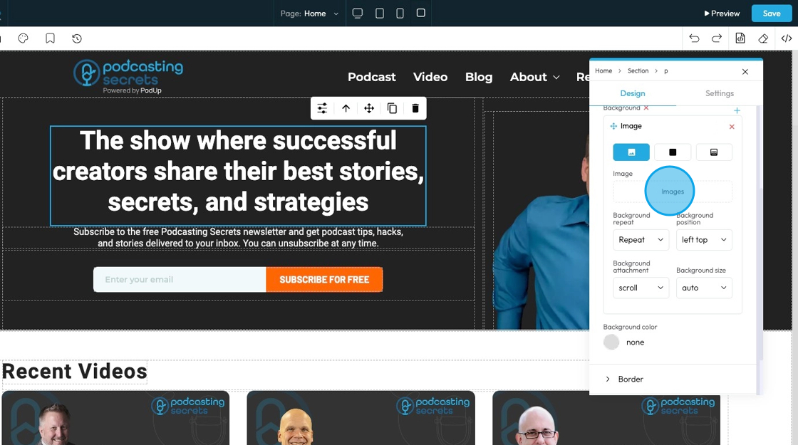
20. The first page will display the option for you to upload an image to the background
- Click "Images" to open a pop-up of the file manager where the image can be selected from the files already in PodUp or uploaded from the computer
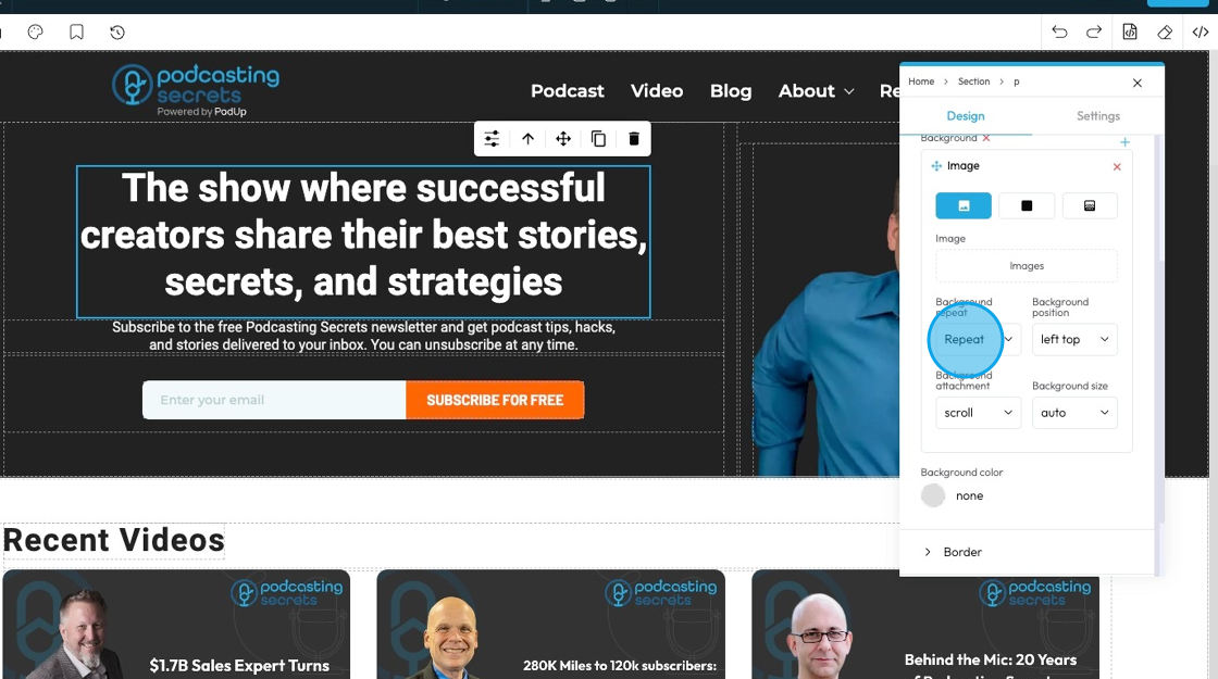
21. - Background repeat
- Repeat: The image repeats both side to side and top to bottom to fill the whole area.
- Repeat-x: The image only repeats horizontally (left to right).
- Repeat-y: The image only repeats vertically (top to bottom).
- No-repeat: The image shows only once and does not repeat at all.
- Space: The image repeats with extra space between each copy so they spread out evenly.
- Round: The image repeats and stretches or shrinks slightly so the copies fit perfectly across the space.
22. - Background position
- left top: The image is placed in the top-left corner of the element.
- left center: The image is placed on the left side, centered vertically.
- left bottom: The image is placed in the bottom-left corner.
- right top: The image is placed in the top-right corner.
- right center: The image is placed on the right side, centered vertically.
- right bottom: The image is placed in the bottom-right corner.
- center top: The image is centered horizontally and placed at the top.
- center center: The image is exactly in the middle of the element.
- center bottom: The image is centered horizontally and placed at the bottom.

23. - Background attachment
- scroll: The background image moves when you scroll the page
- fixed: The background image stays fixed in place while the content scrolls over it
- local: The background image moves when you scroll the content inside the element (like if the element has a scrollbar)
24. - Background size
- Auto: The background image displays at its original size without resizing
- Cover: The background image scales to cover the entire element, cropping if necessary to fill all space
- Contain: The background image scales to fit entirely inside the element without cropping, leaving empty space if needed

25. Click "Color" to select a specific color for the background or add a specific hex color
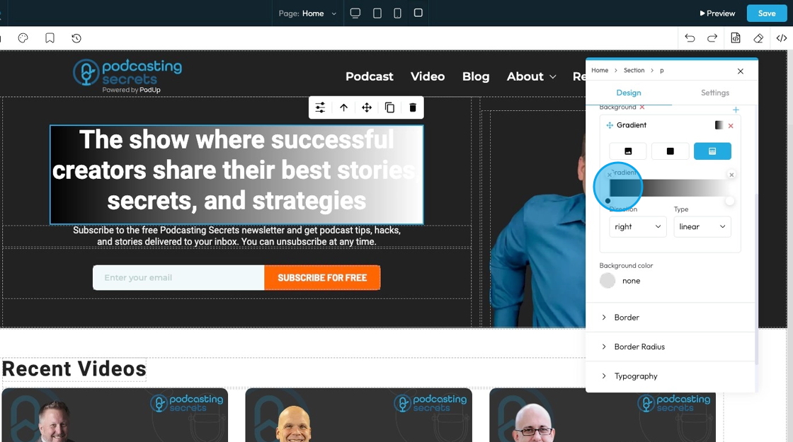
26. Click "Gradient" to create a gradient background
- Gradient: A gradual blend between two or more colors that creates a smooth transition, often used as a background effect instead of a solid color or image.
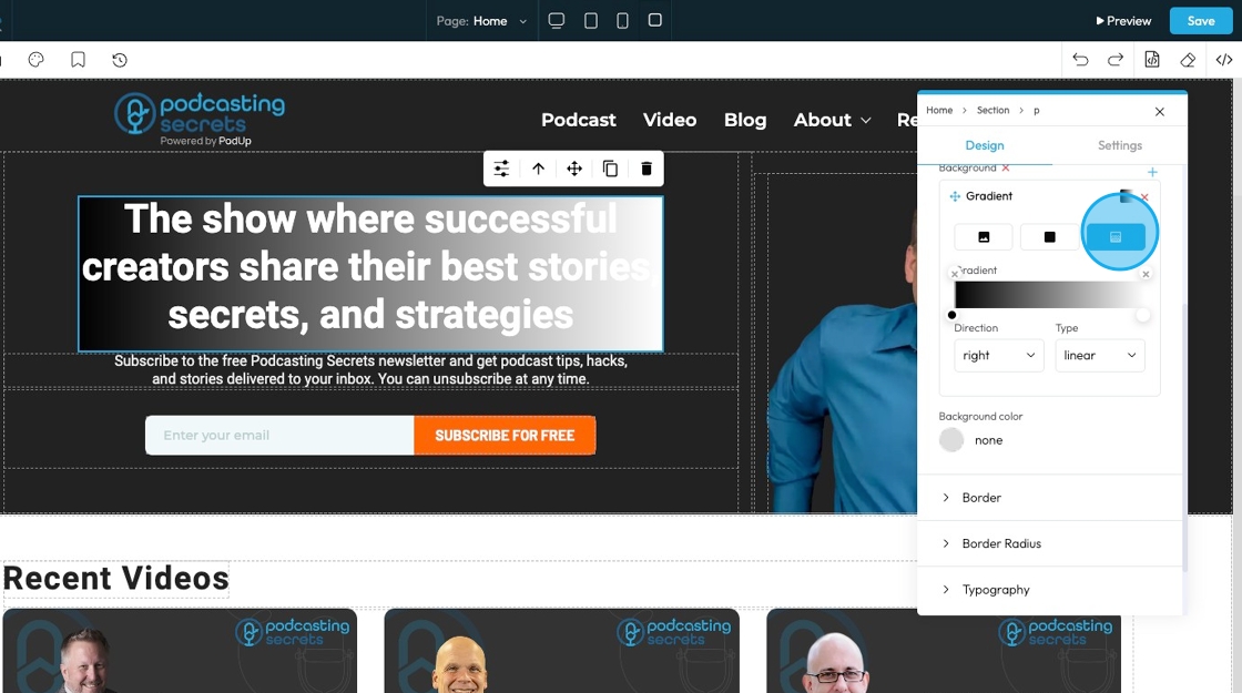
27. Select the point on the color bar to change the depth of the gradient.
- The closer the points the less drastic the color blend
- The further the points, the more drastic the color blend
- Click the colored dots at the bottom of the color spectrum to change the color of the gradient
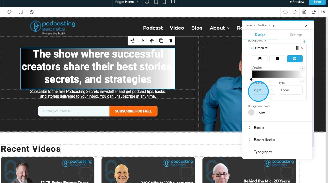
- For example, here the points are on opposite ends, so the blend goes all the way from black to white
28. - Direction that the gradient is flowing
- Right: The gradient flows horizontally from left to right across the element
- Bottom: The gradient flows vertically from top to bottom across the element
- Left: The gradient flows horizontally from right to left across the element
- Top: The gradient flows vertically from bottom to top across the element
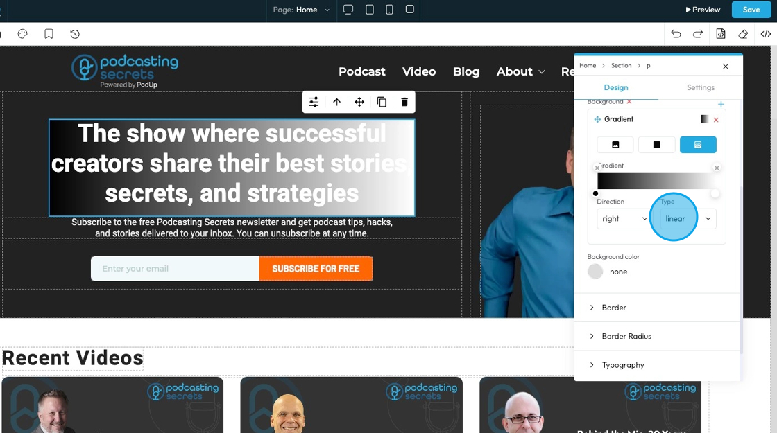
29. - Type: Chooses the style of gradient for the background of an element. It controls how the colors blend and flow.
- Linear Gradient: Blends colors in a straight line; useful for smooth transitions from one side to another.
- Radial Gradient: Blends colors outward in a circular or oval shape from the center; good for spotlight or ripple effects.
- Repeating-Linear Gradient: Repeats a linear gradient pattern; great for creating striped or repeated effects.
- Repeating-Radial Gradient: Repeats a radial gradient pattern in rings; useful for layered or ripple-style backgrounds.
30. Background color: Sets a solid color behind the content and padding of an element
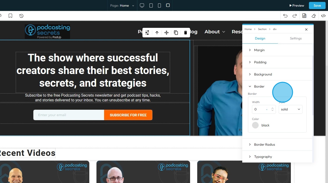
31. Click "Border" to set a shorthand property that allows you to set the border-width, border-style, and border-color for all four sides of an element simultaneously in a single input field
- Border Width: Controls the thickness of the border line. Change the size (number) and unit by adding a number and clicking 1 of the 5 following units
- px (pixels): Like little dots on the screen.
200pxmeans 200 dots wide or tall. - em: Grows with the text around it.
2emis 2 times bigger than the normal text. - rem: Like em, but always starts from the main page size.
1remis usually normal-size text. - vh (viewport height): How tall the screen is.
100vhmeans the whole height of the screen. - vw (viewport width): How wide the screen is.
100vwmeans the whole width of the screen.
- px (pixels): Like little dots on the screen.
- Border Color: Defines the color of the border line
- Can be selected from a color spectrum or through a hex code
- Border Style: Determines the visual pattern or type of the border line. This is crucial for how the border actually looks
- None: No border will be shown around the element — the element will have no visible edge, line, or outline.
- Solid: a single, unbroken line as the border
- Dotted: a border made of evenly spaced round dots
- Dashed: a border made of short, straight dashes
- Double: two solid lines with space between them
- Groove: a carved or pressed-in effect that makes the border look like it's grooved
- Ridge: the opposite of groove; a raised, 3D effect that looks like the border sticks out
- Inset: makes the border appear pushed into the page, giving a sunken effect
- Outset: makes the border appear to pop out from the page, creating a raised look
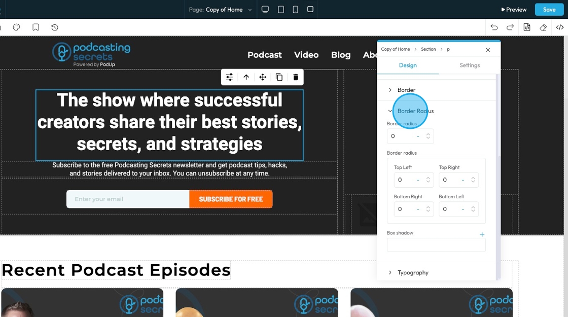
32. Click "Border Radius"which allows you to round the corners of an element. Instead of sharp, 90-degree angles, the corners become smooth curves. When set as a single value, it applies uniformly to all four corners
Top Left: Rounds the top-left corner of the element.
Top Right: Rounds the top-right corner of the element.
Bottom Right: Rounds the bottom-right corner of the element.
Bottom Left: Rounds the bottom-left corner of the element.
Box Shadow: Adds a shadow effect around the border-box of an element. This creates a visual depth, making the element appear as if it's lifted off the page
Click the plus arrow to add the shadow
It will give you these options
X (horizontal offset): moves the shadow left or right; positive values move it right, negative values move it left
Y (vertical offset): moves the shadow up or down; positive values move it down, negative values move it up
Blur: controls how soft or sharp the shadow is; 0 means a sharp edge, higher numbers make the shadow more blurred and spread out
Spread: Controls how big the shadow looks. A higher number makes the shadow wider and more noticeable.
Color: Click the colored dot to pick the color from the color spectrum or to insert your hex code
- Hex Code: A six-digit code used in web design to represent a specific color. It starts with a # symbol followed by numbers and letters (like #FF5733). This can help you stay consistent with your colors
Type (Inside or Outside):
Inside: The shadow shows up inside the letters.
Outside: The shadow shows up around the letters.
Change the unit of X, Y, and blur by selecting the "px" next to the number
Next to each of these elements, you can change the number and the unit of the feature. See below for an explanation of the units
- px (pixels): Like little dots on the screen.
200pxmeans 200 dots wide or tall. - % (percent): A part of something else.
50%means half the size of the box it’s in. - em: Grows with the text around it.
2emis 2 times bigger than the normal text. - rem: Like em, but always starts from the main page size.
1remis usually normal-size text. - vh (viewport height): How tall the screen is.
100vhmeans the whole height of the screen. - vw (viewport width): How wide the screen is.
100vwmeans the whole width of the screen.
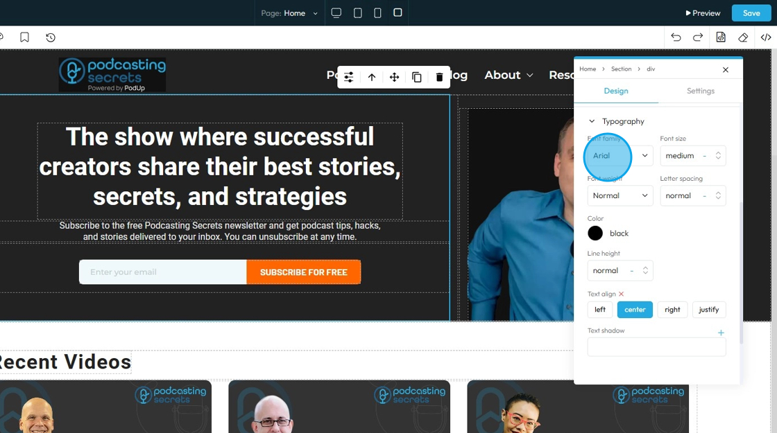
33. Click "Typography" to change the font, size, color, alignment etc. of the text
- Font family: Select the typeface (the specific design of the letters) to be used for the text
34. - Font Size: Controls the height of the characters in your text
- The bigger the number the bigger the character
- The unit can be changed to adjust to the specific project you are working in. Generally px is easiest
- px (pixels): Like little dots on the screen.
200pxmeans 200 dots wide or tall. - % (percent): A part of something else.
50%means half the size of the box it’s in. - em: Grows with the text around it.
2emis 2 times bigger than the normal text. - rem: Like em, but always starts from the main page size.
1remis usually normal-size text. - vh (viewport height): How tall the screen is.
100vhmeans the whole height of the screen. - vw (viewport width): How wide the screen is.
100vwmeans the whole width of the screen.
- px (pixels): Like little dots on the screen.

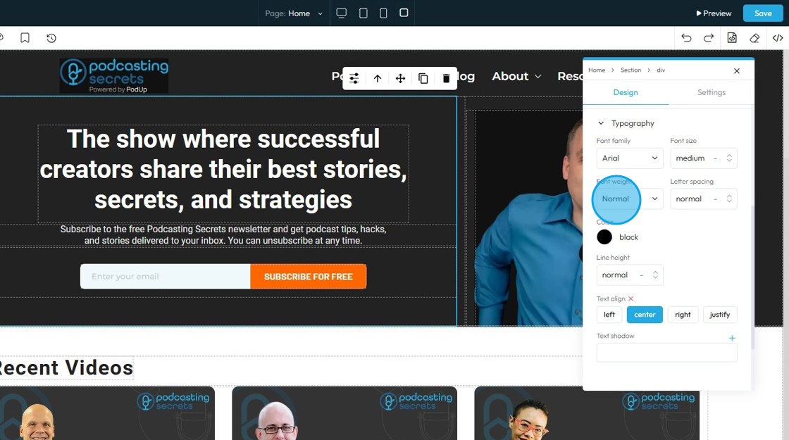
35. - Font Weight: Controls the boldness or thickness of the text characters
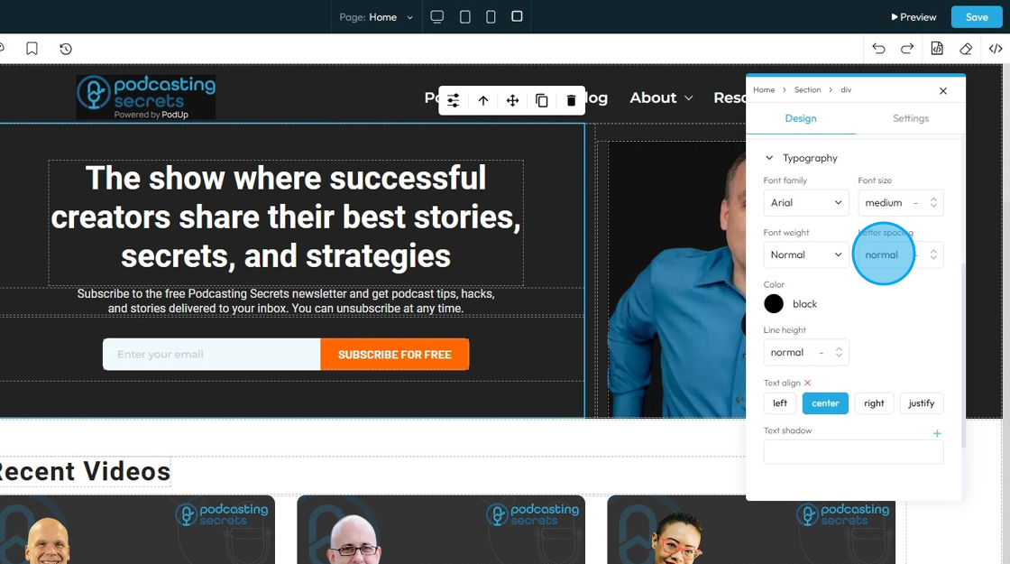
36. - Letter Spacing: Controls the horizontal space between individual characters (letters) within a word. Also known as "tracking" in traditional typography
- The bigger the number the more space between the characters
- Change the unit by clicking the blue dash next to the number
- px (pixels): Like little dots on the screen.
200pxmeans 200 dots wide or tall. - % (percent): A part of something else.
50%means half the size of the box it’s in. - em: Grows with the text around it.
2emis 2 times bigger than the normal text. - rem: Like em, but always starts from the main page size.
1remis usually normal-size text. - vh (viewport height): How tall the screen is.
100vhmeans the whole height of the screen. - vw (viewport width): How wide the screen is.
100vwmeans the whole width of the screen.
- px (pixels): Like little dots on the screen.
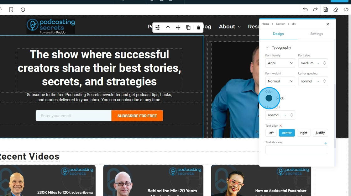
37. - Color: Sets the color of the text characters themselves
- Click the colored dot to pick the color from the color spectrum or to insert your hex code
- Hex Code: A six-digit code used in web design to represent a specific color. It starts with a # symbol followed by numbers and letters (like #FF5733). This can help you stay consistent with your colors
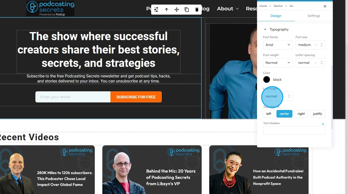
38. - Line Height: Controls the vertical space between lines of text within a paragraph or text block. Also known as "leading" in traditional typography
- 1 is the standard spacing size
- Change the units by selecting the dash next to the number
- px (pixels): Like little dots on the screen.
200pxmeans 200 dots wide or tall. - % (percent): A part of something else.
50%means half the size of the box it’s in. - em: Grows with the text around it.
2emis 2 times bigger than the normal text. - rem: Like em, but always starts from the main page size.
1remis usually normal-size text. - vh (viewport height): How tall the screen is.
100vhmeans the whole height of the screen. - vw (viewport width): How wide the screen is.
100vwmeans the whole width of the screen.
- px (pixels): Like little dots on the screen.
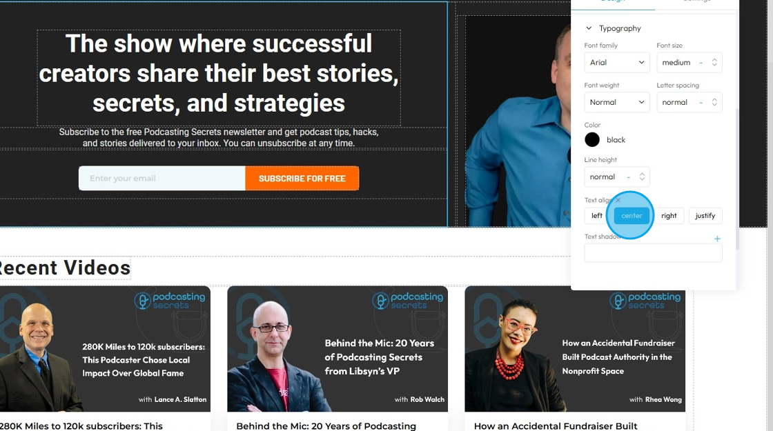
39. - Text align: Controls the horizontal alignment of text and inline content within its containing element (e.g., a paragraph, heading, button, or column). It dictates where the text begins and ends horizontally within the available space of its parent
- Left: Align the text to the left edge of its container. The right edge of the text will appear "ragged" or uneven
- Center: Centers the text horizontally within its container. Both the left and right edges of the text will appear ragged
- Right: Aligns the text to the right edge of its container. The left edge of the text will appear ragged
- Justify: When you apply "justify" to a block of text, the browser will stretch the text lines so that both the left and right edges are flush (aligned) with the container's boundaries. This creates a very neat, block-like appearance for the paragraph, similar to how text is often formatted in newspapers, books, and magazines
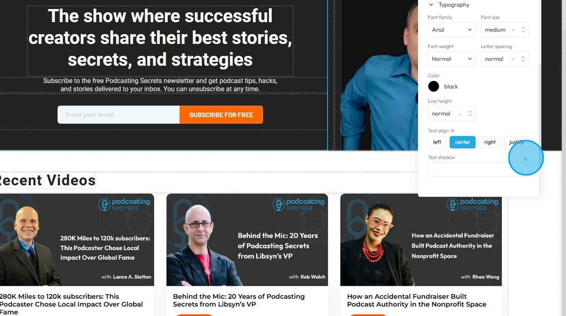
40. - Text Shadow: Adds a shadow effect directly behind the text characters. This can be used to make text stand out, improve readability against busy backgrounds, or add a decorative touch
- Click the plus arrow to add the shadow
- It will give you these options
- X (horizontal offset): moves the shadow left or right; positive values move it right, negative values move it left
- Y (vertical offset): moves the shadow up or down; positive values move it down, negative values move it up
- Blur: controls how soft or sharp the shadow is; 0 means a sharp edge, higher numbers make the shadow more blurred and spread out
- Color: Click the colored dot to pick the color from the color spectrum or to insert your hex code
- Hex Code: A six-digit code used in web design to represent a specific color. It starts with a # symbol followed by numbers and letters (like #FF5733). This can help you stay consistent with your colors
- Change the unit of X, Y, and blur by selecting the "px" next to the number
- px (pixels): Like little dots on the screen.
200pxmeans 200 dots wide or tall. - em: Grows with the text around it.
2emis 2 times bigger than the normal text. - rem: Like em, but always starts from the main page size.
1remis usually normal-size text. - vh (viewport height): How tall the screen is.
100vhmeans the whole height of the screen. - vw (viewport width): How wide the screen is.
100vwmeans the whole width of the screen.
- px (pixels): Like little dots on the screen.
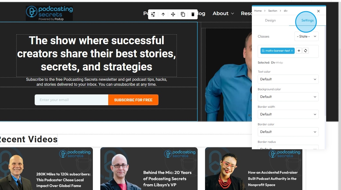
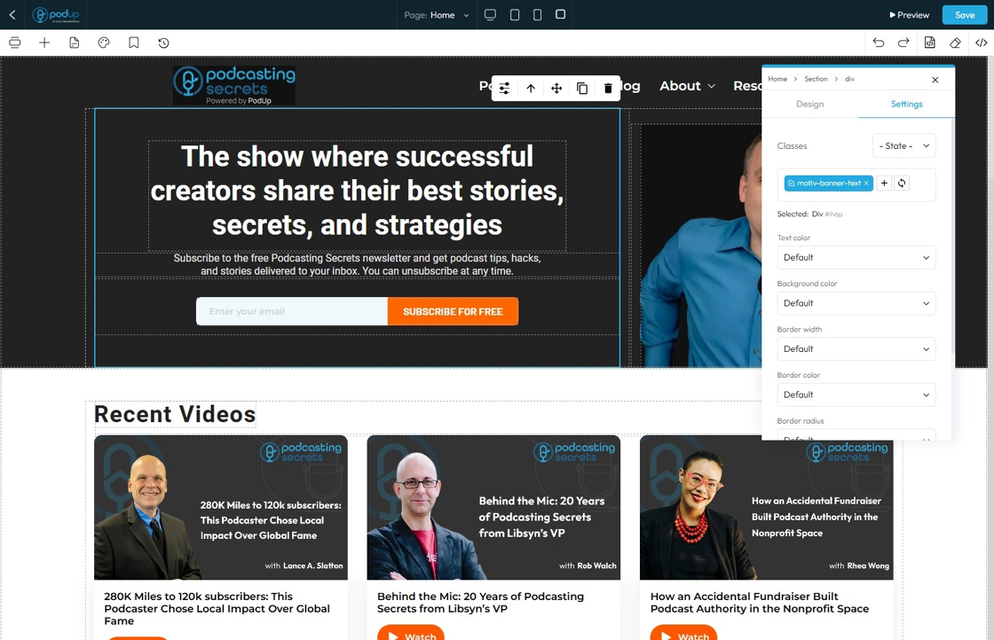
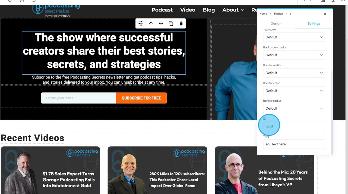
41. Click "Settings" to customize each specific element. This menu will be different sepending on what you are editing. This specific element offers options to edit Text color, Background color, Border width, Border color, Border radius, ID and Title
- Classes: Is essentially a reusable set of styles that you can apply to multiple elements across your website. Instead of setting the font-size, color, padding, margin, etc., individually for every button, you create a "Button" class and apply it to all your buttons. If you later decide to change the button color, you only change it once in the "Button" class definition, and all buttons with that class update automatically
- Hover: This allows you to define a special set of styles that apply only when a user's mouse cursor is hovering over an element that has this class. It adds interactivity and visual feedback
- Click: This allows you to define a special set of styles that apply when an element is being actively clicked or pressed down by the user. It provides immediate visual feedback that the user's action is being registered
- Even/Odd: This allows you to apply different styles to elements based on their position in a sequence (even or odd number) within a common parent. This is incredibly useful for creating visual patterns, like "zebra striping" in lists or tables
42. Options under "Settings"
- Lead?: A class you can add to a paragraph to make the text look bigger and easier to read. It's often used for the first line or intro text on a page so it stands out more.
- Select "Yes" or "No"
43. - Text Color: This property directly changes the color of the text characters within an element
- Default: The standard text color used by the website theme
- Primary: A bold color used to highlight main actions or important text
- Secondary: A softer color used for less important or supporting text
- Success: A green-like color often used to show something positive, like a success message
- Info: A blue-like color used to show helpful or informational text
- Warning: An orange or yellow color used to alert users without being too alarming
- Danger: A red-like color used to show errors or serious warnings
- Light: A very light or gray color, usually used on dark backgrounds
- Dark: A dark gray or near-black color, used on light backgrounds for strong contrast
- White: Pure white text, best used on dark or colored backgrounds for readability

44. - Background Color: Sets a solid color that fills the background area of an element. This color sits behind the element's content and its padding, but inside its border
- Default: The standard background color set by the theme
- Primary: A main brand color used to highlight key areas or buttons
- Secondary: A supporting color that complements the primary color
- Success: A green-toned background often used to show success messages or positive status
- Info: A blue-toned background used to display helpful or informational content
- Warning: A yellow or orange background used to show caution or warning messages
- Danger: A red-toned background used to alert users to errors or serious issues
- Light: A very light background, often gray or off-white, for a clean, subtle look
- Dark: A dark gray or black background, used for bold sections or contrast
- White: A pure white background, often used for clean and simple sections

45. - Border Width: Controls the thickness of the line that forms the border around an element
- Default: Uses the standard border size set by the website theme
- Full: Adds a border to all four sides of the element
- No Top: Removes the border from the top side only
- No Right: Removes the border from the right side only
- No Bottom: Removes the border from the bottom side only
- No Left: Removes the border from the left side only
- None: Removes the border from all sides of the element

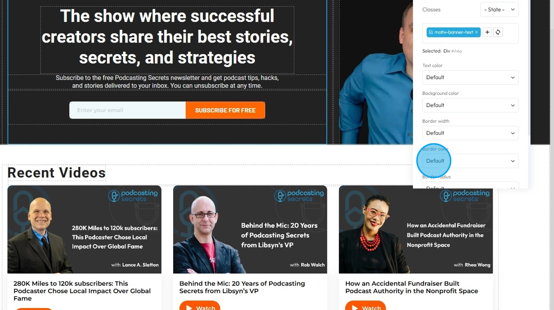
46. - Border Color: Defines the color of the border line
- Default: The standard border color based on the website’s theme
- Primary: A bold color used to highlight or emphasize the border
- Secondary: A softer, supporting color for a more subtle border look
- Success: A green-toned border often used to show something positive or approved
- Info: A blue-toned border used for helpful or informational content
- Warning: A yellow or orange border to draw attention or show a caution
- Danger: A red-toned border used to show an error or alert
- Light: A pale or gray border for a minimal, clean design
- Dark: A deep gray or black border for strong contrast or bold sections
- White: A white border, best used on dark backgrounds for visibility
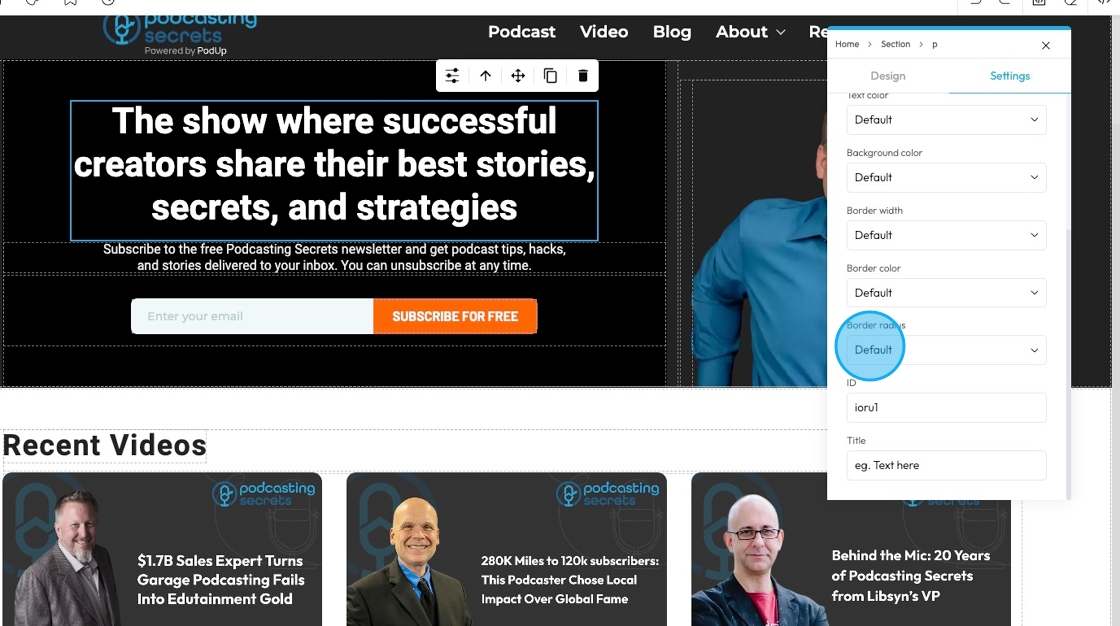
47. - Border Radius: This property rounds the corners of an element's border (and its background and content area). Instead of sharp 90-degree corners, you get smooth, curved ones
- Default: Uses the standard corner style set by the website theme
- Rounded: Softens all four corners of the element for a smooth, curved look
- Rounded Top: Only the top-left and top-right corners are rounded
- Rounded Right: Only the top-right and bottom-right corners are rounded
- Rounded Bottom: Only the bottom-left and bottom-right corners are rounded
- Rounded Left: Only the top-left and bottom-left corners are rounded
- Circle: Makes the element fully circular (works best on square elements)
- Square: Removes all rounding for sharp, straight corners on all sides
48. - ID: An "ID" (short for Identifier) is a unique label you give to an element so you can style it, link to it, or control it separately from everything else on the page.
- Customize it in the text field
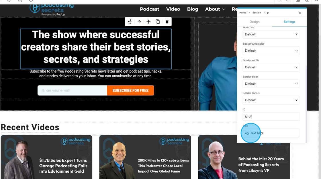
49. - Title: The "Title" attribute provides additional, non-critical information or a brief description about an element
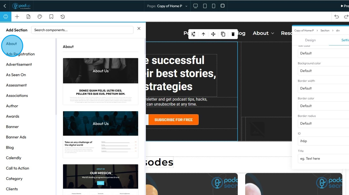
50. Click "Components" to add, move, delete, or rearrange components without affecting other parts of the page
Components (sometimes also called "blocks," "widgets," "modules," or "elements") are essentially pre-built, reusable building blocks that you drag and drop onto your webpage to construct its layout and add content. They are the fundamental units that make up your website, allowing you to create a complex site without needing to write code from scratch
Think of components like LEGO bricks. Each brick has a specific shape and function, and you combine them in various ways to build a complete structure
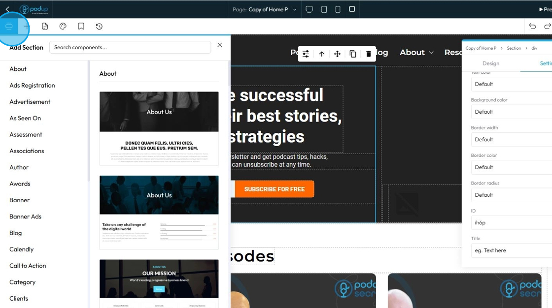
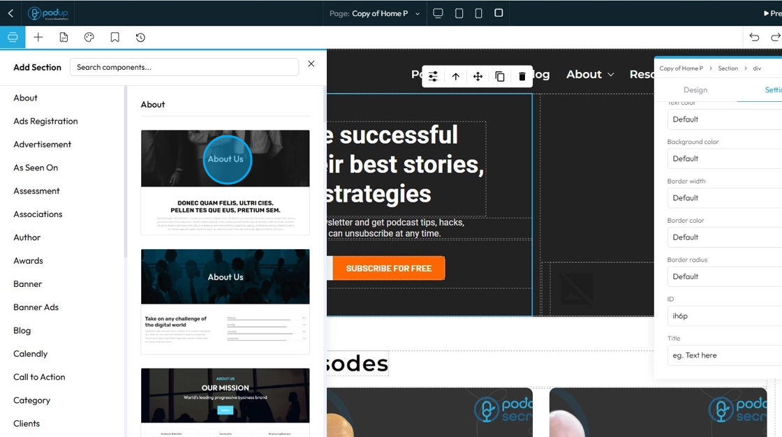
51. Choose from over 50 sections "About, Ad Registration, ect."
52. Each section has many different components, so you can choose the style that best fits with your website and brand
- Click on the desired component to add it to your website, where you can then select if you want the default style or the global style
- Global Style: These are settings that apply to many elements across your entire website. When you change a global style (like font, color, or spacing), it updates everywhere that style is used, keeping your design consistent.
- Default Style: This is the basic style an element uses if you don't change anything. It's often set by your website’s theme or global styles. You can leave it as-is or customize it for specific elements.
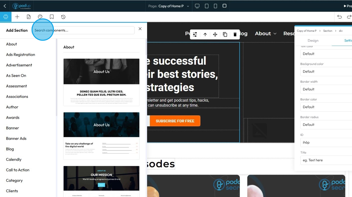
53. Search for specific components using the search bar
54. Click "Blocks" to add different elements to your page
Elements are self-contained units of content and design. Each element represents a specific piece of functionality or content that you can add to your page. When you drag an "Image" element onto your page, for instance, you're not just adding a space for an image; you're adding a complete, pre-configured structure that's ready for you to upload an image and apply specific styling
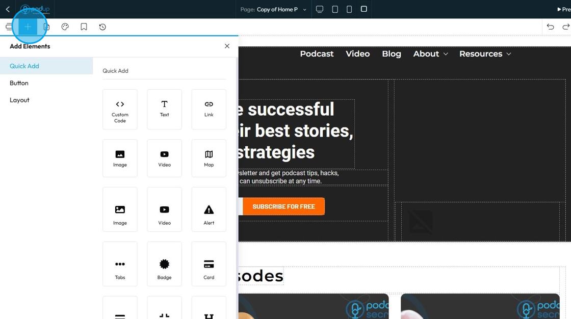
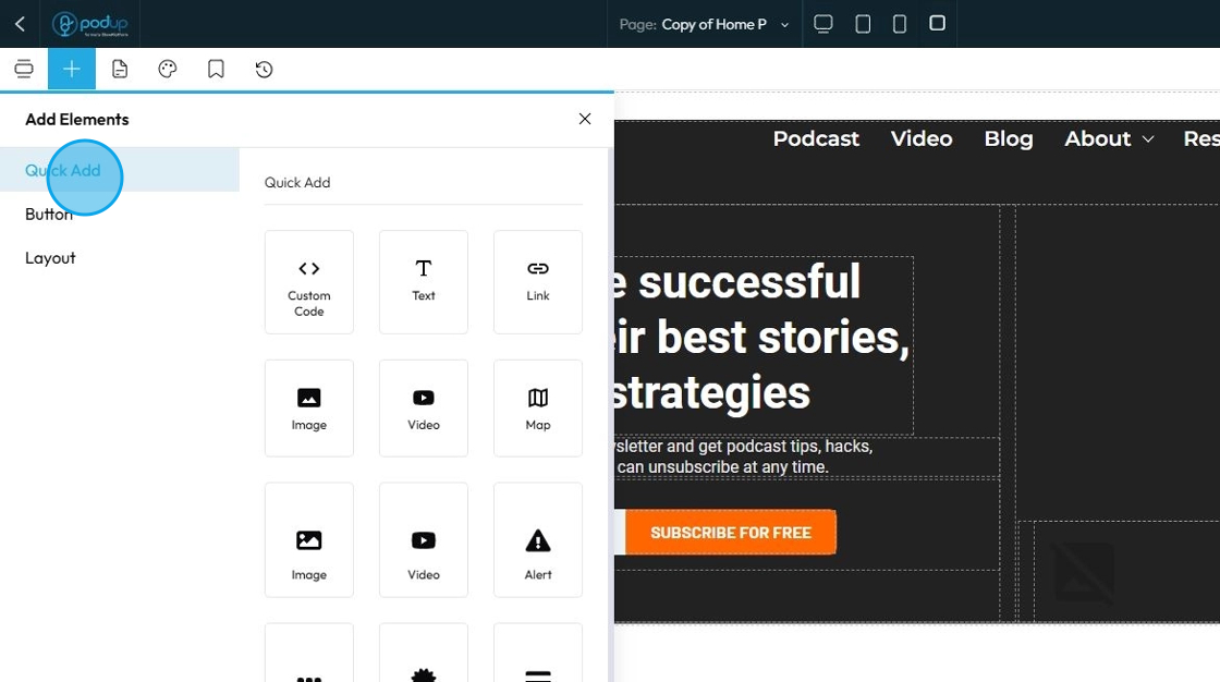
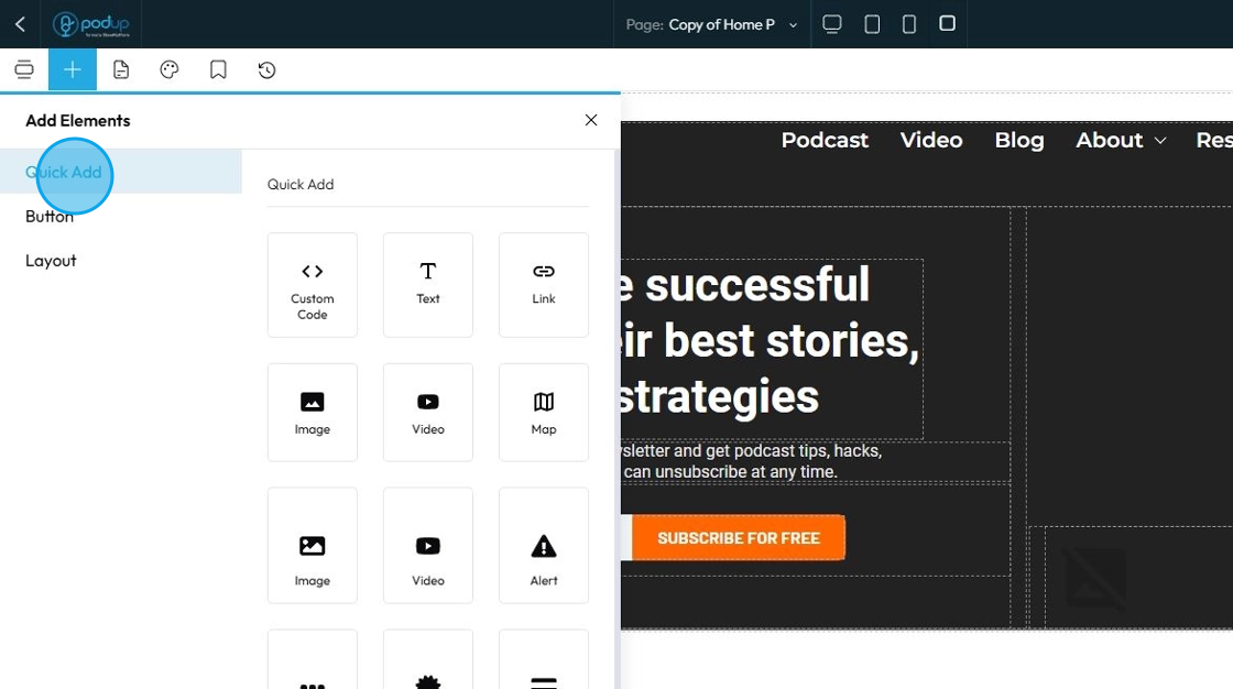
55. Click "Quick Add" to add the following elements to your page by dragging and dropping it in the desired location
- Custom Code: This is a powerful, advanced element that allows you to insert your own raw HTML, CSS, or JavaScript code directly into your webpage
- Text: This option lets you quickly add a text box or paragraph to your page. You can type anything you want—like titles, descriptions, or content—and then style it by changing the font, size, color, alignment, and spacing.
- Link: A Link, or more formally a hyperlink, creates a clickable connection from one piece of text or an object (like an image or button) to another resource
- Image: Allows you to display static visual images on your webpage
- Video: Enables you to embed video content directly onto your webpage
- Map: Allows you to embed an interactive map directly into your webpage
- Alert: Displays short, attention-grabbing messages to the user. These messages are typically used for notifications, warnings, errors, or success confirmations
- Tabs: Organizes and display a large amount of content in a compact space by dividing it into distinct, clickable panes. Users can click on a tab title to reveal the corresponding content section
- Badge: Small, non-interactive visual component used to display a small piece of information, often a count, status, or label. They are usually compact and often appear on or near other elements
56. More elements under "Quick Add"
Card: A box that holds content like text, images, and links. It usually has padding, a border, and sometimes a shadow to help it stand out.
- Display things like features, team members, blog posts, or product info in a clean and organized way.
Card Container: A layout tool that holds multiple cards and arranges them evenly—often in rows or grids. It helps you keep a group of cards aligned and spaced correctly, especially on different screen sizes.
- Use it when you want to display several cards together as a section.
Collapse: Hide and show content with a click or tap. It typically consists of a clickable header/title that, when activated, expands to reveal a hidden content area, and then collapses when clicked again
Header: Designed to define the topmost section of a webpage or an entire website. It's meant to contain essential site-wide elements like the logo, navigation menu, and sometimes a call to action or search bar
Paragraph: Designed for displaying standard body text or longer blocks of written content. It is the go-to element for all the descriptive text on your website
Form: A container that holds and organizes input fields (like checkboxes, radio buttons, text fields). It also allows users to submit the information. For example, a contact form or newsletter signup.
Checkbox – A small box that users can click on or off. It's used when users can choose multiple options from a list (e.g., "Subscribe to updates", "I agree to the terms").
Radio: A round button used when users must choose only one option from a group (e.g., "Male", "Female", "Prefer not to say"). Once one is selected, the others are automatically unselected.
Label: Text connected to an input field (like a checkbox or radio). It tells users what the field is for. Clicking a label will often activate the input it's linked to, making forms more user-friendly.
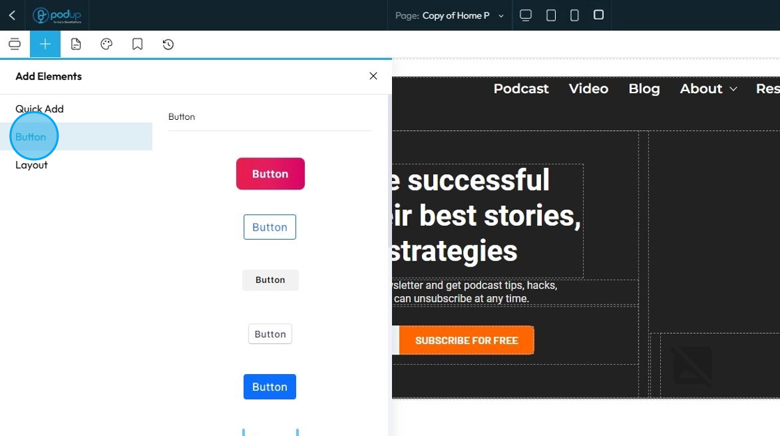
57. Click "Button" to add buttons to your web page
A Button element creates a clickable interactive component that users can press to trigger an action or navigate to another location. It's essentially a specially styled link or form submission trigger
Over 30 button styles. Click to add it to the webpage or drag and drop it in the desired location
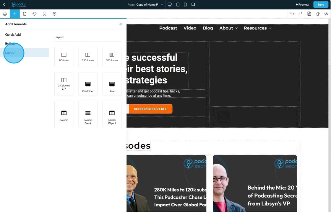
58. Click "Layout" to add layouts to your web page
Layout refers to the collection of structural elements and tools dedicated to arranging and organizing content on your page
- 1 Column: Creates a full-width row with a single column inside it. All content placed here will span the entire available width
- 2 Column: Creates a row divided into two vertical columns, often of equal width (50%/50% split by default). This is perfect for side-by-side content like an image next to text
- 3 Columns: Creates a row divided into three vertical columns, often of equal width (33.33%/33.33%/33.33% split by default). Ideal for displaying multiple items like service features or product highlights
- 2 Columns 3/7: This is a specific type of "2 Columns" layout, but instead of being equal width (50%/50%), the columns are proportionally split. "3/7" means one column takes up 3 parts of the available width, and the other takes up 7 parts (out of a total of 10 parts). This creates an asymmetrical layout
- Container: To constrain content flow, ensure readability, and simplify applying styles to a collection of elements
- Row: Horizontal container that acts as the primary means of dividing your webpage vertically into distinct blocks. Its main purpose is to hold one or more "Column" elements
- Column: Vertical container that sits inside a "Row." Its purpose is to divide the horizontal space of its parent row into smaller vertical segments, allowing you to place content side-by-side
- Column Break: Utility element used to force the content that follows it to start on a new line or in the next available column
- Media Object: Pre-configured layout pattern designed to efficiently display an image positioned to one side of a block of content
59. Click "Pages" to add
"Pages" is your central hub for managing the overall structure, hierarchy, and content of your website's individual pages. It's where you define what pages exist on your site and how they are organized and linked together
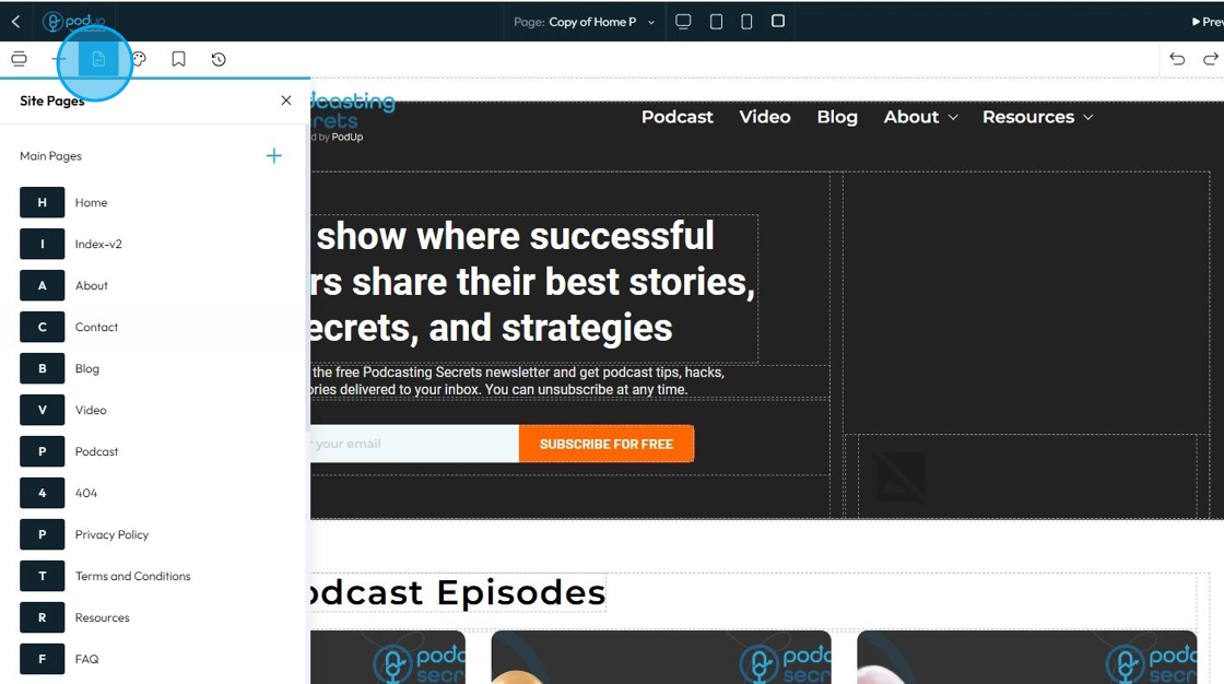
60. Add a new page by clicking on the plus sign
61. It will open to a page to insert page details
- Title: The name of the page that often appears in the navigation menu and at the top of the browser tab.
- Description: A short summary of what the page is about, often used internally or for SEO purposes.
- URL: The web address of the page (example:
yourwebsite.com/about-us). You can usually customize this to be short and clear. - Home Page: A setting that marks this page as the main landing page of your website (the one that opens at
yourwebsite.com). - Header: The top section of your website that often includes the logo, navigation menu, and sometimes contact info. This can be toggled on/off for each page.
- Footer: The bottom section of your website that usually contains links, contact details, or legal info. Like the header, you can choose whether it shows on each page.
- Meta Title: The title that shows in search engine results. It's different from the page title and is meant to attract clicks.
- Meta Keywords: A list of keywords (separated by commas) that describe the content of your page. These are less important for modern SEO but some builders still include them.
62. To edit the details of a pre-created page
- General: This section includes basic settings for the page, such as the title, URL, and whether the header or footer is visible.
- SEO: This section lets you add meta titles, descriptions, and keywords to help your page show up in search engine results.
- Duplicate: This creates a copy of the page with the same content and layout, which you can then edit separately.
- Rename: This lets you change the name of the page, which may update the title shown in menus or tabs.
- Show/Hide: This controls whether the page is visible to visitors on your live site or hidden from view.
- Delete: This permanently removes the page from your website.
63. Click "Global Design"
Global Style Settings are a centralized control panel where you define the default visual appearance of your entire website. Instead of styling each individual element on every single page, global styles allow you to set foundational design rules that apply universally across your site.
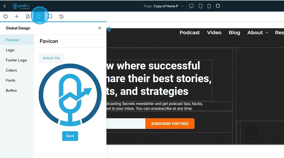
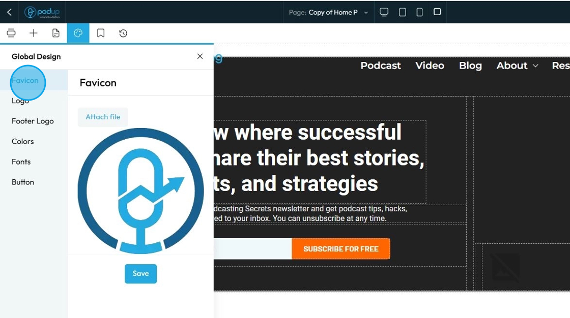
64. Click "Favicon" to add your favorite icon
A Favicon (short for "favorite icon") is a small, square, iconic image that represents your website
Click "Attach file" to add the image then click "Save" once you have chosen your favicon
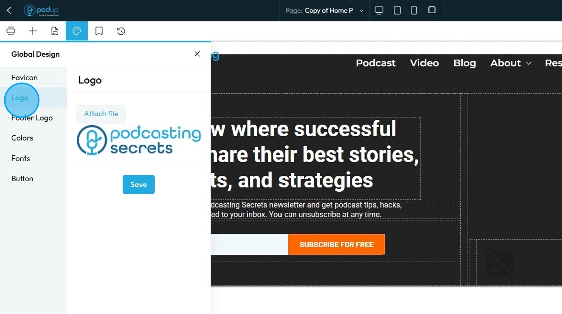
65. Click "Logo" to add logo
"Logo" refers to the graphical mark or emblem that represents your brand, company, or personal identity on your website
Click "Attach file" to add the logo then click "Save" to apply the changes
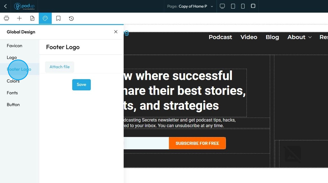
66. Click "Footer Logo" to add a logo at the footer section of your website
The Footer Logo is an instance of your brand's logo that is specifically placed within the footer section of your website. The footer is the bottommost section that appears consistently across all or most pages of your site, typically containing copyright information, navigation links, contact details, and sometimes social media links
Click "Attach file" to add the footer logo then click "Save" to apply the changes
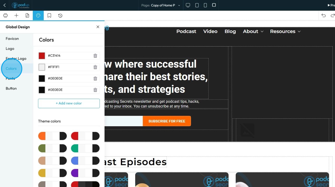
67. Click "Color"
When you manage "Color" in the Global Design section, you're not just setting the color for one specific piece of text or one background. Instead, you're defining the entire color palette and scheme for your entire website. These are your brand's official colors that will be available and applied across all pages and elements by default
Pick theme colors or add your own colors by clicking "+ Add new color"
To change the color
Click the colored box where you can select the color from the color spectrum or insert a specific number using Hex, rgb, or hsl
Hex: A 6-digit code that starts with
#(like#FF5733). It defines color using combinations of red, green, and blue in hexadecimal format. Common in web design.rgb: Stands for Red, Green, Blue. It defines color using three numbers (like
rgb(255, 87, 51)), where each number ranges from 0 to 255 to mix the right shade.hsl: Stands for Hue, Saturation, Lightness. It defines color based on:
Hue (0–360 degrees on a color wheel),
Saturation (intensity of the color), and
Lightness (brightness from black to white). Example:
hsl(12, 100%, 60%).
Each method produces the same result—a specific color—just in different formats.
Click "Save"
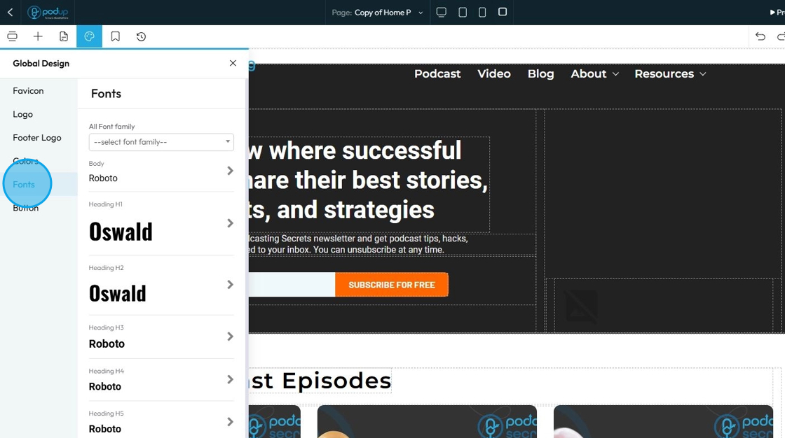
68. Click "Fonts"
"Fonts" in your Global Design settings means you are defining the default typefaces, sizes, and styles for all text elements across your entire website
Click "Save"
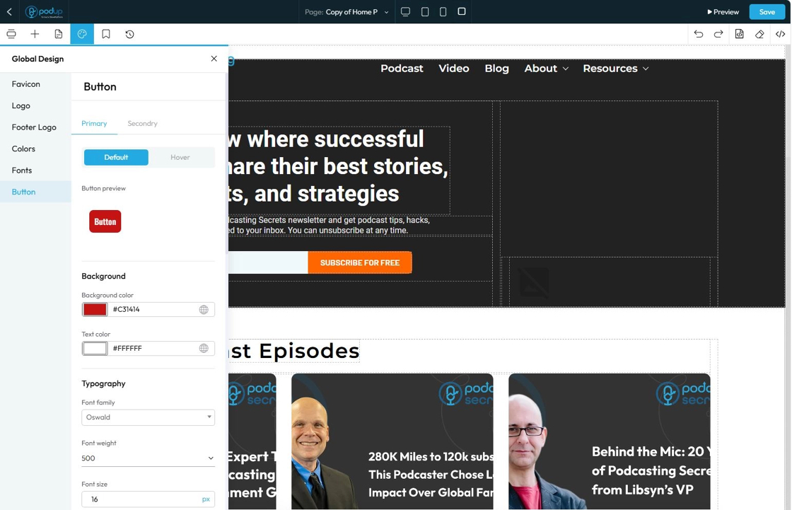
69. Click "Button" under Global Design settings
"Button" settings in the Global Design section, you are defining the default visual appearance for all (or specific types of) buttons across your entire website. This ensures that every time you add a new button, it automatically adopts a consistent, on-brand look and feel without you having to manually style it each time
- Primary: Used for the main action on a page, like "Submit" or "Save." It usually has a bold or standout color to draw attention.
- Default shows how the button looks sitting on the website
- Hover shows how the button looks when the cursor is over the button
- This can look the same as the default, or it can be different to add an interactive element to your site
- A preview of the button will appear to demonstrate how the button will appear on the main page
- This can be customized like editing a main element
- See steps 14-47
- Secondary: Used for less important actions, like "Cancel" or "Learn More." It typically has a lighter color or an outlined style to appear less prominent.
- Default shows how the button looks sitting on the website
- Hover shows how the button looks when the cursor is over the button
- This can look the same as the default, or it can be different to add an interactive element to your site
- A preview of the button will appear to demonstrate how the button will appear on the main page
- This can be customized like editing a main element
- See steps 14-47
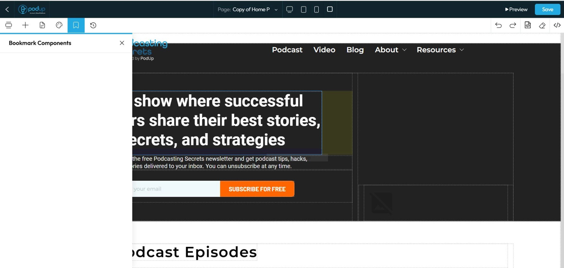
70. Click "Bookmark Components" to keep certain components handy, you will be easily able to access them from here
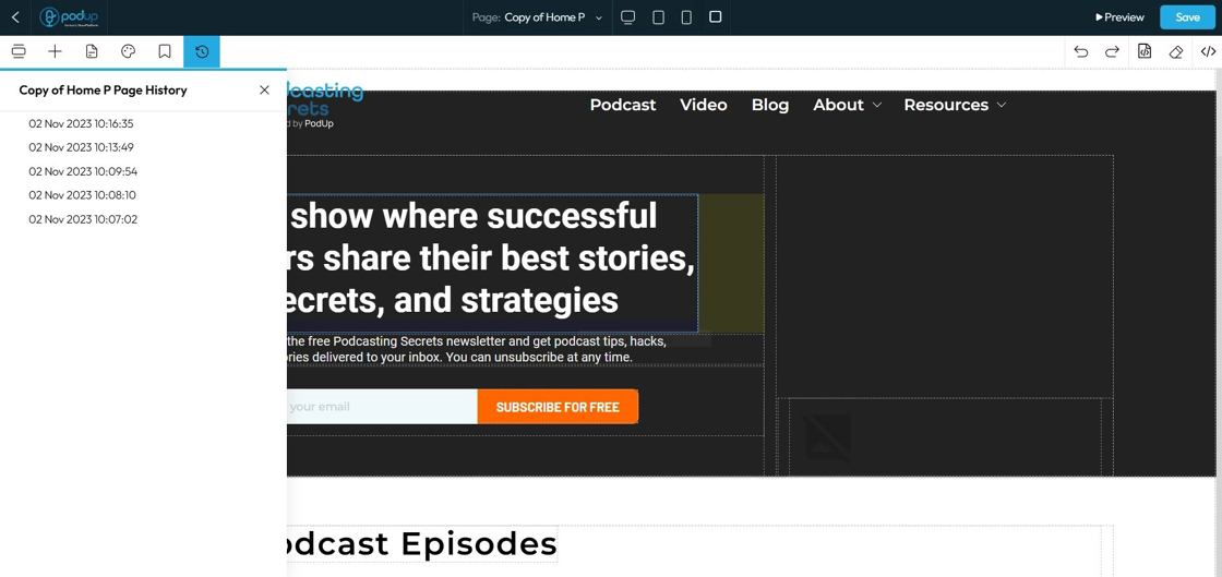
71. Click "History" to preview, restore or delete any previous version of your web page
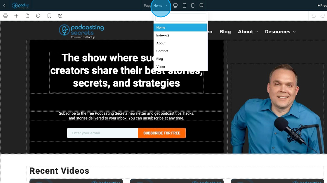
72. Click "Home" to change the page view through the drop-down menu
- You can navigate through different pages from this point here so you don't have to leave the page builder to edit a different page
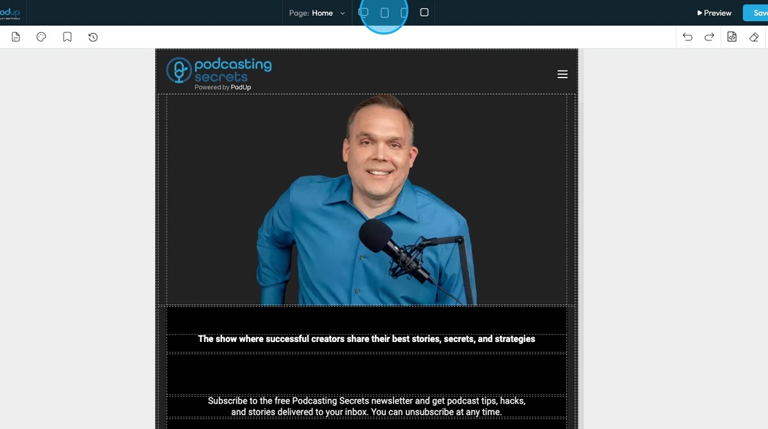
73. Click the display icons to change the display of the page. This helps you edit the website according to different screen sizes
Computer icon: Switches the view to desktop mode. Lets you see and edit how your website looks on a full-sized screen.
Tablet icon: Switches the view to tablet mode. Lets you adjust layout and styling for mid-sized screens like iPads or other tablets.
Phone icon: Switches the view to mobile mode. Helps you fine-tune how your website looks and functions on smartphones.
Square icon: Often represents a full-width or default view. It may reset the display or show the original layout without device-specific styling. (Exact function can vary depending on the builder.)
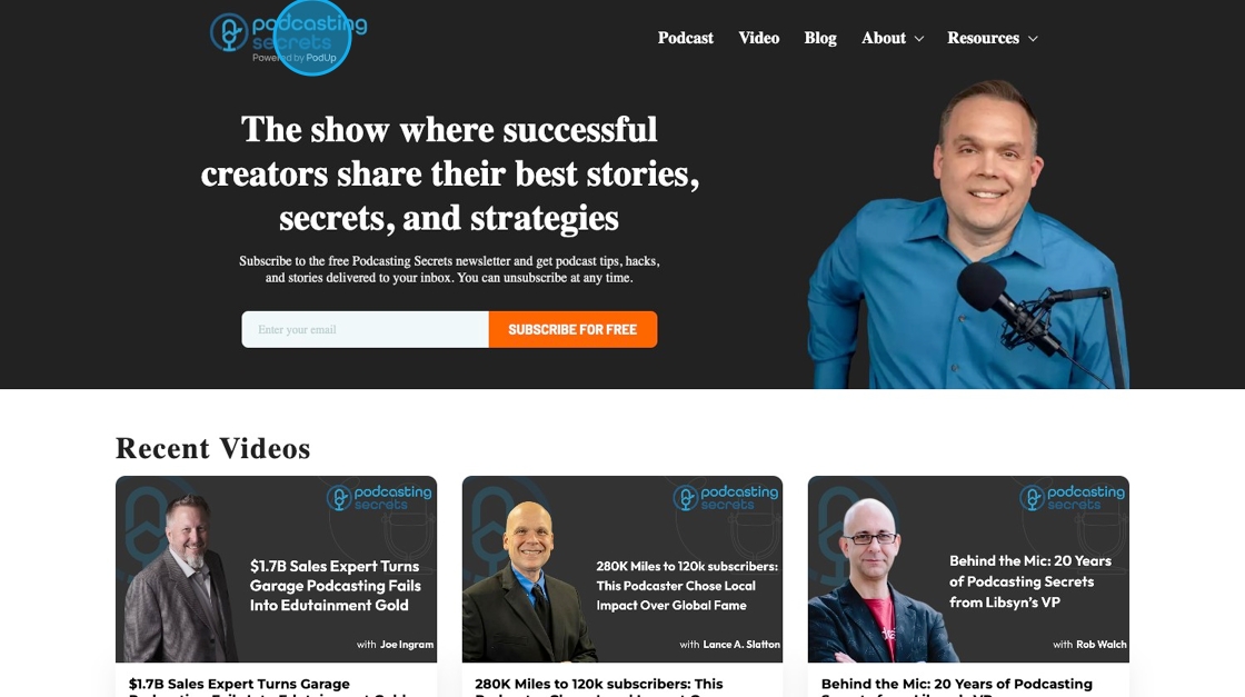
74. Click "Preview" to view the website as would appear on the browser
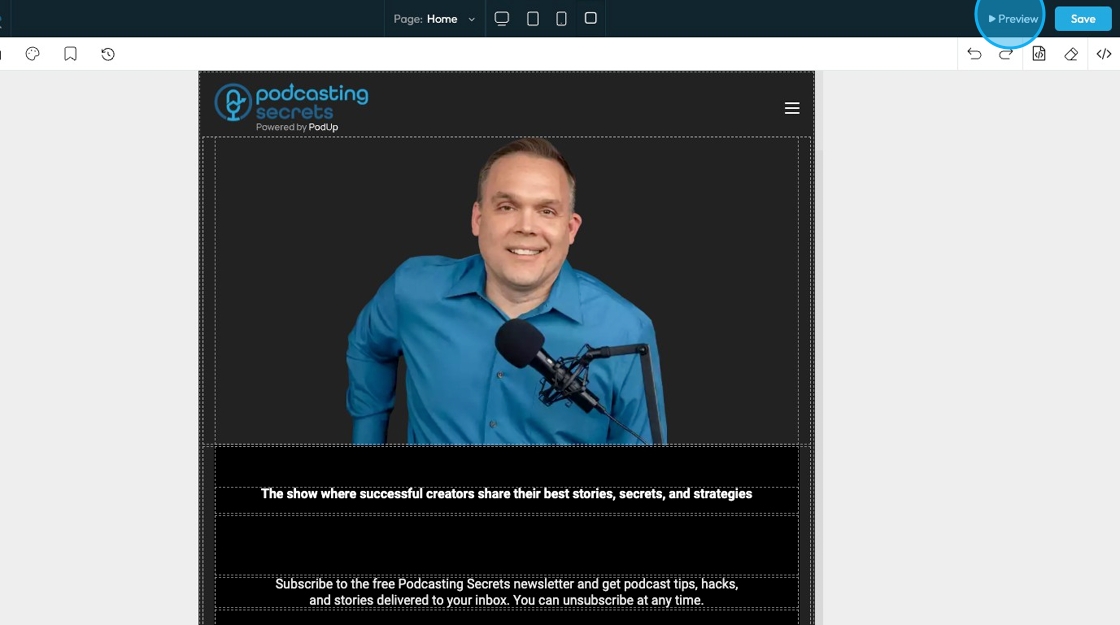
75. The web preview will open in a different tab
76. Click "Save" to keep all the progress that you've made on the website
77. Click "Undo" which reverses your last change, like deleting text or moving something by mistake.
78. Click "Redo" which brings back a change you just undid, in case you want it again.

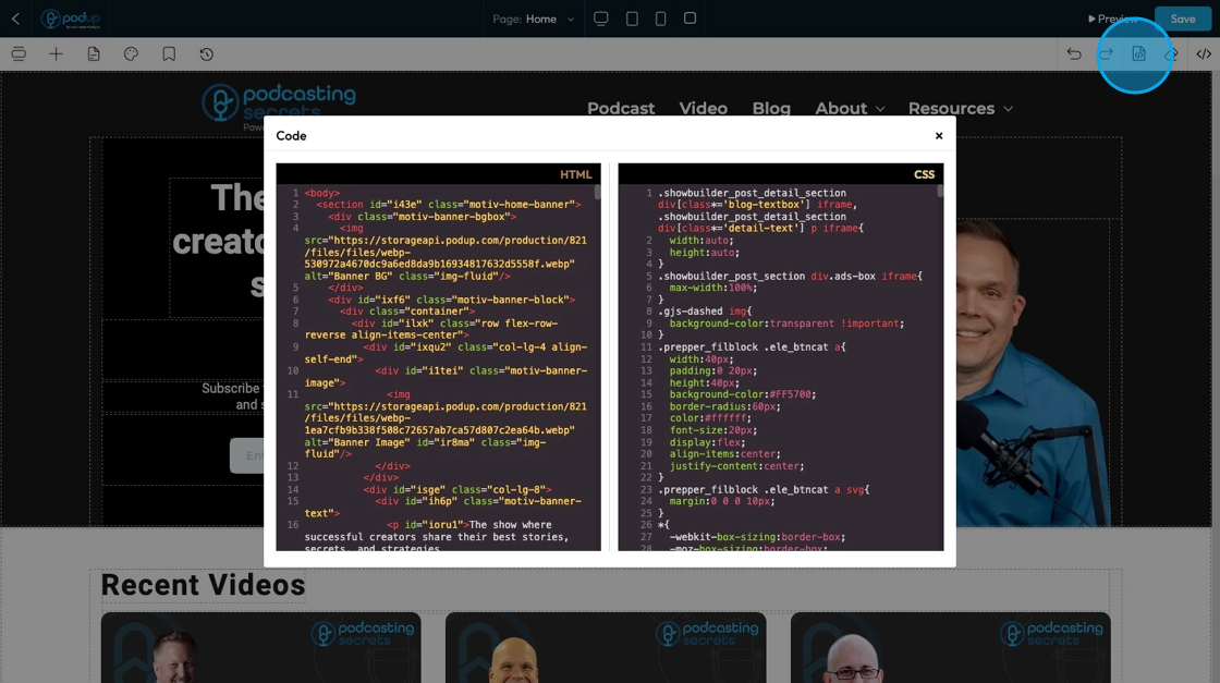
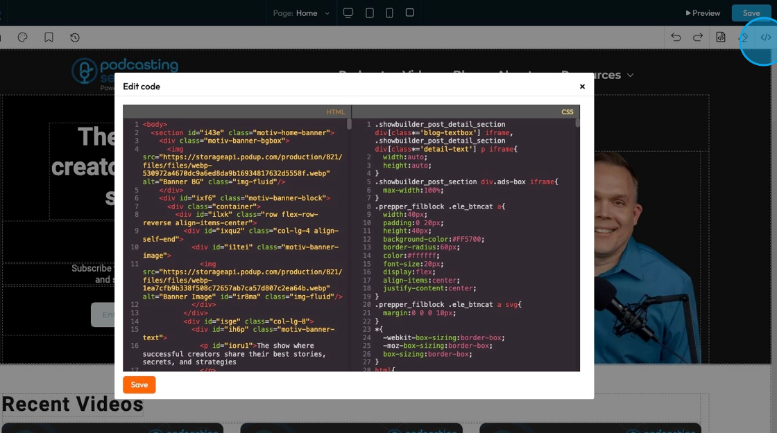
79. Click "Open Code" to open the code and view the HTML and CSS codes
- Note - You cannot edit the code here
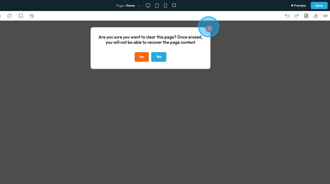
80. Click "Erase" to clear the page.

81. A confirmation popup will appear asking for confirmation that you want to delete the page
- Click "Yes" to continue erasing the page
- Click "No" to keep the page content
82. Click "Edit Code" to edit the HTML or CSS code
Related Articles
How to Navigate Post Page Builder (Detailed)
This guide offers a straightforward approach to creating and customizing post pages using PodUp's Post Page Builder, making it ideal for bloggers, video creators, and podcasters. It provides step-by-step instructions for adding and enhancing post ...How to Navigate Nav Builder (Detailed)
This guide provides a step-by-step approach to creating a navigation menu in PodUp, essential for enhancing user experience on your website. It simplifies the process of organizing and managing your site's links, making it easier for visitors to ...How to Add an Image from a URL to PodUp Page Builder using Quick Add (Detailed)
This guide offers a straightforward approach to adding images from URLs in PodUp Page Builder, making it ideal for users looking to enhance their website visually and interactively. It provides detailed steps for customizing images, managing styles, ...How to Customize "Create Code" Quick Add in PodUp Page Builder (Detailed)
This guide offers a step-by-step approach to customizing the Create Code Quick Add feature in Page Builder, making it essential for anyone looking to enhance their website's interactivity and design. It covers key functionalities, such as adding ...How To Customize Link Quick Add in PodUp Page Builder (Detailed)
This guide is essential for anyone looking to enhance their website using PodUp's Page Builder. It provides step-by-step instructions on customizing the Quick Add link feature, allowing you to create interactive and visually appealing elements ...