How to Customize "Create Code" Quick Add in PodUp Page Builder (Detailed)
This guide offers a step-by-step approach to customizing the Create Code Quick Add feature in Page Builder, making it essential for anyone looking to enhance their website's interactivity and design. It covers key functionalities, such as adding custom HTML, modifying element styles for user interactions, and managing element settings efficiently. Whether you're a beginner or an experienced user, this resource simplifies the customization process and helps you create a visually appealing and functional website.
1. Navigate to https://app.podup.com/home
There are 2 ways to access the Page Builder

2. 1. Click "Page Builder" in the "Favorite Modules" on the Dashboard

3. 2. Click "My Site"
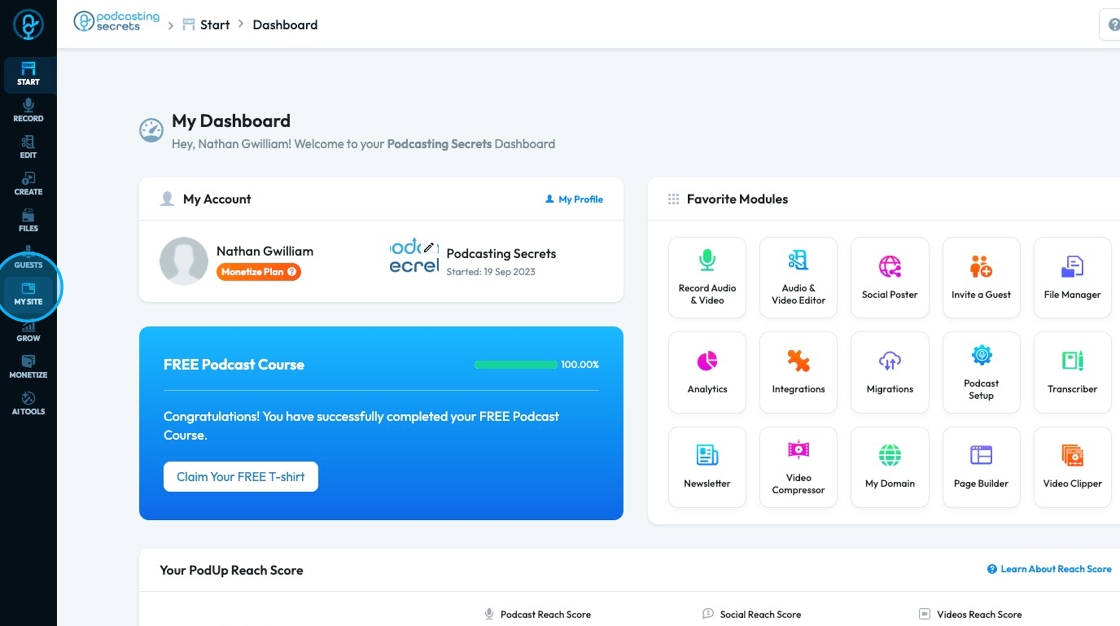
4. Click "Page Builder"

5. Select the page you want to build

6. Click "Add" to add a "Quick Add" element

7. Click "Custom Code" and drag it to the desired location

8. A pop-up will appear with an option to insert your HTML code

9. Insert your code into the text box

10. Click "Save" to save the code you added

11. The code will then be added to the website

12. Click on the element to edit it specifically

13. Click "Customize" to customize the element

14. See "How to format a design element" for the Design section since this is the same for every element

15. Click "Settings" to view the settings for this specific element

16. State: The different ways an element looks or acts depending on how someone interacts with it
- Hover: This allows you to define a special set of styles that apply only when a user's mouse cursor is hovering over an element that has this class. It adds interactivity and visual feedback
- Click: This allows you to define a special set of styles that apply when an element is being actively clicked or pressed down by the user. It provides immediate visual feedback that the user's action is being registered
- Even/Odd: This allows you to apply different styles to elements based on their position in a sequence (even or odd number) within a common parent. This is incredibly useful for creating visual patterns, like "zebra striping" in lists or tables

17. Classes: A reusable set of styles that you can apply to multiple elements across your website. You can add specific elements that you have already programmed or they will be automatically added when you edit the menu
- Tip: If this is your first website, leave this blank and let the software fill this in unless you have experience website building

18. Click the "Text here" field under "ID" to add an ID which is a unique name given to the element so it can be targeted with code (like for styling or linking) which will be used internally
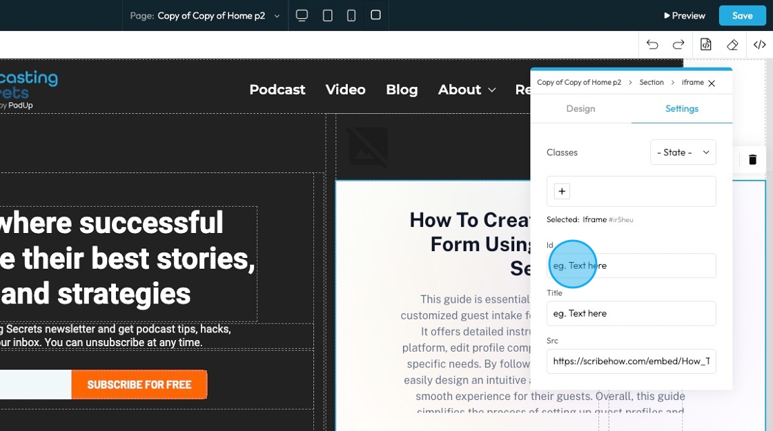
19. Click the "Text here" field under "Title" to add a title which is a short description that may show up as a tooltip when users hover over the element.

20. Click this text field to insert a SRC which is the source link or file path, usually used to load content like an image, video, or embed.

21. Clicking this icon tells the element to “move to the next bigger container,” which shifts it from a smaller box (like a text block or section) into the larger layout it's part of—helping you place it more accurately on the page

22. Move: Reposition the section to where you want. Click and hold this icon while you drag it to the desired location. A green line will indicate where it is being placed

23. Copy: Create a copy of the section

24. Delete: Remove the section entirely
- Note: If you have a duplicate, it will only delete one of the two

Related Articles
How To Customize Link Quick Add in PodUp Page Builder (Detailed)
This guide is essential for anyone looking to enhance their website using PodUp's Page Builder. It provides step-by-step instructions on customizing the Quick Add link feature, allowing you to create interactive and visually appealing elements ...How to Customize "Text" Quick Add in PodUp Page Builder (Detailed)
This guide offers a comprehensive and friendly approach to customizing the "Text" Quick Add feature in PodUp's Page Builder. It provides step-by-step instructions on enhancing your website's text elements, including formatting options, color choices, ...How do I customize Web builder Quick Add (Detailed) - Checkbox
By following this guide, you can easily customize the Quick Add Checkbox feature in the PodUp Page Builder to enhance your website’s interactivity and design. 1. Navigate to https://app.podup.com/home 2. Click "Page Builder". 3. Click the "Build" ...How do I customize Web builder Quick Add (Detailed) - Tabs
By following this guide, you can easily customize the Quick Add Tabs feature in PodUp Web Builder to enhance your website’s functionality and design. 1. Navigate to https://app.podup.com/home 2. Click "Page Builder". 3. Click the "Build" button for ...How do I customize Web builder Quick Add (Detailed) - Card
By following this guide, you can easily customize the Quick Add Card feature in PodUp Web Builder to enhance your website’s design and visual appeal. 1. Navigate to https://app.podup.com/home 2. Click "Page Builder". 3. Click the "Build" button for ...