How to Customize "Text" Quick Add in PodUp Page Builder (Detailed)
This guide offers a comprehensive and friendly approach to customizing the "Text" Quick Add feature in PodUp's Page Builder. It provides step-by-step instructions on enhancing your website's text elements, including formatting options, color choices, and interactivity settings. By following this guide, all can create visually appealing and engaging content. Whether you're a novice or experienced user, this resource streamlines the customization process.
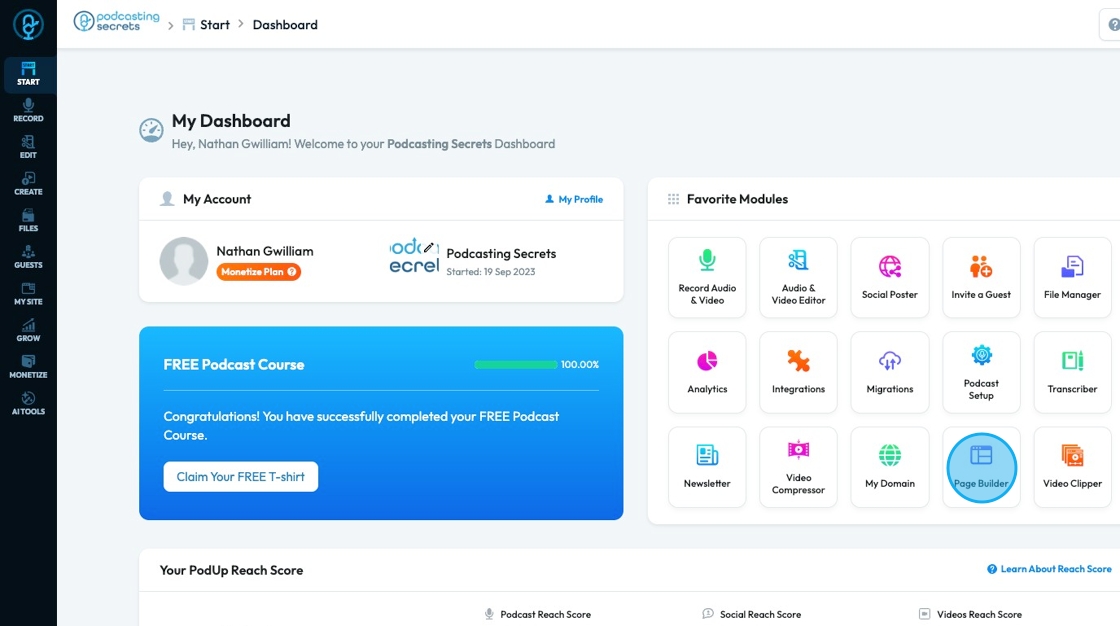
1. Navigate to https://app.podup.com/home
There are 2 ways to access the Page Builder
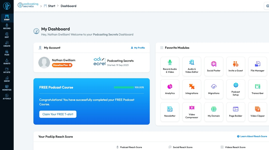
2. 1. Click "Page Builder" in the "Favorite Modules" on the Dashboard
3. 2. Click "My Site"

4. Click "Page Builder"

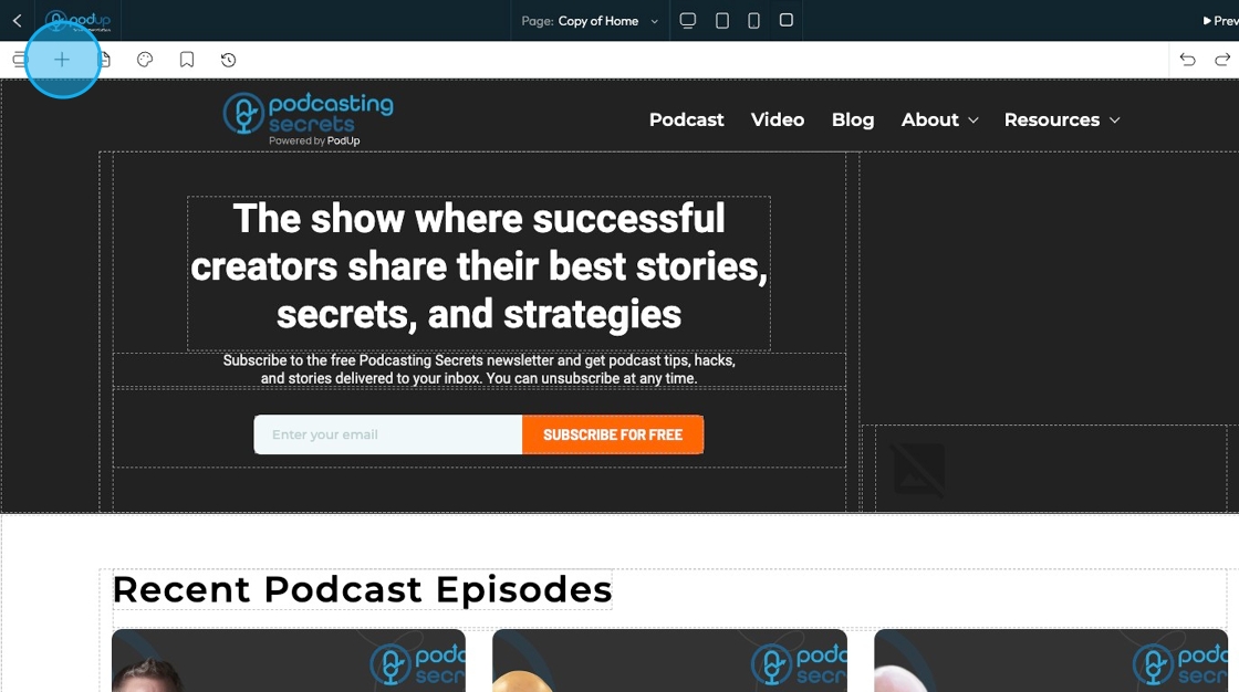
5. Click "Build" on the page that you want to build

6. Click "Add" to add a "Quick Add" element
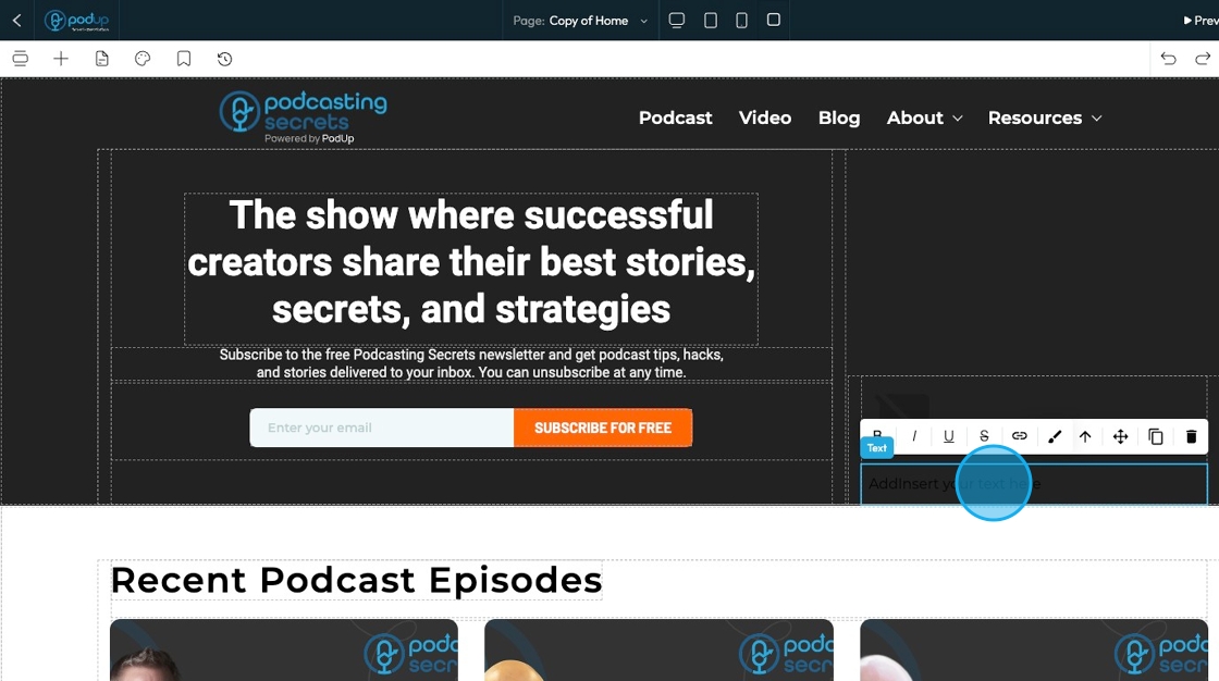
7. Click "Text" and drag it to the desired location

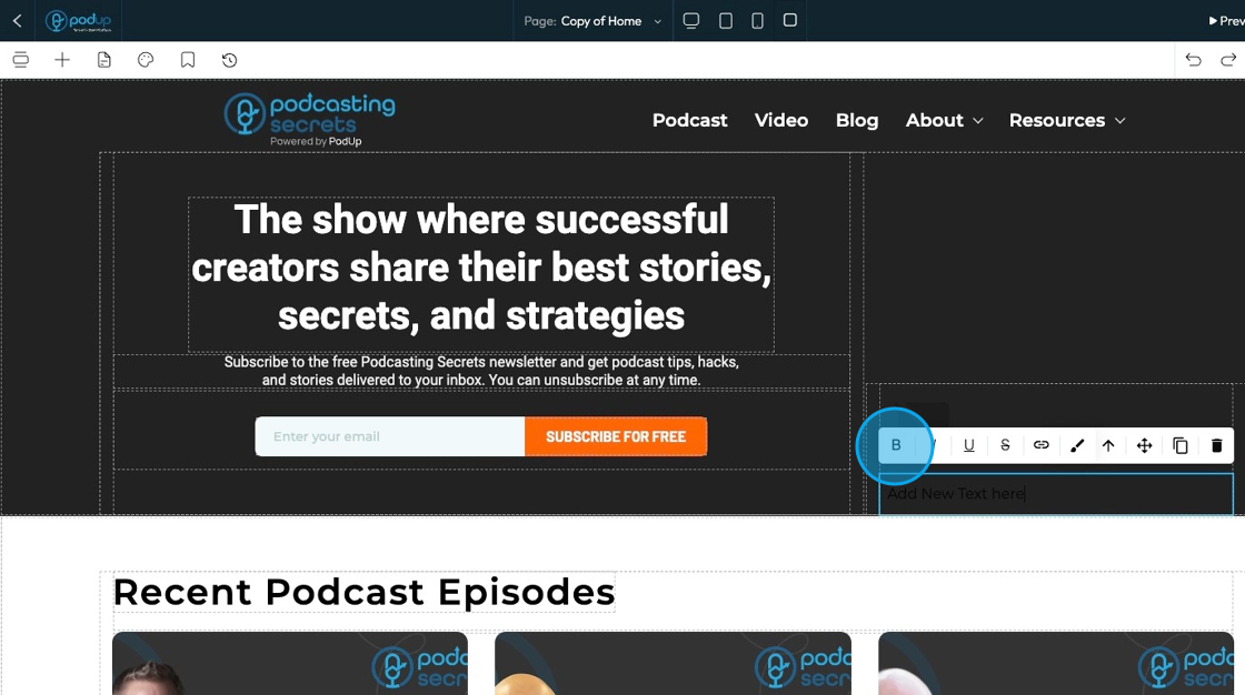
8. Click "Insert your text here" and type your desired text
9. Click "B" to bold the text to make it thicker
10. Click "I" to italicize the text, which slants it

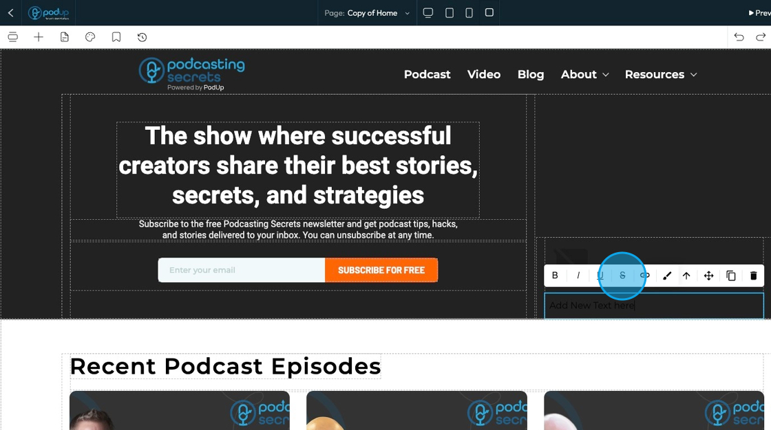
11. Click "U" to underline the text which means drawing a line underneath the text

12. Click "S" to strike through the text which means drawing a line through the text
13. Click the hyperlink to make the text link to another website link

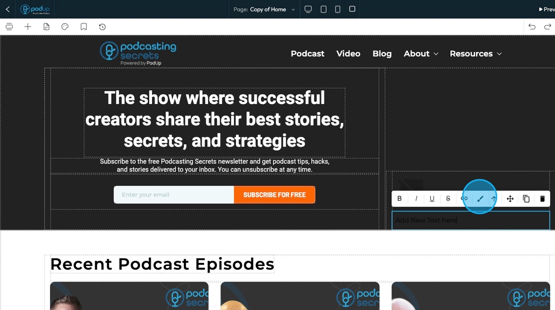
14. Click the paintbrush to open the standard customization menu
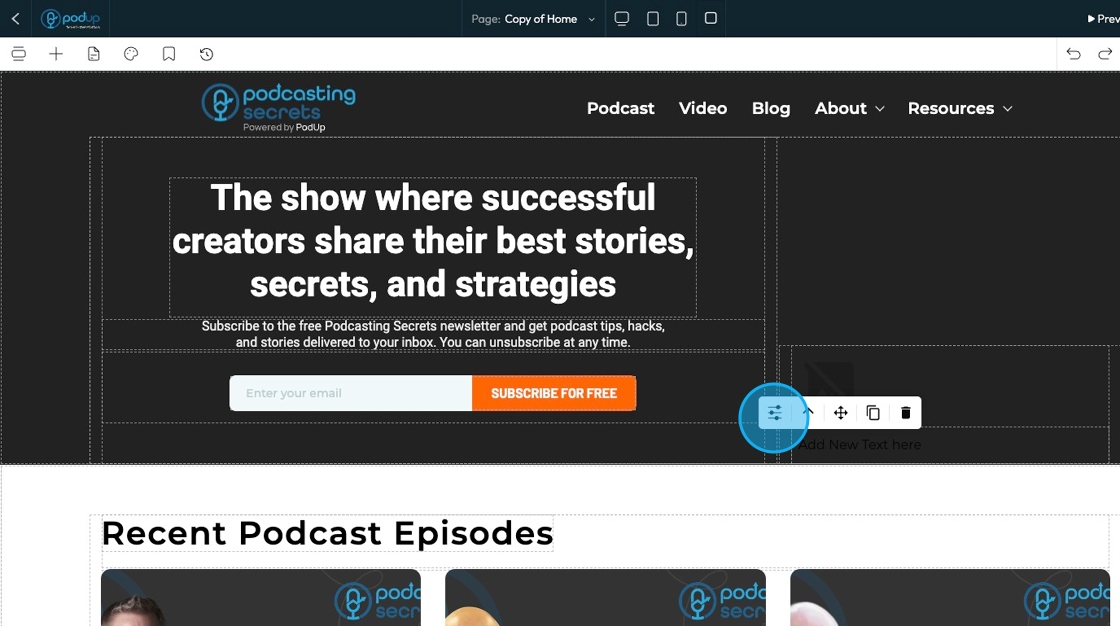
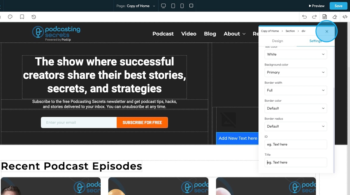
15. This is the standard customization menu. Click the customization icon to customize the element
16. See "How to format a design element" for the Design section since this is the same for every element

17. Click "Settings" to view the settings for this specific element
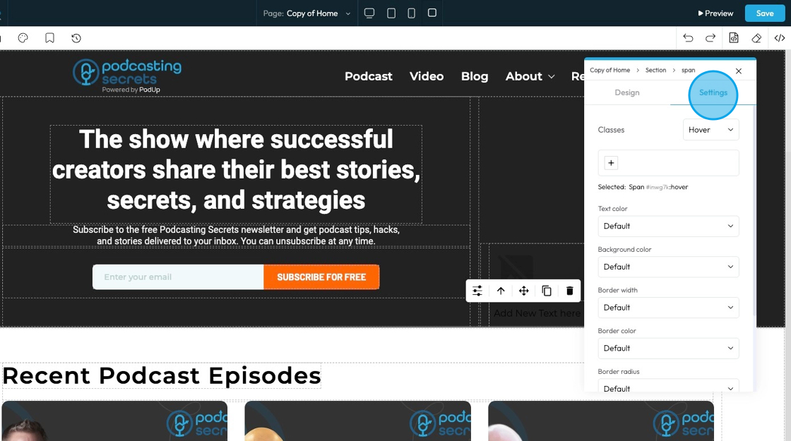
18. State: The different ways an element looks or acts depending on how someone interacts with it
- Hover: This allows you to define a special set of styles that apply only when a user's mouse cursor is hovering over an element that has this class. It adds interactivity and visual feedback
- Click: This allows you to define a special set of styles that apply when an element is being actively clicked or pressed down by the user. It provides immediate visual feedback that the user's action is being registered
- Even/Odd: This allows you to apply different styles to elements based on their position in a sequence (even or odd number) within a common parent. This is incredibly useful for creating visual patterns, like "zebra striping" in lists or tables

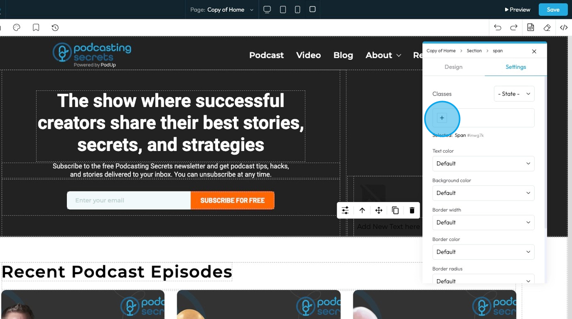
19. Classes: A reusable set of styles that you can apply to multiple elements across your website. You can add specific elements that you have already programmed or they will be automatically added when you edit the menu
- Tip: If this is your first website, leave this blank and let the software fill this in unless you have experience website building
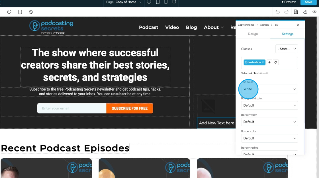
20. Click "Default" under Text color to choose from 1 of 10 text color options. This will change the color of the text itself
- Default: The standard text color used by the website theme
- Primary: A bold color used to highlight main actions or important text
- Secondary: A softer color used for less important or supporting text
- Success: A green-like color often used to show something positive, like a success message
- Info: A blue-like color used to show helpful or informational text
- Warning: An orange or yellow color used to alert users without being too alarming
- Danger: A red-like color used to show errors or serious warnings
- Light: A very light or gray color, usually used on dark backgrounds
- Dark: A dark gray or near-black color, used on light backgrounds for strong contrast
- White: Pure white text, best used on dark or colored backgrounds for readability
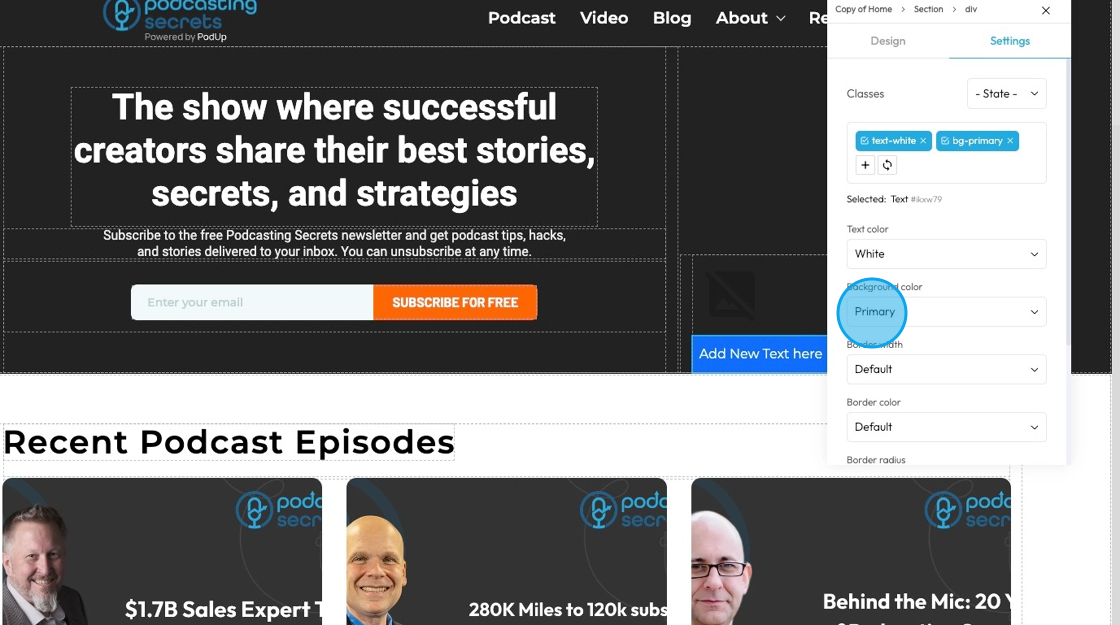
21. Click "Default" under background color to choose from 1 of 10 background color options which will change the color behind the text
- Default: The standard background color set by the theme
- Primary: A main brand color used to highlight key areas or buttons
- Secondary: A supporting color that complements the primary color
- Success: A green-toned background often used to show success messages or positive status
- Info: A blue-toned background used to display helpful or informational content
- Warning: A yellow or orange background used to show caution or warning messages
- Danger: A red-toned background used to alert users to errors or serious issues
- Light: A very light background, often gray or off-white, for a clean, subtle look
- Dark: A dark gray or black background, used for bold sections or contrast
- White: A pure white background, often used for clean and simple sections
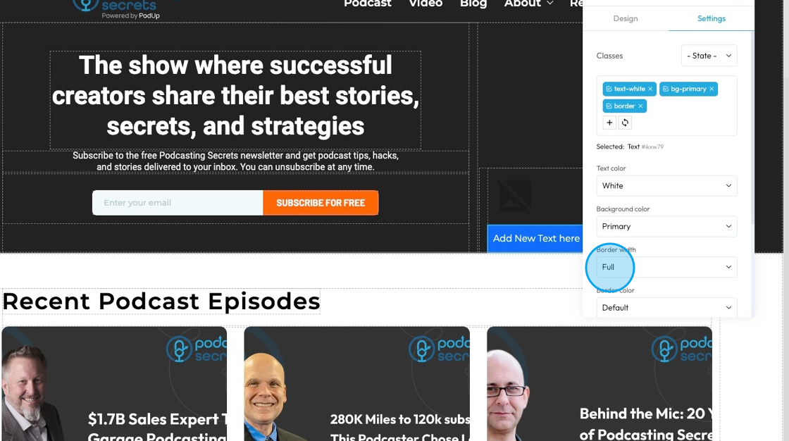
22. Click "Default" under border width to choose from 1 of 7 different options to clarify where you want the border
- Default: Uses the standard border size set by the website theme
- Full: Adds a border to all four sides of the element
- No Top: Removes the border from the top side only
- No Right: Removes the border from the right side only
- No Bottom: Removes the border from the bottom side only
- No Left: Removes the border from the left side only
- None: Removes the border from all sides of the element
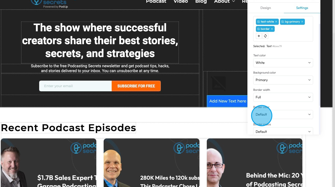
23. Click "Default" under border color to choose from 1 of 10 different preset color options
- Default: The standard border color based on the website’s theme
- Primary: A bold color used to highlight or emphasize the border
- Secondary: A softer, supporting color for a more subtle border look
- Success: A green-toned border often used to show something positive or approved
- Info: A blue-toned border used for helpful or informational content
- Warning: A yellow or orange border to draw attention or show a caution
- Danger: A red-toned border used to show an error or alert
- Light: A pale or gray border for a minimal, clean design
- Dark: A deep gray or black border for strong contrast or bold sections
- White: A white border, best used on dark backgrounds for visibility
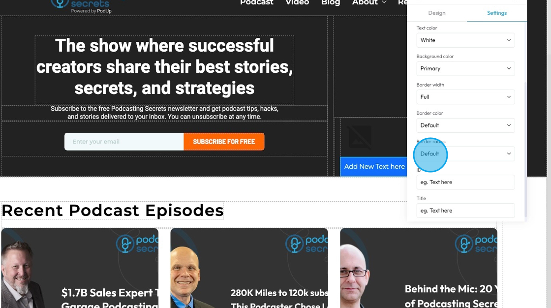
24. Click "Default" under border radius to choose from 1 of 8 options to adjust how rounded the corners of the element is
- Default: Uses the standard corner style set by the website theme
- Rounded: Softens all four corners of the element for a smooth, curved look
- Rounded Top: Only the top-left and top-right corners are rounded
- Rounded Right: Only the top-right and bottom-right corners are rounded
- Rounded Bottom: Only the bottom-left and bottom-right corners are rounded
- Rounded Left: Only the top-left and bottom-left corners are rounded
- Circle: Makes the element fully circular (works best on square elements)
- Square: Removes all rounding for sharp, straight corners on all sides
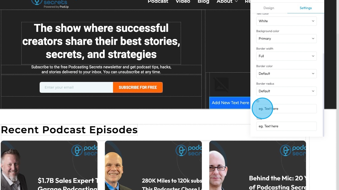
25. Click the "Text here" field under "ID" to add an ID which is a unique name for one element that lets you style it specifically, keep changes organized, and target it in code or links without affecting other elements.
26. Click the "Text here" field under "Title" to add a title which is a short description that may show up as a tooltip when users hover over the element.

27. Click "x" to dismiss the menu
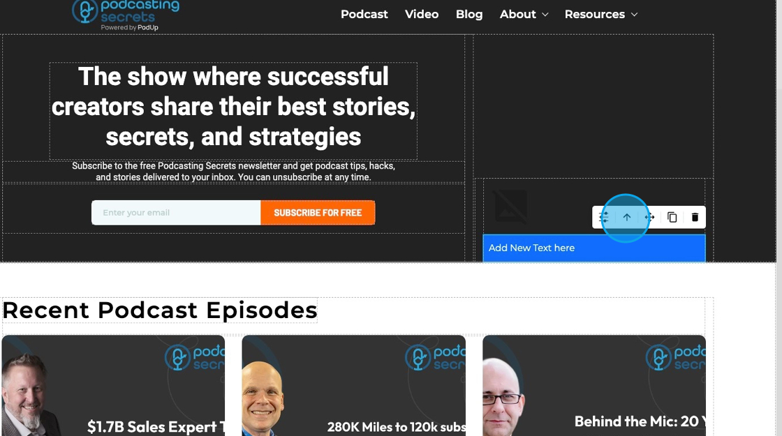
28. Clicking this icon tells the element to “move to the next bigger container,” which shifts it from a smaller box (like a text block or section) into the larger layout it's part of—helping you place it more accurately on the page.
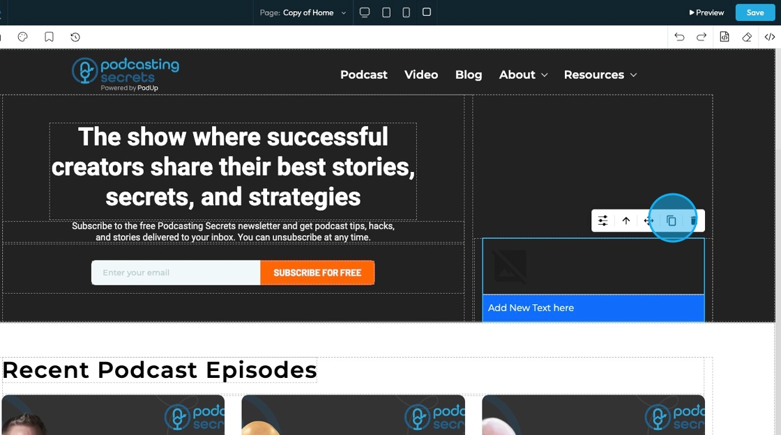
29. Move: Reposition the section to where you want. Click and hold this icon while you drag it to the desired location. A green line will indicate where it is being placed

30. Copy: Create a copy of the section
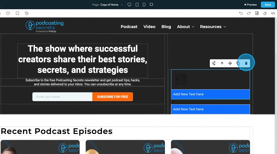
31. Delete: Remove the section entirely
- Note: If you have a duplicate, it will only delete one of the two
Related Articles
How to Customize "Create Code" Quick Add in PodUp Page Builder (Detailed)
This guide offers a step-by-step approach to customizing the Create Code Quick Add feature in Page Builder, making it essential for anyone looking to enhance their website's interactivity and design. It covers key functionalities, such as adding ...How To Customize Link Quick Add in PodUp Page Builder (Detailed)
This guide is essential for anyone looking to enhance their website using PodUp's Page Builder. It provides step-by-step instructions on customizing the Quick Add link feature, allowing you to create interactive and visually appealing elements ...How do I customize Web builder Quick Add (Detailed) - Radio
By following this guide, you can easily customize the Quick Add Radio feature in the PodUp Page Builder to enhance your website’s interactivity and user experience. 1. Navigate to https://app.podup.com/home 2. Click "Page Builder". 3. Click the ...How do I customize Web builder Quick Add (Detailed) - Label
By following this guide, you can easily customize the Quick Add Label feature in the PodUp Web Builder to create visually appealing and interactive elements that enhance your website’s design and user experience. 1. Navigate to ...How do I Customize Web builder Quick Add (Detailed) - Paragraph
By following this guide, you will learn how to customize the Quick Add feature in the PodUp Web Builder from adding a paragraph block to adjusting text, background, and border settings so you can create polished, visually appealing elements with ...