How to Add an Image from a URL to PodUp Page Builder using Quick Add (Detailed)
1. Navigate to https://app.podup.com/home
There are 2 ways to access the Page Builder

2. 1. Click "Page Builder" in the "Favorite Modules" on the Dashboard

3. Click "My Site"

4. Click "Page Builder"

5. Click "Build" on the page you want to build

6. Click "Add" to add a "Quick Add" element

7. Click "Image" and drag it to the desired location

8. An image space will appear - use the setting section to customize the image

9. Adjust the image by grabbing one of the boxes on the image and dragging it to the desired size

10. Click the customization icon to customize the element

11. See "How to format a design element" for the Design section since this is the same for every element

12. Click "Settings" to view the settings for this specific element

13. State: The different ways an element looks or acts depending on how someone interacts with it
- Hover: This allows you to define a special set of styles that apply only when a user's mouse cursor is hovering over an element that has this class. It adds interactivity and visual feedback
- Click: This allows you to define a special set of styles that apply when an element is being actively clicked or pressed down by the user. It provides immediate visual feedback that the user's action is being registered
- Even/Odd: This allows you to apply different styles to elements based on their position in a sequence (even or odd number) within a common parent. This is incredibly useful for creating visual patterns, like "zebra striping" in lists or tables

14. Classes: A reusable set of styles that you can apply to multiple elements across your website. You can add specific elements that you have already programmed or they will be automatically added when you edit the menu
- Tip: If this is your first website, leave this blank and let the software fill this in unless you have experience website building

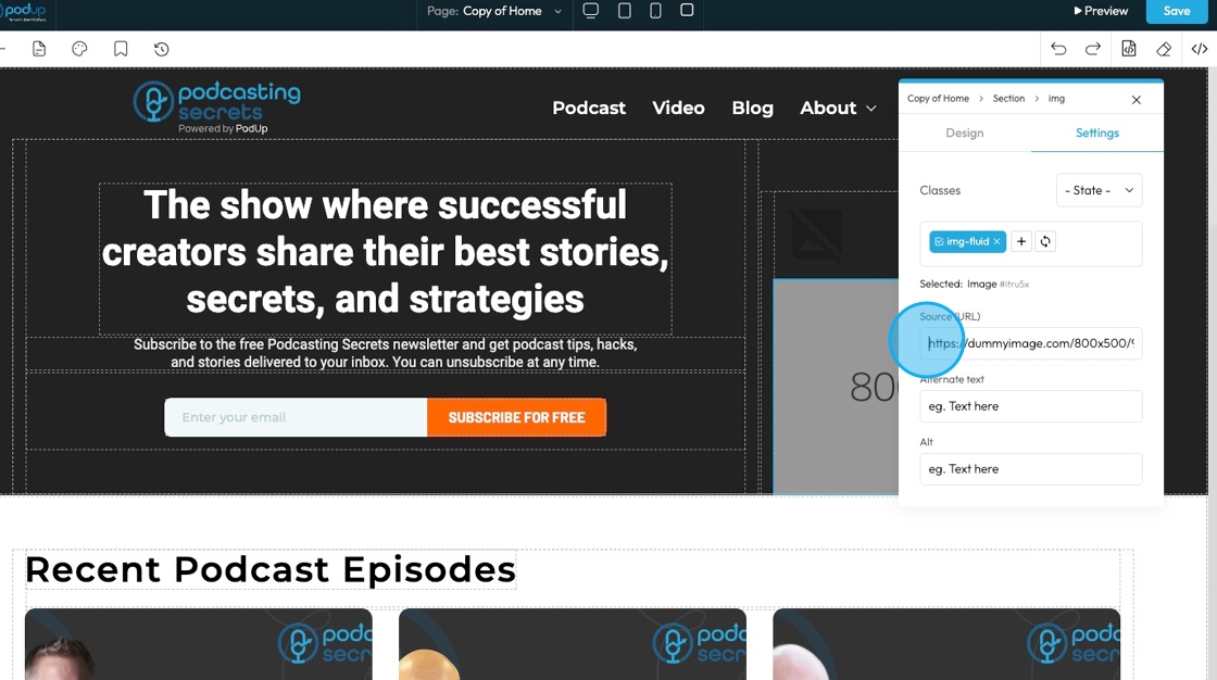
15. Click the "Source (URL)" to add the link to the image
16. Alternate Text: This usually means the same thing as alt, just written out. In some website builders, it might also show up as a caption or small label near the image.

17. Alt: This is the hidden description of an image that helps screen readers and shows up if the image doesn’t load. It’s mostly used for accessibility.

18. Click "x" to dismiss the menu

19. Clicking this icon tells the element to “move to the next bigger container,” which shifts it from a smaller box (like a text block or section) into the larger layout it's part of—helping you place it more accurately on the page.

20. Move: Reposition the section to where you want. Click and hold this icon while you drag it to the desired location. A green line will indicate where it is being placed

21. Copy: Create a copy of the section

22. Delete: Remove the section entirely
- Note: If you have a duplicate, it will only delete one of the two

Related Articles
How to Add an Image from PodUp or Your Computer to PodUp Page Builder using Quick Add (Detailed)
This guide offers a straightforward approach to adding small images to your PodUp Page Builder, making it ideal for users looking to enhance their website's visual appeal with ease. It provides step-by-step instructions for both beginners and ...How to Add A Video to My Website using Quick Add (Detailed)
This guide shows you how to quickly add videos to your website using the Quick Add feature. It walks you through choosing a video source and customizing how it looks and works. Follow the steps to make your site more engaging and professional with ...How to Navigate Page Builder (Detailed)
This guide provides a straightforward method for creating and customizing website pages using PodUp's Page Builder, making it ideal for users of all skill levels. It outlines each step in the process, from accessing the page builder to editing ...How to Add An Image to My Website Using A URL
This guide provides a straightforward method for adding images to your website using a URL, making it ideal for both beginners and those looking to enhance their website's visual appeal. It outlines a step-by-step process that simplifies image ...How to Customize "Create Code" Quick Add in PodUp Page Builder (Detailed)
This guide offers a step-by-step approach to customizing the Create Code Quick Add feature in Page Builder, making it essential for anyone looking to enhance their website's interactivity and design. It covers key functionalities, such as adding ...