How to Customize Format of Design Elements in PodUp Page Builder (Detailed)
This guide offers comprehensive instructions on customizing design elements in the PodUp Page Builder, making it essential for anyone looking to enhance their website's appearance. With step-by-step explanations on adjusting dimensions, margins, padding, backgrounds, typography, and borders, users will gain a deeper understanding of how to create visually appealing layouts.
1. If you select "Add Custom Style" a white menu will appear giving you the features to edit the website
- This menu can be moved by dragging it to the desired location
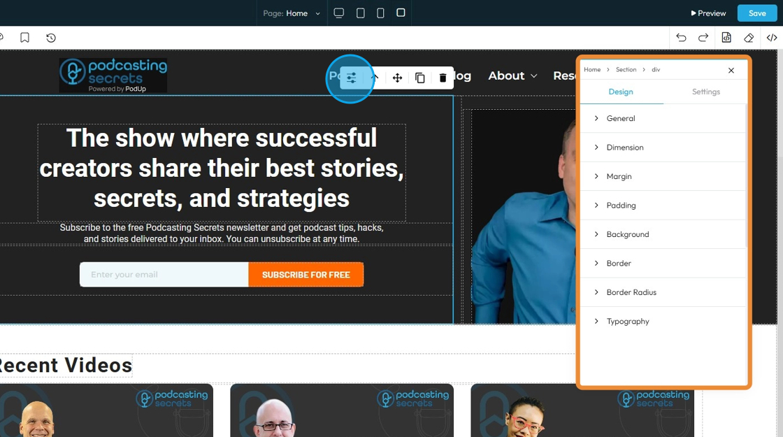
2. If you click "Design" you will get eight customizable options
- General: Basic settings like name, visibility, or position of the element on the page.
- Dimensions: The width and height of the element.
- Margin: The space outside the element, creating distance from other elements.
- Padding: The space inside the element, between the content and the border.
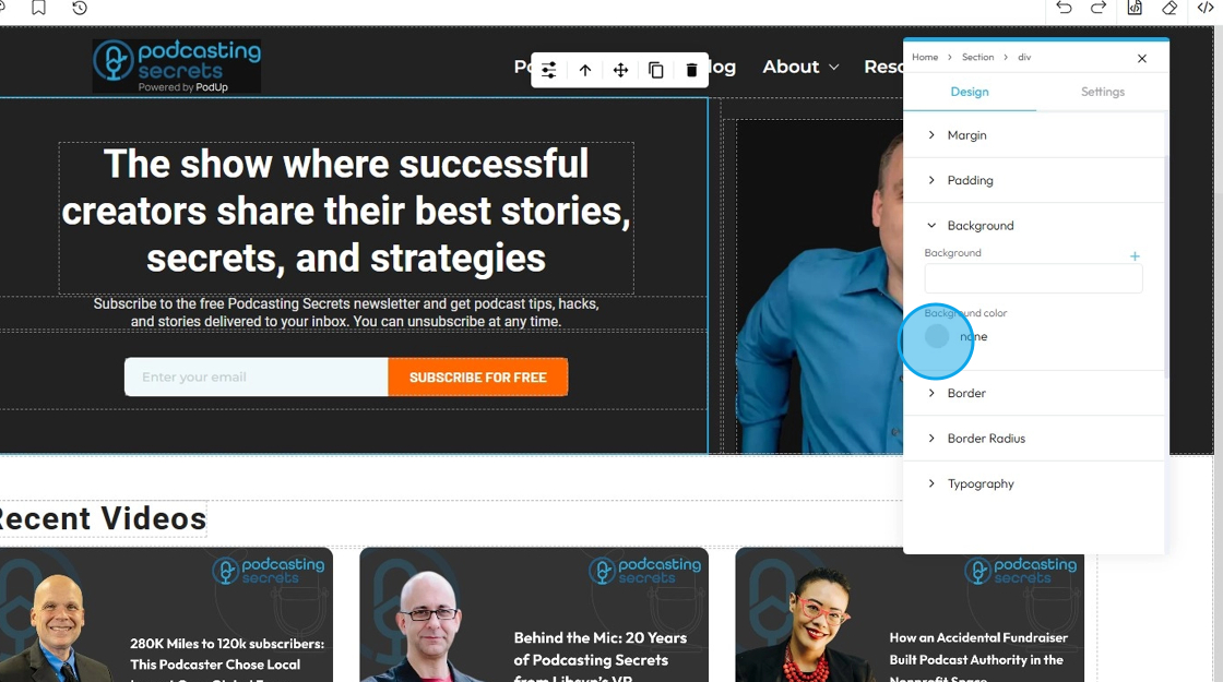
- Background: The color, image, or gradient behind the content of the element.
- Border: The line around the element’s edge — can be styled, colored, or sized.
- Border Radius: The roundness of the element’s corners.
- Typography: The style of the text, including font, size, color, line spacing, and alignment.

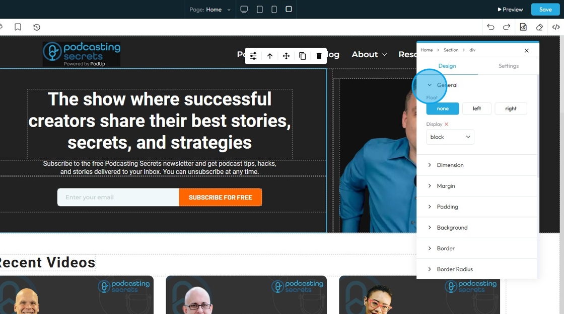
3. If you click "General" you can customize the Float and Display
- Float: Controls how an element lines up next to other elements
- None: The selected element will stay as it was originally placed
- Left: The selected element will be placed on the left with the surrounding material on the right
- Right: The selected element will be placed on the right with the surrounding material on the left
- Display: Controls how an element behaves on the page — whether it appears as a block, inline, flex, grid, or is hidden. It affects layout and spacing.
- Block: Takes full width and starts on a new line, good for sections and containers.
- Inline: Takes only the space needed and stays in line with other elements, good for text and small items.
- Inline-Block: Like inline but can have width and height set, useful for small boxes inside text.
- Flex: Arranges elements in a row or column with easy alignment, great for menus and buttons.
- None: Completely hides the element and removes it from the layout, so it doesn’t take up any space—useful to temporarily or permanently hide content.
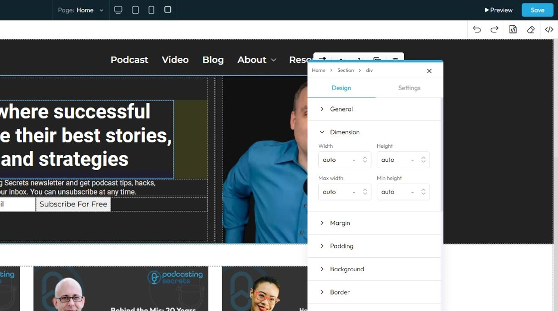
4. Click "Dimension" to adjust the dimensions as per your needs
- Width: Set the horizontal size of an element on a web page
- Height: Set the vertical size of an element on a web page
- Max. width: Set an upper limit for an element's width. The element will never be wider than this value, but it can be narrower
- Min height: Set a lower limit for an element's height. The element will never be shorter than this value, but it can be taller
Next to each of these elements, you can change the number and the unit of the feature. See below for an explanation of the units
- px (pixels): Like little dots on the screen.
200pxmeans 200 dots wide or tall. - % (percent): A part of something else.
50%means half the size of the box it’s in. - em: Grows with the text around it.
2emis 2 times bigger than the normal text. - rem: Like em, but always starts from the main page size.
1remis usually normal-size text. - vh (viewport height): How tall the screen is.
100vhmeans the whole height of the screen. - vw (viewport width): How wide the screen is.
100vwmeans the whole width of the screen.
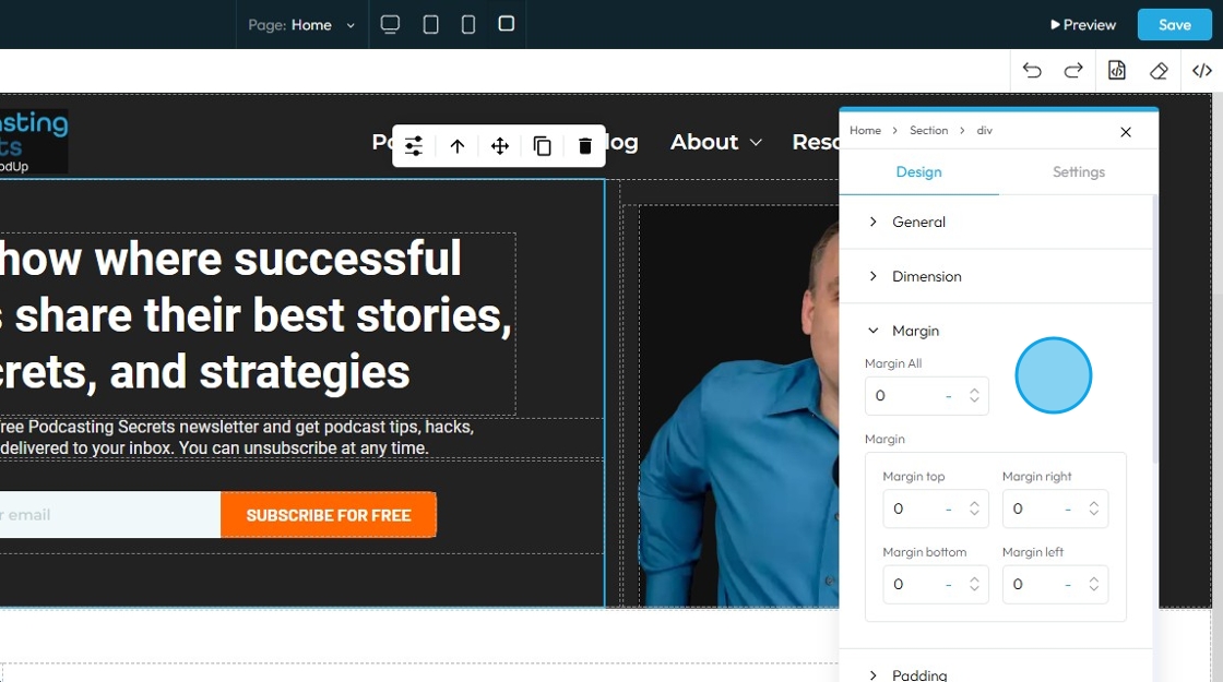
5. Click "Margin" to set the margin of the section
Margin is the space outside an element (like a box, image, or text block) on a webpage.
- Margin All: This is a shorthand property that allows you to set the margin for all four sides (top, right, bottom, and left) of an element simultaneously
- Margin top: Controls the space above an element. It pushes the element down from whatever is directly above it (e.g., another element, the browser window edge, or its parent container's top edge)
- Margin right: Controls the space to the right of an element. It pushes the element to the left from whatever is directly to its right
- Margin bottom: Controls the space below an element. It pushes the element up from whatever is directly below it
- Margin left: Controls the space to the left of an element. It pushes the element to the right from whatever is directly to its left
You can change the value (number) and the unit of the feature. See below for an explanation of the units
- px (pixels): Like little dots on the screen.
200pxmeans 200 dots wide or tall. - % (percent): A part of something else.
50%means half the size of the box it’s in. - em: Grows with the text around it.
2emis 2 times bigger than the normal text. - rem: Like em, but always starts from the main page size.
1remis usually normal-size text. - vh (viewport height): How tall the screen is.
100vhmeans the whole height of the screen. - vw (viewport width): How wide the screen is.
100vwmeans the whole width of the screen.
6. Click "Padding" to set the padding for the section
Padding: Padding creates inner space within an element. It pushes the element's content away from its own borders (and therefore away from its own edges)
- Padding all: This is a shorthand property that allows you to set the padding for all four sides (top, right, bottom, and left) of an element simultaneously.
- Padding top: Controls the inner space above an element's content. It pushes the content down from the element's top border
- Padding bottom: Controls the inner space below an element's content. It pushes the content up from the element's bottom border
- Padding right: Controls the inner space to the right of an element's content. It pushes the content to the left from the element's right border
- Padding left: Controls the inner space to the left of an element's content. It pushes the content to the right from the element's left border

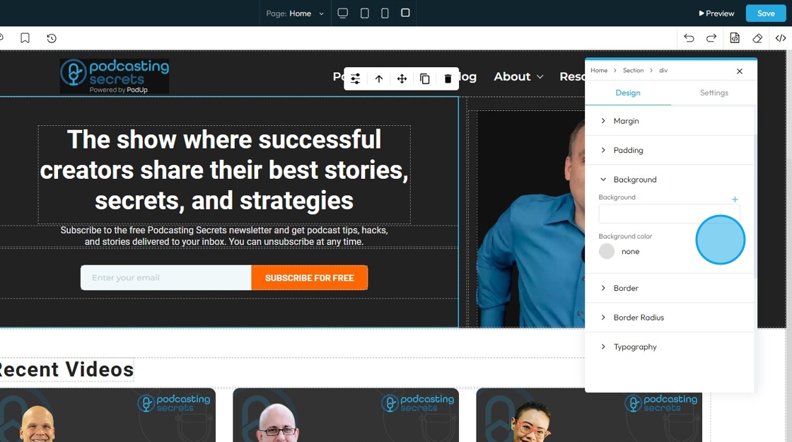
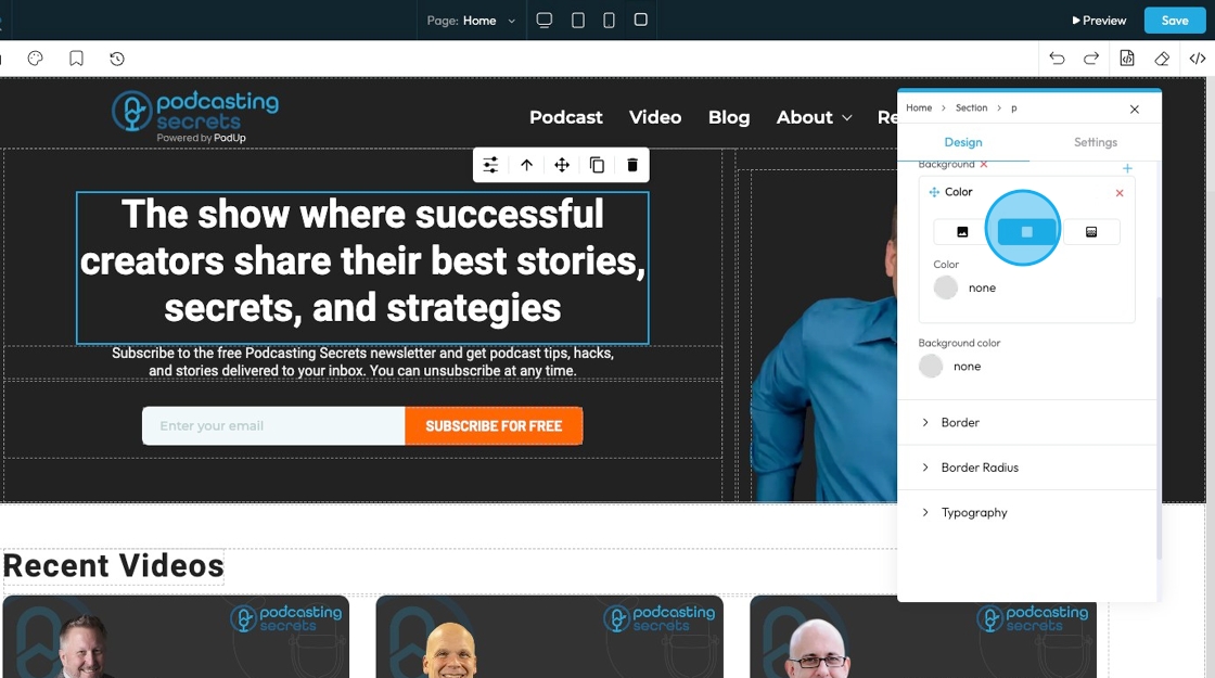
7. Click "Background color" to change the background color
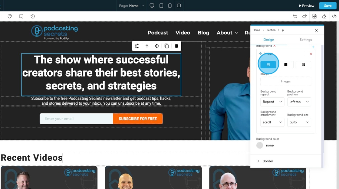
- Background image: Allows you to place an image behind the content and padding of an element. This is powerful for creating visual interest, setting a mood, or conveying branding
- Click the plus arrow to add the image
- See steps 20 - 28 for more details on editing that image
- Background color: Sets a solid color behind the content and padding of an element
8. The first page will display the option for you to upload an image to the background
- Click "Images" to open a pop-up of the file manager where the image can be selected from the files already in PodUp or uploaded from the computer
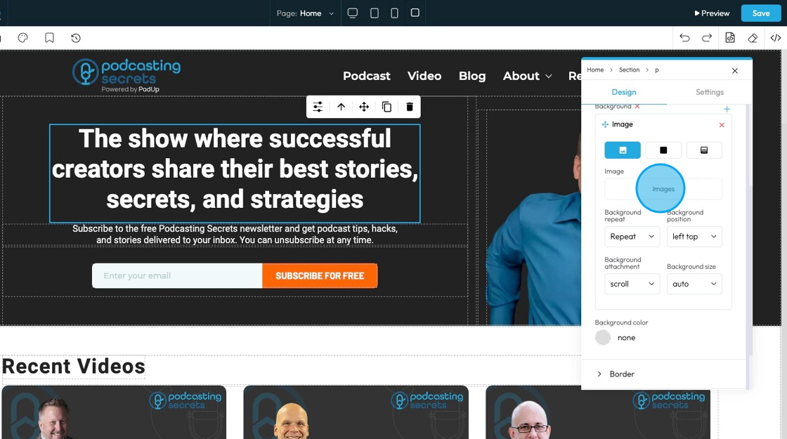
9. - Background repeat
- Repeat: The image repeats both side to side and top to bottom to fill the whole area.
- Repeat-x: The image only repeats horizontally (left to right).
- Repeat-y: The image only repeats vertically (top to bottom).
- No-repeat: The image shows only once and does not repeat at all.
- Space: The image repeats with extra space between each copy so they spread out evenly.
- Round: The image repeats and stretches or shrinks slightly so the copies fit perfectly across the space.

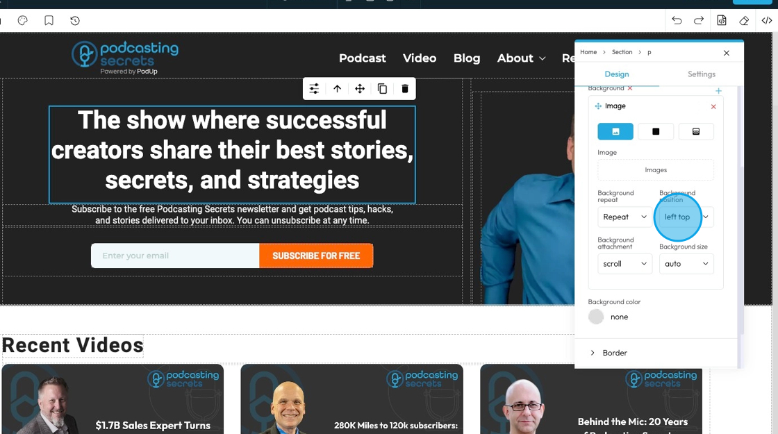
10. - Background position
- left top: The image is placed in the top-left corner of the element.
- left center: The image is placed on the left side, centered vertically.
- left bottom: The image is placed in the bottom-left corner.
- right top: The image is placed in the top-right corner.
- right center: The image is placed on the right side, centered vertically.
- right bottom: The image is placed in the bottom-right corner.
- center top: The image is centered horizontally and placed at the top.
- center center: The image is exactly in the middle of the element.
- center bottom: The image is centered horizontally and placed at the bottom.
11. - Background attachment
- scroll: The background image moves when you scroll the page
- fixed: The background image stays fixed in place while the content scrolls over it
- local: The background image moves when you scroll the content inside the element (like if the element has a scrollbar)
12. - Background size
- Auto: The background image displays at its original size without resizing
- Cover: The background image scales to cover the entire element, cropping if necessary to fill all space
- Contain: The background image scales to fit entirely inside the element without cropping, leaving empty space if needed

13. Click "Color" to select a specific color for the background or add a specific hex color
14. Click "Gradient" to create a gradient background
- Gradient: A gradual blend between two or more colors that creates a smooth transition, often used as a background effect instead of a solid color or image.

15. Select the point on the color bar to change the depth of the gradient.
- The closer the points the less drastic the color blend
- The further the points, the more drastic the color blend
- Click the colored dots at the bottom of the color spectrum to change the color of the gradient
- For example, here the points are on opposite ends, so the blend goes all the way from black to white

16. - Direction that the gradient is flowing
- Right: The gradient flows horizontally from left to right across the element
- Bottom: The gradient flows vertically from top to bottom across the element
- Left: The gradient flows horizontally from right to left across the element
- Top: The gradient flows vertically from bottom to top across the element

17. - Type: Chooses the style of gradient for the background of an element. It controls how the colors blend and flow.
- Linear Gradient: Blends colors in a straight line; useful for smooth transitions from one side to another.
- Radial Gradient: Blends colors outward in a circular or oval shape from the center; good for spotlight or ripple effects.
- Repeating-Linear Gradient: Repeats a linear gradient pattern; great for creating striped or repeated effects.
- Repeating-Radial Gradient: Repeats a radial gradient pattern in rings; useful for layered or ripple-style backgrounds.

18. Background color: Sets a solid color behind the content and padding of an element
19. Click "Border" to set a shorthand property that allows you to set the border-width, border-style, and border-color for all four sides of an element simultaneously in a single input field
- Border Width: Controls the thickness of the border line. Change the size (number) and unit by adding a number and clicking 1 of the 5 following units
- px (pixels): Like little dots on the screen.
200pxmeans 200 dots wide or tall. - em: Grows with the text around it.
2emis 2 times bigger than the normal text. - rem: Like em, but always starts from the main page size.
1remis usually normal-size text. - vh (viewport height): How tall the screen is.
100vhmeans the whole height of the screen. - vw (viewport width): How wide the screen is.
100vwmeans the whole width of the screen.
- px (pixels): Like little dots on the screen.
- Border Color: Defines the color of the border line
- Can be selected from a color spectrum or through a hex code
- Border Style: Determines the visual pattern or type of the border line. This is crucial for how the border actually looks
- None: No border will be shown around the element — the element will have no visible edge, line, or outline.
- Solid: a single, unbroken line as the border
- Dotted: a border made of evenly spaced round dots
- Dashed: a border made of short, straight dashes
- Double: two solid lines with space between them
- Groove: a carved or pressed-in effect that makes the border look like it's grooved
- Ridge: the opposite of groove; a raised, 3D effect that looks like the border sticks out
- Inset: makes the border appear pushed into the page, giving a sunken effect
- Outset: makes the border appear to pop out from the page, creating a raised look

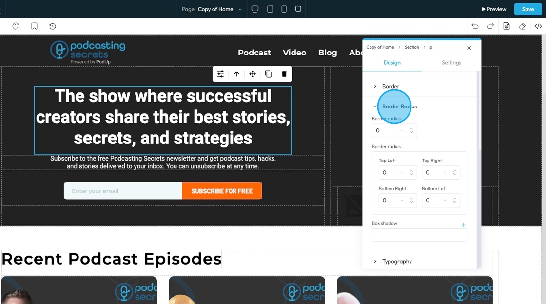
20. Click "Border Radius"which allows you to round the corners of an element. Instead of sharp, 90-degree angles, the corners become smooth curves. When set as a single value, it applies uniformly to all four corners
Top Left: Rounds the top-left corner of the element.
Top Right: Rounds the top-right corner of the element.
Bottom Right: Rounds the bottom-right corner of the element.
Bottom Left: Rounds the bottom-left corner of the element.
Box Shadow: Adds a shadow effect around the border-box of an element. This creates a visual depth, making the element appear as if it's lifted off the page
Click the plus arrow to add the shadow
It will give you these options
X (horizontal offset): moves the shadow left or right; positive values move it right, negative values move it left
Y (vertical offset): moves the shadow up or down; positive values move it down, negative values move it up
Blur: controls how soft or sharp the shadow is; 0 means a sharp edge, higher numbers make the shadow more blurred and spread out
Spread: Controls how big the shadow looks. A higher number makes the shadow wider and more noticeable.
Color: Click the colored dot to pick the color from the color spectrum or to insert your hex code
- Hex Code: A six-digit code used in web design to represent a specific color. It starts with a # symbol followed by numbers and letters (like #FF5733). This can help you stay consistent with your colors
Type (Inside or Outside):
Inside: The shadow shows up inside the letters.
Outside: The shadow shows up around the letters.
Change the unit of X, Y, and blur by selecting the "px" next to the number
Next to each of these elements, you can change the number and the unit of the feature. See below for an explanation of the units
- px (pixels): Like little dots on the screen.
200pxmeans 200 dots wide or tall. - % (percent): A part of something else.
50%means half the size of the box it’s in. - em: Grows with the text around it.
2emis 2 times bigger than the normal text. - rem: Like em, but always starts from the main page size.
1remis usually normal-size text. - vh (viewport height): How tall the screen is.
100vhmeans the whole height of the screen. - vw (viewport width): How wide the screen is.
100vwmeans the whole width of the screen.
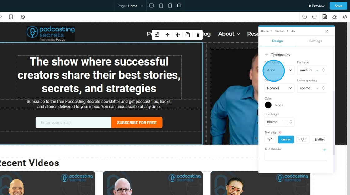
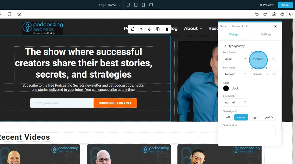
21. Click "Typography" to change the font, size, color, alignment etc. of the text
- Font family: Select the typeface (the specific design of the letters) to be used for the text
22. - Font Size: Controls the height of the characters in your text
- The bigger the number the bigger the character
- The unit can be changed to adjust to the specific project you are working in. Generally px is easiest
- px (pixels): Like little dots on the screen.
200pxmeans 200 dots wide or tall. - % (percent): A part of something else.
50%means half the size of the box it’s in. - em: Grows with the text around it.
2emis 2 times bigger than the normal text. - rem: Like em, but always starts from the main page size.
1remis usually normal-size text. - vh (viewport height): How tall the screen is.
100vhmeans the whole height of the screen. - vw (viewport width): How wide the screen is.
100vwmeans the whole width of the screen.
- px (pixels): Like little dots on the screen.
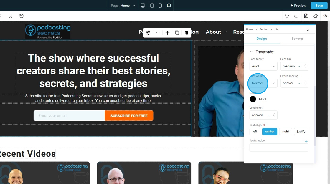
23. - Font Weight: Controls the boldness or thickness of the text characters
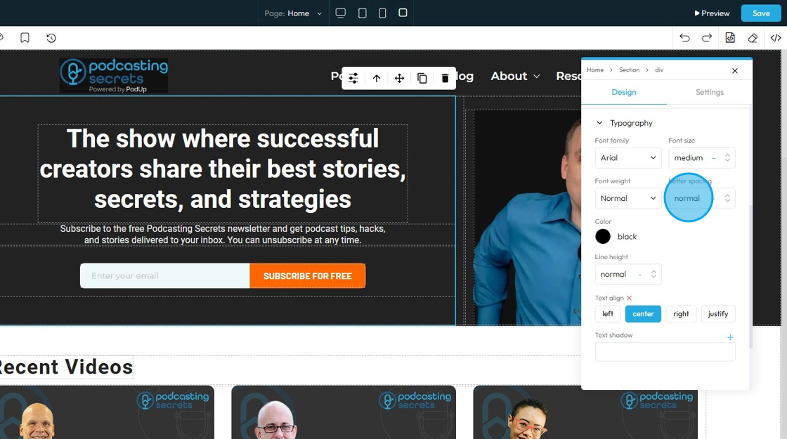
24. - Letter Spacing: Controls the horizontal space between individual characters (letters) within a word. Also known as "tracking" in traditional typography
- The bigger the number the more space between the characters
- Change the unit by clicking the blue dash next to the number
- px (pixels): Like little dots on the screen.
200pxmeans 200 dots wide or tall. - % (percent): A part of something else.
50%means half the size of the box it’s in. - em: Grows with the text around it.
2emis 2 times bigger than the normal text. - rem: Like em, but always starts from the main page size.
1remis usually normal-size text. - vh (viewport height): How tall the screen is.
100vhmeans the whole height of the screen. - vw (viewport width): How wide the screen is.
100vwmeans the whole width of the screen.
- px (pixels): Like little dots on the screen.
25. - Color: Sets the color of the text characters themselves
- Click the colored dot to pick the color from the color spectrum or to insert your hex code
- Hex Code: A six-digit code used in web design to represent a specific color. It starts with a # symbol followed by numbers and letters (like #FF5733). This can help you stay consistent with your colors

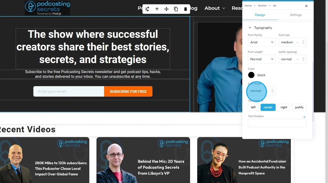
26. - Line Height: Controls the vertical space between lines of text within a paragraph or text block. Also known as "leading" in traditional typography
- 1 is the standard spacing size
- Change the units by selecting the dash next to the number
- px (pixels): Like little dots on the screen.
200pxmeans 200 dots wide or tall. - % (percent): A part of something else.
50%means half the size of the box it’s in. - em: Grows with the text around it.
2emis 2 times bigger than the normal text. - rem: Like em, but always starts from the main page size.
1remis usually normal-size text. - vh (viewport height): How tall the screen is.
100vhmeans the whole height of the screen. - vw (viewport width): How wide the screen is.
100vwmeans the whole width of the screen.
- px (pixels): Like little dots on the screen.
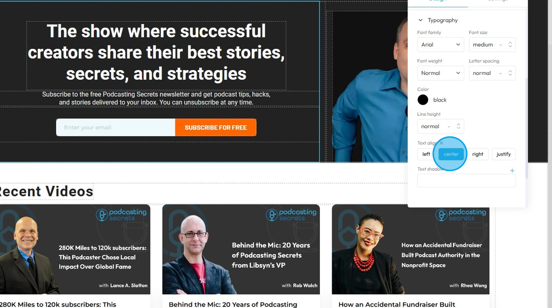
27. - Text align: Controls the horizontal alignment of text and inline content within its containing element (e.g., a paragraph, heading, button, or column). It dictates where the text begins and ends horizontally within the available space of its parent
- Left: Align the text to the left edge of its container. The right edge of the text will appear "ragged" or uneven
- Center: Centers the text horizontally within its container. Both the left and right edges of the text will appear ragged
- Right: Aligns the text to the right edge of its container. The left edge of the text will appear ragged
- Justify: When you apply "justify" to a block of text, the browser will stretch the text lines so that both the left and right edges are flush (aligned) with the container's boundaries. This creates a very neat, block-like appearance for the paragraph, similar to how text is often formatted in newspapers, books, and magazines
28. - Text Shadow: Adds a shadow effect directly behind the text characters. This can be used to make text stand out, improve readability against busy backgrounds, or add a decorative touch
- Click the plus arrow to add the shadow
- It will give you these options
- X (horizontal offset): moves the shadow left or right; positive values move it right, negative values move it left
- Y (vertical offset): moves the shadow up or down; positive values move it down, negative values move it up
- Blur: controls how soft or sharp the shadow is; 0 means a sharp edge, higher numbers make the shadow more blurred and spread out
- Color: Click the colored dot to pick the color from the color spectrum or to insert your hex code
- Hex Code: A six-digit code used in web design to represent a specific color. It starts with a # symbol followed by numbers and letters (like #FF5733). This can help you stay consistent with your colors
- Change the unit of X, Y, and blur by selecting the "px" next to the number
- px (pixels): Like little dots on the screen.
200pxmeans 200 dots wide or tall. - em: Grows with the text around it.
2emis 2 times bigger than the normal text. - rem: Like em, but always starts from the main page size.
1remis usually normal-size text. - vh (viewport height): How tall the screen is.
100vhmeans the whole height of the screen. - vw (viewport width): How wide the screen is.
100vwmeans the whole width of the screen.
- px (pixels): Like little dots on the screen.
Related Articles
How to Customize "Create Code" Quick Add in PodUp Page Builder (Detailed)
This guide offers a step-by-step approach to customizing the Create Code Quick Add feature in Page Builder, making it essential for anyone looking to enhance their website's interactivity and design. It covers key functionalities, such as adding ...How To Customize Link Quick Add in PodUp Page Builder (Detailed)
This guide is essential for anyone looking to enhance their website using PodUp's Page Builder. It provides step-by-step instructions on customizing the Quick Add link feature, allowing you to create interactive and visually appealing elements ...How to Customize "Text" Quick Add in PodUp Page Builder (Detailed)
This guide offers a comprehensive and friendly approach to customizing the "Text" Quick Add feature in PodUp's Page Builder. It provides step-by-step instructions on enhancing your website's text elements, including formatting options, color choices, ...How to Add an Image from a URL to PodUp Page Builder using Quick Add (Detailed)
This guide offers a straightforward approach to adding images from URLs in PodUp Page Builder, making it ideal for users looking to enhance their website visually and interactively. It provides detailed steps for customizing images, managing styles, ...How to Navigate Post Page Builder (Detailed)
This guide offers a straightforward approach to creating and customizing post pages using PodUp's Post Page Builder, making it ideal for bloggers, video creators, and podcasters. It provides step-by-step instructions for adding and enhancing post ...