How to customize a section?
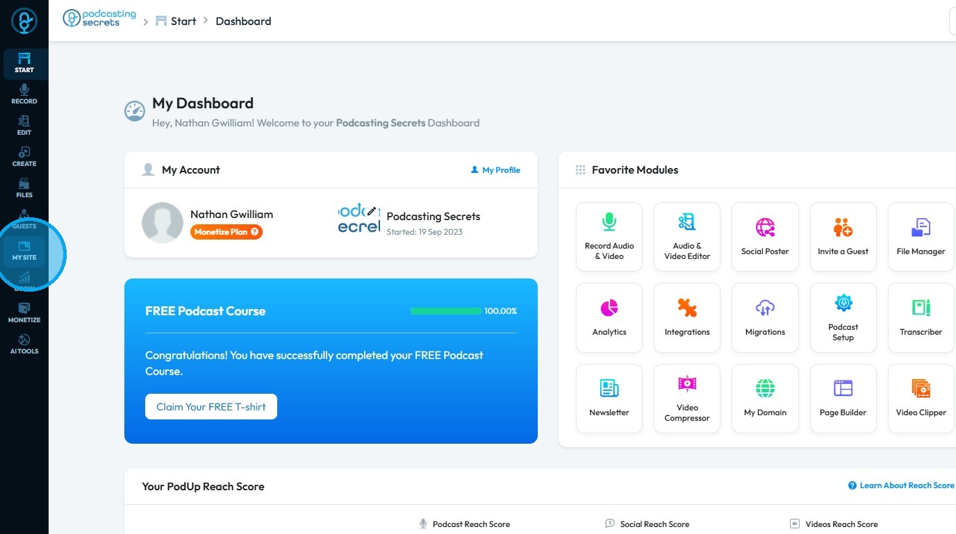
2. Click "My Site"
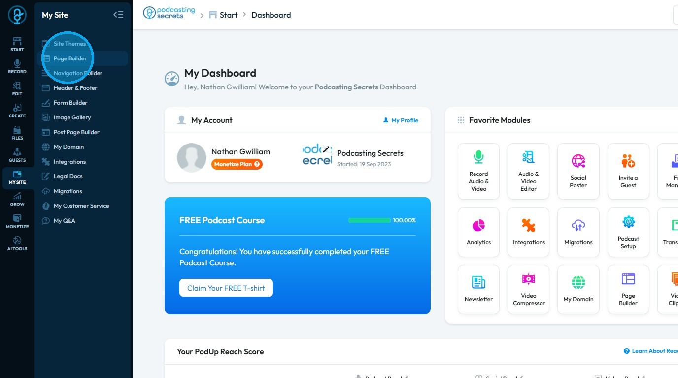
3. Select "Page Builder"
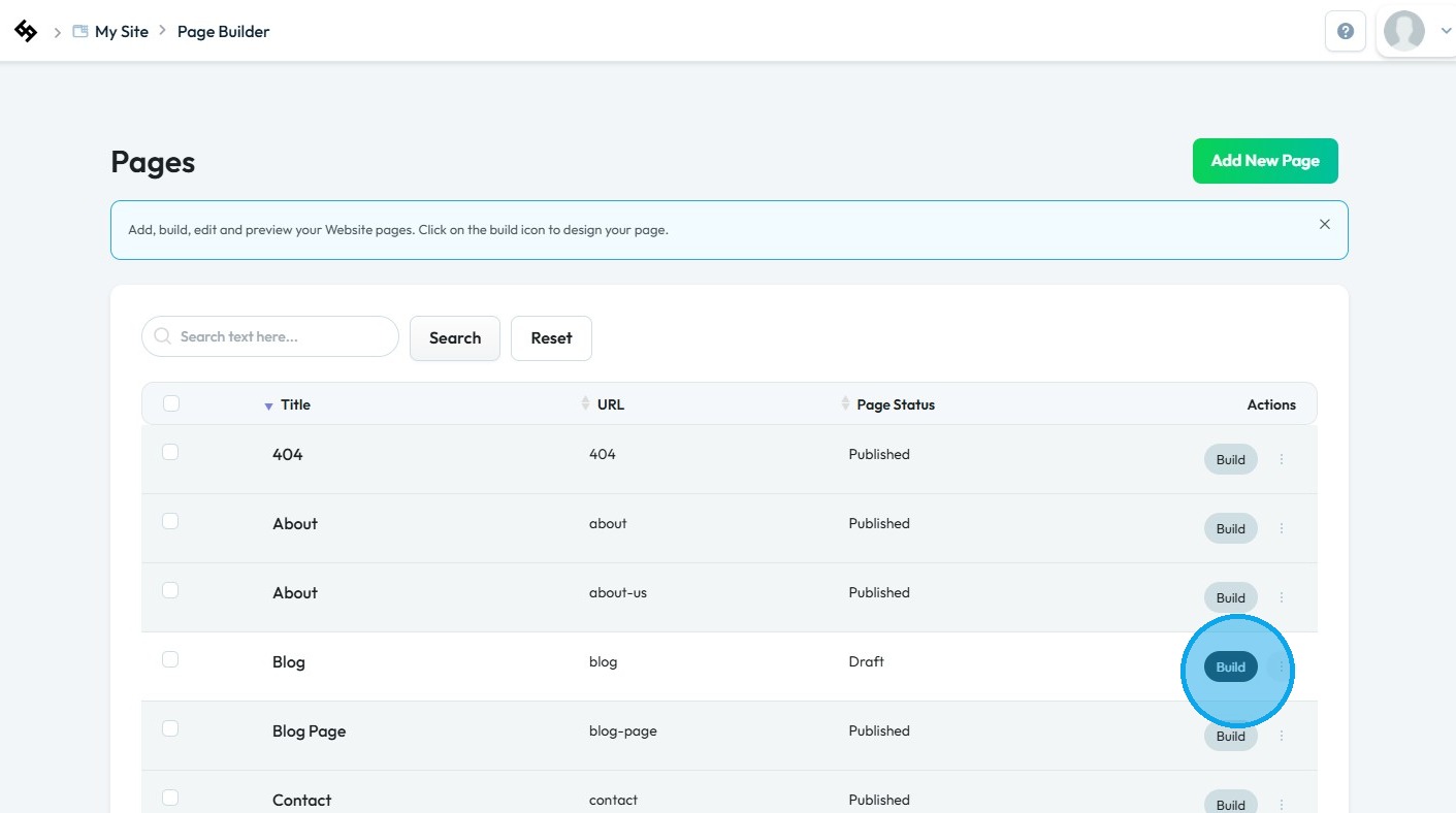
4. The “Pages” section will open, displaying a list of all your website’s webpages
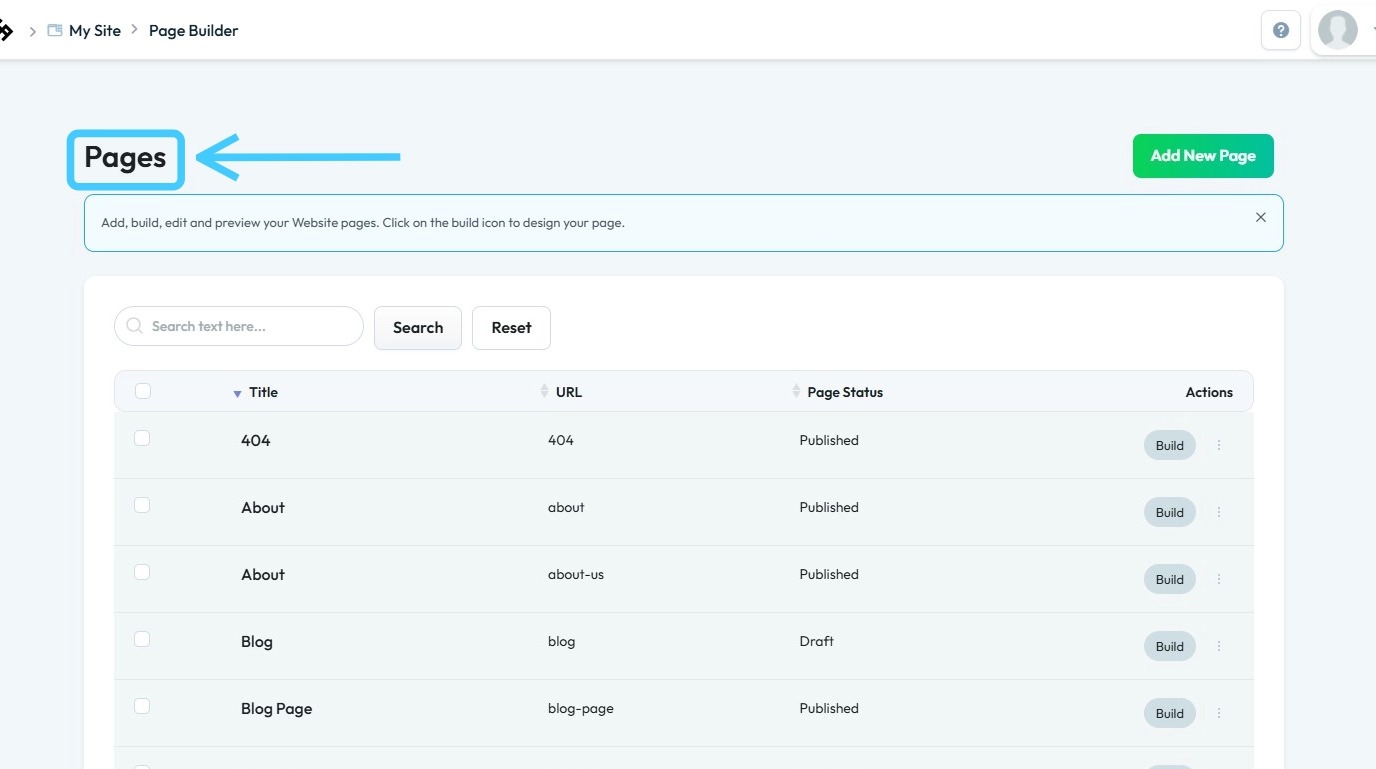
5. Click “Build” on the page you wish to customize to begin editing that section
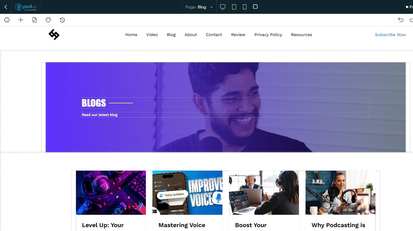
6. The PodUp Page Builder will load
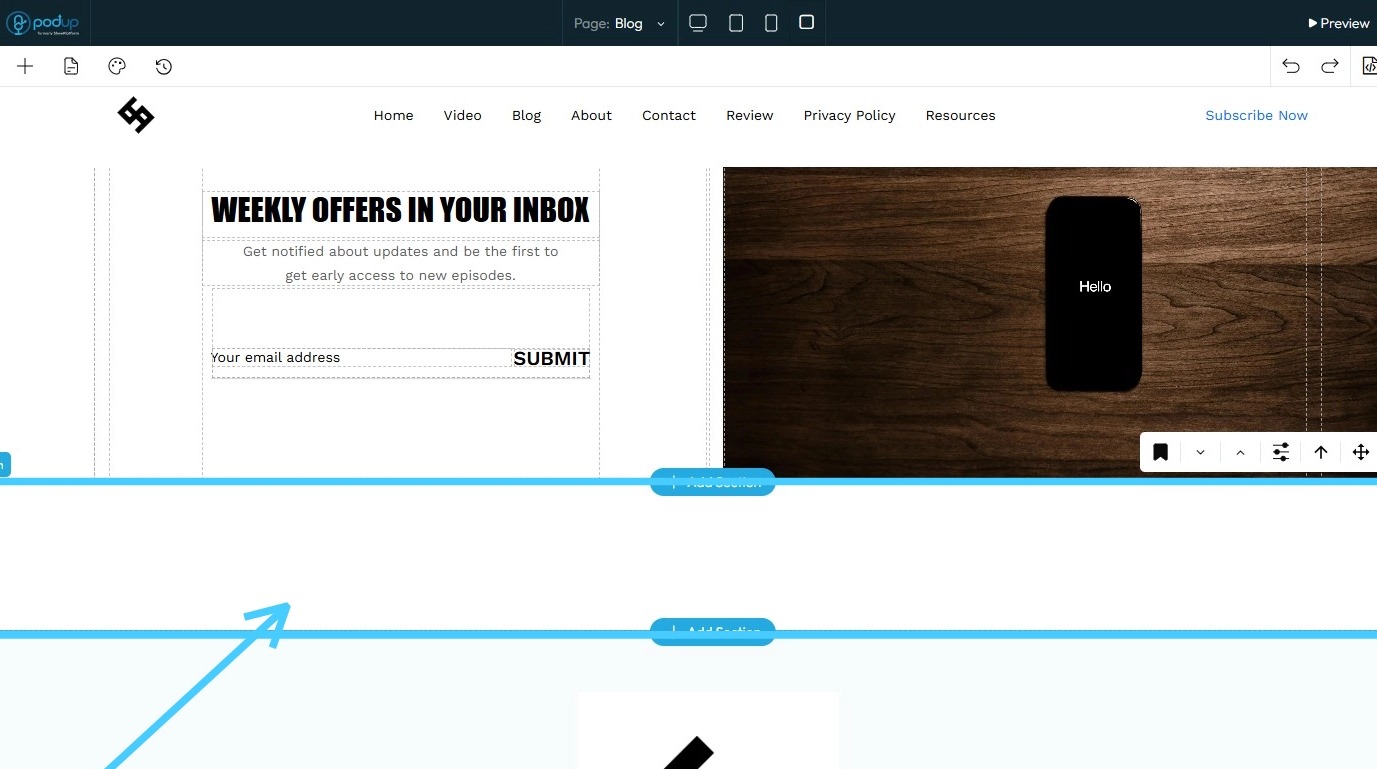
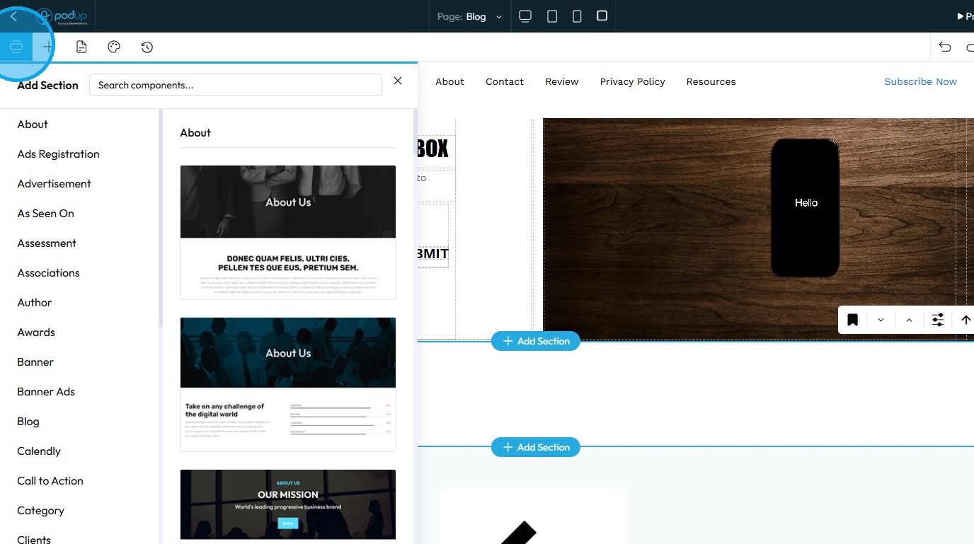
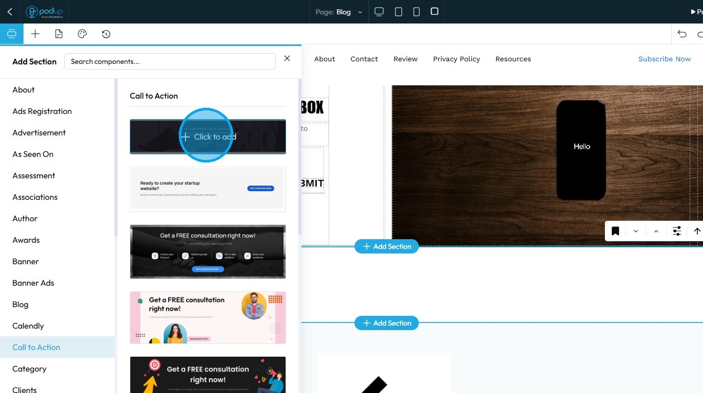
7. To add a new section, click on an existing section within the page
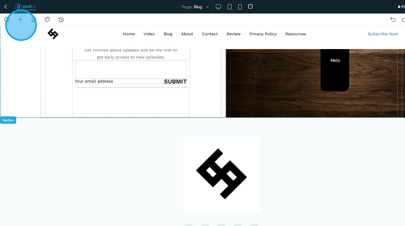
8. Click "Add Section"
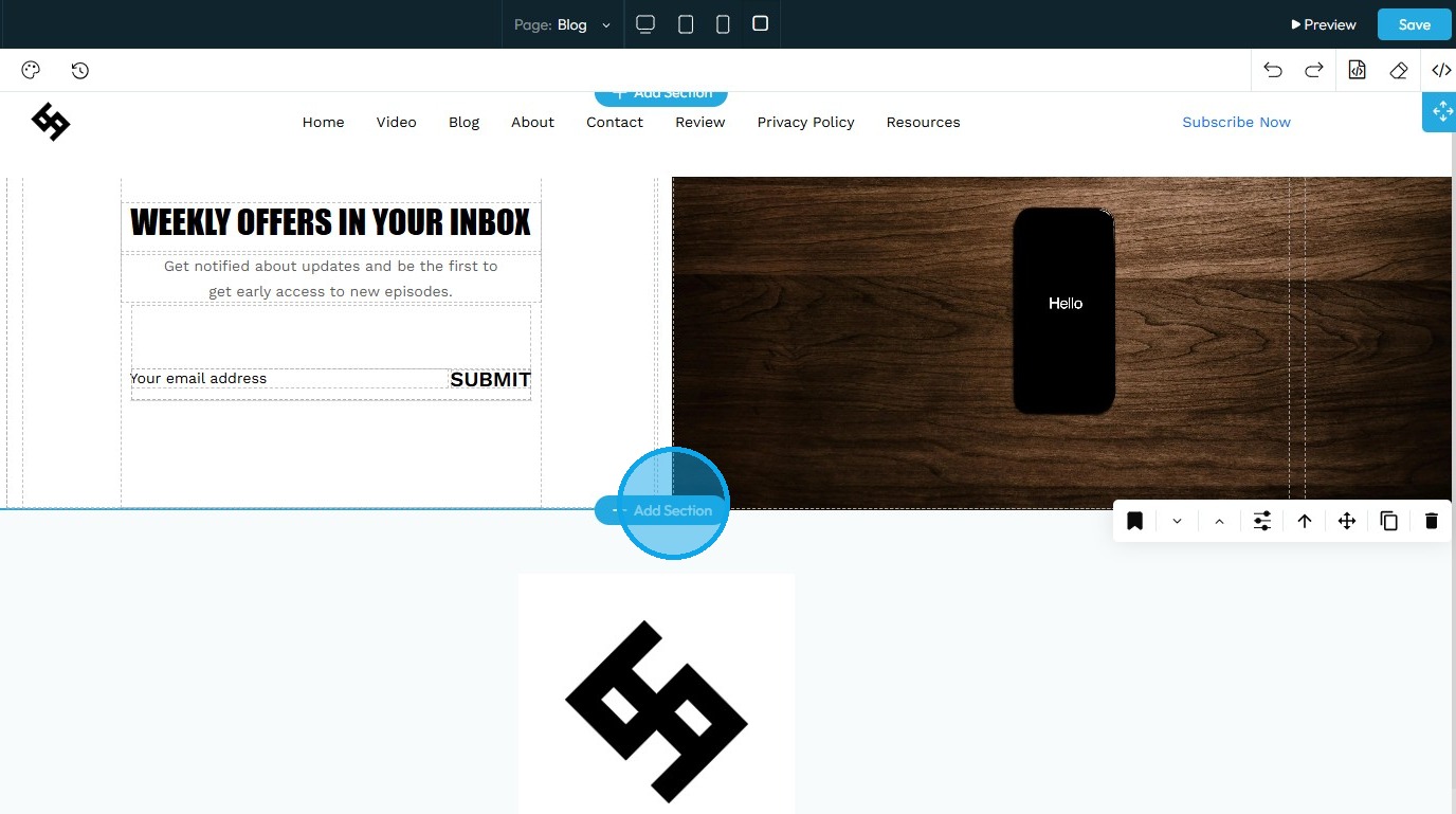
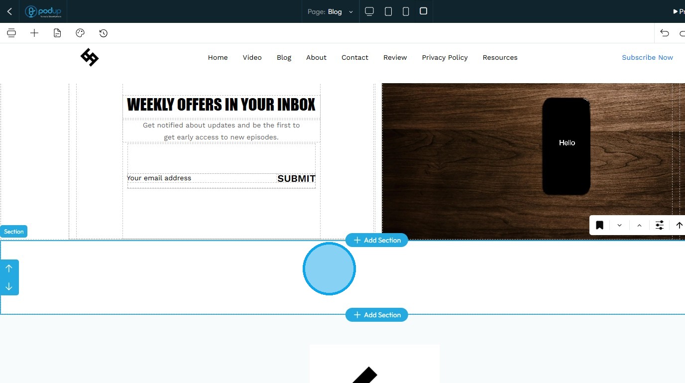
9. A new section will be successfully added to the page
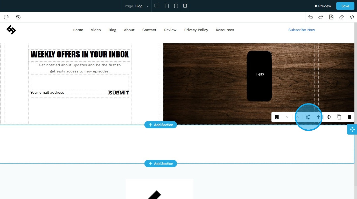
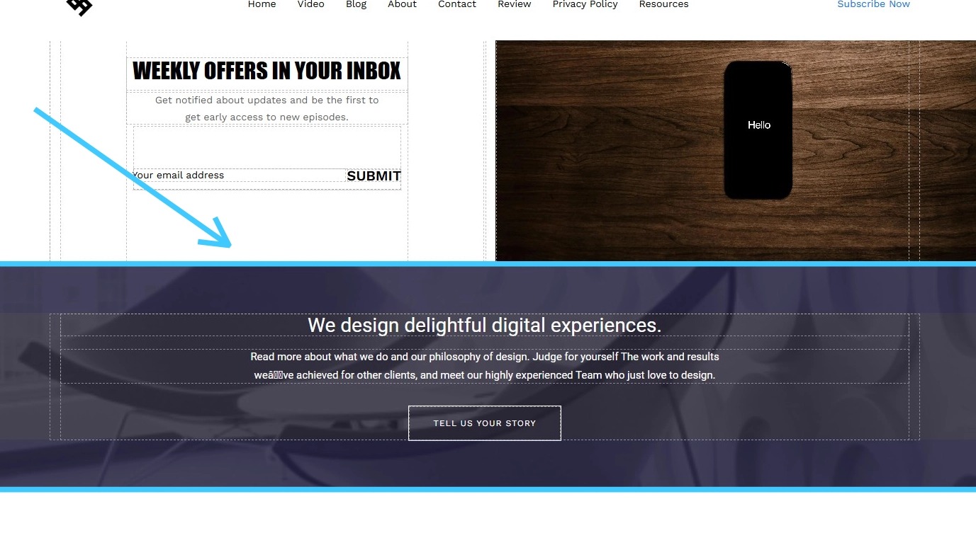
10. To customize a section, click on it to select and activate the editing options
11. Click the “Customize” icon to access the section’s editing options
12. Refer to “How to Format a Design Element” for guidance on the Design section, as the process is consistent across all elements
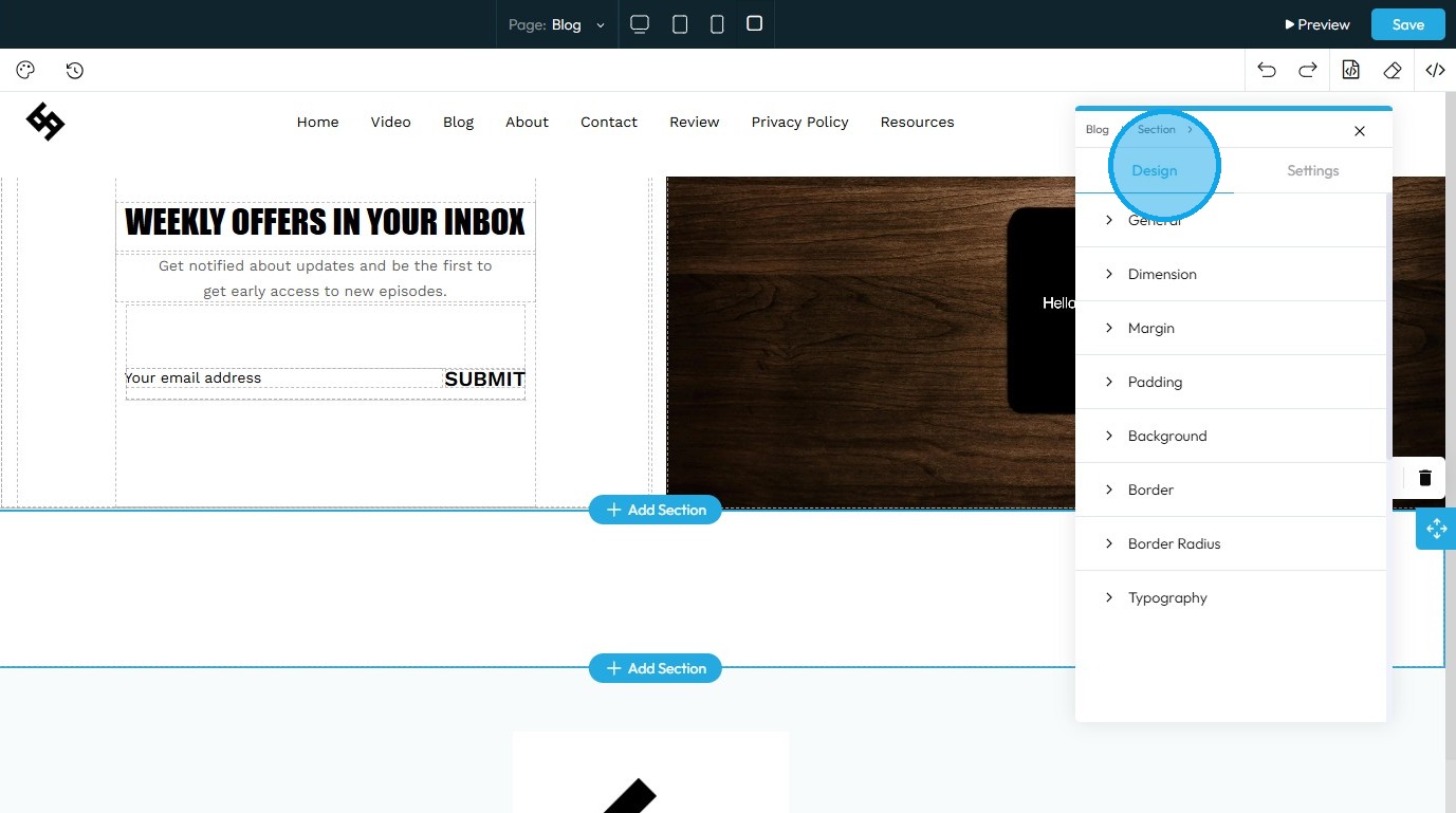
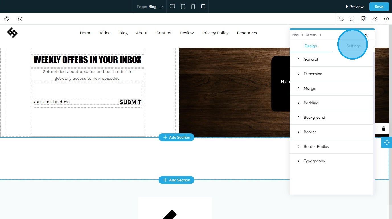
13. Select "Settings"
14. State: The different ways an element looks or acts depending on how someone interacts with it
- Hover: This allows you to define a special set of styles that apply only when a user's mouse cursor is hovering over an element that has this class. It adds interactivity and visual feedback
- Click: This allows you to define a special set of styles that apply when an element is being actively clicked or pressed down by the user. It provides immediate visual feedback that the user's action is being registered
- Even/Odd: This allows you to apply different styles to elements based on their position in a sequence (even or odd number) within a common parent. This is
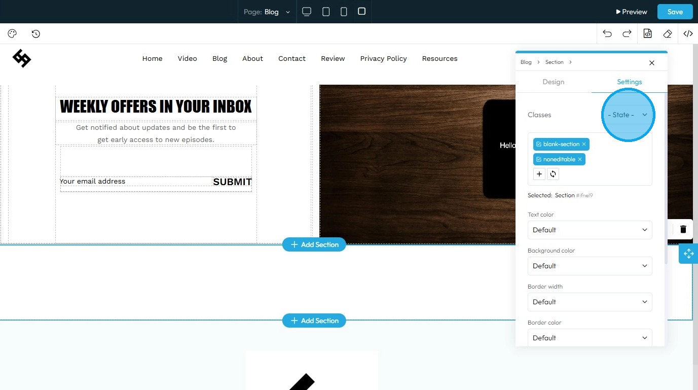
15. Classes: A reusable set of styles that you can apply to multiple elements across your website. You can add specific elements that you have already programmed or they will be automatically added when you edit the menu
- Tip: If this is your first website, leave this blank and let the software fill this in unless you have experience website building
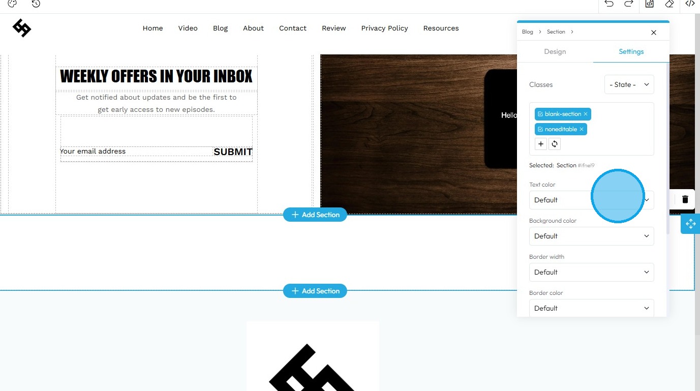
16. Text Color: This property directly changes the color of the text characters within an element
- Default: The standard text color used by the website theme
- Primary: A bold color used to highlight main actions or important text
- Secondary: A softer color used for less important or supporting text
- Success: A green-like color often used to show something positive, like a success message
- Info: A blue-like color used to show helpful or informational text
- Warning: An orange or yellow color used to alert users without being too alarming
- Danger: A red-like color used to show errors or serious warnings
- Light: A very light or gray color, usually used on dark backgrounds
- Dark: A dark gray or near-black color, used on light backgrounds for strong contrast
- White: Pure white text, best used on dark or colored backgrounds for readability
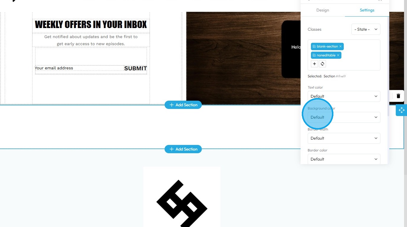
17. Background Color: Sets a solid color that fills the background area of an element. This color sits behind the element's content and its padding, but inside its border
- Default: The standard background color set by the theme
- Primary: A main brand color used to highlight key areas or buttons
- Secondary: A supporting color that complements the primary color
- Success: A green-toned background often used to show success messages or positive status
- Info: A blue-toned background used to display helpful or informational content
- Warning: A yellow or orange background used to show caution or warning messages
- Danger: A red-toned background used to alert users to errors or serious issues
- Light: A very light background, often gray or off-white, for a clean, subtle look
- Dark: A dark gray or black background, used for bold sections or contrast
- White: A pure white background, often used for clean and simple sections
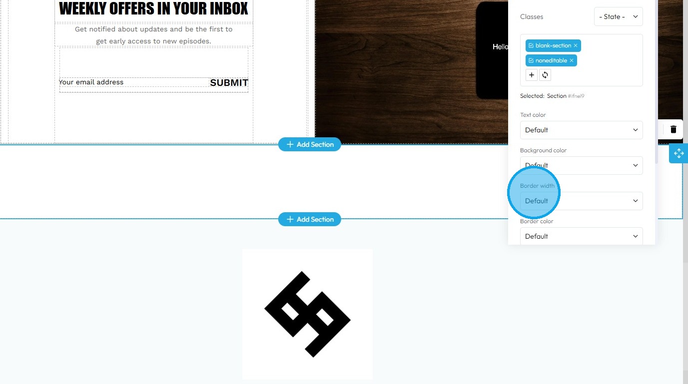
18. Border Width: Controls the thickness of the line that forms the border around an element
- Default: Uses the standard border size set by the website theme
- Full: Adds a border to all four sides of the element
- No Top: Removes the border from the top side only
- No Right: Removes the border from the right side only
- No Bottom: Removes the border from the bottom side only
- No Left: Removes the border from the left side only
- None: Removes the border from all sides of the element
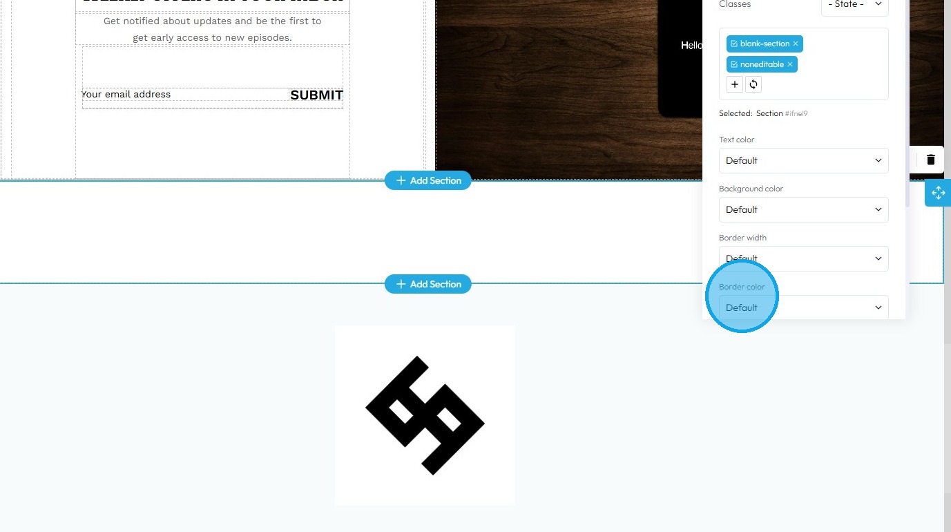
19. Border Color: Defines the color of the border line
- Default: The standard border color based on the website’s theme
- Primary: A bold color used to highlight or emphasize the border
- Secondary: A softer, supporting color for a more subtle border look
- Success: A green-toned border often used to show something positive or approved
- Info: A blue-toned border used for helpful or informational content
- Warning: A yellow or orange border to draw attention or show a caution
- Danger: A red-toned border used to show an error or alert
- Light: A pale or gray border for a minimal, clean design
- Dark: A deep gray or black border for strong contrast or bold sections
- White: A white border, best used on dark backgrounds for visibility
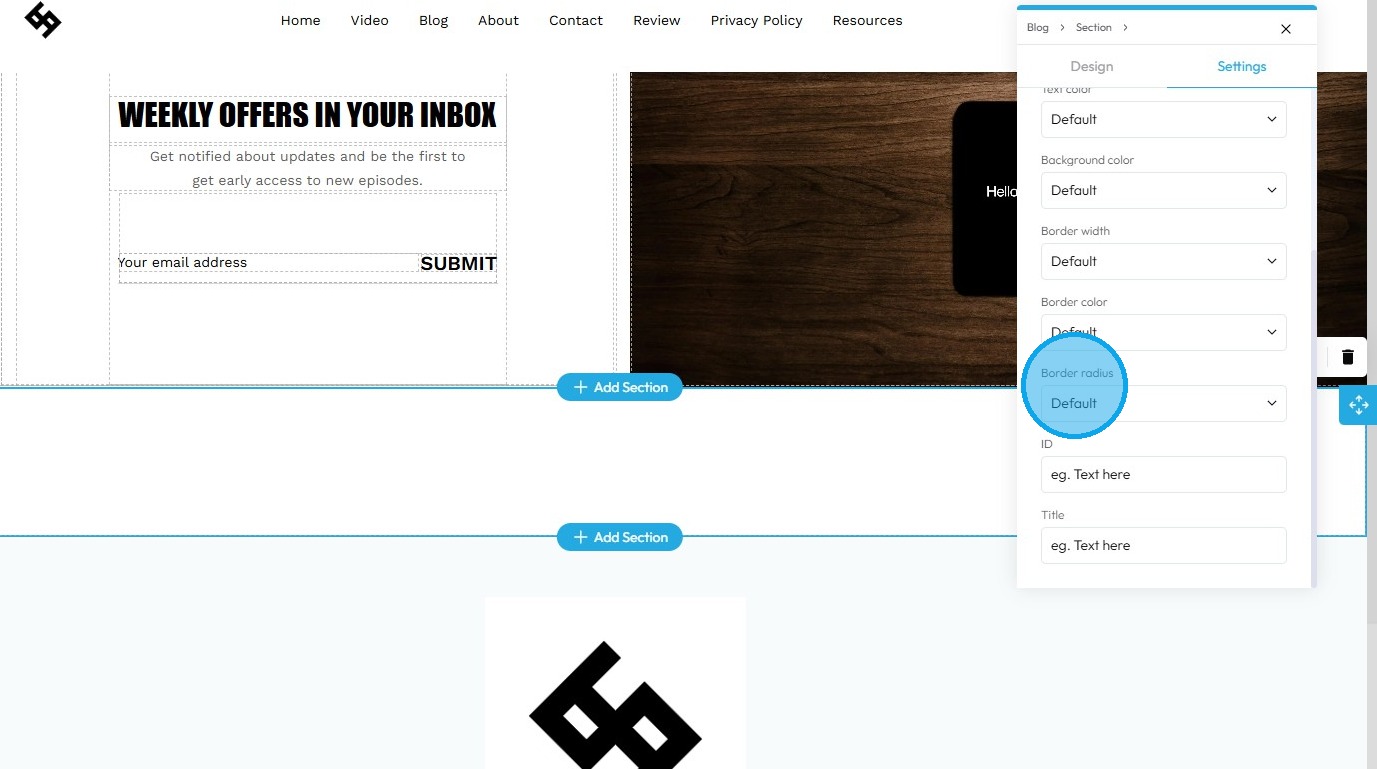
20. Border Radius: This property rounds the corners of an element's border (and its background and content area). Instead of sharp 90-degree corners, you get smooth, curved ones
- Default: Uses the standard corner style set by the website theme
- Rounded: Softens all four corners of the element for a smooth, curved look
- Rounded Top: Only the top-left and top-right corners are rounded
- Rounded Right: Only the top-right and bottom-right corners are rounded
- Rounded Bottom: Only the bottom-left and bottom-right corners are rounded
- Rounded Left: Only the top-left and bottom-left corners are rounded
- Circle: Makes the element fully circular (works best on square elements)
- Square: Removes all rounding for sharp, straight corners on all sides
21. Click the "Text here" field under "ID" to add an ID which is a unique name given to the element so it can be targeted with code (like for styling or linking) which will be used internally
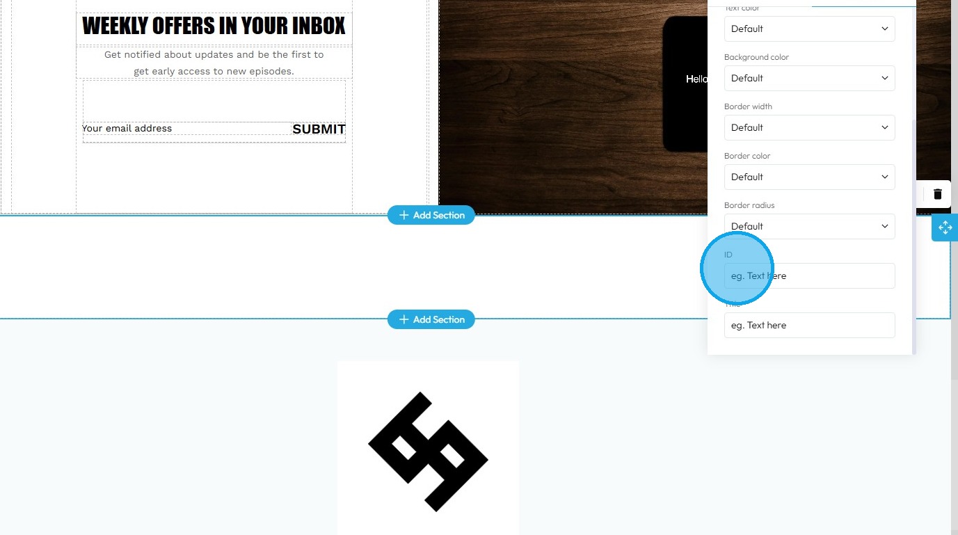
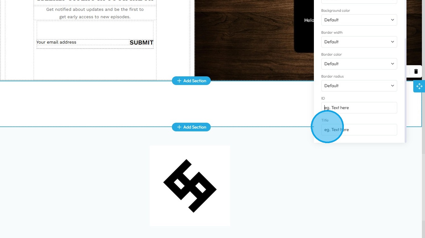
22. Click the "Text here" field under "Title" to add a title which is a short description that may show up as a tooltip when users hover over the element.
23. Click "+" Block icon to add the blocks in the new "Section"
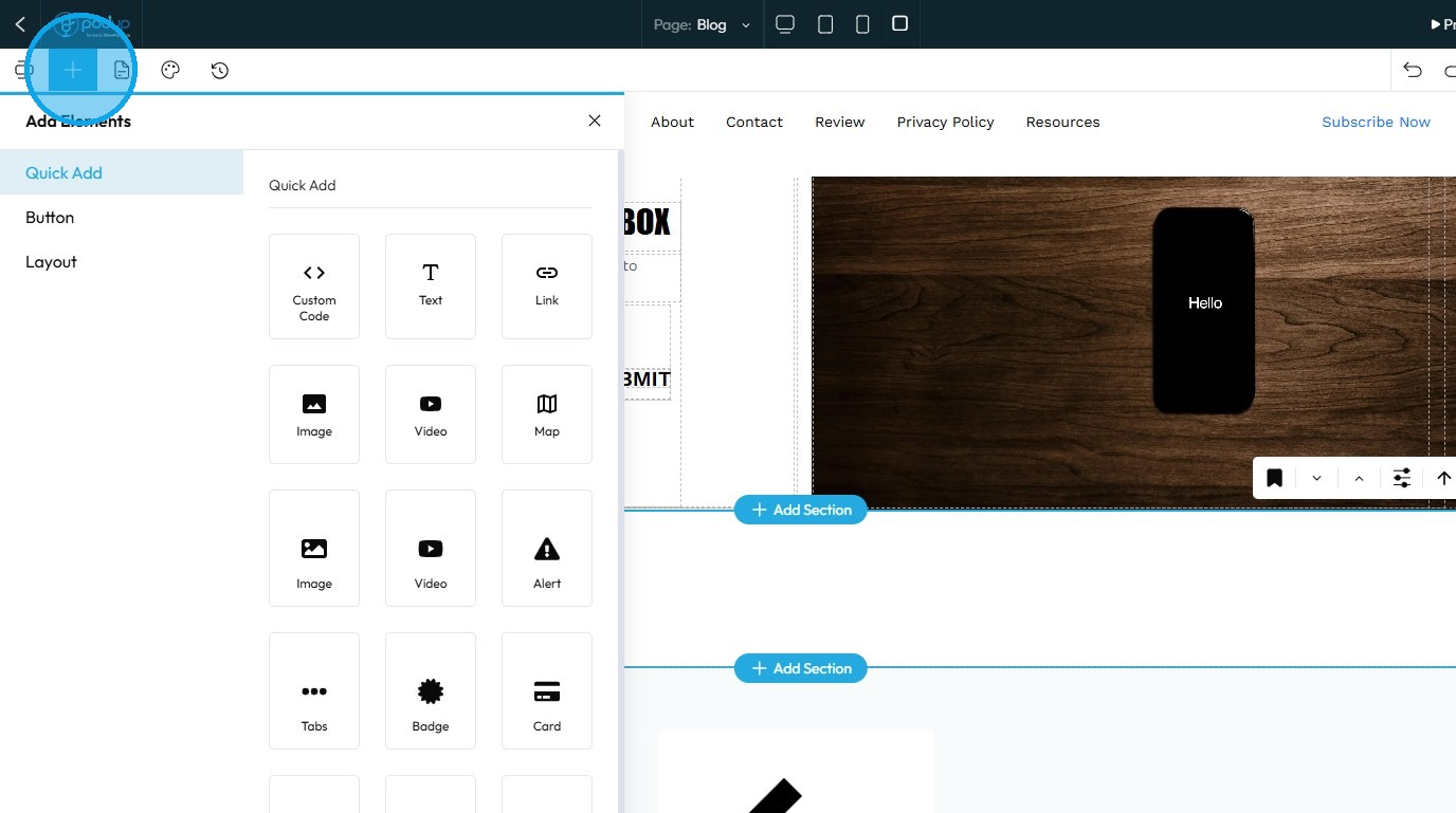
24. Click “Component” to display the list of available components
25. To add a component, simply drag and drop it into the new section
26. The component will be successfully added to the section
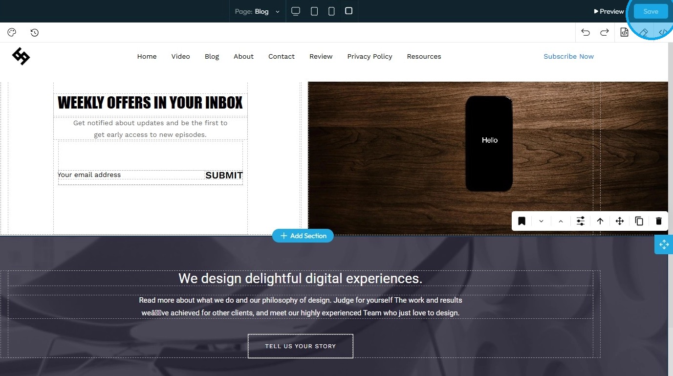
27. Click "Save" in the top-right corner to apply and retain your changes
Related Articles
How to Add a Section to my Page
This guide provides a straightforward approach to enhancing your webpage by adding new sections using Podup's Page Builder. It simplifies the process into easy-to-follow steps, making effective customization accessible for users of all skill levels. ...How to turn a section into an "About" area
Turn a website section into a polished "About" area with PodUp’s page builder to tell your brand’s story 1. Navigate to https://app.podup.com/home 2. Click "My Site." 3. Select "Page Builder" 4. The "Pages" section will open, displaying all the ...How to turn a section into a banner?
Turn any website section into a banner to highlight key content or announcements 1. Navigate to https://app.podup.com/home 2. Click "My Site" 3. Select "Page Builder." 4. The "Pages" section will open, displaying all the webpages on your site 5. ...How do I customize my newsletter for every newsletter?
Follow this guide to customize your newsletter with your own content and images easily. 1. Navigate to https://app.podup.com/home 2. Click "Grow" 3. Select "Email Marketing" 4. The “Newsletter” section will load 5. Click “Create Newsletter Template” ...How do I customize Web builder Quick Add (Detailed) - Collapse
By following this guide, you will be able to easily customize the Quick Add feature in the PodUp Web Builder from adding a collapse block to adjusting its visual properties ensuring an interactive and visually appealing website. 1. Navigate to ...