How do I Customize Web builder Quick Add (Detailed) - Header
By following this guide, you will learn how to fully customize the header in the PodUp Web Builder from adding the header block to adjusting its styles, colors, and interactive features ensuring a visually appealing and highly functional design.
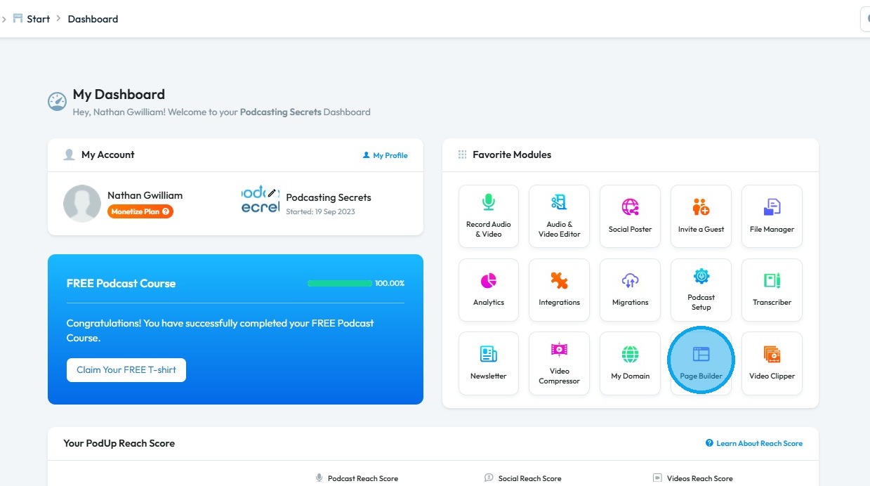
2. Click "Page Builder"
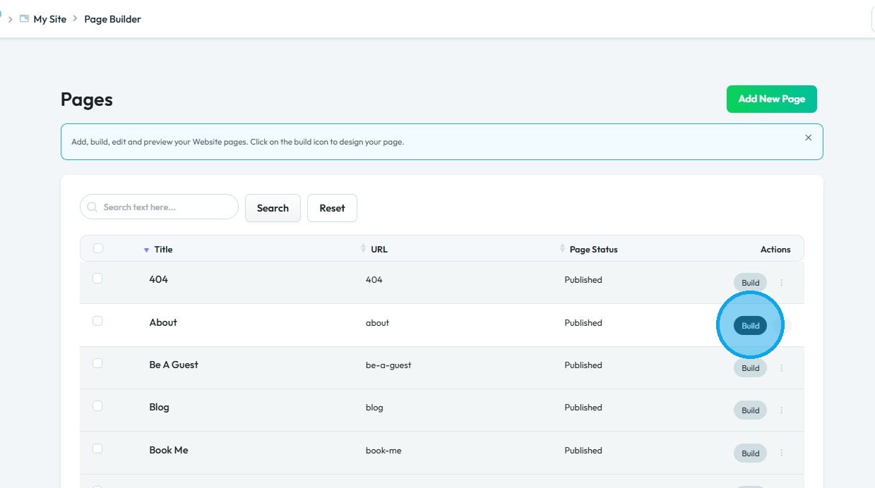
3. Click the “Build” button on the page where you want to add a form
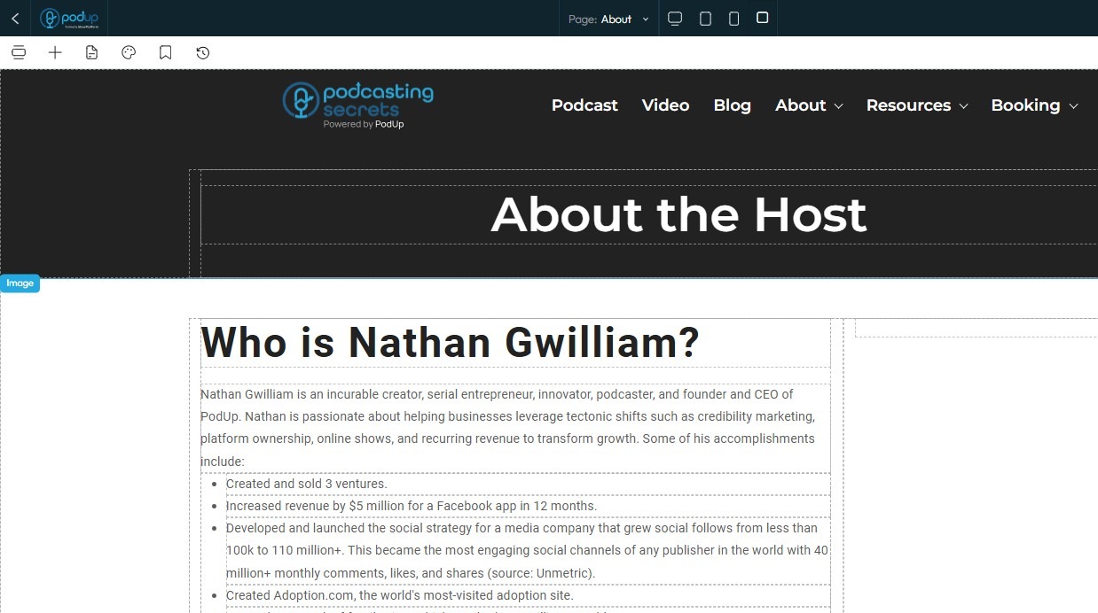
4. The PodUp Page Builder will load
5. Click the "Add Block" icon
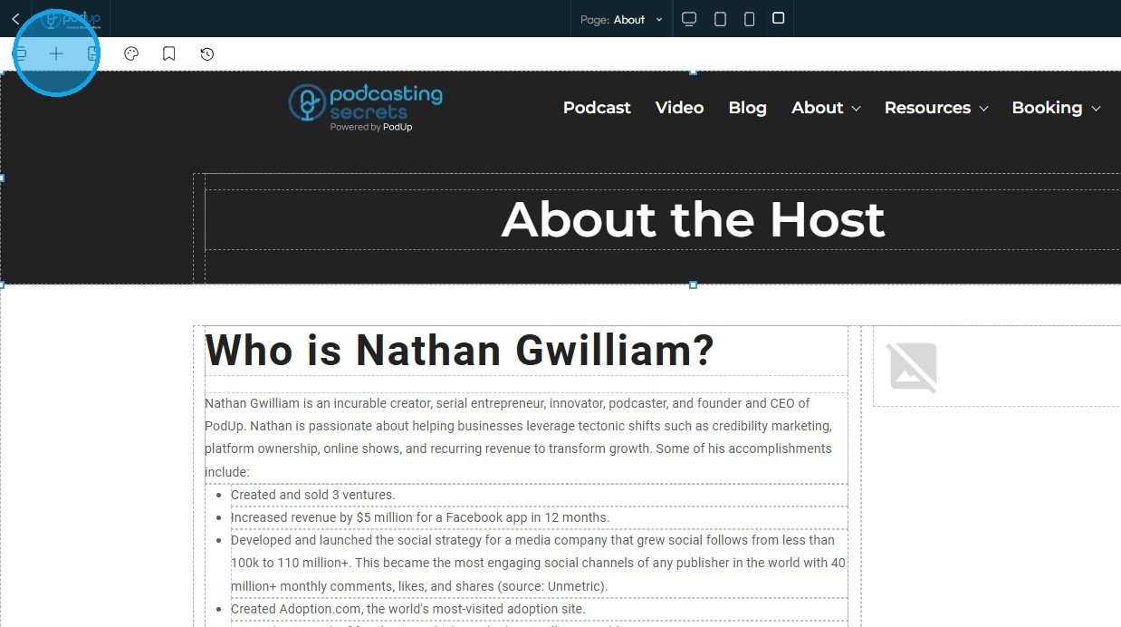
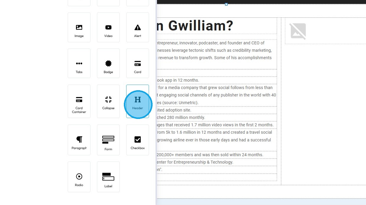
6. Drag and drop the Header block onto your page
7. Header will be added to your site
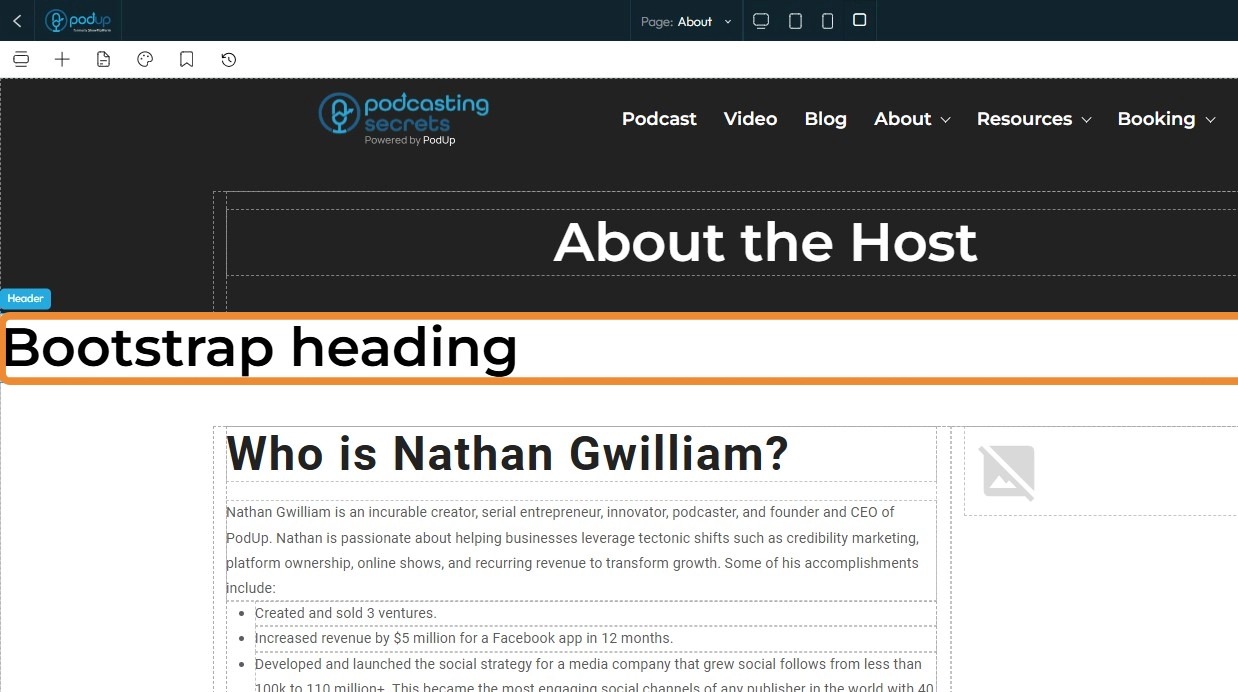
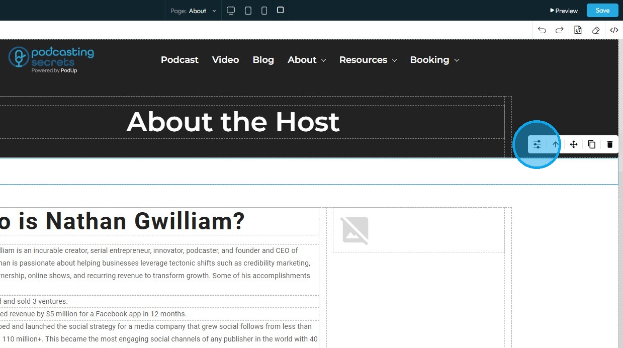
8. To further customize it, click on the header block to select it
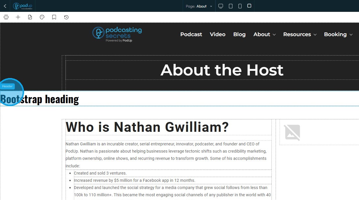
9. Click on the "Settings" icon
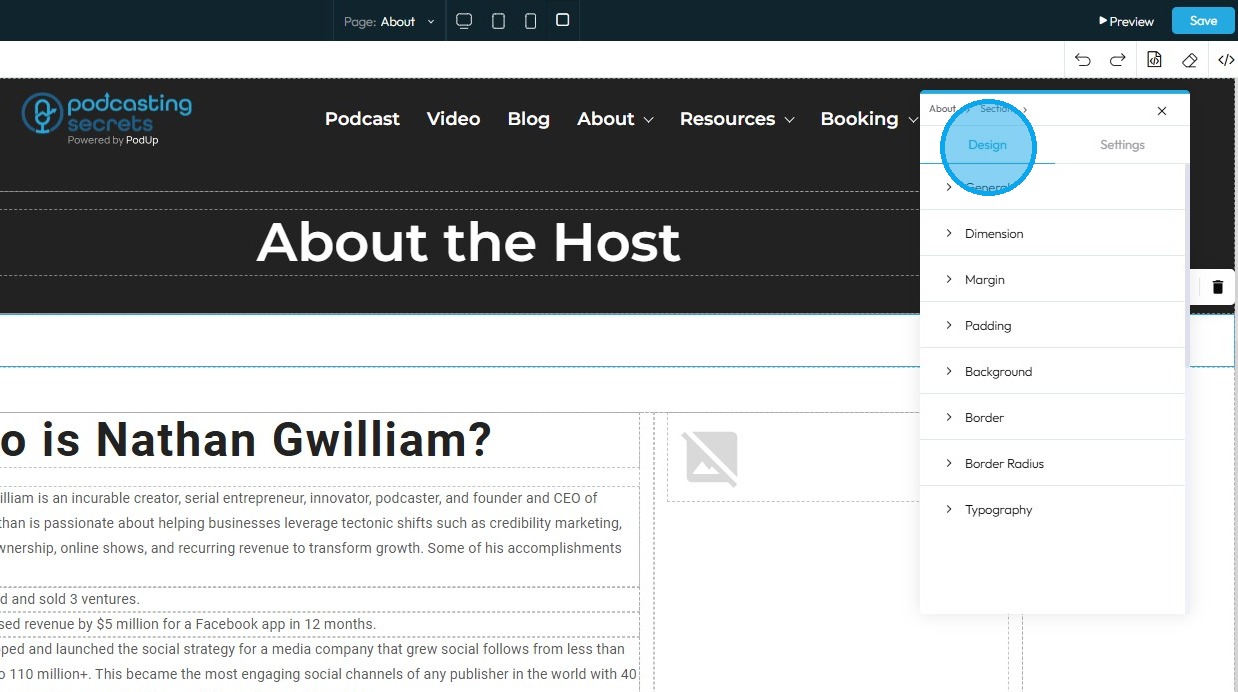
10. Refer to "How to Format a Design Element" for guidance on the Design section, as these options are consistent across all elements
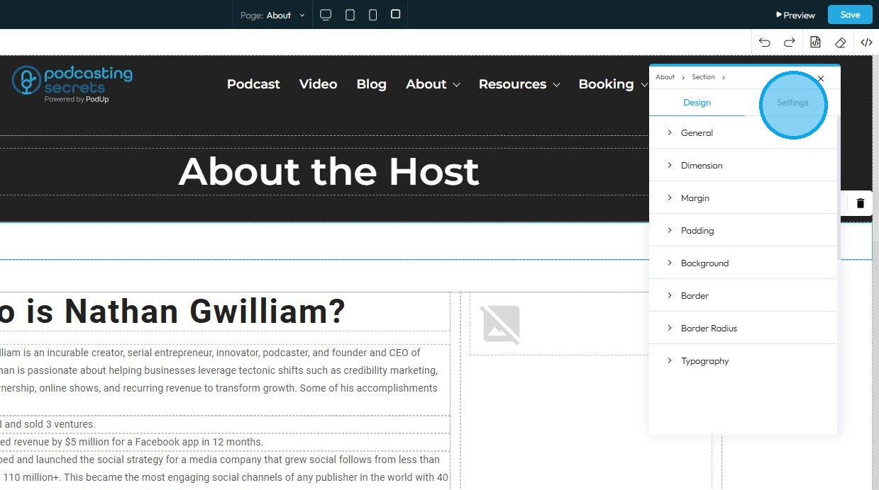
11. Click "Settings" to access the configuration options for this specific element
12. State: The different ways an element looks or acts depending on how someone interacts with it
- Hover: This allows you to define a special set of styles that apply only when a user's mouse cursor is hovering over an element that has this class. It adds interactivity and visual feedback
- Click: This allows you to define a special set of styles that apply when an element is being actively clicked or pressed down by the user. It provides immediate visual feedback that the user's action is being registered
- Even/Odd: This allows you to apply different styles to elements based on their position in a sequence (even or odd number) within a common parent. This is incredibly useful for creating visual patterns, like "zebra striping" in lists or tables
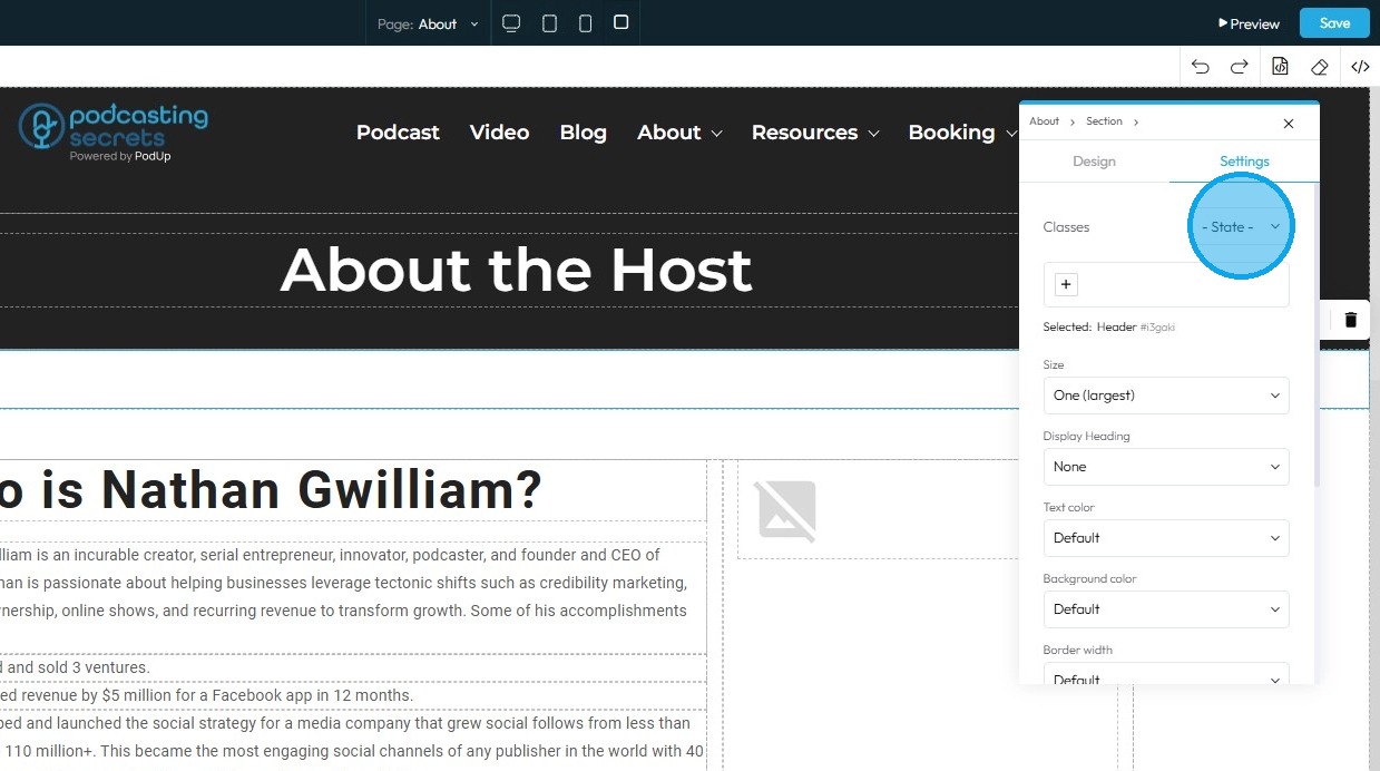
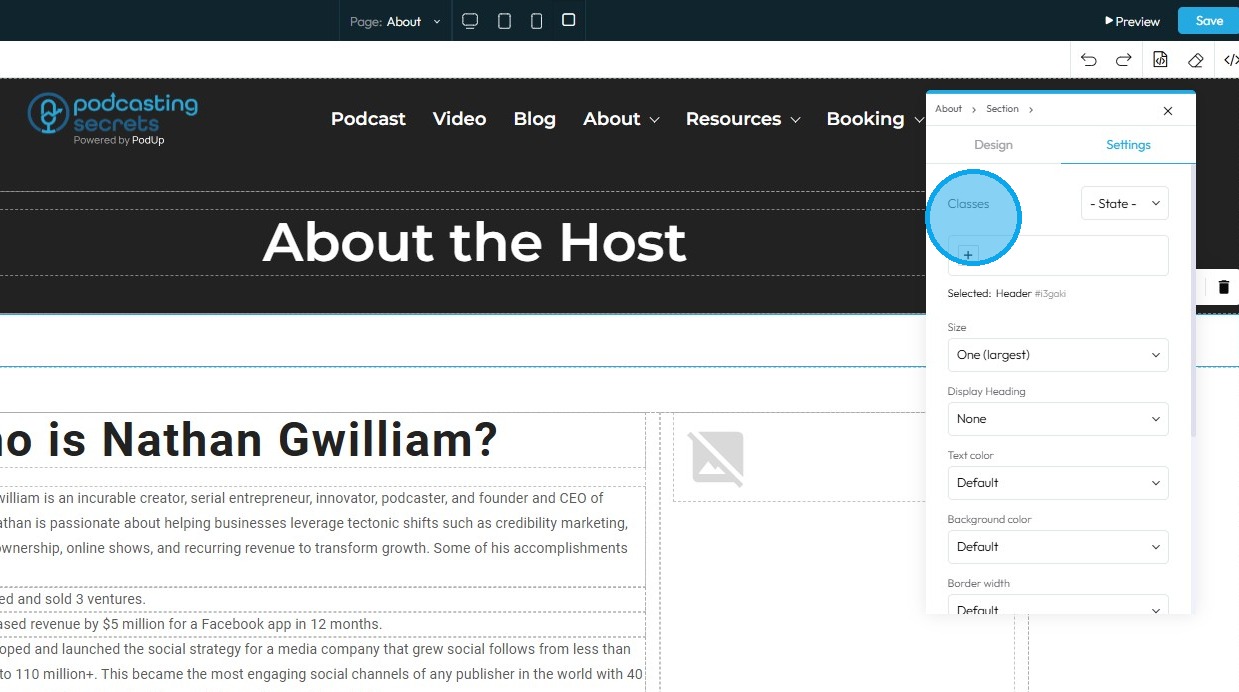
13. Classes: A reusable set of styles that you can apply to multiple elements across your website. You can add specific elements that you have already programmed or they will be automatically added when you edit the menu
- Tip: If this is your first website, leave this blank and let the software fill this in unless you have experience website building
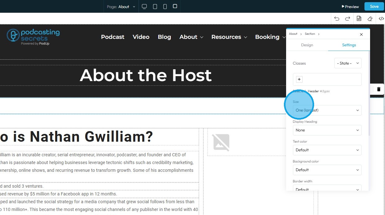
14. Click "Size"
- Size: Refers to the font size of the heading
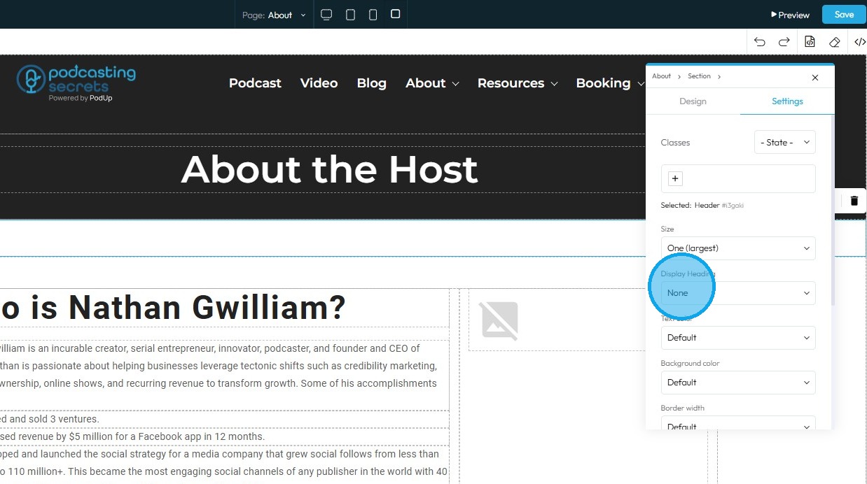
15. Click "Display Heading"
- Display Heading: Is a styling option for text elements, specifically for headings. It is a feature that applies special, often larger and more attention-grabbing, typography to a heading
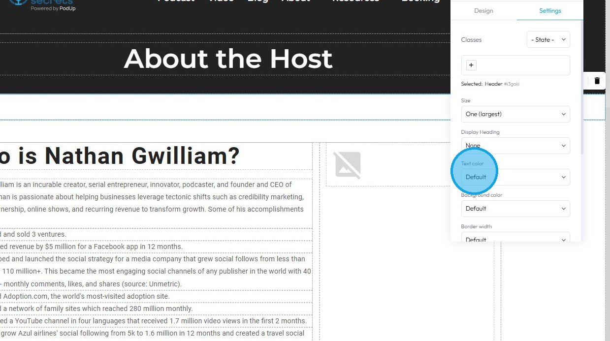
16. Click "Text color"
- Text Color: This property directly changes the color of the text characters within an element
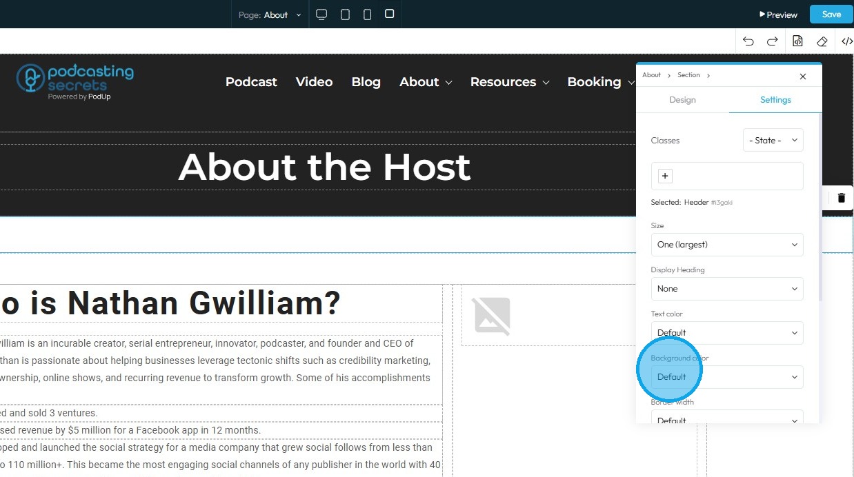
17. Click "Background color"
- Background Color: Sets a solid color that fills the background area of an element. This color sits behind the element's content and its padding, but inside its border
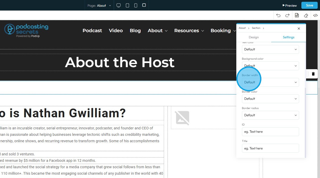
18. Click "Border Width"
- Border Width: Controls the thickness of the line that forms the border around an element
19. Click " Border Color"
- Border Color: Defines the color of the border line

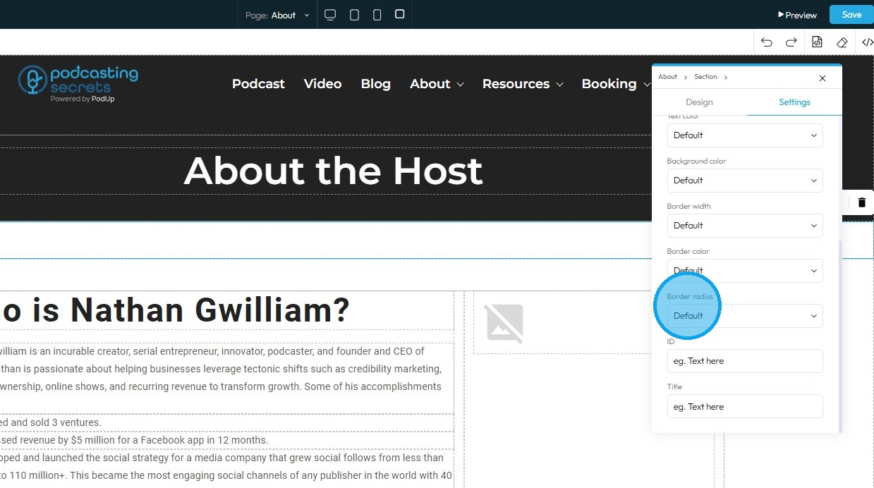
20. Click "Border Radius"
- Border Radius: This property rounds the corners of an element's border (and its background and content area). Instead of sharp 90-degree corners, you get smooth, curved ones
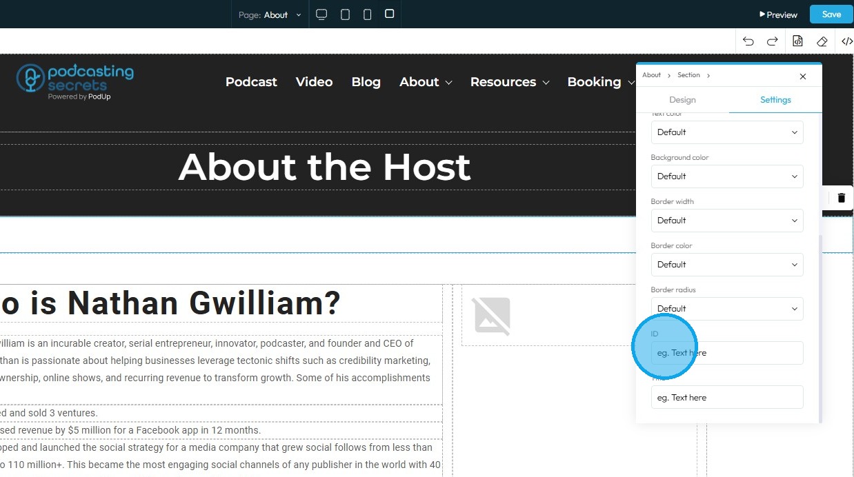
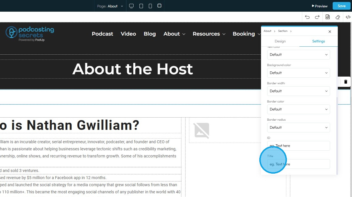
21. Click "ID" to assign a unique identifier to the element, allowing it to be styled, linked, or controlled independently from other components on the page
22. Click "Title" to add a brief, non-critical description that provides additional context or information about the element
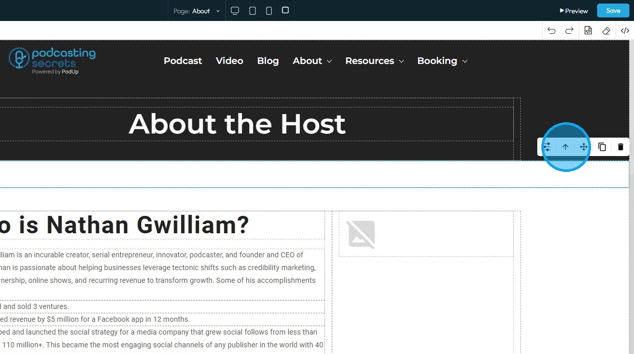
23. Click the arrow icon moves the element into the next larger container, shifting it from a smaller block (such as a text block or section) into the broader layout to help position it more accurately on the page.
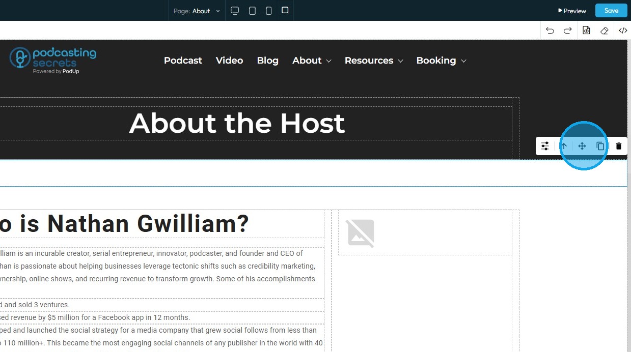
24. Move: Reposition the section by clicking and holding this icon, then dragging it to the desired location. A green line will indicate the placement point.
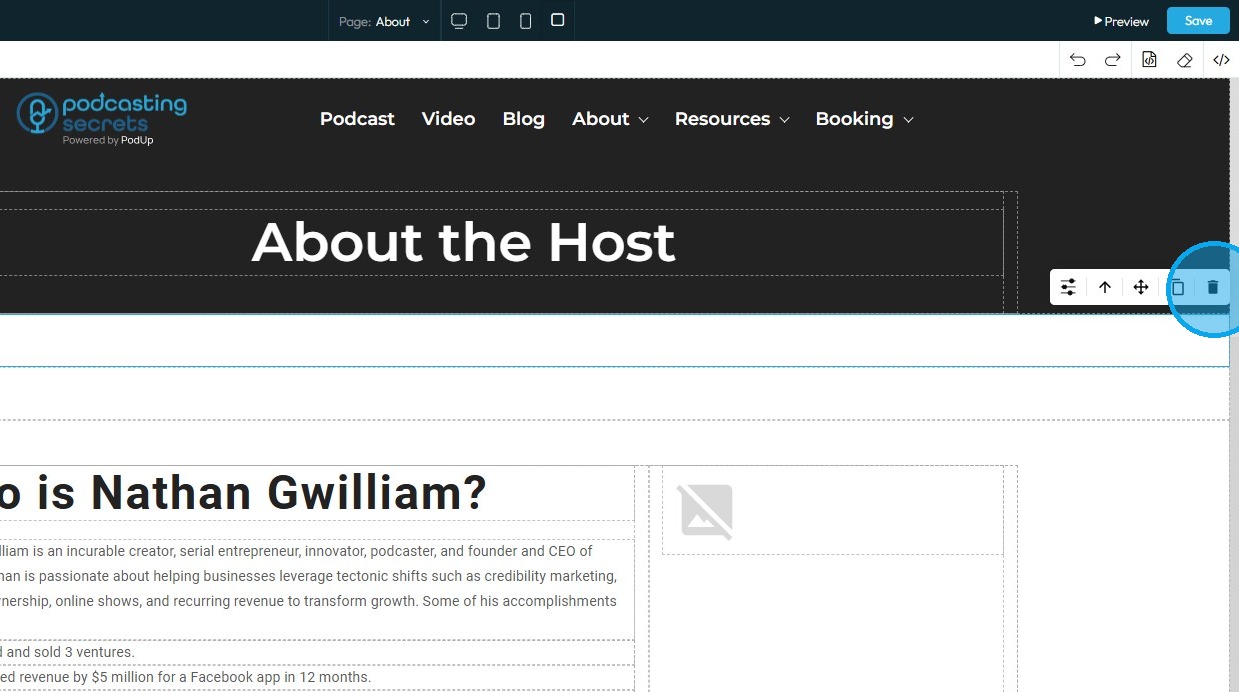
25. Copy: Create a duplicate of the section
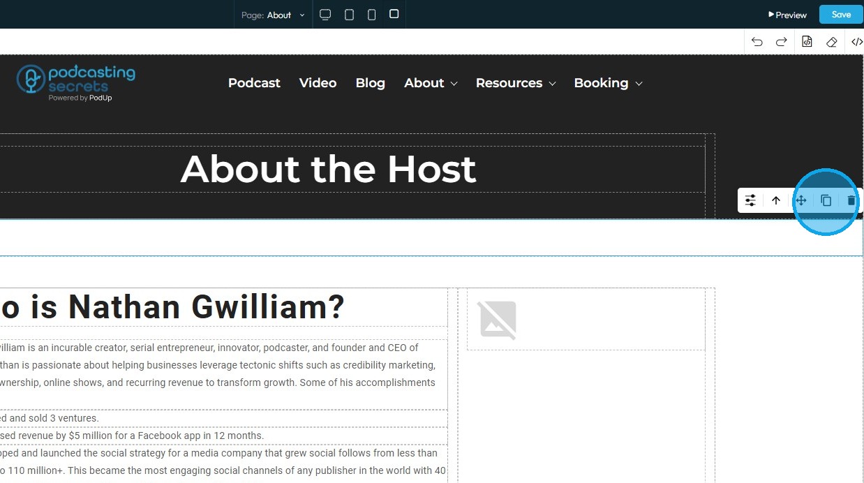
26. Delete: Remove the section entirely.
- Note: If a duplicate exists, only one instance will be deleted
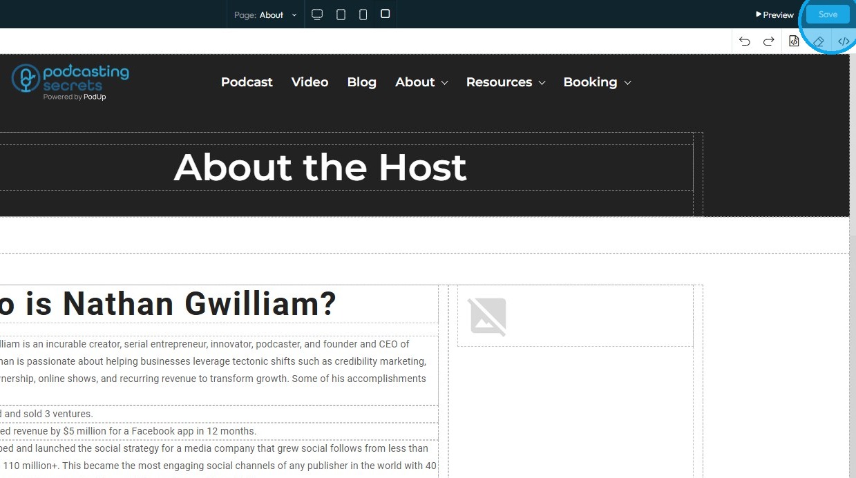
27. Click "Save" in the top-right corner once all edits are complete
Related Articles
How do I customize Web builder Quick Add (Detailed) - Card
By following this guide, you can easily customize the Quick Add Card feature in PodUp Web Builder to enhance your website’s design and visual appeal. 1. Navigate to https://app.podup.com/home 2. Click "Page Builder". 3. Click the "Build" button for ...How to Navigate Page Builder (Detailed)
This guide provides a straightforward method for creating and customizing website pages using PodUp's Page Builder, making it ideal for users of all skill levels. It outlines each step in the process, from accessing the page builder to editing ...How do I Customize Web builder Quick Add (Detailed) - Paragraph
By following this guide, you will learn how to customize the Quick Add feature in the PodUp Web Builder from adding a paragraph block to adjusting text, background, and border settings so you can create polished, visually appealing elements with ...How do I customize Web builder Quick Add (Detailed) - Collapse
By following this guide, you will be able to easily customize the Quick Add feature in the PodUp Web Builder from adding a collapse block to adjusting its visual properties ensuring an interactive and visually appealing website. 1. Navigate to ...How do I customize Web builder Quick Add (Detailed) - Label
By following this guide, you can easily customize the Quick Add Label feature in the PodUp Web Builder to create visually appealing and interactive elements that enhance your website’s design and user experience. 1. Navigate to ...