How do I customize Web builder Quick Add (Detailed) - Checkbox
By following this guide, you can easily customize the Quick Add Checkbox feature in the PodUp Page Builder to enhance your website’s interactivity and design.
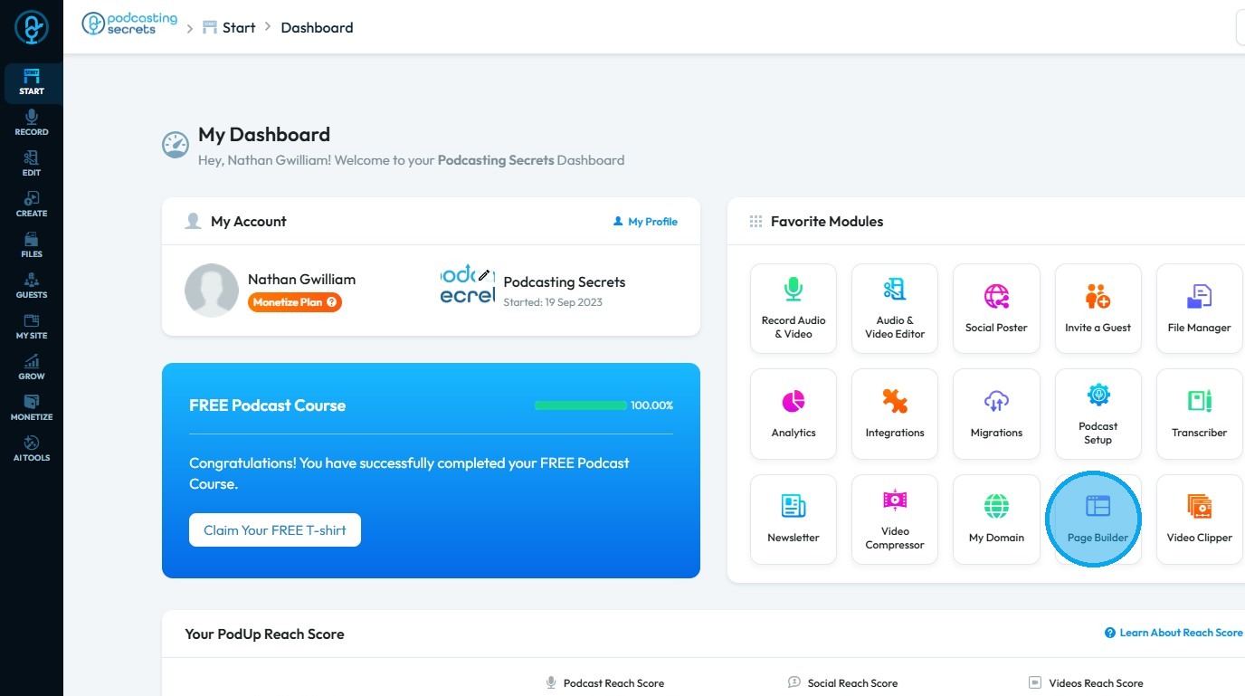
2. Click "Page Builder".
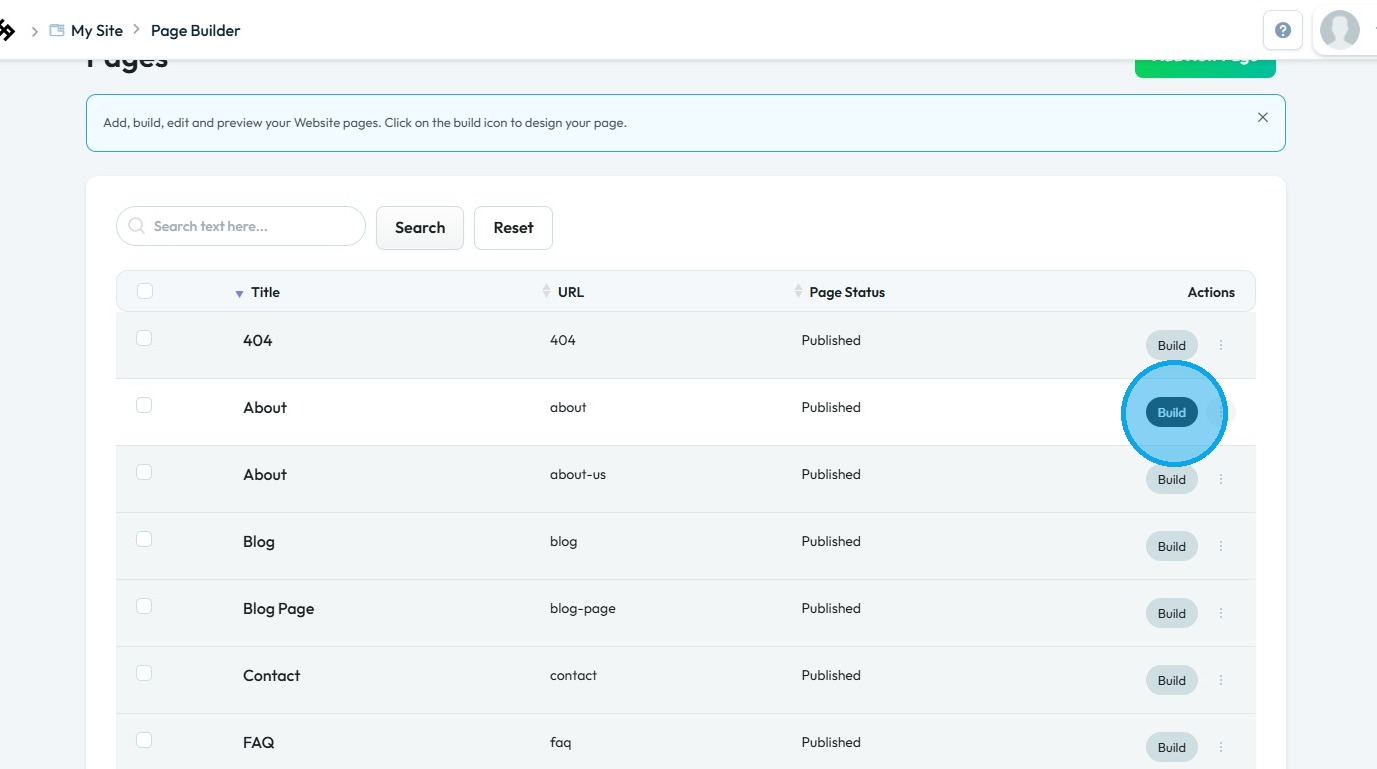
3. Click the "Build" button on the page where you want to add maps
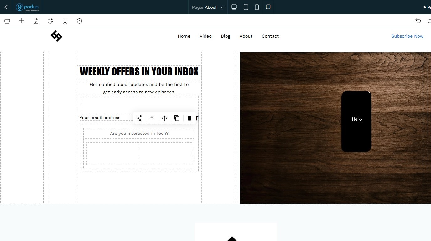
4. The PodUp Page Builder will load
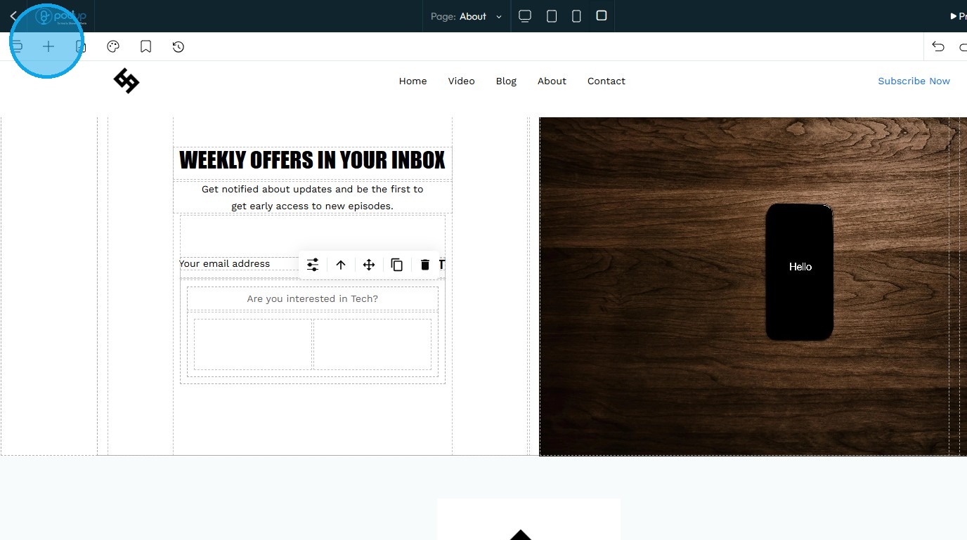
5. Click "Add Block" icon.
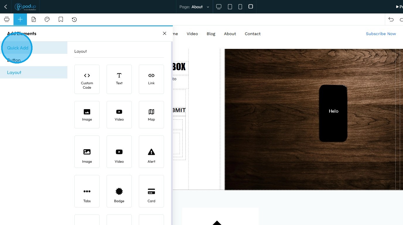
6. Click "Quick Add"
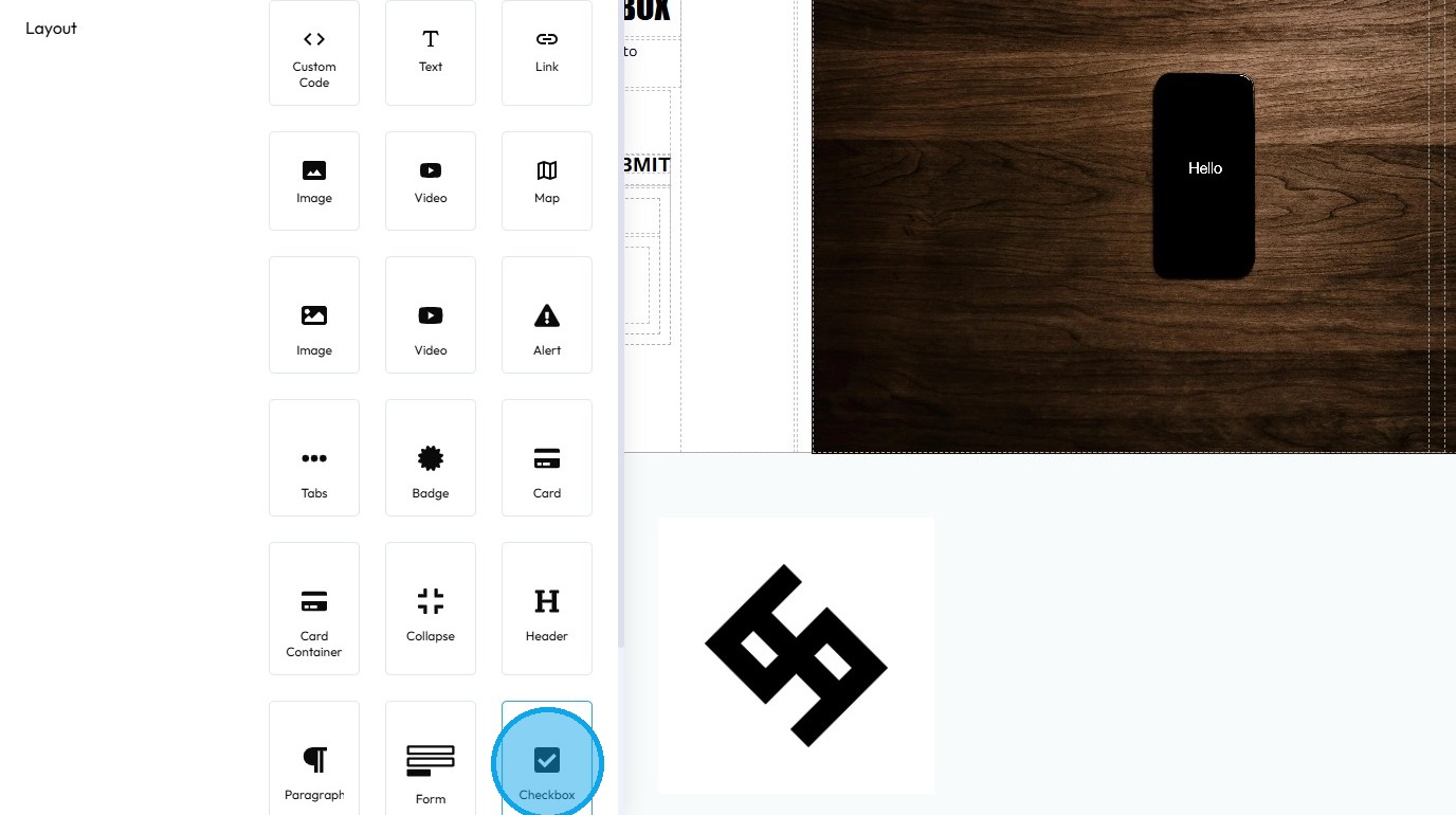
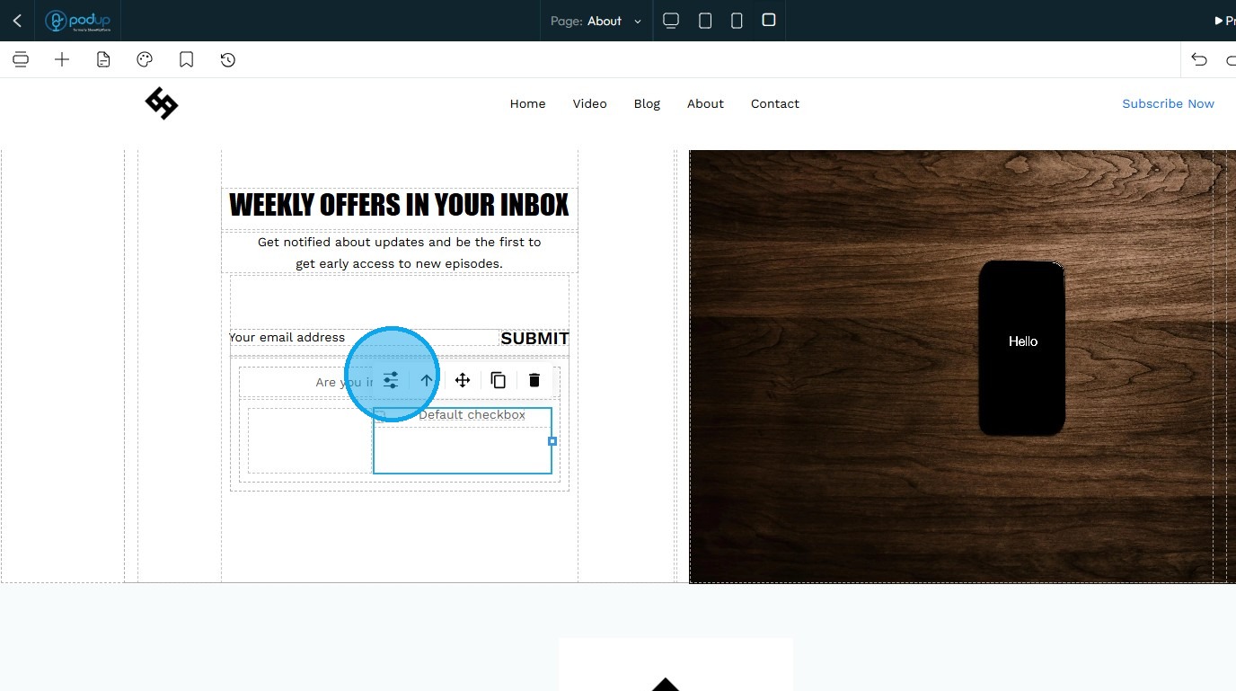
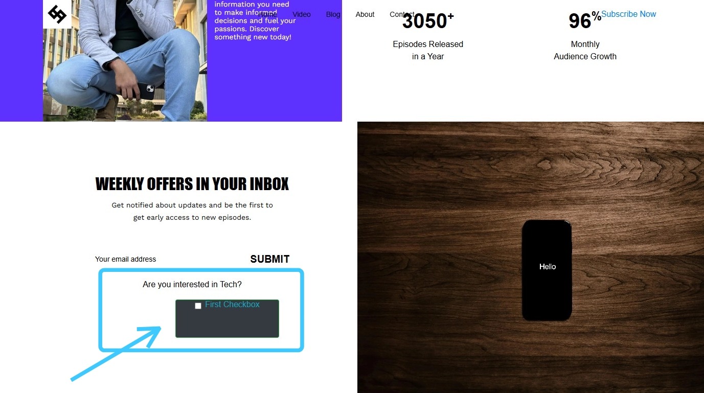
7. Click "Checkbox" and drag it to the desired location
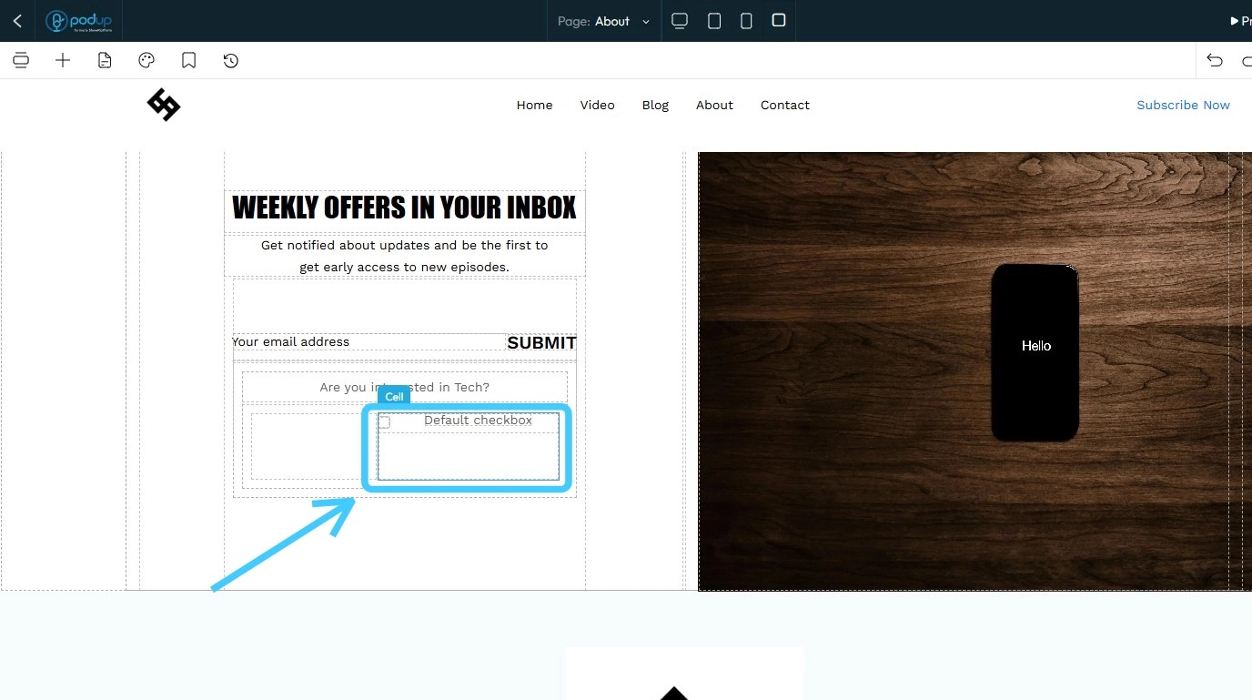
8. The Checkbox will be added to your website
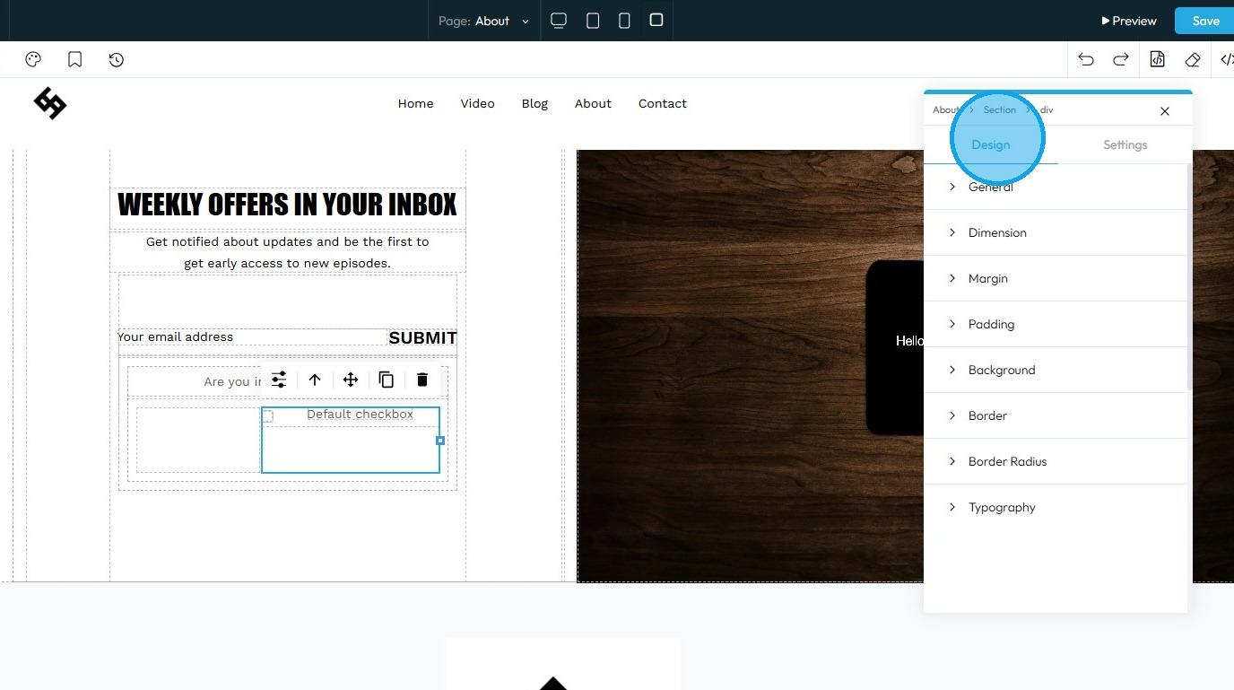
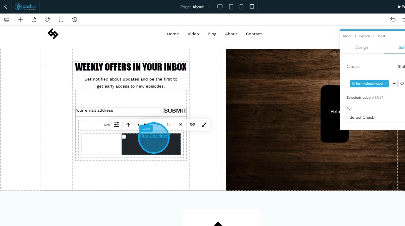
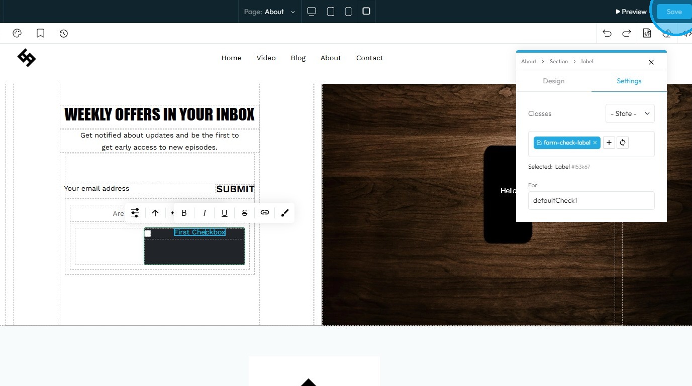
9. Select the element you want to edit, then click "Customize" to modify it
10. Refer to "How to Format a Design Element" for the Design section, as it applies consistently to all elements
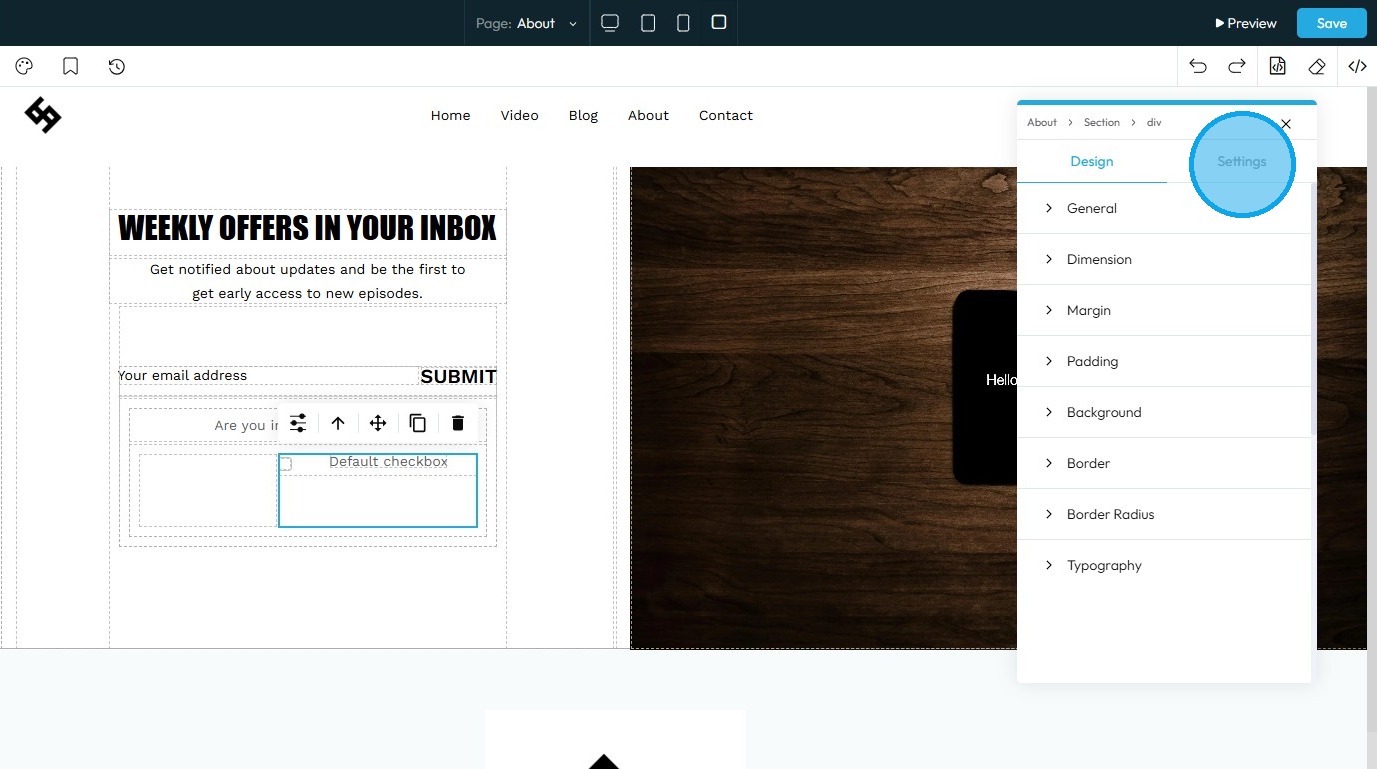
11. Click "Settings" to access the configuration options for this element
12. State: The different ways an element looks or acts depending on how someone interacts with it
- Hover: This allows you to define a special set of styles that apply only when a user's mouse cursor is hovering over an element that has this class. It adds interactivity and visual feedback
- Click: This allows you to define a special set of styles that apply when an element is being actively clicked or pressed down by the user. It provides immediate visual feedback that the user's action is being registered
- Even/Odd: This allows you to apply different styles to elements based on their position in a sequence (even or odd number) within a common parent. This is incredibly useful for creating visual patterns, like "zebra striping" in lists or tables
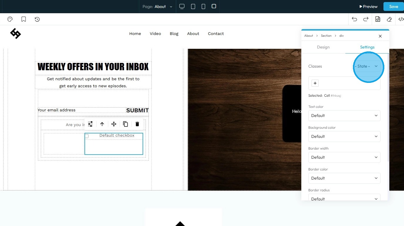
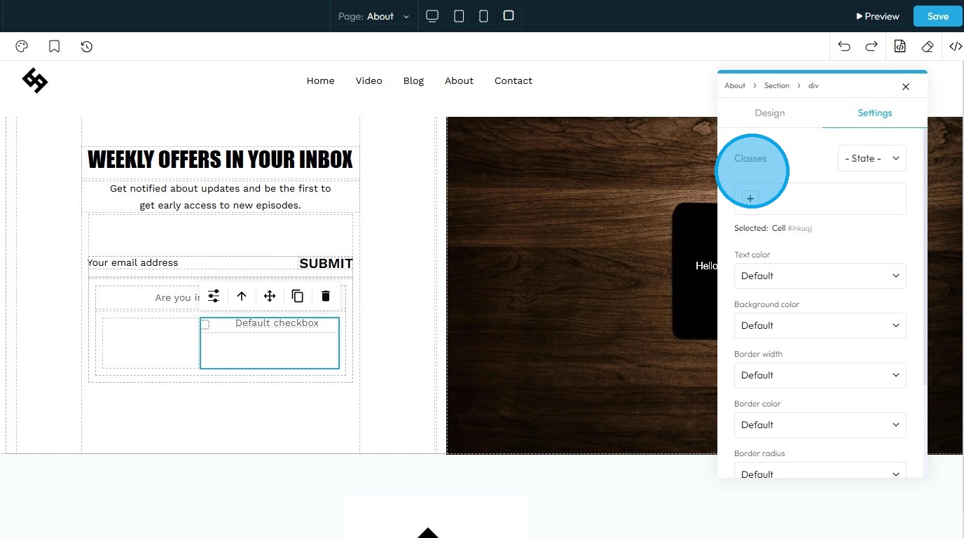
13. Classes: A reusable set of styles that you can apply to multiple elements across your website. You can add specific elements that you have already programmed or they will be automatically added when you edit the menu
- Tip: If this is your first website, leave this blank and let the software fill this in unless you have experience website building
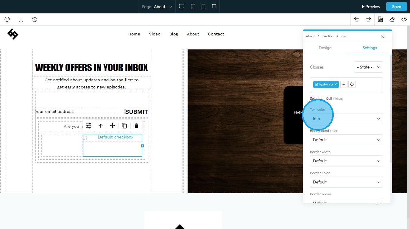
14. Text color: It allows you to choose a color for the Radio Button Text.
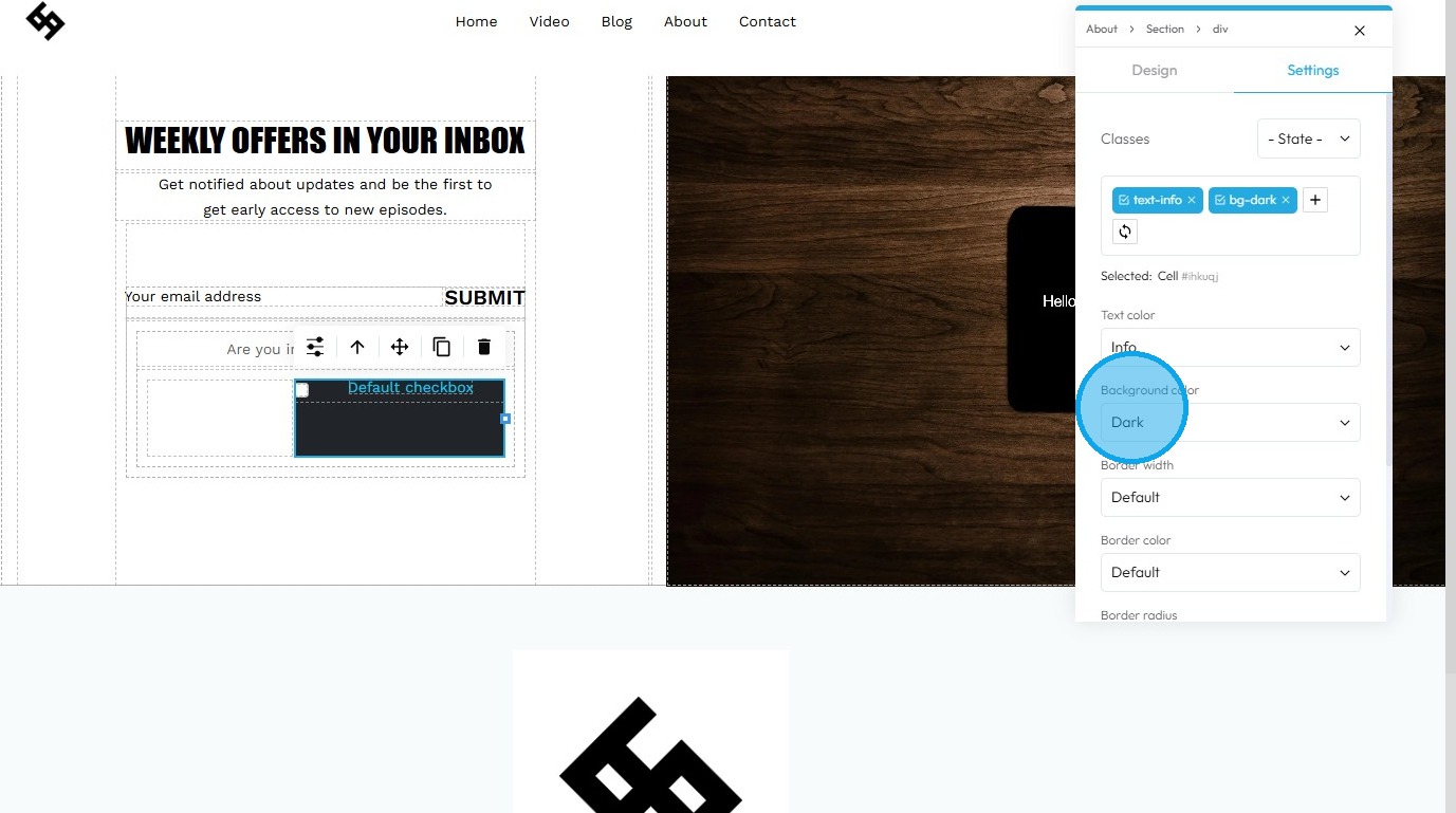
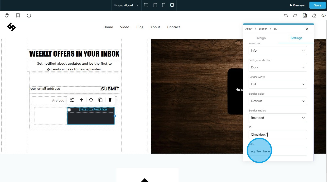
15. Background Color: It lets you choose a color for Radio Button Field.
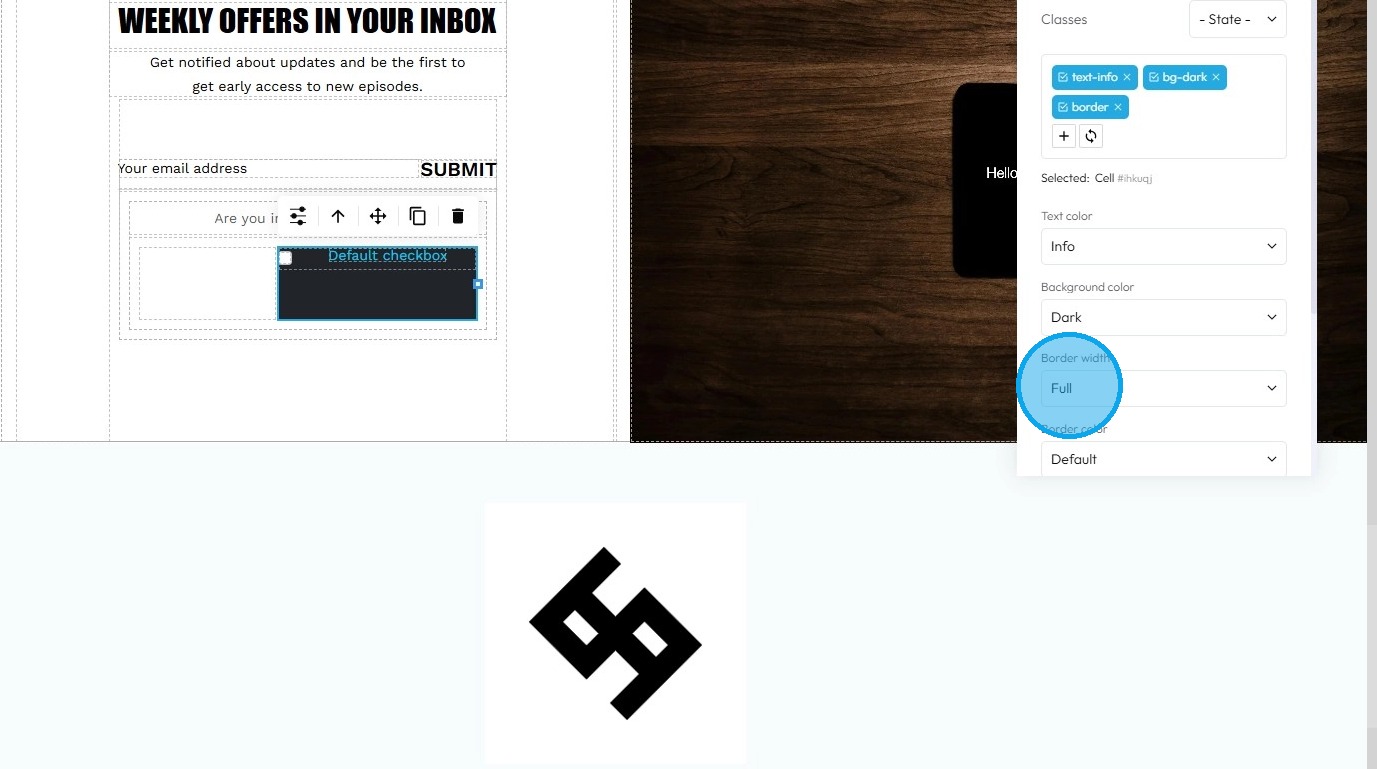
16. Border Width: Allows you to set thickness of the border.
17. Border Color: Allows you to set the color of the border.

18. Border Radius: Allows you to set the curvature of the border corners.

19. Click the "Text here" field under "ID" to assign a unique identifier to the element, allowing it to be targeted internally for styling, linking, or other code-based actions

20. Click the "Text here" field under "Title" to add a brief description that may appear as a tooltip when users hover over the element
21. Clicking the arrow icon moves the element to the next larger container, shifting it from a smaller block (such as a text block or section) into the broader layout to help position it more accurately on the page
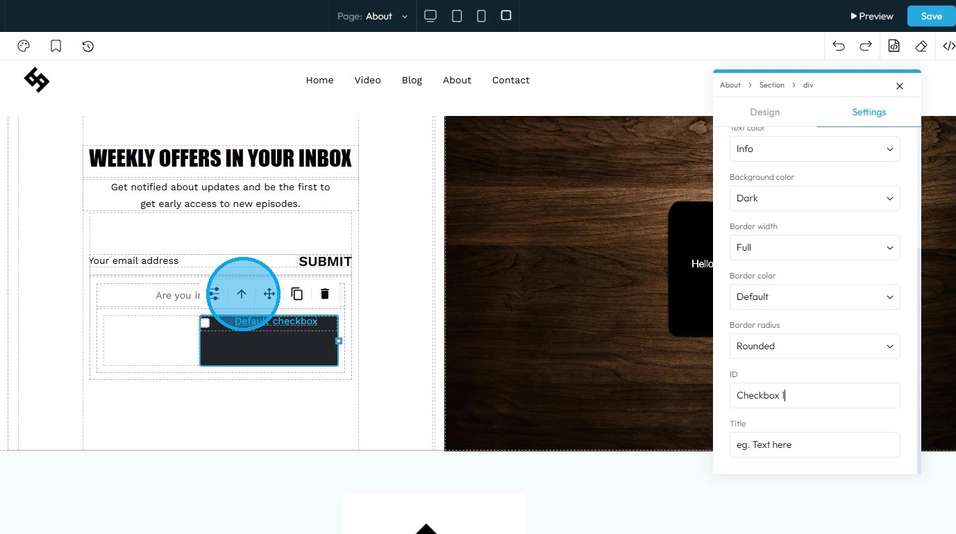
22. Move: Reposition the section to where you want. Click and hold this icon while you drag it to the desired location. A green line will indicate where it is being placed

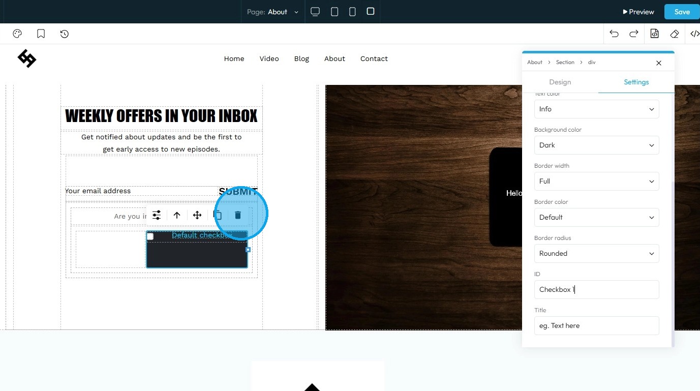
23. Copy: Create a duplicate of the section

24. Delete: Remove the section entirely.
Note: If duplicates exist, only one instance will be deleted
25. "Double Click" on the element to load up "Text Formatting" options.
- Bold: Makes the selected text thicker and darker to stand out.
- Italics: Slants the selected text to the right for emphasis.
- Underline: Adds a horizontal line beneath the selected text.
- Strikethrough: Draws a horizontal line through the center of the selected text, as if crossing it out.
- Hyperlink: Turns the selected text into a clickable link that directs to a URL.
- Wrap for Style: Lets you change the look (like the color or font) of just the specific words you have selected.
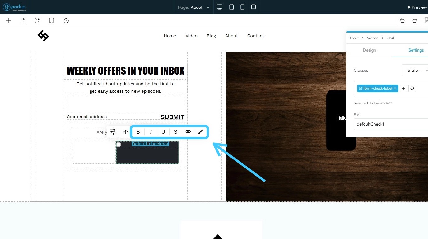
26. You can also re-write the text by double clicking on it.
27. Click "Save" in the top-right corner
28. The Checkbox element will be added to your website
Related Articles
How to Navigate Page Builder (Detailed)
This guide provides a straightforward method for creating and customizing website pages using PodUp's Page Builder, making it ideal for users of all skill levels. It outlines each step in the process, from accessing the page builder to editing ...How do I Customize Web builder Quick Add (Detailed) - Paragraph
By following this guide, you will learn how to customize the Quick Add feature in the PodUp Web Builder from adding a paragraph block to adjusting text, background, and border settings so you can create polished, visually appealing elements with ...How do I customize Web builder Quick Add (Detailed) - Collapse
By following this guide, you will be able to easily customize the Quick Add feature in the PodUp Web Builder from adding a collapse block to adjusting its visual properties ensuring an interactive and visually appealing website. 1. Navigate to ...How do I customize Web builder Quick Add (Detailed) - Label
By following this guide, you can easily customize the Quick Add Label feature in the PodUp Web Builder to create visually appealing and interactive elements that enhance your website’s design and user experience. 1. Navigate to ...How do I customize Web builder Quick Add (Detailed) - Tabs
By following this guide, you can easily customize the Quick Add Tabs feature in PodUp Web Builder to enhance your website’s functionality and design. 1. Navigate to https://app.podup.com/home 2. Click "Page Builder". 3. Click the "Build" button for ...