How do I customize Web builder Quick Add (Detailed) - Card
By following this guide, you can easily customize the Quick Add Card feature in PodUp Web Builder to enhance your website’s design and visual appeal.
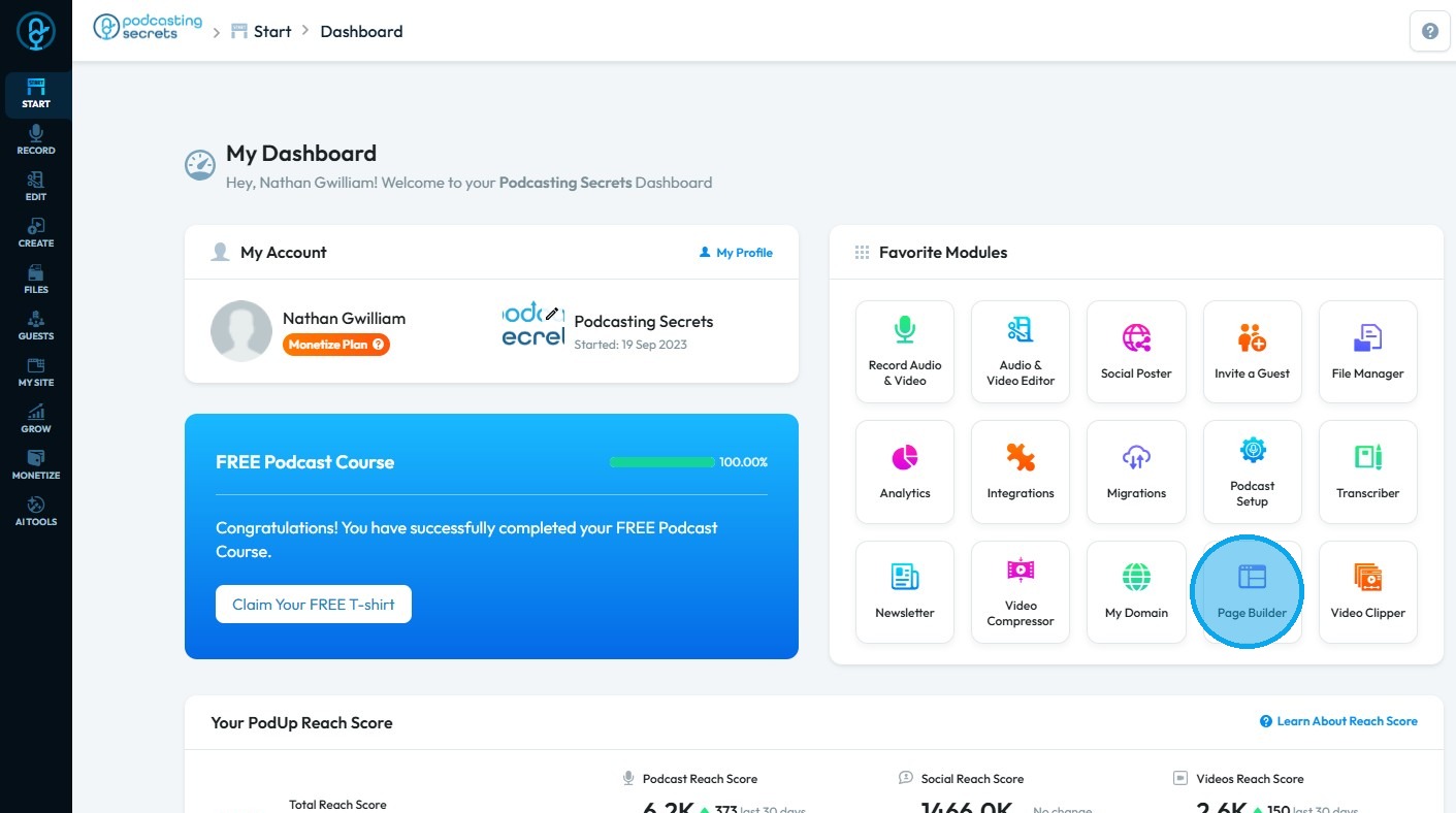
2. Click "Page Builder".
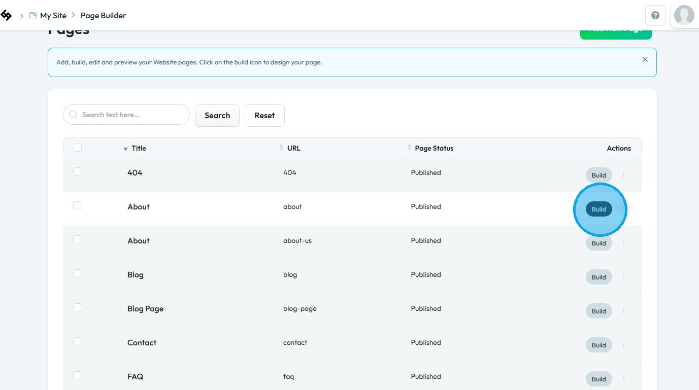
3. Click the "Build" button for the page where you want to add maps
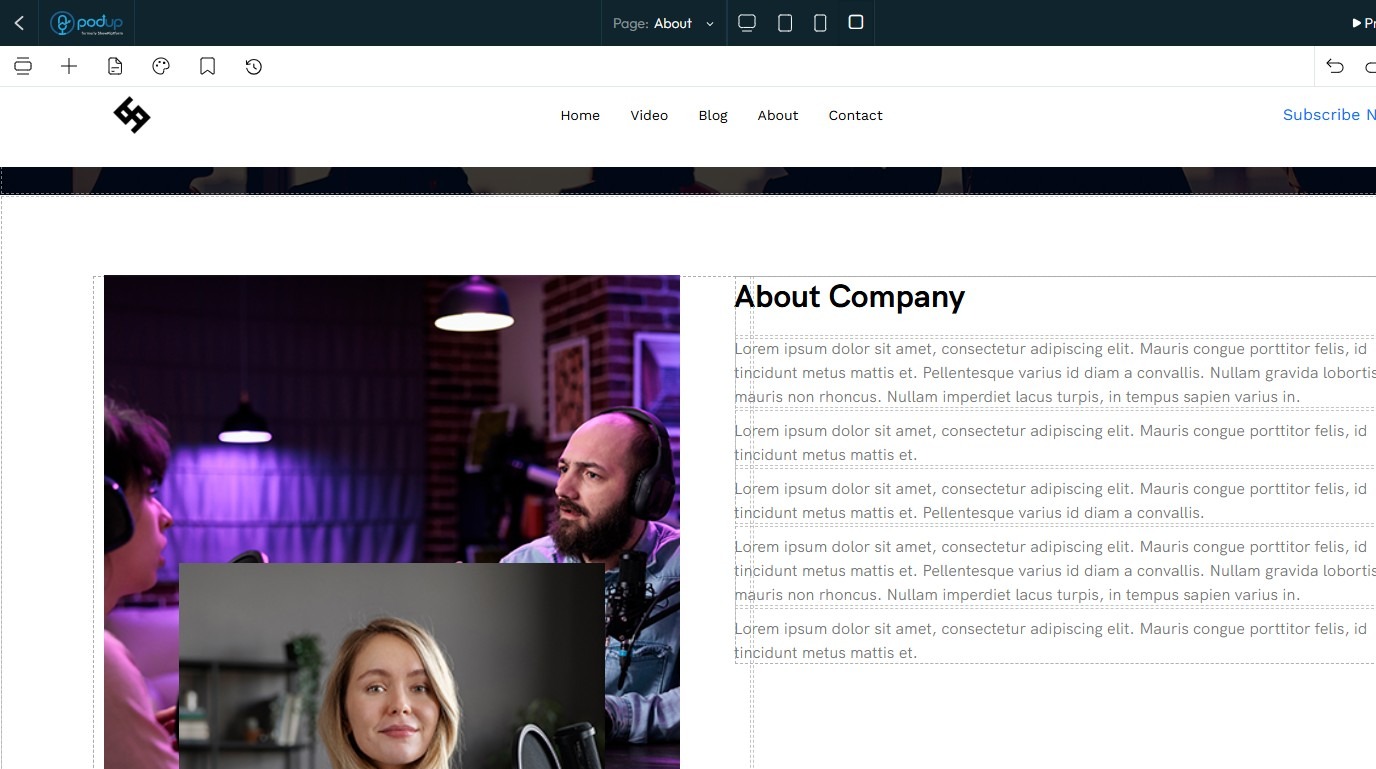
4. The PodUp Page Builder will load
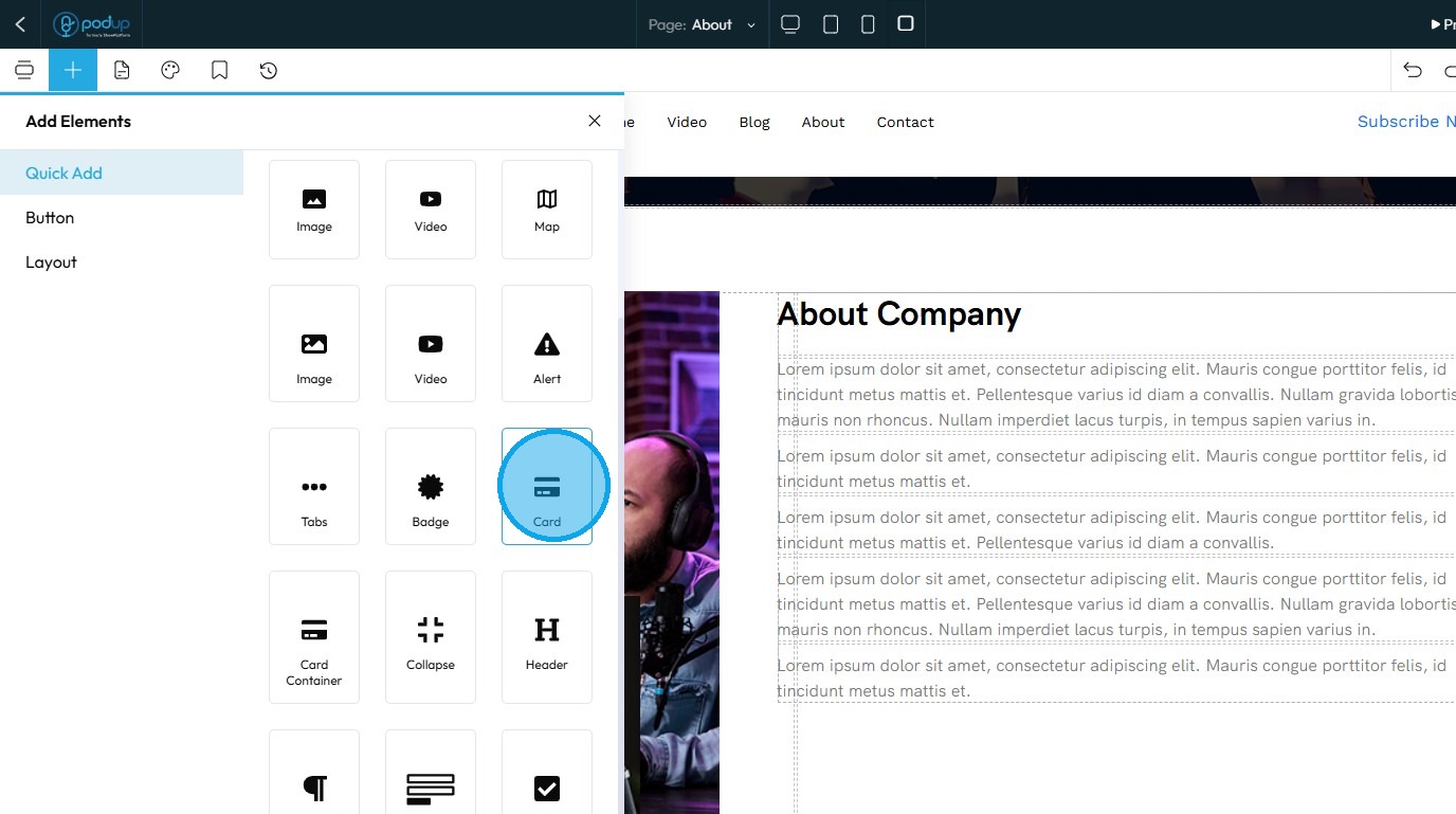
5. Click "Add Block" icon
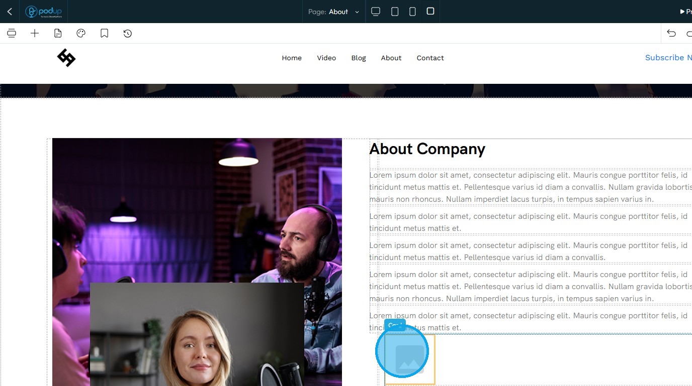
6. Click "Card" and drag it to the desired location
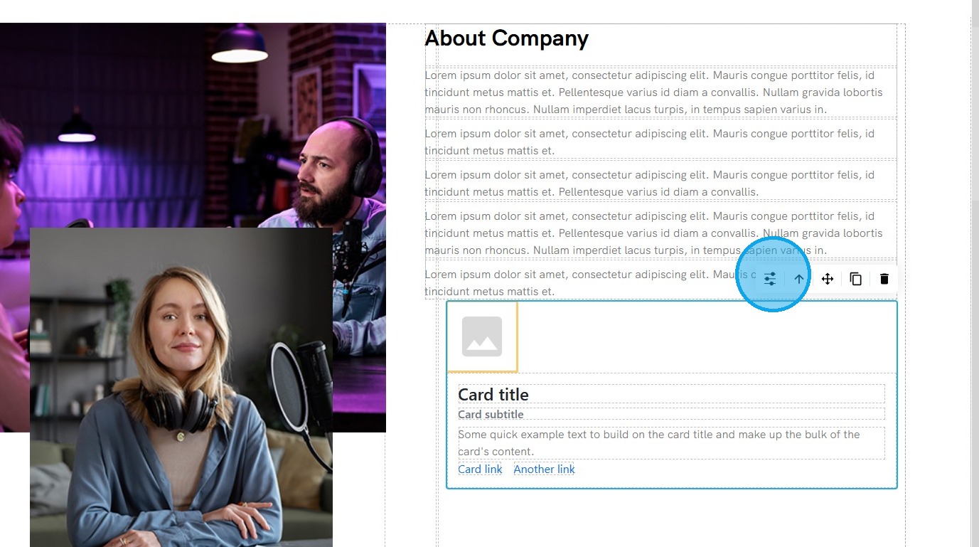
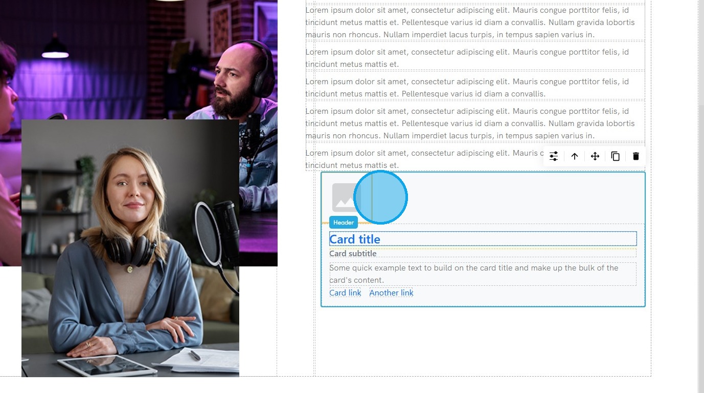
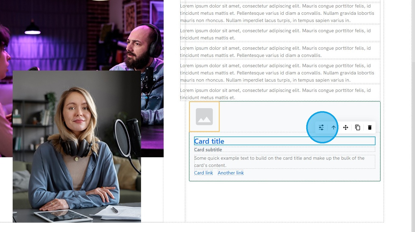
7. Select the element you want to edit
8. Click "Customize" to modify the element
9. See "How to format a design element" for the Design section since this is the same for every element
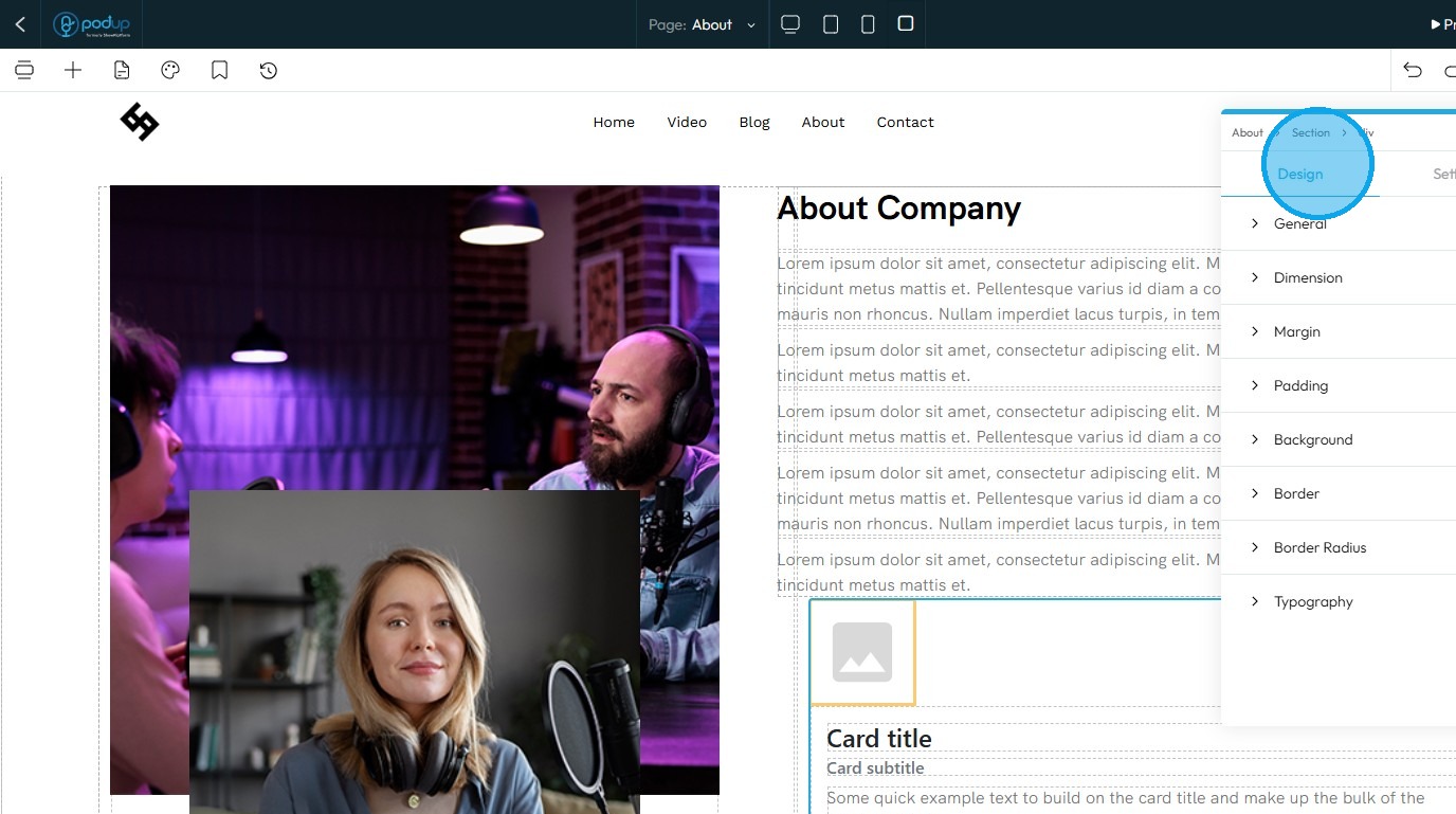
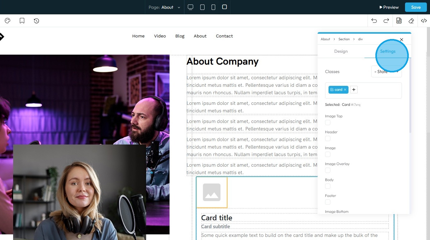
10. Click "Settings" to view the settings for this specific element
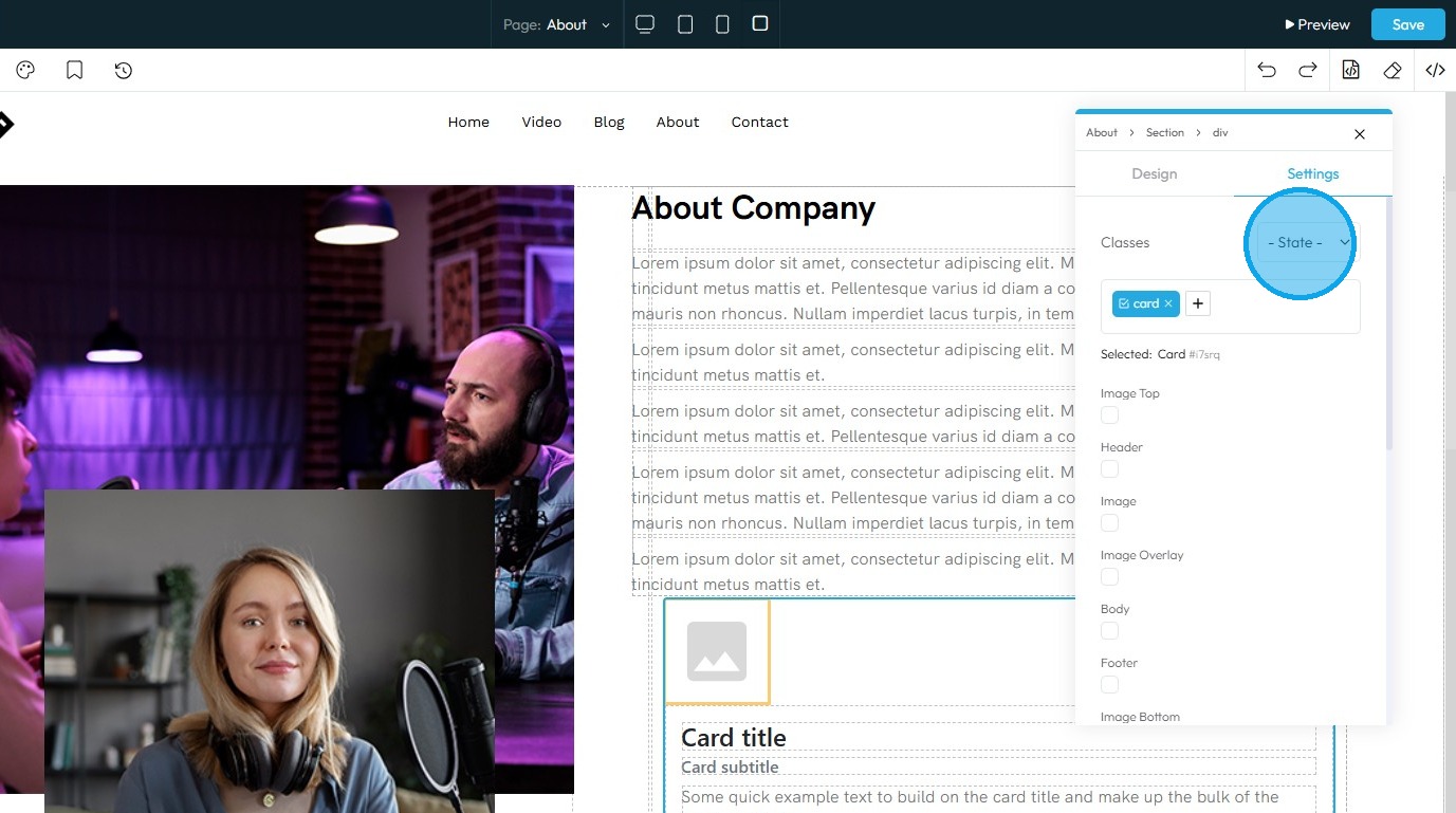
11. State: The different ways an element looks or acts depending on how someone interacts with it
- Hover: This allows you to define a special set of styles that apply only when a user's mouse cursor is hovering over an element that has this class. It adds interactivity and visual feedback
- Click: This allows you to define a special set of styles that apply when an element is being actively clicked or pressed down by the user. It provides immediate visual feedback that the user's action is being registered
- Even/Odd: This allows you to apply different styles to elements based on their position in a sequence (even or odd number) within a common parent. This is incredibly useful for creating visual patterns, like "zebra striping" in lists or tables
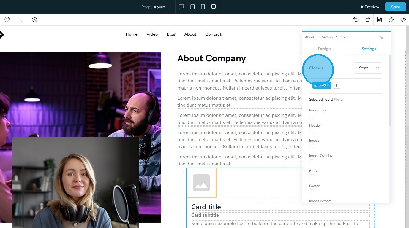
12. Classes: A reusable set of styles that you can apply to multiple elements across your website. You can add specific elements that you have already programmed or they will be automatically added when you edit the menu
- Tip: If this is your first website, leave this blank and let the software fill this in unless you have experience website building
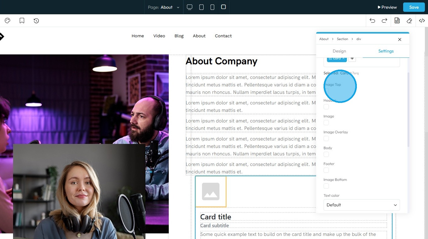
13. "Image Top" can be used to display or hide Image.
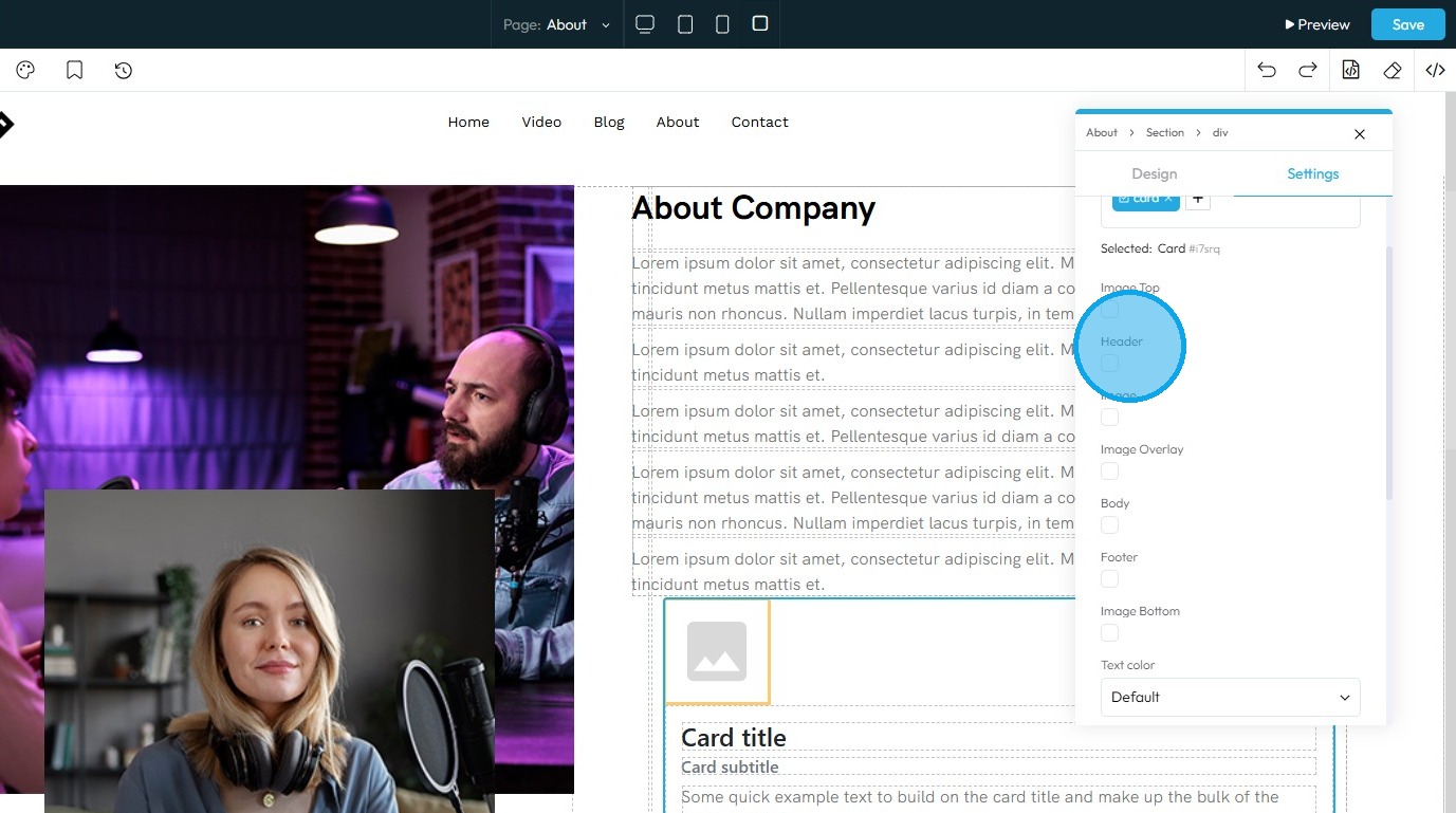
14. "Header" can be turned on or off depending on the prefrences.
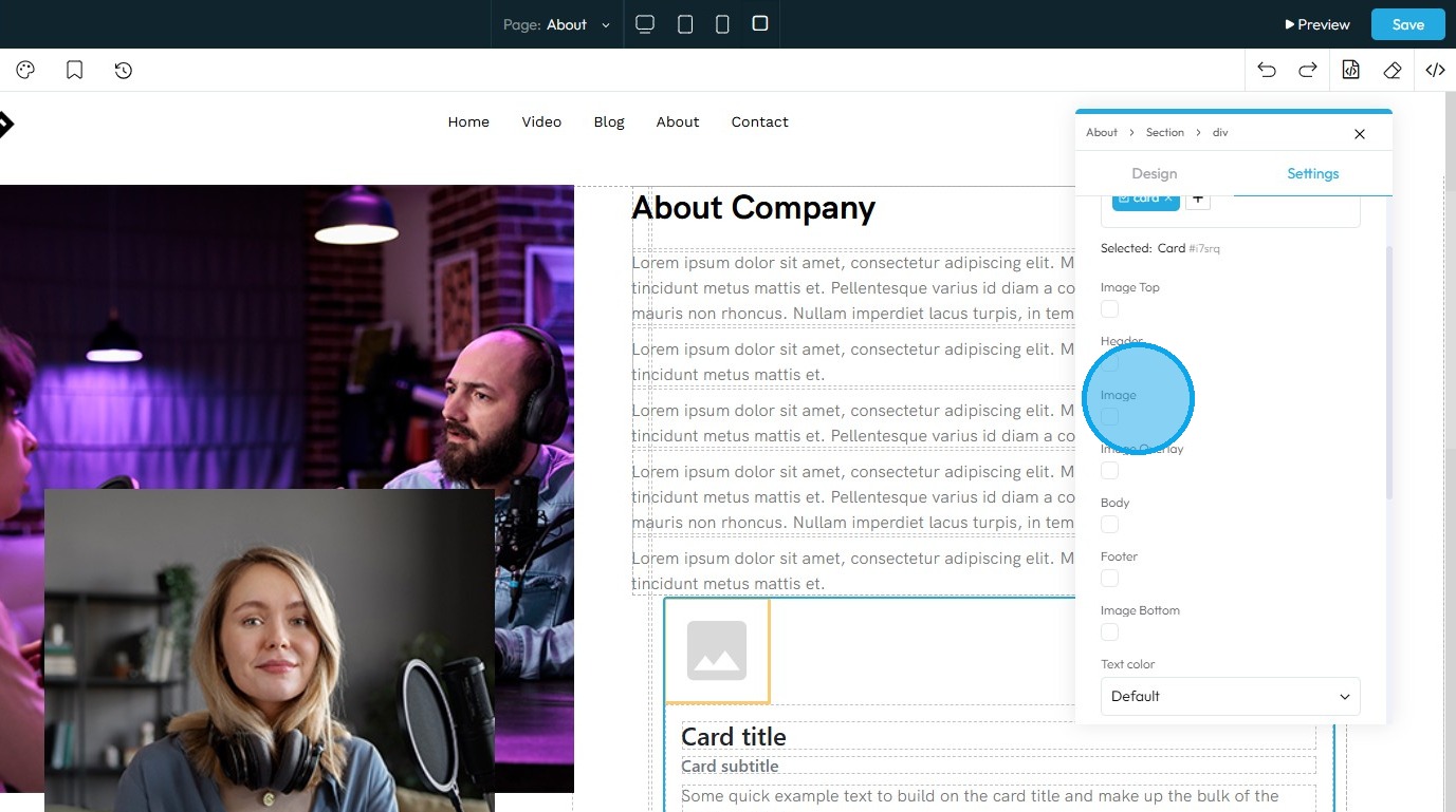
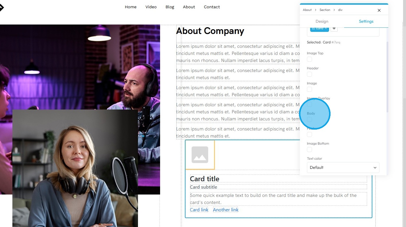
15. "Image" can be toggled on and off in the card.
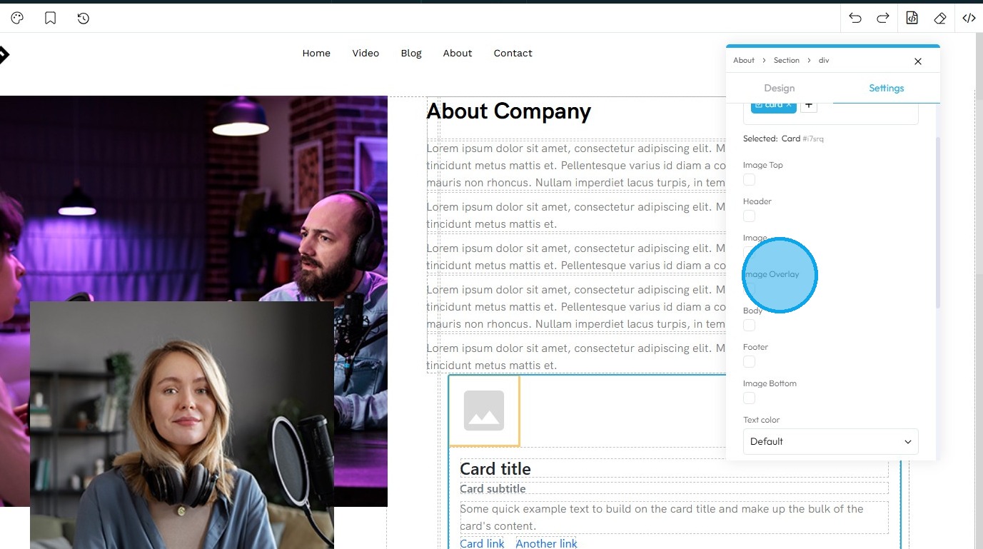
16. "Image Overlay" can be set or removed from the card.
17. Uncheck this property to remove the Body
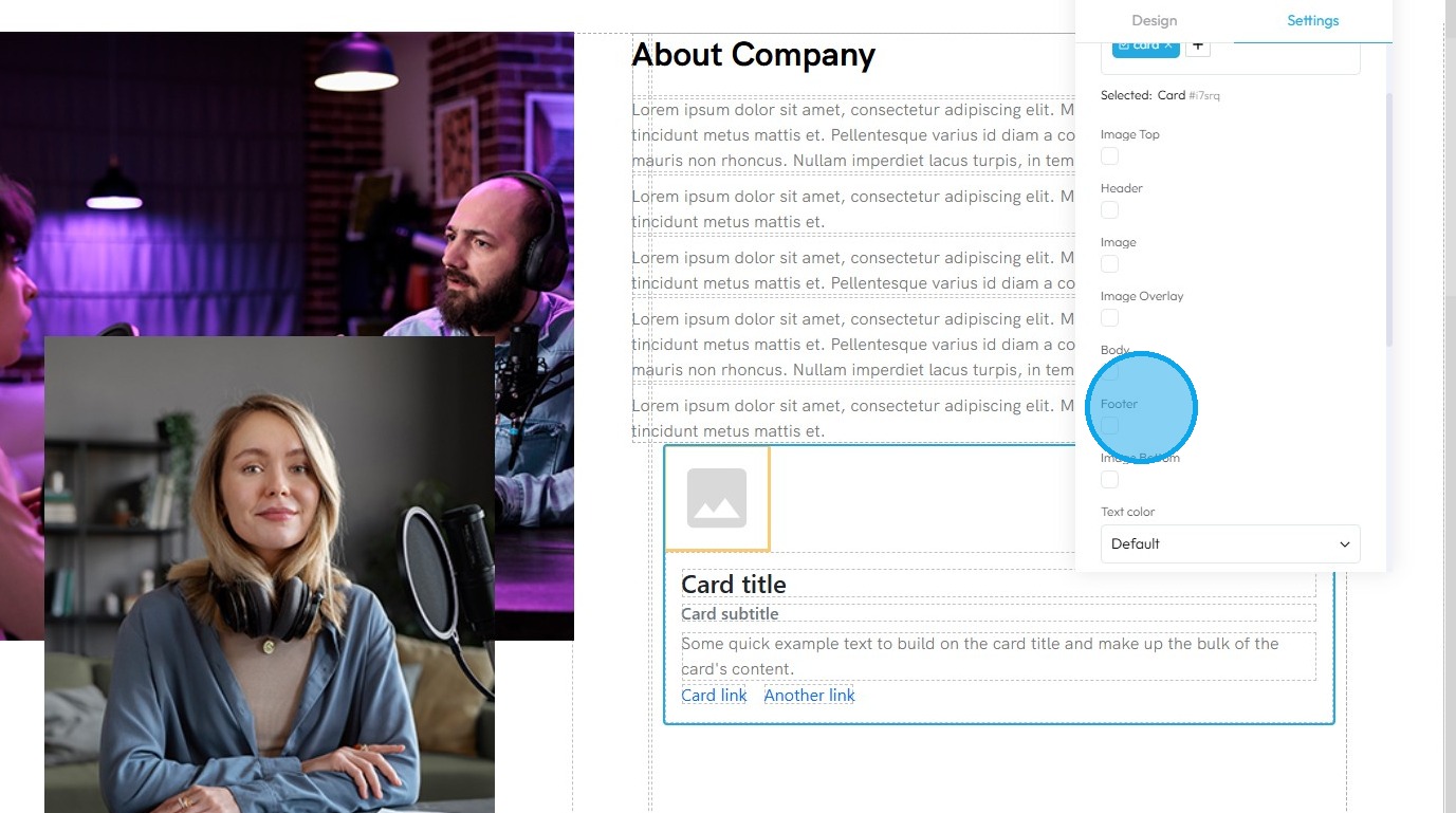
18. Check the Footer box to add a footer, or uncheck it to remove it
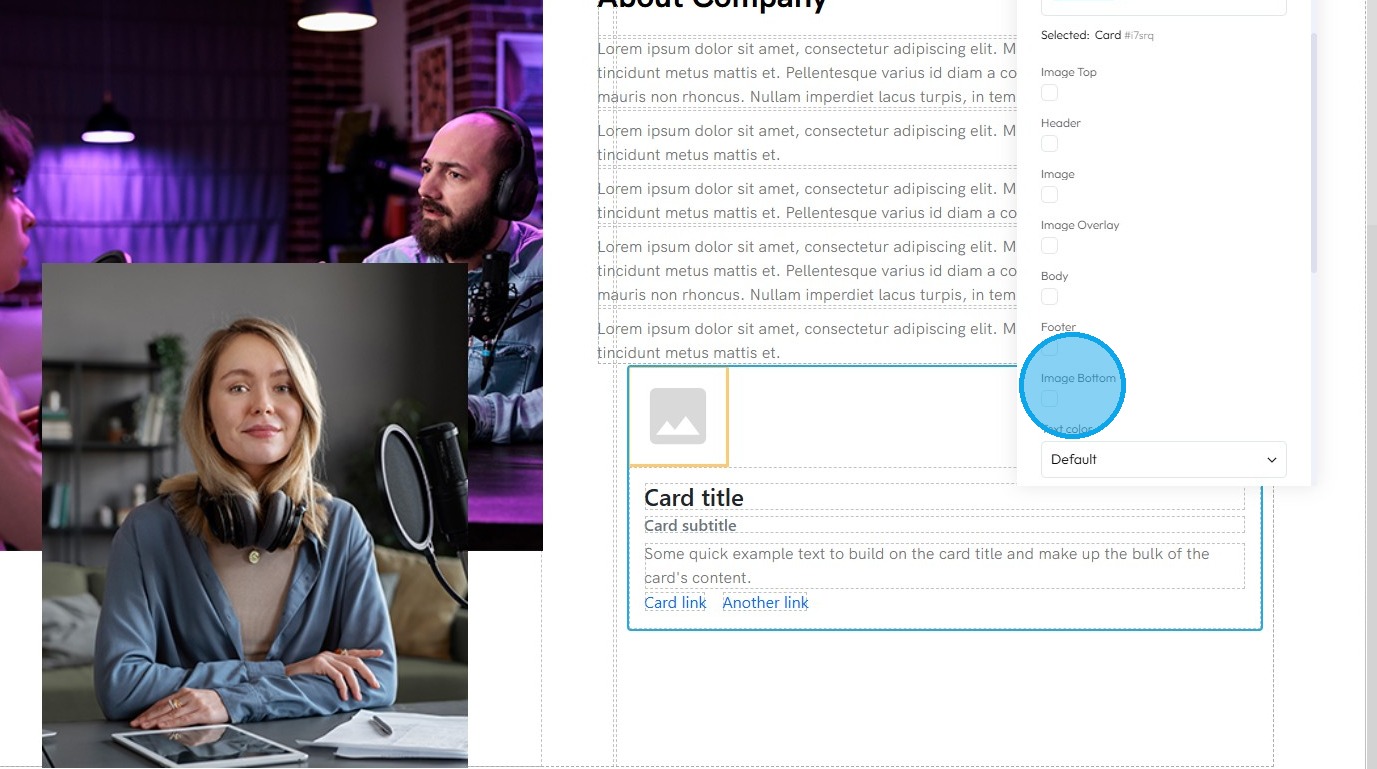
19. The Image Bottom option can be toggled on or off by checking or unchecking the property
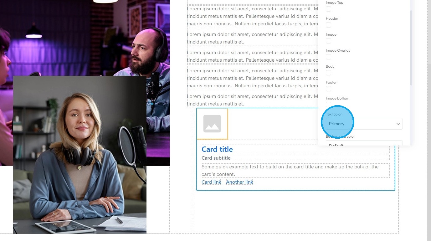
20. Text Color: This property directly changes the color of the text characters within an element
- Default: The standard text color used by the website theme
- Primary: A bold color used to highlight main actions or important text
- Secondary: A softer color used for less important or supporting text
- Success: A green-like color often used to show something positive, like a success message
- Info: A blue-like color used to show helpful or informational text
- Warning: An orange or yellow color used to alert users without being too alarming
- Danger: A red-like color used to show errors or serious warnings
- Light: A very light or gray color, usually used on dark backgrounds
- Dark: A dark gray or near-black color, used on light backgrounds for strong contrast
- White: Pure white text, best used on dark or colored backgrounds for readability
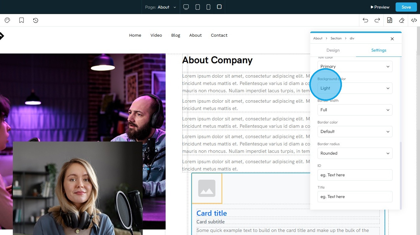
21. Background Color: Sets a solid color that fills the background area of an element. This color sits behind the element's content and its padding, but inside its border
- Default: The standard background color set by the theme
- Primary: A main brand color used to highlight key areas or buttons
- Secondary: A supporting color that complements the primary color
- Success: A green-toned background often used to show success messages or positive status
- Info: A blue-toned background used to display helpful or informational content
- Warning: A yellow or orange background used to show caution or warning messages
- Danger: A red-toned background used to alert users to errors or serious issues
- Light: A very light background, often gray or off-white, for a clean, subtle look
- Dark: A dark gray or black background, used for bold sections or contrast
- White: A pure white background, often used for clean and simple sections
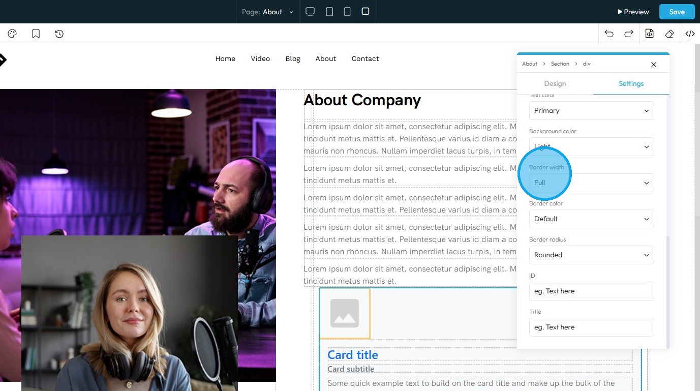
22. Border Width: Controls the thickness of the line that forms the border around an element
- Default: Uses the standard border size set by the website theme
- Full: Adds a border to all four sides of the element
- No Top: Removes the border from the top side only
- No Right: Removes the border from the right side only
- No Bottom: Removes the border from the bottom side only
- No Left: Removes the border from the left side only
- None: Removes the border from all sides of the element
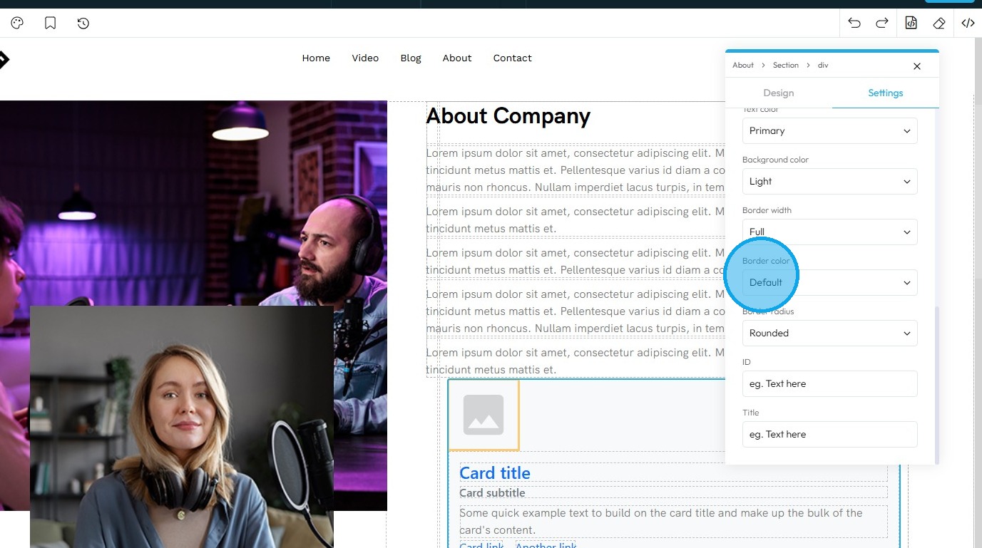
23. Border Color: Defines the color of the border line
- Default: The standard border color based on the website’s theme
- Primary: A bold color used to highlight or emphasize the border
- Secondary: A softer, supporting color for a more subtle border look
- Success: A green-toned border often used to show something positive or approved
- Info: A blue-toned border used for helpful or informational content
- Warning: A yellow or orange border to draw attention or show a caution
- Danger: A red-toned border used to show an error or alert
- Light: A pale or gray border for a minimal, clean design
- Dark: A deep gray or black border for strong contrast or bold sections
- White: A white border, best used on dark backgrounds for visibility
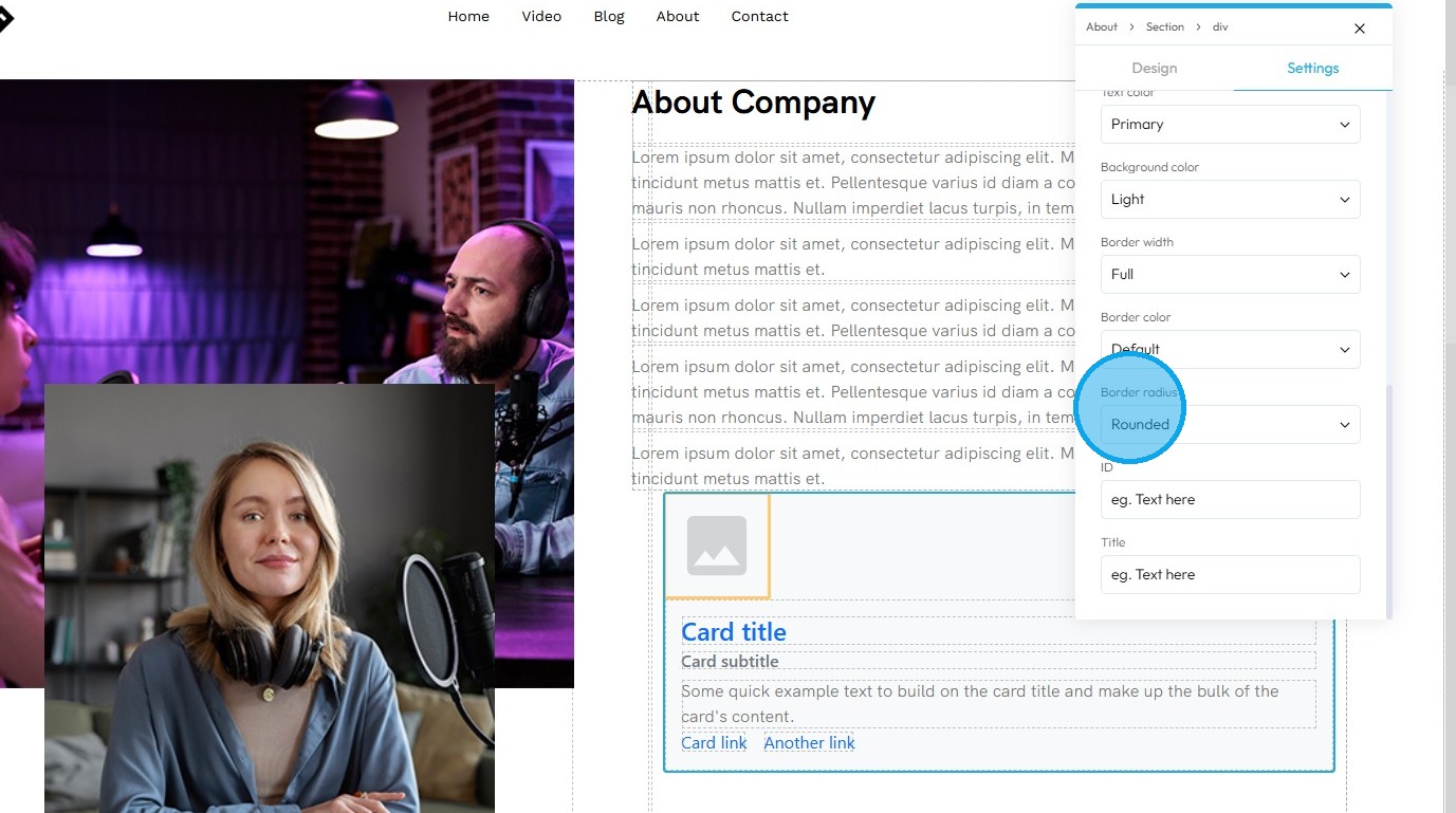
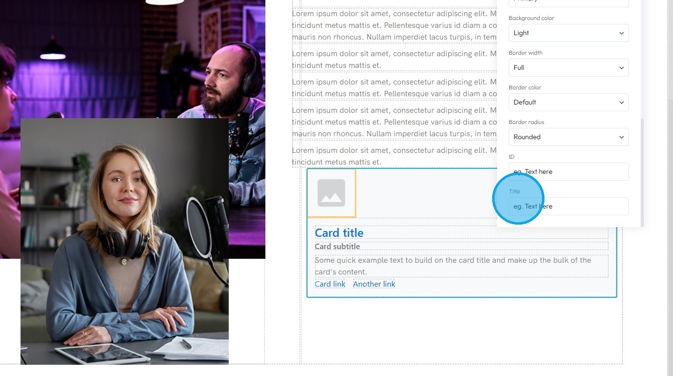
24. Border Radius: This property rounds the corners of an element's border (and its background and content area). Instead of sharp 90-degree corners, you get smooth, curved ones
- Default: Uses the standard corner style set by the website theme
- Rounded: Softens all four corners of the element for a smooth, curved look
- Rounded Top: Only the top-left and top-right corners are rounded
- Rounded Right: Only the top-right and bottom-right corners are rounded
- Rounded Bottom: Only the bottom-left and bottom-right corners are rounded
- Rounded Left: Only the top-left and bottom-left corners are rounded
- Circle: Makes the element fully circular (works best on square elements)
- Square: Removes all rounding for sharp, straight corners on all sides
25. Click the "Text here" field under "ID" to add an ID which is a unique name given to the element so it can be targeted with code (like for styling or linking) which will be used internally
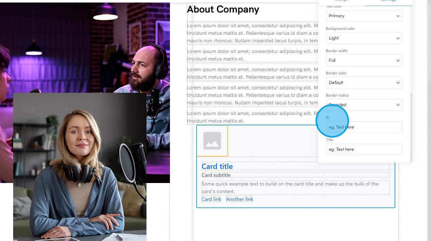
26. Click the "Text here" field under "Title" to add a title which is a short description that may show up as a tooltip when users hover over the element.
27. You can also customize the internal elements by selecting them directly
28. Click "Customize" icon.
29. You will see two new properties available
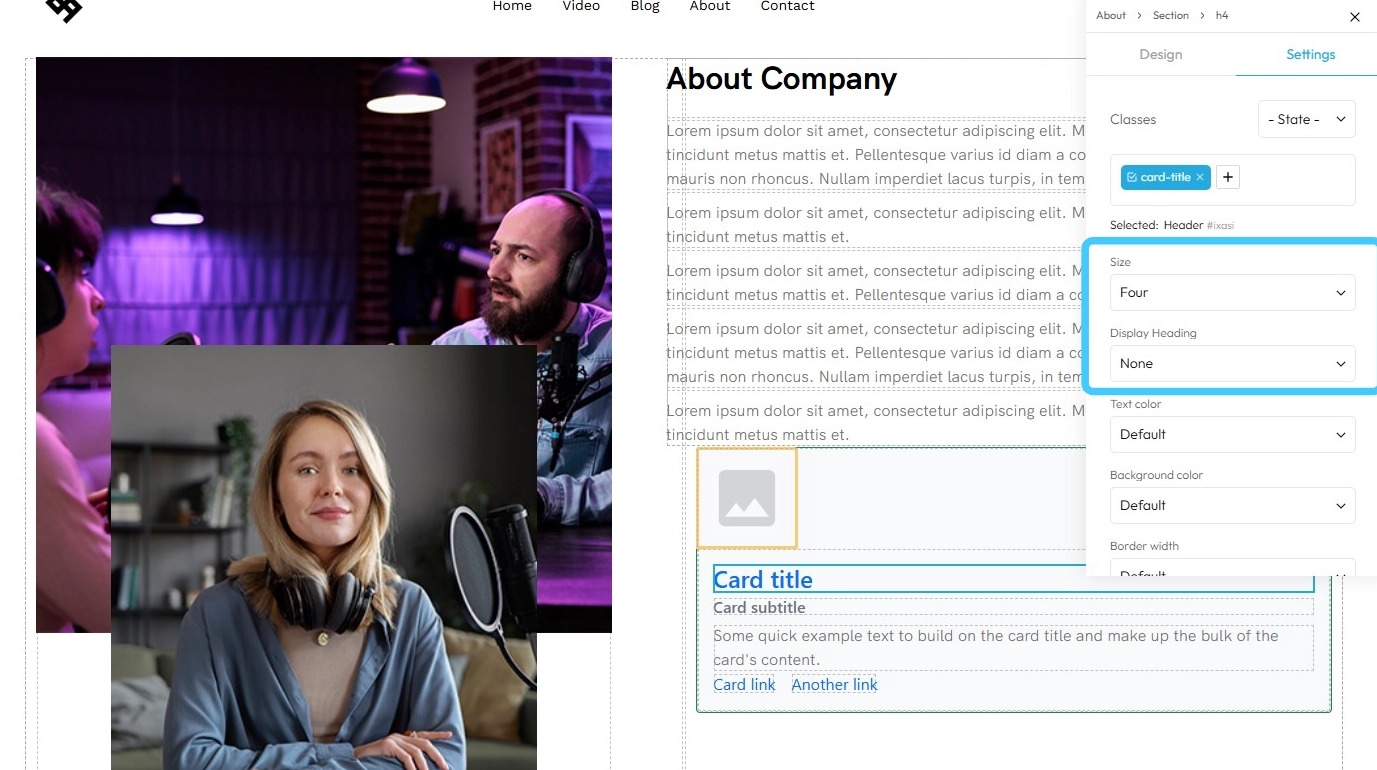
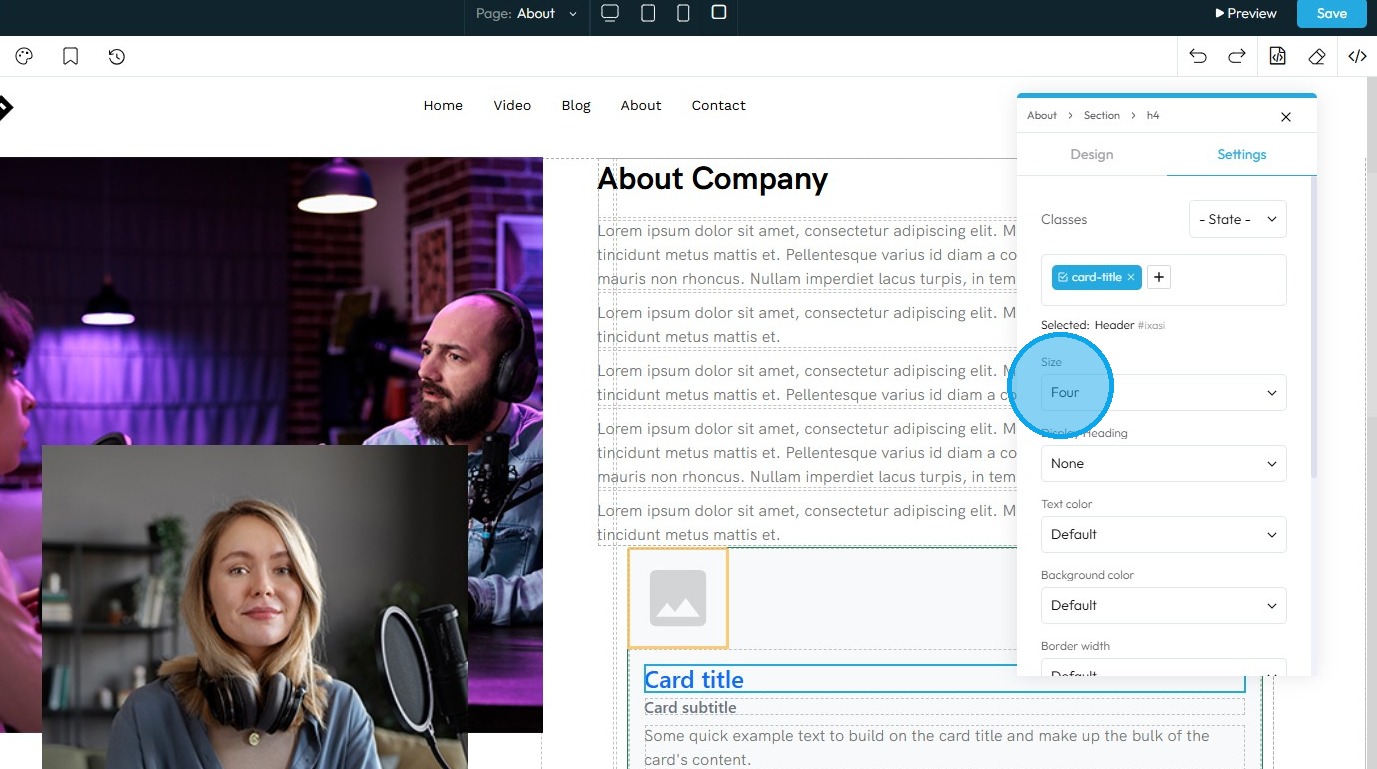
30. You can adjust the text size from One (largest) to Six (smallest)
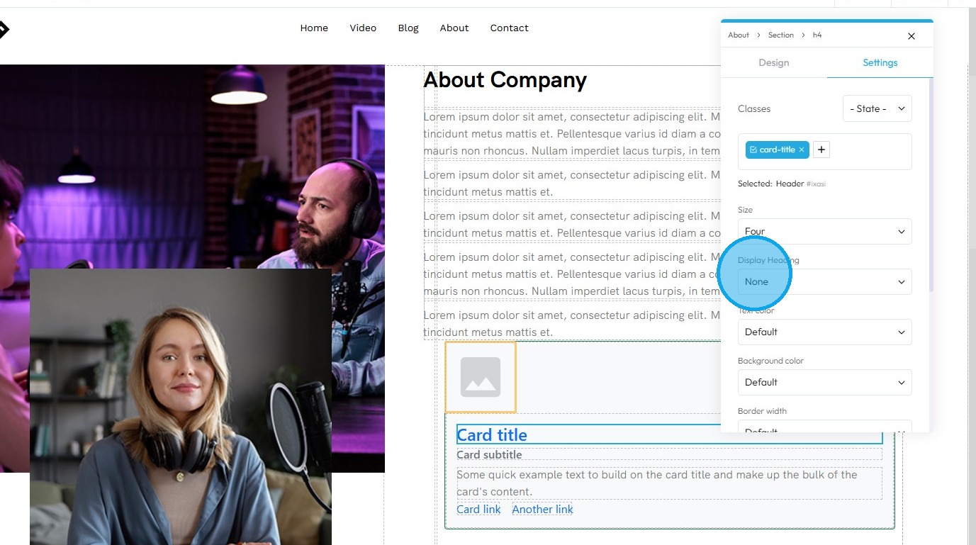
31. You can adjust the Display Heading size from One (largest) to Four (smallest)
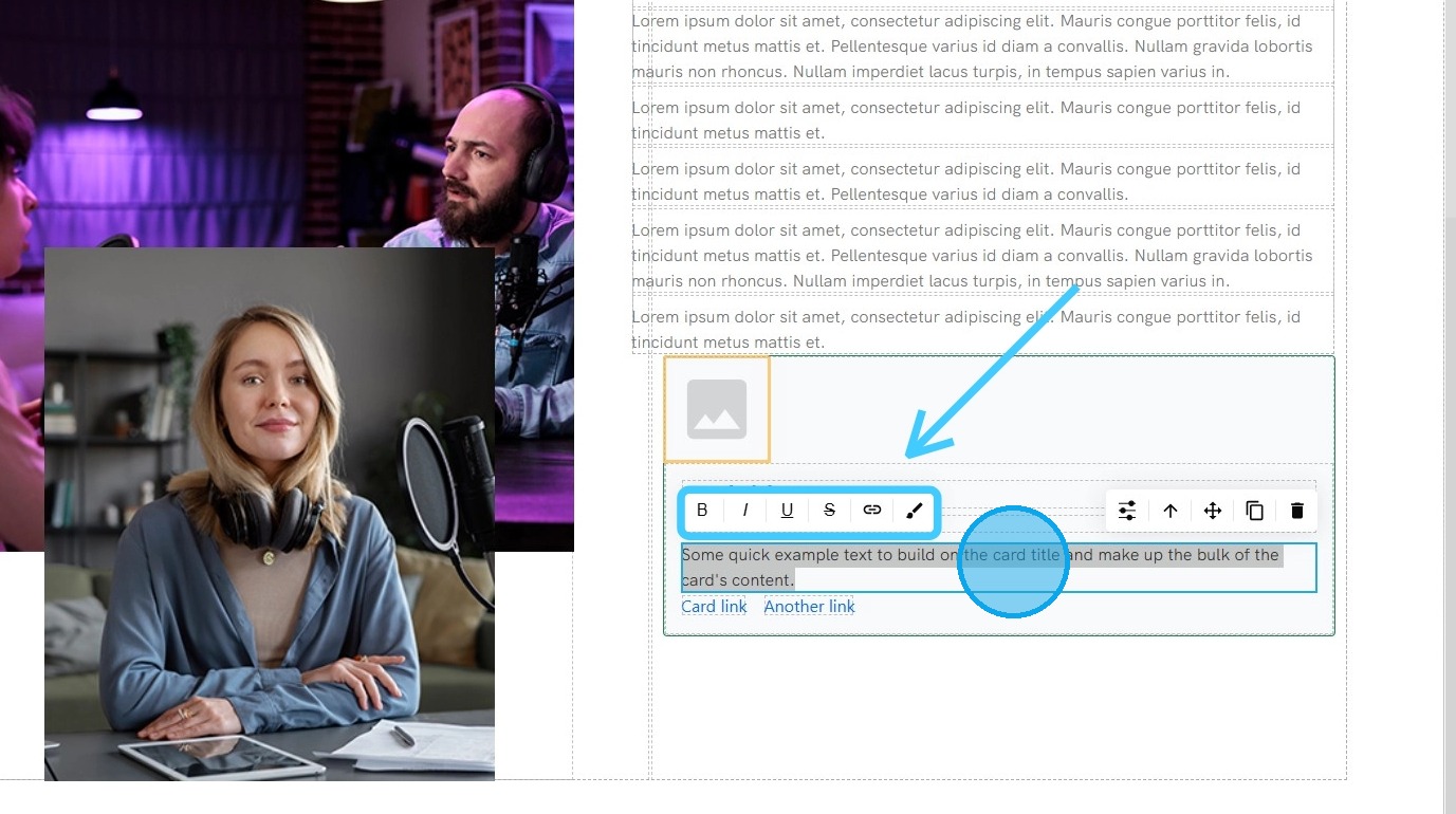
32. "Double Click" on the element to load up "Text Formatting" options.
- Bold: Makes the selected text thicker and darker to stand out.
- Italics: Slants the selected text to the right for emphasis.
- Underline: Adds a horizontal line beneath the selected text.
- Strikethrough: Draws a horizontal line through the center of the selected text, as if crossing it out.
- Hyperlink: Turns the selected text into a clickable link that directs to a URL.
- Wrap for Style: Lets you change the look (like the color or font) of just the specific words you have selected.
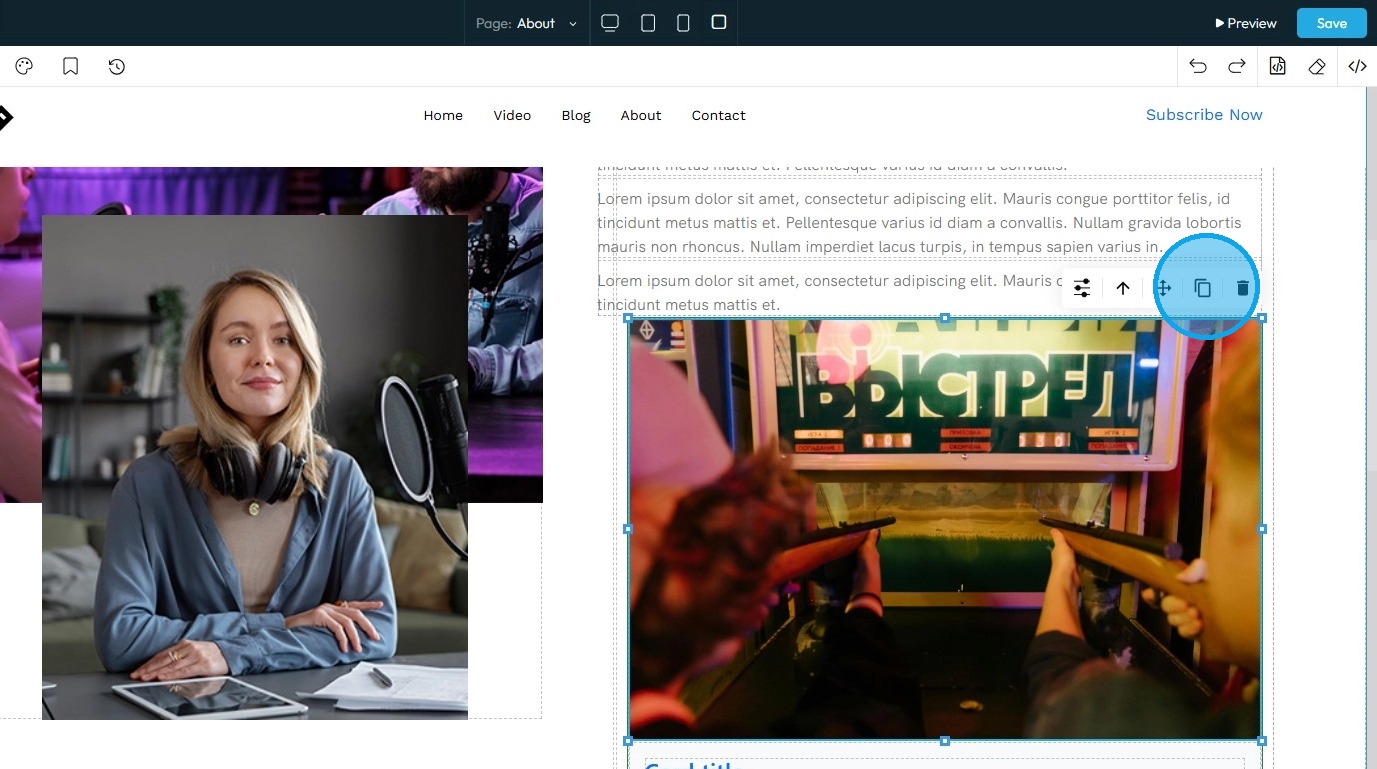
33. Clicking this icon tells the element to “move to the next bigger container,” which shifts it from a smaller box (like a text block or section) into the larger layout it's part of—helping you place it more accurately on the page

34. Move: Reposition the section to where you want. Click and hold this icon while you drag it to the desired location. A green line will indicate where it is being placed

35. Click the Copy icon to create a duplicate of the section
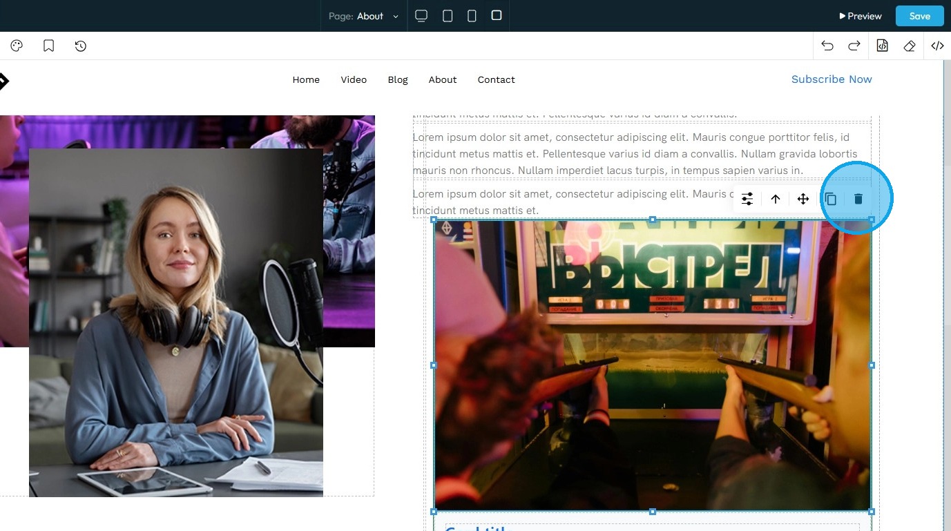
36. Delete: Remove the section entirely.
Note: If duplicates exist, only one of them will be deleted
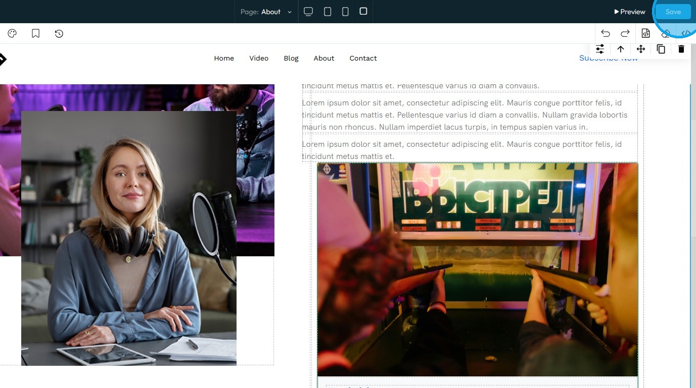
37. Click “Save” in the top-right corner to apply the changes
Related Articles
How do I customize Web builder Quick Add (Detailed) - Card Container
By following this guide, you will learn how to easily customize the Card Container in the PodUp Page Builder from adding it to your page to adjusting its layout, colors and interactivity to create visually appealing and functional website elements. ...How to Navigate Page Builder (Detailed)
This guide provides a straightforward method for creating and customizing website pages using PodUp's Page Builder, making it ideal for users of all skill levels. It outlines each step in the process, from accessing the page builder to editing ...How do I Customize Web builder Quick Add (Detailed) - Paragraph
By following this guide, you will learn how to customize the Quick Add feature in the PodUp Web Builder from adding a paragraph block to adjusting text, background, and border settings so you can create polished, visually appealing elements with ...How do I customize Web builder Quick Add (Detailed) - Collapse
By following this guide, you will be able to easily customize the Quick Add feature in the PodUp Web Builder from adding a collapse block to adjusting its visual properties ensuring an interactive and visually appealing website. 1. Navigate to ...How do I customize Web builder Quick Add (Detailed) - Label
By following this guide, you can easily customize the Quick Add Label feature in the PodUp Web Builder to create visually appealing and interactive elements that enhance your website’s design and user experience. 1. Navigate to ...